Week 3 — Assignment “Letters Analyzed”
Discuss + Studio due Sunday (end-of-day). Comments on other people’s posts due Tuesday.
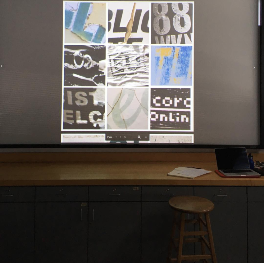
Project 1—Letters in the World. Create a visual study of letters in your world through a series of media-focussed explorations. This week you will organize your letters (from Week 2) into three thematic groupings of nine (9) photos each and create a 3-page grid layout to present them. Consider characteristics that you observe in the letters—e.g. their material, texture, color, formal qualities, tone/voice, degree of legibility, production method, etc. Next week we will be tracing the letterforms digitally in Illustrator and making compositions. This project is inspired by Ed Fella’s “Letters On America.”
1/
Discuss:
- Watch the 2019 presentation En Route: Lebanese Vernacular Typography with Chantal Jahchan.
- Write your response (200 words minimum) as a comment to this post.
Questions:
1. What are the four characteristics of “Arabic complexity” that are not served well by latin alphabet-based type design technology?
2. What does she acknowledge is good about modernism? How does she question modernism?
3. On a personal note, what inspired you about Jahchan’s work and life story?
Reply to at least two other people’s posts (below). Due Tuesday.
2/
Studio: Look at your photos of letters, what characteristics do your observe among them? There may be many characteristics for each, start to list these as potential groupings.
- Make selections from your larger collection of photos and organize them in groups that share a characteristic. In the groups that you make—what do the letters share in common? Are the letters in a grouping (explained in class:) serif fonts, sans-serif fonts, all metallic, weathered texture, reflective, neon, blue in color, etc. etc. What are the qualities that you observe? What is each page’s group theme?
* Each page of your PDF presents one grouping. Each grouping will have nine (9) distinct photos/different letter photos. Be prepared to talk about the ideas behind each grouping next week.
For more theory and history, consult Thinking with Type, Ellen Lupton ebook chapter on the “Letter.” - Follow the design steps precisely. Create a (nine-space modular) grid layout in InDesign (see specs below and demo in class). Layout three pages, package the file, and export as a PDF.
- Package the Indesign file and make a single PDF of all three pages. Upload the entire *packaged* design folder to onedrive. It should have an .indd, .idml, .pdf, and a links folder inside where your 27 selected photos are. It is always important to package the files each and upload the whole folder. If you need more photos to make successful groupings, you can take more photos!
- Write a description of your project explaining what your three groupings are (as a comment below) and in the same space post the link to your PDF on the drive.
InDesign document specs:
10 in x 10 in page, InDesign doc
Turn off facing pages
Margins: 0.125 in
Three columns / Gutter is 0.125 in
No bleed
On the “Parent” Page A, make rows. Select Layout>Create Guides>Create rows
Three rows / Gutter is 0.125 in
Select “fit guides to margins”
Three pages (nine diff images) / each page a different grouping
Review Suzanne Helms’ in-class presentation (Special Collections Uni Archives) via this link.
Click on image to see more examples —>

Links:
Chantal Jahchan
Jerome Harris
Lara Captan
Ed Fella, AIGA Medalist
[from Typographics]—
“This talk (Chantal Jahchan) took place in The Great Hall at The Cooper Union on June 15, 2019. The livestreaming and video recording were made possible by a generous sponsorship from Google.
“Through photographic case studies of vernacular typography in Mount Lebanon, Chantal will explore the rich history of the country’s relationship to language, identity, and the “revolution” of Arabic type design. What does modernity mean for Lebanon? How can we as designers and typographers challenge ourselves to rethink what we consider “modern”?
“Chantal Jahchan is a graphic designer and writer based in NYC. Ever since she moved from Lebanon to the US at a young age, she has been interested in the ways that language can be both a barrier and a tool for communication. As a result, her work tends to be type and literature-driven with a focus on social and cultural discourse. Chantal is a recent graduate of Washington University in St. Louis and is currently an intern on Michael Bierut’s team at Pentagram. She has previously interned at Moment (2017) and worked at Interbrand NY (2018).
“Her team at Moment was awarded the IxDA 2018 People’s Choice Award for their design of an artificially intelligent companion that redefines how parents pass down their native culture and language to their children. She is a collaborator of 1on1, a collective devoted to elevating the narrative and experience of Arab and Muslim Americans. Chantal’s typeface identification and education app, TypeDig, was a 2017 Finalist in the Adobe Design Achievement Awards (ADAA). Her work has been recognized by Fast Company and It’s Nice That.”
1. Four characteristics of “Arabic complexity” that are not served well by Latin alphabet-based type design technology include…..
– Connection and flow because the way that Arabic letters connect would require a more fluid and loose design.
– Symbolism and small details due to the fact that Arabic relies on diacritics which are a heavy part of the language.
– Letterforms because Arabic letters have different shapes and little but noticeable variations.
– The cursive-like appeal of the script because Arabic letters change form but it depends on their position in a word.
2. Jachan acknowledges that modernism is very beneficial and brought important advancements to the world, especially in simplicity and functional design. Those traits are said to have been crucial to the evolution of graphic design and typography. She questions modernism by bringing up its tendency to rely heavily on universalism and standardization. She states that modernist design doesn’t always cater to expressive characteristics that are found in scripts like Arabic.
3. What inspired me about Jahan’s work was the fact that she is a huge advocate for cultural representation within design. Cultural representation within design is crucial because it reflects and honors the diversity of human experience. Design shapes how we communicate, express ourselves, and connect with others, so ensuring that it is inclusive and representative of various cultures allows for more accurate, meaningful, and respectful exchanges.
Hello Chris,
I agree with your opinion about how important cultural representation is in design and how it honors diversity. I think it is great that she cares so much about it too in her own art.
Hey Chris, I didn’t catch the point that “Symbolism and small details due to the fact that Arabic relies on diacritics” is a reason why modernity hasn’t caught up to Arabic script in the video, so thanks for including it! That’s a really good point.
Also, I agree that modernity can suffocate unique cultural inspiration/expression and it’s really inspiring seeing Jahchan advocating for that. I think a huge downside to how we create art today, specifically in typefaces, is that they’re used primarily commercially; and that often times the “universality” as you mentioned of a typeface is prioritized over the art itself.
Hi Chris,
I agree that cultural representation within a design is a huge part of learning about the human experience. It was interesting to see a culture I didn’t have any prior knowledge about expressed artistically.
Hey Chris, your answer to question 3 is really important and I absolutely agree. It’s really nice to see someone phrase it so eloquently, you did an amazing job!!
1.
The four characteristics of “Arabic complexity” are that we read Arabic right to left, it is a connected script meaning the letters form words by joining together, the letters may change depending on where they appear in a word and what letters they appear next to, and finally a technique called Kishida is used to extend letters for justification. This is extraordinary as it is, and must be really challenging to learn.
2.
She questions what happens now that technology has caught up to the Arabic script demands. Instead of treating letters in discredited forms, the new technology now breaks the script down into “Elemental building blocks”. She does not fully agree with the way Arabic writing is being advanced, as I agree this new form is more “literal” and bold. I believe she acknowledges modernism in the study of replicating calligraphy and digital type. This allows the study of the script in “basic principles”. Jahchan states that “we have to use the technology no to replicate the past, but to reshape the future to solve new problems and ask new questions”, showing her optimism for modernism.
3.
I myself found this lecture interesting as I have always wondered how the Arabic letters worked together. I have found myself finding an interest in the way the letters looked and flowed together, and this lecture taught me a lot about the structure and the history of this language. Chantal tackles the barriers of language in her research through her graphic design. I find it interesting how she picked her thesis and went full circle with her ideas. This inspired me to strive for success in my own projects and goals.
My three groupings is the first one includes all bold lettering with the emphasis on bold fonts. The second grouping all include numbers in different fonts. My final grouping is a collage of hand-written lettering. After our meeting I decided to take more pictures to help finish my groupings. I believe I found some solid examples as I even included a couple of my own tattoos that I have.
https://uncg-my.sharepoint.com/shared?id=%2Fpersonal%2Fr%5Friley%5Funcg%5Fedu%2FDocuments%2F%5FRachele%20Riley%2Fteaching%2FS25%2FART%20341%E2%80%9302%2FAlex%20Gentry%2FWeek%2DThree%2FTypography%2DWeek3%20Folder&listurl=%2Fpersonal%2Fr%5Friley%5Funcg%5Fedu%2FDocuments
Hi William,
I agree with you that it is interesting about how the Arabic language is structured. I never knew that it was read from right to left or about the other properties before watching the video.
Hi Willam,
I also was intrigued by how the Arabic letters worked together. Chantal did a great job of connecting her history and culture to her typography work.
Hi William!
Chantal’s lecture also made me more interested in the structure and history of language, especially with Arabic script. I was curious as to how they worked and how letters are joined together, and it was definitely interesting to see how she broke down the history of typography with Arabic script as well.
I agree, the lecture was really engaging and gave great insight into the Arabic language’s structure. It’s fascinating how Chantal used her graphic design skills to explore and break down language barriers. I also love how she took her thesis concept from start to finish, showing the power of a strong, focused idea. It definitely encourages a more dedicated approach to our own work.
Your groupings sound interesting! Bold fonts can really make a statement, and the inclusion of handwritten letters adds a personal touch. I like how you used tattoos to tie in your examples—such a unique approach!
Arabic is read right to left, is part of a connected script, changes physical form depending on context, and can be stretched to justify itself to a corresponding Latin word’s length.
These four aspects contribute to a complexity that makes it incompatible with Latin alphabet-based designs.
Jahchan claims modernism embodies a belief in the power of the present and a constant redefining of the norm. She describes it as being in a conversation with tradition. Jahchan follows this with a quote by Phin Baines. The quote describes tradition as being ever changing and not a concrete ruleset. However, modernism has created a much leaned-on framework to represent Arabic in type. Jahchan argues this framework is influenced by an interest in appealing to western sensibilities and erodes the elegance the language is capable of. This is demonstrated in the cluttered grids of signs, all with competing English/French and Arabic words.
I appreciate Jahchan’s interest in challenging tradition. I also enjoy how the work shows how much complacency can lead to mediocrity in design work. Her story is yet another example of how inspiration can start with something easily taken for granted and be transformed into an obsessive body of work.
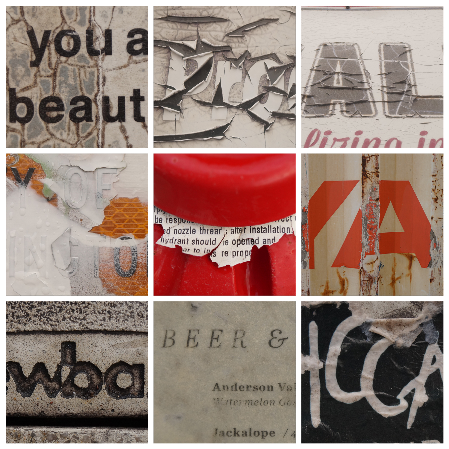
Below is a link to my groupings. The first grouping consists of eroded text, the second is graffiti/hand written examples, the third consists of text extruded or inset across various materials.
https://uncg-my.sharepoint.com/:b:/g/personal/r_riley_uncg_edu/EddcmgBZWWtNmD6KkUcKObABdX_8bozNNg9kvSkVKSGSsA?e=rYWLf4
Hey Zeus! I think challenging tradition can be a super cool way to create your own style as an artist and cause for a new tradition to be born out of that perhaps. I also believe that there is huge importance in the things that are taken for granted in everyday life and how that type of stuff can really have an impact on inspiring us if we were to pay more attention to it. Great job!
Hey Zeus, that’s a really interesting point about Jahchan’s work being potentially “obsessive”. I didn’t think about it that way when I first watched it, but looking back on it their work could be considered ‘archiving’ in the sense that it’s holding on to the uniqueness of Arabic script as opposed to disregarding it for modernity.
Hi Zeus I wanted to make a quick comment on your groupings. I really like the images you have in all of the groupings. But my personal favorites are your 1st and 2nd groupings, I just really like the images you picked to be together. I also like your statement for question three really interesting!
Hey Zeus, your answers are really well put. I specifically like your response to question 2, about modernism. Everything you said is really important, specifically how modernism affects Arabic type and how it’s going to be moving forward.
1) The four characteristics of “Arabic complexity” that are not served well by latin alphabet-based type design technology are that Arabic is read from right to left, it is a connected script, Arabic letters are like shapeshifters and can change appearance based on where they are located in a word or what other letters they are next to, and finally she notes that Arabic is stretchy.
2) Chantal acknowledges that modernism is good in the sense that it means having a belief in the power of the present and a constant redefining of the norm. She questions modernism in the sense of thinking on the question “Is modernism your standard for what constitutes good design?”.
3) On a personal note, what inspires me about Jahchan’s work and life story is that she figured out how to take two things from her life that had an impact or intrigued her and figured out how to mesh them into one powerful creation. I think that her finding out that there is this avenue of other people that are concerned with Arabic font design is super cool and obviously helped her to continue along this journey of raising some awareness for the needed improvement of Arabic font design.
4) For my three groupings I tried to make use of three separate categories to break my photos up into a broader range of groupings. For the first grouping, the images can all be categorized as a graffiti style of letters/fonts. For my second grouping, the images can all be tied together because they are all on printed matter and all make use of black and white for certain details. For my third and final grouping, the images can all be related through the use of red in the design of all the letter forms.
Link to my PDF on OneDrive: https://uncgmy.sharepoint.com/:b:/g/personal/r_riley_uncg_edu/Eb28NDJuJmFPtTG8bHeqCwoBHS1VYgB9b5IqytxxZvCfZQ?e=fBpLse
Hey Hayden, I found it interesting that you included that quote from Jahchan. I feel like the concept of modernism is frequently used by our society in an oversaturated way. Everytime I open up social media, I find out about a coporation that simpilifed their logo and font like every other corporation. In terms of Jahchan’s work, I also found it interesting that she is invested in Arabic font design. It was an issue that I didn’t even know about.
Hello Hayden! I also find it inspiring how she was able to take the two things she liked and combine it into one amazing creation!
Video Response:
1. The four characteristics are that Arabic is read from right to left rather than left to right, it is a connected script so the letters form words by combining with others, Arabic letters change depending on where they appear in a word and what other letters they appear next to, and Arabic letters can be stretched without affecting how they are read.
2. She acknowledges that modernism is good in the sense of not being left behind and being able to be on the same level as other languages when it comes to things such as typing on a computer. However, she points out how modifying the Arabic script takes away a lot of the individuality and beauty of it, and questions whether there is a way for modernism and tradition to coexist.
3. I relate to her experience with seeing yourself represented and the impact it can have on you. It’s really inspiring to me that she did so much research and made this whole project despite not being an “expert” in the subject as she says. As someone who often shies away from making certain things because I feel like I’m not qualified enough, it’s really cool that she decided to make her project anyway while still acknowledging that she doesn’t know everything.
Hey Simon!
I really agree with your last point on your post. I also sometimes shy away from representing certain aspects or ideas because I myself do not feel as qualified to talk on it than say a professional in the field. However, being able to recognize and communicate that to your audience can help show how interested you are in something and be able to show your appreciation for it.
I appreciated her confidence in allowing the art to fill in where she feels she lacks expertise. The idea that her images can contribute to the conversation regardless.
1. The 4 characteristics of “Arabic complexity” that are not served well by the Latin alphabet are that Arabic is read from right to left, the opposite of the Latin alphabet; the letters are also in a connected script. Connected script means that there is no easy to see distinction between the letters, much like Latin alphet’s cursive. The letters also change situationally, depending on the letters they’re next to and where in the word they are. Arabic is also stretchy, meaning you can stretch letters out to fill space and make them take up much more space than they did originally.
2. Jahchan acknowledges good things about modernism, such as how in 2009 a computer program was made to write Arabic without Latin alphabetic constraints. This greatly moves towards the good in modernism, described as a conversation with tradition and flexibility. Jahchan speaks on how she had to reframe her mind, and see the beauty in things that she otherwise would not. Modernism is also described as helping push the Arabic script forwards, if not just for capitalistic gains. She questions modernism in quite a few instances, but the one that stuck out to me was how she compared the beautiful scripts and calligraphy to the present day script and described it as much less inspired.
3. Jahchan inspired me with how she viewed something so close to her with such an exact lens. She saw something she had been around most of her life, and yet she approached her thesis with a perspective that was new and interesting to someone who didn’t have all the history and understanding she did.
(Word count 270)
Hello Lucio, I agree it’s amazing to see how she approached someone she saw something that is normal in her life and turned it into something even more intriguing!
I agree that it is really cool how Jahchan looked at something that was so familiar to her and wondered how to “improve” upon its situation and how to show others the beauty of the letters
I completely agree! Jahchan’s ability to look at something so familiar to her with fresh eyes is really inspiring. It shows how even something we’re surrounded by every day can offer new insights when viewed from a different perspective. Her approach reminds us that personal experience can be a powerful tool in creating something unique and meaningful, especially when shared in a way that others can connect to as well.
Chantal Jahchan explains there are many characteristics in Arabic typography however, she condenses them into just four. The first characteristic is that we read Arabic from right to left. The second characteristic is that Arabic is connected script, letters form words by joining together. The third characteristic is that Arabic is a shapeshifter typography; their physical form changes depending on where they appear in a word and what letters they are next to. The fourth characteristic is that Arabic is stretchy and can be used to fit the page.
Chantal Jahchan says modernism is a belief in the power of the present and a constant redefining of the norm. She aims to challenge the Western culture to rethink what modernism is. Not replacing the past but reshaping the future. To solve new problems and ask new questions.
I loved how Chantal Jahchan’s work reflected her culture as well as connecting her to something she was passionate about. I found it inspiring that she was so inspired by something as simple as signage. She took her inspiration and turned it into amazing research into her cultural history as well as beautiful artwork that teaches many about Arabic typography. I enjoyed listening to her speak so passionately.
Hey Victoria, I liked how you worded Jahchan’s perspective on modernism. I think she words it perfectly that modernism should be used to create a future we want while exisiting in harmony with the past. I also agree as people who live in Western societies, we should question what modernism looks like for us. I agree with you on what makes Jahchan’s work so inspiring. I also want to combine my passion for creative disciplines and the culture my parents raised me by.
Hi Victoria,
I really like how you clearly explain the challenges of adapting Arabic script to Latin based typography while keeping the explanation simple. Your point about Jahchan balancing tradition makes me appreciate how typography connects to culture.
Hi Victoria.
I agree that she found a great source of inspiration from history of Arabic typography and signage. The way she was able to bridge the connection of the old and modern is truly outstanding.
Chantal Jahchan’s talk about Lebanese typography was really eye-opening. She explains that Arabic script doesn’t fit well into type design made for the Latin alphabet because of four main reasons. First, Arabic is cursive, meaning the letters connect, unlike Latin ones. Second, letters change shape depending on where they are in a word. Third, diacritics are often left out in modern fonts. Lastly, Arabic has a strong calligraphic tradition, making it hard to force into rigid, modern typeface designs. These challenges make it difficult to adapt Arabic writing into Western-style typography.
Jahchan appreciates that modernism makes design simple and clear, but she also questions it. She points out that modernist design often ignores the history and beauty of Arabic script by trying to make it fit into a system that wasn’t built for it. This can take away the uniqueness of Arabic typography.
What I found most inspiring about Jahchan is how she connects design with identity and culture. Her passion for preserving Arabic script while making it work in today’s world really stood out to me. It made me realize how much design can impact cultural expression and storytelling.
Hey Tre!
I agree that modernism, which is largely rooted in Western ideals, can sometimes overlook the history and beauty of Arabic script. I also really enjoyed how Jahchan discussed her project and connected it to her culture- it’s a great way to help preserve the beauty of Arabic script and help promote it to cultures who may not have been as heavily exposed to it 🙂
Hi Tre,
I really like how you explained the challenges of adapting Arabic script to modern typography while also emphasizing its cultural significance. Your response does a great job of showing why preserving the uniqueness of Arabic design is very important.
The four characteristics of “Arabic complexity” is that the Arabic language is read right to left rather than left to right. Secondly, the language is a connected language meaning letters are connected closely to form words. Third Arabic letters according to Jahchan are “shapeshifters.” That the letters change shape depending on the placement of the letter in a word. Lastly, Arabic words or letters can be stretched further for effect. While the meaning still stays the same and it has been used to expand the word.
She questioned why does Arabic typography look like that today? What defines contemporary vernacular and where do they come from? Why does modern Arabic look different from previous years of calligraphy? Through her thesis research she discovered this shift began with the printing press. Which notably was created using the Latin way of writing. Due to these Arabic texts became more simplified in design. Good modernism to Jahchan is to take from the past and to create something new. To expand on the past and to learn from it but the past does not define the creative output of the work.
I found Jahchan’s want to learn about the art of the Arabic language inspiring and informative. She examines how different languages or cultures are bent to more Western ways of writing. Questioning why does it have to be that way and what does it look like when it is not done that way? Her work explores these questions of connection to language and to typography. And her work takes from things that she has seen and puts it all together.
For PDF’s I wanted each one to have similarities to each other, the way I grouped them together was one theme was glossy or sticker fonts. The second theme was the texture particularly with ripped texts. Lastly, I wanted the theme to be handwritten texts that I took pictures of.
Hi Sarah! I agree that the way Arabic (and other languages) have to be modified to fit in with Western standards is a very interesting and important discussion to have. Why is that the case and not the other way around? (The answer is pretty clear.)
I like that you organized your photos around the texture! That’s a less obvious aspect to highlight when it comes to letters (which we usually think of as something totally 2D and flat) so it makes your project very unique.
Hi Sarah!
I also agree that different languages today have been modified to appease Western standards, and it’s unfortunate that Arabic texts were a victim to it to match the Latin way of writing, as the history and art of the Arabic language is already beautiful as is.
I wanted to note how I really enjoyed your groupings! There are clear and distinctive themes between the three, and the second one is by far my favorite. It’s definitely interesting to see how texture affects the form of texts as the material that the texts are printed on begins to deteriorate.
https://uncg-my.sharepoint.com/:b:/r/personal/r_riley_uncg_edu/Documents/_Rachele%20Riley/teaching/S25/ART%20341%E2%80%9302/Sarah%20Hines/week%203/week%203%202.pdf?csf=1&web=1&e=AJObnr
Link for PDF
There are four characteristics of Arabic complexity that don’t mesh well with Latin-based type design technology. The first is that Arabic is written from right to left unlike Latin based languages where script is written left to right. The second is that Arabic is a connected script like cursive letters. The third limitation is the way Arabic characters can be extended to fit certain dimensions. The final challenge is the way letters interact with each other in a sentence and where they are placed in a sentence.
Jahchan acknowledges that modernism can be used as to innovate upon past traditions. She claims that Modernism has “the power of the present”. One of the aspects of Modernism she questions is how Arabic went from very detailed and artistic calligraphy to modern Arabic script. She found that the invention of the metal moving printing press in Europe caused this rupture in script.
I find Jahchan’s work really interesting. I like how she found beauty in text that often has a protective purpose on object of use. For example, she talks about how Arabic is written on Lebanese truck driver’s vehicles with protective statements or prideful remarks. I like how she documented that aspect of culture that most people would look over.
Studio Link: https://uncg-my.sharepoint.com/:b:/r/personal/r_riley_uncg_edu/Documents/_Rachele%20Riley/teaching/S25/ART%20341%E2%80%9301/Mar%20Alvarado-Escobar/Week%203/m_alvarado_9_image_type.pdf?csf=1&web=1&e=4qBHgb
The first page has text and font that has an industrial purpose. The second page has text that has a vintage or aged look to them. The final set has a handwritten quality or takes influence from handwritten traditions.
Hey Mar, I love your perspective on Chantal’s work. I also noticed the immense joy she had with finding the different remarks on trucks as well as the love and respect of the culture and the letters that she found an interacted it.
Write your response (200 words minimum) as a comment to this post.
Questions:
1. What are the four characteristics of “Arabic complexity” that are not served well by latin alphabet-based type design technology? Chantal Jahchan listed four Arabic key components that did not serve well by Latin alphabet design technology. Arabic text is read from right to left. Arabic text is connected or joined together rather than being printed as individual letters. Arabic Letters change depending on where they appear on a word and what letters they appear next to. There are a handful of Arabic letters that can stretch.
2. What does she acknowledge is good about modernism? How does she question modernism?
Chantal Jahchan questioned the perception of modernism within Arabic and Western culture. As noted previously parts of Arabic historical textual content have been abandoned due to the historical conversion of Middle Eastern textual technological advancement. Jahchan did mention the transition of textual technological advancement has moved beyond the need to simplify Arabic text. Jahchan displayed a multitude of images showing the societal impact of conformity and heritage. Jahchan lecture forced me to think the twenty-century modernism the push to conform to Western ideology. Change the mentality of thinking of heritage and modernism as two different entities.
3. On a personal note, what inspired you about Jahchan’s work and life story?
Reply to at least two other people’s posts (below). Due Tuesday.
Jahchan researched the history of how Arabic text key designs were abandoned to convert towards a constrained Christian Middle East form of typography. Heritage within every community Jahchan life’s story forced me to look at my own experience within the academic art realm. The thought of modernism and conformity towards Western culture is a norm for me. I am a first-generation American, and most of my experience with history has been focused on American history and its impact on the world. Mexican culture/people constantly face backlash and contradictions. From a young age, I was always taught to have pride in displaying heritage. Jahchan lecture did inspire me to invest more time in learning about my heritage beyond what has been provided in an academic setting. Knowledge is the best power.
https://uncg-my.sharepoint.com/shared?id=%2Fpersonal%2Fr%5Friley%5Funcg%5Fedu%2FDocuments%2F%5FRachele%20Riley%2Fteaching%2FS25%2FART%20341%E2%80%9301%2FKarla%20S%20Morga%2FWeek%20Three&listurl=%2Fpersonal%2Fr%5Friley%5Funcg%5Fedu%2FDocuments
Hey Karla! I really loved reading your reply to the last question. The fact that you were able to drive personal connections to Jahchan’s work to your own. Maybe you could do this for a future project? It would be really interesting to see!
My three groupings for this project were San Serif, then Serif, and hand drawn lettering
https://uncg-my.sharepoint.com/:b:/g/personal/r_riley_uncg_edu/EQWqaJchdPVOn3PS7DwcBQsBY2JCSmGTH5GvUb5WBivquw?e=lwaNZE
Chantal Jahchan’s talk about Lebanese vernacular typography was really interesting. She talked about how Arabic writing has its own special way of working, and it doesn’t always fit well with Latin based type design technology. There are four main reasons for this. First, Arabic is read from right to left, which is the opposite of English. Second, the letters in Arabic connect to each other, unlike Latin letters which are separate. Third, Arabic letters change their shape depending on where they are in a word. Lastly, Arabic is “stretchy,” meaning some letters can be extended to make words fit better on a page. These things make it hard to use Latin-based type for Arabic writing.
She also talked about modernism, saying that it’s not all bad. Modernism is about thinking in new ways and moving forward, which is important. But she also questions it because sometimes it forces Arabic type to look like Latin letters instead of letting it be its own thing. She thinks that instead of copying old styles, designers should use new technology to make Arabic type better in its own way.
I think her story is really inspiring because she took something from her own background and made a project out of it. She noticed things about Arabic signs that most people might not pay attention to. Even though she grew up in the U.S., she still found a way to connect with her Lebanese roots. Her project shows that you can mix personal experiences with design to tell an important story. It made me think about how different languages and cultures have unique ways of expressing themselves, and we should understand and respect that.
Hey Clint! I really think that taking inspiration from your own unique background is really what makes artists/designers who they are and causes them to be individualized so that everything isn’t a direct copy and paste of someone else’s style or aesthetic. I like how you pointed out her particular background playing a crucial role in the project she was presenting. Great work!
Hi Clint, I really enjoy how Chantal talked about modernism because it was a somewhat neutral stance. I think that she also talks about how modernism really also interacts with tradition and it formed a new perspective for me.
1. What are the four characteristics of “Arabic complexity” that are not served well by latin alphabet-based type design technology?
The four characteristics of “Arabic complexitiy” that are not served well by latin alphabet-based type design technology are that you read the language from right to left, all of the letters are connected like cursive making it a connected script (which latin is not), Arabic letters are like “shapeshifters” as they will look a lot different depending on where they are in the word they are in, and the Arabic words are stretchy.
2. What does she acknowledge is good about modernism? How does she question modernism?
She said it is “a belief in the power of the present and a constant redefining of the norm.” With that being said she also talks about how for some being informed about the roots of the Arabic script before moving forward, and for others, it meant pushing the envelope through experimentation and collaboration. She also questions it by talking about how changing up part of the scripts was not sufficient. She then goes to talk about how modernism is evolving.
3. On a personal note, what inspired you about Jahchan’s work and life story?
I really enjoyed how she started with how she first got introduced and what got her into typographics and a bit of photography. This was very inspirational to me because it makes you sit back and relax for a bit and just absorb what you’ve done, and see how far you’ve come. It even inspired me to think about my own inspiration for doing design.
Grouping Descriptions
1. Bold Solid Letters
-Block Style
-sans serif
2. Notches on the bottom and top of letters
-Deccorative styles
-serif
3. Smooth and Slim linework
-Block Style
-sans serif
https://uncg-my.sharepoint.com/:f:/g/personal/r_riley_uncg_edu/EgwkXtiCU7NDl1dxr0y0X18BiPM0HrDG6HWpqybAavsMxA?e=KvygD6
Hey Jon,
I can also appreciate how she’s able to take in the things she experiences throughout her exploration of the arts, one bit at a time. It got me thinking about myself and my experiences as well when you mentioned it, and I can say when you look back and reflect, it’s pretty easy to see how far you’ve come.
Discussion:
1. Chantal Jahchan describes four characteristics of Arabic complexity. The first one is reading Arabic from left to right. The second characteristic is called connected script, where letters form words by combining together. The third explains how Arabic letters “shapeshift,” where their physical form changes depending on where they are in a word, but also what letters they appear next to. The final characteristic she discusses is that Arabic is “stretchy” – it’s a technique to expand specific letters for their explanation purposes.
2. Chantal Jahchan acknowledges that modernism has brought structure, organization, and clarity to design’s functionality. However, she questions modernism by emphasizing how it became a strict ‘stylistic toolset’ that only focused on the present and ignored cultural and historical diversity. She talks about how imperative local traditions and typography shape a more inclusive visual language versus only one fixed idea.
3. Chantal Jahchan’s work is inspiring because you can see she values culture and history throughout her design. She doesn’t want to follow a set of rules but questions them to make the design itself more meaningful. Her focus on Lebanese typography shows how the things we see every day can tell stories. It’s inspiring how she embraces tradition and change, proving that design can be both personal and universal.
Studio:
My first page is grouped by stickers, each sticker has a different font but most of them are weathered and show evidence of being outside. This second page contains letters and numbers that I found affected by their background. Throughout the letters and numbers, the material shows directly through and it becomes the background. The last page is the complete opposite of page number two. It includes letters and numbers that are separate from their background and do not blend into the background texture.
https://uncg-my.sharepoint.com/personal/r_riley_uncg_edu/_layouts/15/onedrive.aspx?id=%2Fpersonal%2Fr%5Friley%5Funcg%5Fedu%2FDocuments%2F%5FRachele%20Riley%2Fteaching%2FS25%2FART%20341–02%2FChristina%
Honoring tradition and embracing change can yield very interesting results; I picked up on that too.
Dear Christina,
I really appreciate how well you summarized Jahchan’s take on Arabic visual complexity and cultural influence. I believe you have fully encompassed her main points quite nicely. I also found your studio work to be fascinating! The contrast between the last two pages is visually striking. Overall, you did a wonderful job with both the discussion and the studio work.
Project Description:
My groupings are based on color. The first page’s grouping is red, the second page’s is black and white, and the third page’s is yellow. I picked them based on what the main color in the image was, so for instance, some of the red images have red text with other colored backgrounds, while others have red backgrounds with other colored text.
Link to my PDF: https://uncg-my.sharepoint.com/:b:/g/personal/r_riley_uncg_edu/EWYzQa_GWY5Fp5ZWMsYXOGMBEFDmqF178OidvvPT3Eb6Nw?e=YJatZP
1. the four aspects of Arabic Complexity as stated by Chantal Jahan are as follows. Arabic is read right to left, which contrasts most Western languages. Arabic letters are connected, which is seen in Western cursive but never seen in type. Letters in Arabic also have inconsistent shapes, changing appearance based on where in a word they are and what letters they are placed adjacent to. Similar to the last point, Arabic letters are also stretchy, thanks to a technique called Kashida, used by calligraphers, Arabic letters can be stretched for reasons related to justification all without affecting the reading of the words.
2. the reason Jahan gives for modernism being a good thing is that it lets Arabic exist on a global scale. However, this globalization has had mostly downsides when it comes to Arabic script as most of, if not all these so-called “global” rules for type derive mostly from Latin, resulting in a simplified form of Arabic script that removes a lot of the subtleties and complexities that a written language like Arabic needs to function. Moreover, there are mechanical difficulties since type devices such as the printing press were created with Latin scripts in mind, and thus are built for scripts of that type, without keeping in mind the fact that other language types exist.
3. While my personal experiences with cultural erasure via modernity aren’t racial or on a cultural level as deep as language itself, I do relate to her struggle seeing aspects of her culture being erased by being unable to fit into modernity’s rigid cultural boxes. I’ve witnessed my fair share of corporately sponsored pride parade floats that want all the glory of pride without featuring any of the cultural elements or connecting with queer spaces on any meaningful level beyond wanting our money, that much I can relate to, which is why I love her bringing up the trucks near the end of her presentation as something that can be very easily lost in translation and isn’t even fully understood by her but is nonetheless something very hard to replicate outside it’s context.
I also thought it was interesting that Jahchan could equally criticize and praise her heritage, as you pointed out with the truck markings. The whole thing about her sister asking her if she was going to make the country look bad was funny. That she then went on this quest to try to keep her word while doing right by her vision.
1. The four characteristics of Arabic complexity that pose challenges for Latin-based type design include it being read from right-to-left, which differs from the left-to-right Latin scripts. As well, she mentions Arabic being a connected script, where letters link to form words and phrases, unlike the separation in Latin writing. The characters in Arabic also shapeshift depending on their position in the word, as well as what words surround it. Arabic script also has a “stretchiness,” caused by a technique called Kushida, which changes its overall appearance.
3. Jahchan acknowledges current ways that modernism can be good by stating that it is a good example of innovation and type design, as well as made of expressionism rather than constraints. She questions modernism asking why it looks the way it does as well as defining contemporary vernaculars or languages as well as where they come from and why it is different from the Arabic calligraphy.
3. What inspires me about the speaker is her ability to question and observe the world around her. She has a good eye for noticing even the smallest details in text. Also, her depth of knowledge and passion for her craft stand out to me, especially when discussing her inspirations like George Arbid, which adds a personal layer. Her thoughtful approach encourages me to think deeper as well as reflect on design and language of typography.
The Link to my Packaged project is
https://uncg-my.sharepoint.com/:u:/r/personal/jahighshaw_uncg_edu/Documents/typography/typography%20week%203%20JH.indd?csf=1&web=1&e=KVRrFS
The speaker does seem to be in tune with her surroundings, particularly with how text is used. It was interesting to learn about the unique qualities of Arabic in comparison to English.
Discussion:
1) The four characteristics Jahchan presented was letter connectivity, multiple variants per letter, right-to-left orientation, and diacritics. Her research found that the simplification of Arabic letterforms began when the metal type printing press was invented. This technology was made for Latin, and had severe technological limitations. Between the years 1860-2009 Arabic was re-designed to fit the technological constraints, causing the loss of the original fluid-like scriptures.
2) Jahchan admits that she notices several different strengths of modern era Arabic symbols. In her speech, she notes that contemporary Arabic lettering is functional, simple, and concise. However, Jahchan questions the modernization for its lack of cultural grounding. She mentions that the simplification caused a significant loss of Arabian visual culture.
3) I found Jahchan’s overall message to be sincere and pure-hearted. Her curiosity pulled her towards the research project that answered so many important questions. Jahchan acknowledges the desirability of modern Arabic lettering, whilst bringing to light forgotten ancient Arabic text styles. Through her research, she invites her audience to remember the beauty of ancient Arabic visual culture and identity. Hearing about Jahchan’s journey to document her findings on modern Arabic lettering and her passion for original Arabic scriptures was the most inspiring as I agree with her completely.
Studio:
I chose my first grouping to be letterforms that are crisp, straight, and unconnected. My second category is all bright red signs. And lastly, the third collection is combinations of both cursive and regular unconnected print used simultaneously.
https://uncg-my.sharepoint.com/:f:/r/personal/r_riley_uncg_edu/Documents/_Rachele%20Riley/teaching/S25/ART%20341%E2%80%9301/Saige%20Kennedy/Week%203/LettersAnalyzed%20Folder?csf=1&web=1&e=BWKIHj
Hello Saige, I agree with your response! Jahchan’s research definitely highlights both modern and ancient Arabic lettering. It’s a great reminder of how much history can be behind a design.
Hi Saige,
For the Last question I enjoyed reading your response. For whatever factors throughout history lineage is often abandoned. Jahchan journey within this project is a way to both bring awareness in addition to reclaiming original Arabic scriptures.
Regards,
Karla
1. The four characteristics of “Arabic complexity” that aren’t well-served by Latin alphabet-based type design technology are: (1) Arabic is read from right to left, (2) it’s a connected script, so the letters are joined together, (3) Arabic letters change shape based on where they appear in a word and which letters they’re next to, and (4) they’re “stretchy,” meaning you can extend letters for emphasis.
2. The speaker critiques modernism by pointing out how it’s usually viewed through a Western lens, and anything that doesn’t fit this idea of typography and design is considered “ugly.” The graphics used in Lebanon might not align with what Westerners see as “modern,” which can cause us to unintentionally downplay or discriminate against other cultures. However, the speaker also acknowledges the good in modernism, quoting Phil Baines: while following traditions is important, every new generation can bend or change them as needed—they don’t always have to be “slavishly obeyed.”
3. What inspired me about Jahchan’s work is how culture and identity can shape what we create, and how our own preconceived notions can make us see things from our culture as outside the norm, even though they’re just as beautifully unique as our idealized Western art. I also loved learning about how truck drivers in Lebanon decorate their vehicles with type, hoping to keep themselves and their trucks safe- that was really interesting to learn about.
Dear Ava,
Jahchan’s passion for Arabic visual culture is greatly inspiring to me as well. It is fascinating how culture can shape typography and influence on how we perceive the world around us. I found it interesting as well that truck drivers in Lebanon customize their vehicles with texts. This is not something we do in America, at least, not to that extent. We might use bumper stickers that say short phrases, however, we do not hand paint our vehicles in the same manner. Thank-you for sharing your thoughts!
Hi Ava,
Same learning about the uses of words on trucks was interesting to me. Within the western culture I’m so used of text of the roads being used for direction rather than prayer/protection on the property itself.
Regards,
Karla
The four characteristics that Chantal lists for why “Arabic complexity” is not served well by Latin alphabet based type design are as follows. One Arabic is read from right to left unlike latin reading from left to right. Second to make words in Arabic the letters have to be connected. Third, Arabic letter “shape-shift” based on where they are in the word or what letters are next to them. Lastly, the Arabic language is “stretchy”, a lot of Arabic calligraphers stretch letters and words.
Chantal goes on to talk about modernism and how it’s redefining the norm and it in a weird push and pull with tradition but still pushes forward into the future. I really enjoy how she talks about modernism because it makes you become more aware of the fact that modernism uses traditions and stretches them to fit the “ways” of today. I do agree with her jabs against modernism as it has turned into a trend or a tool rather than a conversation which what it originally was.
Above all I really enjoy the way she tackled the “modernity” of the western thought process she had when first going back to Lebanon to how she transformed not only her thinking but also her work. I think uses the concept of modern was beautiful because based on the places history and culture it can be vastly different from the world view someone else has.
1. Written from right to left, this connected script changes physically depending on the letter’s position within a word and its neighboring letters. It’s stretchy.
2. She acknowledges that modernism has advanced type design technology, improving accessibility and enabling the digitization of Arabic script. However, she questions modernism by highlighting how the limitations of Latin-based type technology have molded contemporary Arabic type in ways distinct from its historical evolution. She critiques the pressure on Arabic type to adopt simplified and Latinized forms, which diminishes the unique characteristics of the script.
3. On a personal note, what’s inspiring about Jahchan’s work and life story is her deep curiosity and passion for bridging the gap between tradition and modern technology. Her journey—from capturing Lebanese vernacular typography from the back seat of her grandfather’s car to pursuing an academic exploration of Arabic type—illustrates how personal experiences can shape meaningful research. Her enthusiasm for discovering representation in Arabic type design, especially through Lara Kebtaan’s work, is equally inspiring. It underscores the significance of seeing oneself reflected in a professional space and how that can ignite one’s ambitions.
.
.
.
https://uncg-my.sharepoint.com/:b:/g/personal/r_riley_uncg_edu/EREB1NRtXq9Al59JaLYN7voBFG56r-MKV89CoDJ1EjCdZA?e=6KhSXs
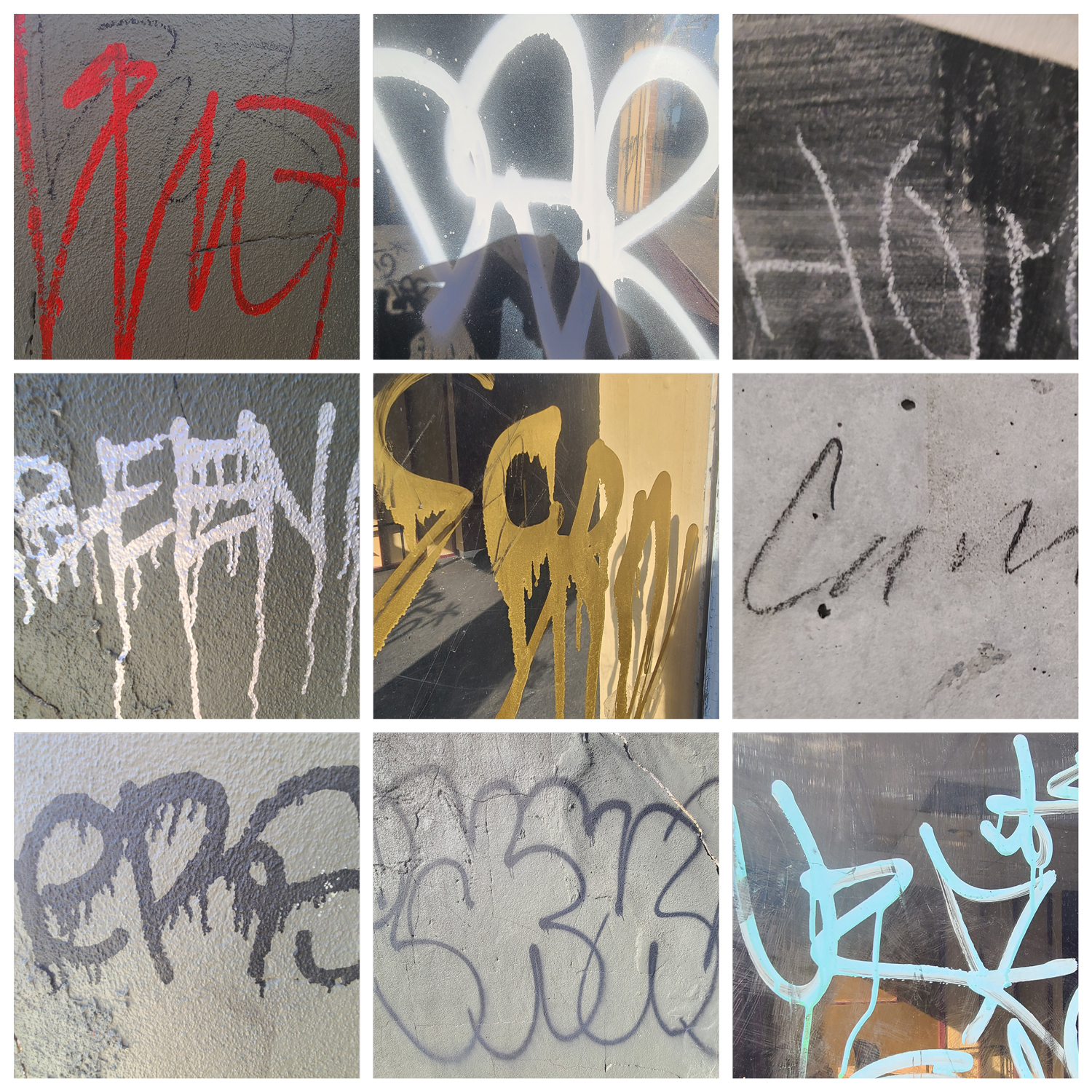
My three categories were signs/labels, thinly written graffiti, and thick block/bubble-lettered graffiti.
Hi Taylor! I really like how you focused specifically on graffiti for your project! It’s really cool seeing all of the images together, and the way you’ve arranged them really makes their uniqueness apparent and shows just how varied graffiti can be from one artist to the next.
For my 3 groupings, I divided into three categories of industrial, comic, and handwritten. For the industrial (first category), I view them as very stagnant and bold lettering, made with the purpose of being simple to read. For the second category I label them as a comic lettering group, because of their overall vibrant colors and bubbly style. For the final category, I call them the “handwritten” category due to the flowy nature of the lettering, especially considering that most of them are (or similar to) in cursive.
https://uncg-my.sharepoint.com/:f:/r/personal/r_riley_uncg_edu/Documents/_Rachele%20Riley/teaching/S25/ART%20341%E2%80%9301/Ethan%20Heggins/Week%203?csf=1&web=1&e=hxrVqS
Hey Ethan,
Your groupings look cool and definitely does fit within each of them. I feel I am more drawn to the second grouping (comic) because it has some personality and fun to it along with color.
In Chantal Jachan’s presentation she talks about the four characteristics of Arabic complexity that are not served well by Latin alphabet-based design type design technology. She mentions that we read Arabic from right to left, making it much harder to translate to a Latin alphabet style. Secondly, Arabic is a connected script in which the physical form of the letters in the alphabet shifts based on the surrounding letters and forms. Also, Arabic is stretchy, changing for the emphasis of certain words. Islam prohibits for the human form to be captured in its art so therefore there is a larger calligraphic history. Because of this, certain fonts were born out of expression rather than out of necessity.
Chantal Jachan admits that modernism can be good if it is looked at as a belief in “The power of the present and a constant redefining of the norm.” However, she laments the losses caused by modernism as well. One of these being the invention of simplified Arabic. It was created during the rise of the printing press which was created for the Latin alphabet. This created constraints for the Arabic alphabet forcing those who used it to abandon key characteristics of the letter forms. Chantal Jachan believes how we can strive for so much more- that capitalist demands cannot be the only force for what we create.
What stood out to me personally was the way that she ends the presentation by asking if “modernism is your standard for what constitutes good design.” She urges her audience to rethink what is considered modern through the Western eye. I felt as though her points spoke to me so personally as someone who unintentionally views art through a Western viewpoint, rarely stopping to think about my own biases and preconceptions.
Hello Isabella, I felt the same way about that question she left with the audience! I know it can be difficult to not let our own bias get in the way, still, it makes you think how much Western influence has shaped our perspective without even realizing it.
The four characteristics of Arabic complexity are that the language reads right to left, it is connected script, but each form changes depending on where it appears in a word and what letter it is found next too, the forms are also known as ‘stretchy’. To make some words as long as other languages the letter forms can be stretched to match the length of the other words while still reading the exact same word. Chantal speaks of modernism and believes that good modernism is belief in the power of the present and a constant redefining of the norm. Particularly in Beirut, Lebanon where multiple languages are spoken (French, Arabic, English), using both languages on signs shows that you are modern and understanding of the different languages within the city. This means that Chantal believes that the signs quite often can look messy and ugly but it represents modernism. I would say the main thing that inspires me after listening to the talk by Chantal Jachan is that I feel very inspired to learn more about the form that the Arabic type takes, it is interesting and beautiful. I also was really intrigues when Chantal spoke about ‘arabising’ logos, I had never thought about this before and would still love to learn more.
For my 3 pages of type I decided to choose a theme of sans-serif type, red type and three-dimensional type.
https://uncg-my.sharepoint.com/:b:/r/personal/r_riley_uncg_edu/Documents/_Rachele%20Riley/teaching/S25/ART%20341%E2%80%9301/Hannah%20Hind/Week%203/Project%201.pdf?csf=1&web=1&e=gQhNpR
Themes: Graffiti/Hand written, Business logos and branding, Neon signs
https://uncg-my.sharepoint.com/:f:/r/personal/r_riley_uncg_edu/Documents/_Rachele%20Riley/teaching/S25/ART%20341%E2%80%9302/Chris%20Pierce/Week%203/Letters%20Project%20Chris%20Pierce?csf=1&web=1&e=Na9vFN
The four characteristics of Arabic complexity are:
That arabic is read from right to left
It’s a connected script. Unlike Latin, words form characters by joining together.
It’s a shapeshifting language. Forms change depending on where in a word they appear and what they appear next to.
It’s a stretchy script! Kashisa is used by calligraphers and typographers to extend letters for justification purposes. Ex: stretching out arabic letters to take up the same length as a french word
Modernism can be good for a legible design or allowing you to streamline or get through projects quicker. People also write scripts on their vehicles to ask God for protection. In response to modernism, she poses the question “ask yourself if modernism is your standard for what constitutes a good design”. A way to not go about thinking about modernism is believing that “modernism is the other and tradition is us”. She says that modernity is tricky for Lebanon as you need to radically reimagine how you see yourself outside of western conventions.
I thought it was interesting when she was discussing being in her grandpa’s backseat and taking photos of how the culture she’s from uses script in general in comparison to the latin alphabet. The words themself are art due to the depiction of living beings being outlawed for a long time.
WEEK 3 STUDIO PROJECT
My three groupings consist of a page each for Bold Font (pg 1) , Cursive/Curved Font (pg 2), and Gritty Texture (pg 3). I feel that this project was good for getting the hang of InDesign and seeing the final product allowed me to see commonalities in the groupings. For example, in pages 2 & 3 I had a lot of red/pink images that caught my attention.
https://uncg my.sharepoint.com/:b:/g/personal/r_riley_uncg_edu/EZu8bDzpq7FPp79RWMucWyABcLpNn2FLHAA_J7TCf5qimQ?e=pAwHsy
https://uncg-my.sharepoint.com/:b:/g/personal/r_riley_uncg_edu/ER_SfXTxSB5Ns144I_pYZ_EB7aDw9uo0M_eMUXSt3sjwHw?e=f3uL9P
First Grouping: BRANDS AND ELEGANCE. This grouping is a combination of elegant, graceful like typography, and recognizable brands with iconic fonts. The focus is on typography that people recognize/may already know, as well as showcasing a sense of movement with the way the letters flow.
Second Grouping: COMMERCIAL. Typography from commercial or retail settings, which include signs, and or logos. The letters are vibrant, bright (sometimes colorful), eye catching, and designed to attract peoples’ attention in a storefront.
Third Grouping: BOLD. My last grouping focuses on typography with strong visual weight. This means letters that are bold, large, uppercase, and designed to catch a person’s attention immediately.
Discussion:
What are the four characteristics of “Arabic complexity” that are not served well by latin alphabet-based type design technology?
Jahchan claims arabic script is not served will by latin based type design because it is read from right to left, it’s a connected script, arabic letter forms change depending on what letters they’re next to and where they appear in a word, as well as arabic words can “stretch” to increase emphasis.
What does she acknowledge is good about modernism? How does she question modernism?
Jahchan acknowledges that modern technology has “caught up” to the complex typography of arabic text, and that arabic script can now be typed digitally in a way that more comfortably adheres to the traditional writing style. However, she also acknowledges that throughout lebanon the inclusion of foreign text is seen as “modern” and poses the fear of lebanese identity being discarded for the sake of modernism.
On a personal note, what inspired you about Jahchan’s work and life story?
I’m inspired firstly by how young Jahchan seems to be in relation to how critically she looks at the relationship between this over-arching almost sometimes indescribable sense of “modernism” and the beautiful unique traditions of arabic script that were, frankly, not prioritized when modernity was forming. I think she makes a lot of interesting points, and I’m also inspired by her, like many of the artists we’ve covered so far, focus on what she finds interesting in typeface as opposed to the convention. Although she certainly is aware and has studied the convention, I personally find any artist’s ability to stick to their own curiosities really inspiring.
Studio:
The three groupings I used to create my studio piece are, Serif type, Sans Serif type, and a theme I found around the typefaces in Greensboro (from mostly less “professional” sources) of very curvy, spirally at times, and overall flamboyant type that I found really eye catching. I like these groupings because I feel like all of these typefaces can be explored in a plethora of ways.
https://uncg-my.sharepoint.com/:b:/g/personal/r_riley_uncg_edu/EUnoxIrpPdZAsKNWBnZCNY0B8Gj8aH8jlEIWECoEpWBdOw?e=psJuy5
The four characteristics of arabic complexity that are not served well by latin based type design technology are: reading arabic from right to left, a connected script, arabic letters physical forms change depending on the words they are next to, and that arabic words are stretchy.
What she acknowledges is good about modernism is the need to use modern technology to tap into the full potential of thhe study if arabic calligraphy. She explains that to use technology not to reshape the pest, but to form the future.
What inspired me about her story and works are how she understands how to blur the lines between modernism and tradition when it comes to arabic typeface and calligraphy. By understanding the importance of the preservation of classic type traditions, whilst embracing the evolution of technology in which that have the potential to enhance said typography.
The four characteristics of Arabic complexity contains of “reading right to left, the letters forming words by joining together, physical form changes depending on where they appear in a word and what letters they appear next to, and lastly extending certain letters for justification.” In terms of modernism, she mentions with the use of new technology, we should avoid replicating the past but rather reshape the future.
My three groupings are hand-painted letters, block letters, and cursive letters.
https://uncg-my.sharepoint.com/:f:/r/personal/r_riley_uncg_edu/Documents/_Rachele%20Riley/teaching/S25/ART%20341%E2%80%9301/Victoria%20McPherson/Week%203/WEEK%203?csf=1&web=1&e=J5Fvei
Four characteristics of “Arabic complexity” are that in arabic they read right to left, it’s a connected script so unlike latin the letters form words by joining together, arabic letters are like shape shifters, there forms changes depending where they appear in a word and what letters they appear next to, and lastly arabic is stretchy.
She acknowledges that they should use technology not to replicate the past but to reshape the future in order for Arabic to reach its full potential, which is what modernism is. Modernism was a belief in the power of the present and a constant redefining of the norm. She was having an inner conflict at the time and Jerome said, ask yourself if modernism is your standard for what constitutes good design. She was also curious about modern arabic and how it appears in the world today, why does arabic type look the way it does today, what defines our contemporary vernaculars and where do they come from, and why does a majority of a contemporary arabic type looks so different from the calligraphy we saw before.
I personally was inspired by Jahchan’s life story. I love seeing her taking photos of everything she found interesting, new, and unique. Since she has some understanding of all three languages, French, English, and Lebanese, it was nice to see how she reacted to the letters and design of each of them.
https://uncg-my.sharepoint.com/shared?id=%2Fpersonal%2Fr%5Friley%5Funcg%5Fedu%2FDocuments%2F%5FRachele%20Riley%2Fteaching%2FS25%2FART%20341%E2%80%9302%2FXimena%20Perez%2DChavarria%2FWeek%203%2FWeek%203%20%2D%20Ximena%20P%20Chavarria%20Folder&listurl=%2Fpersonal%2Fr%5Friley%5Funcg%5Fedu%2FDocuments
Hey Ximena,
Her way of studying the typography and design is pretty inspiring and it is noticeable that she has a passion for it and in hopes that it could also change for the better.
(I forgot to post this in my initial post!)
Group 1: simple, skinny
Group 2: sguiggly, grafitti
Group 3: Bold
1. What are the four characteristics of “Arabic complexity” that are not served well by latin alphabet-based type design technology?
The four characteristics of “Arabic complexity” that’s not served well by latin alphabet-based type design technology is that it is read from right to left instead of left to right. It is also a connected script where letters are formed by being joined together and the form of arabic letters can change, depending on where they appear in a word and the letters they appear next to. Additionally, arabic letters can be stretched out for justification purposes, typically for aligning text to the margins in a paragraph or for aesthetic purposes with calligraphy.
2. What does she acknowledge is good about modernism? How does she question modernism?
With the quote she uses from Phil Baines, she acknowledges that modernism allows for creation of new forms with arabic. Such as the replication of calligraphic forms, which allows for learning of the basic principles of script like contrast and letter shaping.
However, she questions modernism as she states that its necessary to understand and remember the rules and traditions that came before modernism. Not only is one able to learn and benefit from them, but because everyone has their own interpretations, they’re able to pass on those traditions as well as their own beliefs. Traditions are not meant to be strictly obeyed and to be followed to a certain degree.
3. On a personal note, what inspired you about Jahchan’s work and life story?
With Jahchan’s work, it made me realize how similar yet different typography is around the world, and inspired me to learn even more about the different letter forms. I love how with her work, she wanted to challenge people’s view on Lebanon by exploring the country’s rich history of language and how it changed. As well as how not only Lebanon but arabic script as a whole is affected by modernism, and wants her audience to challenge themselves on rethinking what we consider as “modern.”
Furthermore, I loved how she dived into the history between Beirut and how it was initially split between the west and east, and how the west was dominantly Muslim and used Arabic while the other was Christian and used French/English. How once the Lebanese Civil war was over, the two sides eventually came together through language, where on signs, there would be both Arabic and English or French. It served as a reminder on how powerful language is, and how impactful it is when bringing people together and forming communities.
https://uncg-my.sharepoint.com/:f:/r/personal/r_riley_uncg_edu/Documents/_Rachele%20Riley/teaching/S25/ART%20341%E2%80%9302/Cindy%20Pham/Week%203/Typographics_Week3%20Folder?csf=1&web=1&e=vq9T3h
My photos are based off of Chinese characters and Vietnamese letters with accents that I found from Asian grocery stores and from around my house! I wanted to explore the different forms of letters especially with Chinese characters and Vietnamese letters and accents.
Chantal Jahchan names four characteristics of “Arabic complexity” in her speech. The first is that we read Arabic from right to left, whereas Latin is read left to right. Secondly, it is a connected script unlike Latin and Arabic words, letters join together. The last two characteristics are that the physical form of Arabic letters can change depending on where the letter is and what letters they appear next to and the words are stretchy or extended for certain purposes.
In her speech, she acknowledges that things like brands expanding into the Middle East use modernism to do things like create Arabic logos, this is not beneficial but it is also not negative either. She found herself interested in modern Arabic when doing her thesis and questioned things like why Arabic text looks the way it does now and why it looks so different from Arabic text before. I think she makes a very good point in her speech while discussing modernism that “capitalist demands can’t be the only driving force for what we create.” I was also very inspired by her asking western audiences to reconsider what they think is modern.
I forgot that she did say that about creation and capitalism, and I think I should use it as a reminder to try and make art recreationally instead of just out of necessity. That, plus her call to action to the Western audience. Sometimes, we forget there are other parts of the world
In En Route: Lebanese Vernacular Typography with Chantal Jachan, she explains that the four characteristics of “Arabic complexity” that are not served well by Latin alphabet-based type design technology include the fact that Arabic is read from the right to the left, is a connected script when the words join together, change depending on the context like placement or meaning and the words in Arabic can be stretched out. She acknowledges that what is good about modernism is that it can be more inclusive to other languages so everyone can communicate better. She brings up how the new technology of today can write Arabic without the restraints of the Latin alphabet; this makes it easier for Arabic to be read by everyone. However, she starts to question modernism by asking if changing the way Arabic is read to accommodate others takes away from the traditional culture of reading Arabic the way it was intended to. On a personal note, what inspires me about Jahchan’s work and life story is the fact that she cares so much about individuality and the representation of culture. She cares so much so that she tries to include it in her art and be an advocate for how important it is.
https://uncg-my.sharepoint.com/:b:/r/personal/r_riley_uncg_edu/Documents/_Rachele%20Riley/teaching/S25/ART%20341%E2%80%9301/Anthony%20Valentine/Week%203/art%20441%20week3.pdf?csf=1&web=1&e=g2NQaU
I accdientally left this out of my comment but for my first grouping, I took photos of signs or advertisements for places or restaurants. My second grouping I chose pictures with black lettering to show the effects of using bold black letters. My third grouping is just of graffiti.
The four characteristics of Arabic complexity that aren’t served well in Latin alphabet-based type design technology are 1. The fact that Arabic is read right to left instead of the Latin left to right. 2. Arabic is a connected script; it is not broken up into individual modules as it is in the Latin alphabet. 3. Arabic letters have the capacity to change their shapes depending on where they appear in a word, as well as the exact words they’re in. Finally, 4. Arabic has the concept of kashida: letters can be extended for justification purposes.
She acknowledges that modernism has historically always pushed the boundaries of what we deem acceptable/”the norm” in design. It allows us to push through the traditions of old, breaking us free from those almost archaic design chains. However, she does also acknowledge modernism’s failings in the sense that since it’s still so Latin-centric, it ends up stripping away from what makes the Arabic script so unique and beautiful in an attempt to modernize or “legitimize” it.
I admire how incredibly observant and progressive she is, especially in terms of the typographic world. I find her passion regarding the treatment of the Arabic script by modernism to be beautiful, especially how determined she was to go out and find breathtaking examples of the Arabic script in real, modern times that don’t fall to the failings of modernism.
https://uncg-my.sharepoint.com/:f:/g/personal/r_riley_uncg_edu/EvBgPQE1iuNCifH_nF7HMjYBN_NB5mCU88uMcFwFnx-Dog?e=tZ0CQo
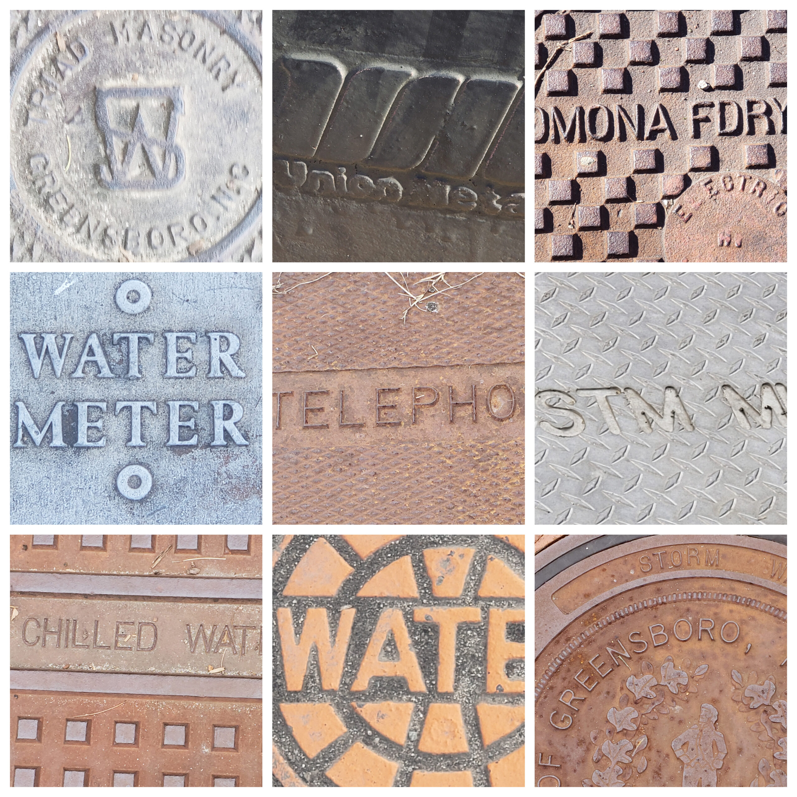
As for my project, I’ve decided to hone in one three themes: 1. Traffic/road signs and lettering, 2. Municipal text, 3. Print (mostly commercial print).
1. The four key characteristics of “Arabic complexity” that Latin alphabet-based type design technology struggles to accommodate are that Arabic is read from right to left, it’s a connected script, its letters change shape depending on their position in a word or the letters around them, and finally, it uses a technique that stretches letters for justification.
2. Chantal acknowledges that modernism has its strengths, particularly in pushing the boundaries of design and keeping up with the times. It’s about believing in the power of the present and constantly reshaping norms. However, she challenges modernism by questioning whether it should be the standard for what defines good design. She suggests that we should consider more than just current trends when creating something meaningful.
3. What really inspires me about Jahchan’s work and story is how she combined her passion for Arabic typography with her personal journey to make an impact. It’s amazing how she managed to address a challenge that’s been overlooked and bring attention to it in a way that has helped push Arabic font design forward. The way she turned her interests into a powerful project is a reminder of the importance of following our passions and creating something that matters.
For my groupings I first have a group of vibrant text, second group consist of white text and for my last I have a group of eroded/altered text
The four characteristics of “Arabic complexity” are that Arabic is read from right to left, it is a connected script, letters form words by joining together, and letters change shape depending on where they appear in a word and what letters they appear next to. Arabic is also stretchy, and kashida is a type of justification that extends certain letters.
The good thing about modernism is its ability to reshape the future while looking back at traditional art. Jahchan questions modernism’s current repudiation as a stylistic tool set and how limiting it is when trying to work with Arabic lettering in said style.
I was really inspired by how passionate Jahchan is when it comes to advocating for advancements in typography when it comes to non-latin scripts, specifically Arabic. I just think it is really amazing how much commitment she has to her project, and I think this will make typography more accessible to everyone and will open the door for new artists and make design really interesting. Jahchan’s love for the Arabic language is also admirable. I have had an interest in Arabic calligraphy. The shapes and designs of the letters have always looked so interesting to me, but I was always intimidated by the new letters to actually learn the language.
https://uncg-my.sharepoint.com/:f:/r/personal/r_riley_uncg_edu/Documents/_Rachele%20Riley/teaching/S25/ART%20341%E2%80%9301/Maria%20Mendoza-Regalado/week%203/letters%20in%20the%20world%20Folder?csf=1&web=1&e=2Mngax
I forgot to put that I grouped my letters into sans-serif, serif, and handwritten groups. I know the latter isn’t exactly a type of font but I found the variety in that group to be interesting
https://uncg-my.sharepoint.com/:f:/r/personal/r_riley_uncg_edu/Documents/_Rachele%20Riley/teaching/S25/ART%20341%E2%80%9301/Maria%20Mendoza-Regalado/week%203/letters%20in%20the%20world%20Folder?csf=1&web=1&e=YwAyxM