
Week 4— Assignment “Text/Image”
Discuss + Studio due Sunday (end-of-day). Reply to other people’s posts due Tuesday.
Project 1— Letters in the World, continued. This week you will create new text/image compositions—using your letter photos as direct inspiration. You will draw over (trace, extract) various letters in your photos, manipulate their form, color. In your composition use language, and if you want, other graphic shapes, lines, drawn symbols.
1/
Discuss:
- Select two (2) items from the People’s GD Archive —*at least one from the typography design category.
- Write about the work you select as a comment below (200 words min) and provide links to the items in the archive. Use this word counter tool to make sure you are meeting the length requirement for your writing: https://wordcounter.net/
Questions:
What is the piece?
Who designed it?
When was it designed?
What is it for?
What are its distinct graphic qualities?
What materials are used?
Why did you select it?
Reply to at least two other people’s posts (below). Due Tuesday.
2/
Studio:
- Bring a selection of your letter photos into a new 10 x 10 in artboard in Illustrator. You can scale them down a bit so you can draw many on one artbaord, but not too small—you want to see detail in order to draw and capture the information.
- Draw over the letters, using the pen tool—make vector outlines of the various forms and/or clip the textures — try lots of modes of translation from photo to drawing — essentially extracting the letters as graphics.
- Use these extracted forms as a graphic elements to create a poster of text/image, featuring a short phrase or word. Your format for this poster is 10 x 10 in. Subject is open. You can introduce other graphic shapes or drawn symbols. Convey a message or mood through your choice of language in combination with your forms, color, and composition.
- Package your Illustrator file and also “export as” a PDF. If your file is too large to export two PDFs—one of all process and one of the final on its own—it’s OK, just make one PDF of all artboards, and let us know which page of the PDF is your final comp. Upload all to the drive.
- Write a description of your project so far as a comment below and provide a link to your project on the drive.
-
Judith Briand, 2023
-
Haley Watson, 2022
-

Ethan Brain, 2020
-
Sarah Early, 2022
-
Dominique Hinrichs, 2023
-
Hanna Gelwix, 2023
-
Annabelle Kizer, 2024
-
The piece I chose is The Rules of Typography According to Crackpots/Experts, designed by Jeffery Keedy in 1993. This piece was designed for an editorial from the Eye magazine that looks at the attitudes of typeface design and typography from the early 1990s as well as typeface design and typography from earlier in history. Looking at Beatrice Warde, Jan Tschichold, Piet Zwart, and Massimo Vingelli. Expressing optimism for the future of the typography art. Keedy uses typefaces from the past that have become unused up until this point to discuss the value of design methods and outputs. The materials are not listed but from what I can tell it looks like print on paper, with black, white, and orange coloring. This piece caught my eye because of the pop of color and the non-traditional text forms found on the page. The different scales and sizes of the text are very pleasing to my eye.
https://peoplesgdarchive.org/item/6631/the-rules-of-typography-according-to-crackpots-experts
The piece I chose is Typography in Asia: A View from Tokyo Exhibition designed by Katsumi Asaba in 1990. The piece is an exhibition poster and cover that explores writing styles, their connection to Asian culture, and their innovative and creative approaches to writing in design. The poster blends unique typography and contemporary elements aligned on lines creating organization for the typography. The materials are not listed but from what I can tell it looks like some sort of pen on paper. I selected this piece because the typography forms caught my eye as I was scrolling through the different pieces. When reading about this piece I was reminded of Chantal Jahchan’s work from last week’s discussion.
https://peoplesgdarchive.org/item/13499/typography-in-asia-a-view-from-tokyo-exhibition-poster
Hey Victoria!
I really like the first typography example you chose. I love the variety of type in the piece, and I agree that the orange really draws you in because of how vibrant it is. I also really like the second example you picked- I enjoy looking at designs from different cultures and countries, especially those that use lettering that looks visually different or incorporate symbols instead of letters in their alphabets.
Hi Victoria,
I love the first piece! I was so drawn in by the orange contrasted with the black letters. I also just love the variety in fonts that are shown.
-The pieces I chose are:
1. Persian Calligraphy, made by Hossein Zenderoudi, designed in 1968, the piece is a complex piece of Persian calligraphy densely packed on top of a teal and orange dyed paper. The script varies in size dramatically throughout the piece as well. The piece is made of paper, and acrylic paints. I chose this piece because of how complex it looks, but of how simplistic the concept is. I’ve seen countless pieces that are lots of script packed into one piece, and I always feel drawn to these pieces.
2. Ornaments, made by Jūlijis Madernieks, designed in 1913. This piece acts as a key to create a typeface off of the original script. This piece is calligraphy ink on paper, now yellowed with age. All three pages have some form of repeating, geometric design on the top of the page, with a related typeface of script laid out in rows below. Each script is unique, and features all uppercase and lowercase letters of the Latin alphabet. I chose this piece because of our final project, and how we will eventually be making our own typeface. These are something I want to be inspired by in my final project.
-My final work is a collage multiple different fonts, abstracted together. I wanted to bring out the colors of old films and photographs r o play with the idea of time, and why things happen when they do.
(Word count: 240)
One of the pieces I chose for this assignment is titled “Design Connoisseur.” The artists credited with designing the piece are Steven Heller and Louise Fili. It was designed on October 1st, 2000, and added to The People’s Graphic Design Archive on February 17th, 2023. According to the website, this piece is a collection of graphic design artifacts from 1900 to 1940, featuring rare type specimens, layouts, marks, and decorations. The designs in this work include bold black lines, serif text, and small illustrations of people—many of which seem to be advertisements in what appears to be German. The materials used are ink on paper since this piece is part of a book. I chose this piece because of the distinct boldness of the lettering, which immediately caught my eye. It’s fascinating to see how typography evolved over time, and this piece showcases that beautifully.
https://peoplesgdarchive.org/item/6804/design-connoisseur
The second piece I chose is titled “Paris 68 – Return to Normality.” The designer is unknown, but it was originally created in 1968 during a period of civil unrest and protests in France. The version in The People’s Graphic Design Archive is a newer rendition by Active Distribution. This design was used as a promotional sticker for anti-establishment movements, standing against government corruption and political repression. The artwork uses strong negative and positive space, a bold red and white color scheme, and a hand-drawn text style. It also features an image of a herd of sheep, likely meant to represent conformity and encourage people to question authority. The materials used are likely ink and adhesive-backed paper or vinyl, as it was distributed as a sticker. I selected this piece because of its simple yet powerful visual impact, the bold red instantly grabs attention, and the imagery makes a strong political statement.
https://peoplesgdarchive.org/item/406/paris-68-return-to-normality
Hi Ava,
I liked the insightful background regarding the history behind both prints. In regard to the second responses print design choice. The idea of bold and simple to make a statement is interesting.
Hey Ava, I reallly like the piece “Design Conoisseur” you picked out. To me it looks comedically German. I also found the lettering interesting especially since the German Language has symbols no commonly used in English. I also find “Paris 68- Return to Normality” really compelling as a piece. Depicting people complacent with government couption as sheep is very on the nose but still a compelling image. I also agree that the strong contrast between colors and space really help to emphasize the strong message.
Hey Ava, love the first piece you chose. I’ve been taking a course on archiving and it’s cool to see how a typography/graphic design archive can be a piece of art in it’s own way as well!
What is the piece?
Design magazine poster
Who designed it?
Bentley/Farrell/Burnett
When was it designed?
1970.
What is it for?
The image was produced for a poster celebrating Design magazine’s 21st anniversary.
Design was founded in 1949.
What are its distinct graphic qualities?
The design portrays a record emerging from it’s sleeve. There is a strong adherence to the rule of thirds, with each third being demarcated almost as separate registers. The bottom third holds the most graphical complexity, the top third being the most simple. The design uses mostly organic lines with the form of the sleeve being indicated with the interruption of these lines with a sharp square border. The color scheme is tetradic with subtle gradients between colors within the same forms. The type used for the titling in the top left corner is a serif using elongated, slender letter forms.
What materials are used?
The piece is made using offset lithography on paper.
Why did you select it?
The subject matter of the piece resonated with me being a record and sleeve with art. I have always been fascinated with album covers
and designs used in psychedelic art from the 1960’s/70’s.
design magazine poster:
https://peoplesgdarchive.org/item/5391/design-magazine-poster
————————————————————————————–
What is the piece?
Design No.163, focusing on the front cover.
Who designed it?
Koji Kusafuka
When was it designed?
1972
What is it for?
A front/back cover spread for a magazine commissioned by ‘Bijutsu Shuppan-sha’, a Japanese publisher of art books.
What are its distinct graphic qualities?
The design uses rectilinear insets to showcase art from within the book. The insets are made with some degree of transparency to allow the background image and its colors to integrate into the line work above. The color scheme is triadic, using predominantly blue and pink, with a introduction to yellow in the bleeding gradient edge along the right side of the cover. The type uses a sans serif type that alternates between Japanese and English words. The type is held within a similar inset as the display art. The artist suggests the with color that the top left image is the background of the design, but the ambiguous bordering allows the images to be construed as just
another inset.
What materials are used?
Print on paper.
Why did you select it?
I enjoyed the balance of the loud colors mixed with the nuanced, subdued graphical elements. The ability of the artist to complete the triadic scheme with the bleeding edge was very satisfying to the eye and drew my attention immediately.
design no.163
https://peoplesgdarchive.org/item/12506/design-no-163
————————————————————————————–
https://uncg-my.sharepoint.com/:b:/g/personal/r_riley_uncg_edu/ESR-1jphGVdKuInI-PrAeeEBv8LeOyrHLx942m9yTVhWMQ?e=nne9uH
I used one of the Graffiti tags photographed as the phrase to base the composition around. I leaned into the theme of touch by implementing texture as a focal point. I used varying degrees of path smoothing to make the original phrase morph iteratively into simple block shapes. The grouped phrases then get extruded, rotated, and lit as its own singular form. I manipulated some layers to allow some organic shapes to appear to be swimming between the letters. Inflate was used to render those organic shapes. I posed each along the x/y/z planes to give more depth. Finally I applied a blurred brush stroke across the upper edge to give a subtle sense of light bleed to the overall piece. Each layer uses varying degrees of Gaussian blur and film grain to make it feel like one cohesive piece.
Hi Zeus,
Love how you incorporated unique shapes and texture this week’s assignment. Especially in regard to transforming graffiti art into a few forms.
Hey Zeus, this Design Magazine Poster is really unique, I appreciate how you wented into the design of the entire compostion, especially how the piece is broken up. I also think the use of organic shapes helps distinguish where the sleave ends and where the vinyl begins. I also think your second piece is also a really good choice. The simple color scheme along side the simple boxed images gives the front cover a nostalgic and stylish feel. I wouldn’t necessarily call these colors loud but they do contrast each other well.
Hi Zeus!
The way you layered up texture and depth in your piece is really impressive. I also love the way that you combined these floating 3D green elements with your twisting primary word. I think your poster is very successful!
Hey Zeus!
I really liked the first piece you chose Design No.163, The colors contrast nicely with each other, and as you mentioned, it is a good example of the rule of thirds.
The first piece I chose is a offset lithography graphic . The page was designed by Bentley/Farrell/Burnett. The page I chose was made in 1970 for Design Magazine which is a UK-founded magazine founded in 1949, made for their 21st anniversary! Some distinct graphic qualities I am noticing is subtle yet bold typography in the center noting the year “1970,” as well as symmetrical iconic imagery which it was known for. Also, a high contrast in the colors. As far as a language or rhythm the page is very loud, and moving dynamically. I selected this piece because it caught my eye, I enjoyed the colors grabbing my attention as well as appreciate the details throughout the piece.
https://thumbs.peoplesgdarchive.org/static/media-items/image/18872/upto-2880×2390/631e6564/@2x/6a00e5532538c488330112797c9d4828a4-800wi.jpeg?tgt=webp
The second piece I chose is a piece titled “MEN SHOULD WEEP.” Who designed it? The cover was designed in 1981 by Alan Marshall. The piece is for a book cover by Ena Lamont Stewart. The font is a classic Stencil typeface channeling a masculine, army, patriotic tone. The text is dark ivy green reading “MEN SHOULD CRY” layered over a clean grayish mint green. The materials used were paper and lithography materials. I selected the piece because the Masculine Font fighting with the meaning of the title resonated with me. Men SHOULD weep, everyone should weep, and that’s the point of the book, to destigmatize any idea that crying as a form of expression of a mechanism is not weak, or feminine or masculine, it just is a thing to do.
https://thumbs.peoplesgdarchive.org/static/media-items/image/18499/upto-2880×5076/62dad3af/@2x/1981MenShouldWeep.jpg?tgt=webp
Hey Jackson, the first piece you chose is soo cool! I didn’t realize lithography produces pieces like this! I’ll definitely have to keep that in mind haha.
Hey Jackson, I agree that the typeface gives a veery masculine feel and the statement is a contrast of what society says to men so I love that it opens up a conversation about the way everyone deserves to be emotional.
Hey Jackson, I really enjoy the man should weep graphic because hit opens up dialog for how men are treated in society regarding their emotions. I think the contrast of the statement that is viewed and the font creates a visual representations of the reality that men can be emotional and it should be celebrated not shamed.
PIECE 1: https://peoplesgdarchive.org/item/1731/typography-22-the-annual-of-the-type-directors-club
This piece is a book cover designed by Gail Anderson in 2001 for the book “Typography 22: The Annual of the Type Directors Club.” It is stylistically distinct via its usage of what appears to be stickers or pins. These pins vary considerably, with lots of miscellaneous imagery ranging from photos of people, to cartoon characters, to brand logos. Amongst these pins are also simple ones with letters in different fonts; mostly black text on a white background, but there are also a good amount of ones with black text on a yellow background, and a few with other colors. The artist appears to have scattered these pins around, taken pictures of them in various arrangements, and then layered them on top of each other to achieve a 3D look. In the middle is a gray oval with the book’s title, which almost looks like a large sticker. There is also a much larger white pin in the top left corner that says “2001,” the year the book was published. I chose this piece because it’s chaotic and colorful nature stood out to me amongst the more straightforward pieces I saw. I really like the maximalism of it, and how it’s able to have so much going on while still appearing cohesive.
PIECE 2: https://peoplesgdarchive.org/item/7505/rusty-warren-bounces-back-album-cover
This piece was designed in 1961 by Stephen P. Haas Studios as the album art for the album “Rusty Warren Bounces Back.” The piece consists of a photograph of a woman (who I assume to be Rusty Warren herself) laying on the ground, looking off into the distance. Nothing about the photograph itself seems to have been edited. The designer has placed text over this photo. At the top, large yellow text reads “RUSTY WARREN” in all caps. Below that, the rest of the title (“BOUNCES BACK”) has been written in large, colorful letters that have been arranged to be out of line with each other, giving them a sort of “jumbled up” quality while still being legible. The letters themselves are irregular, with the two Bs being shaped similarly but not completely identical. Around and behind these letters are scratchy white lines and tan boxes. In the bottom left corner, there is a simple white logo, and in the bottom right corner, there is a red circle with white text giving a description of what the album is. I chose this piece because its simple photograph with colorful, fun text is personally very appealing to me. I enjoy the interaction between the more natural, muted colors of the photograph, and the bright, varied colors of the text.
Hi Simon!
The first typography example looks sooo visually pleasing. I love the different pins scattered around each other, all with that shiny finish. I also love how some have phrases, some just have letters, and some feature visuals- it makes for such a dynamic and engaging composition. It really does capture maximalism, just like you said! I also love your second example, which definitely has a more aged feel, thanks to the type choice and the background mannequin in the album art.
Hi Simon!
I thought the second piece you chose was so interesting. The way that the colors of “Bounces Back” pop against the rest of the album cover which is all very neutral. The letter forms themselves are very bouncy as well which is the perfect choice.
Hey Simon! I really love the pieces you picked! Especially the second one, I just really love 60’s imagery! Album covers can really have a great impact as far as visuals go!
https://peoplesgdarchive.org/item/13060/fuse-no-7
The first piece I chose is a typography piece that is accompanied by a list of credits. The creatives that completed this piece were Neville Brody (designer), Jon Wozencroft (editor), Phil Bicker (contributing editor), David Carson (contributing editor), Tobias Frere-Jones (contributing editor), and Cornel Windlin (contributing editor). The date for this piece is set as 1993 with the media being paper. This is for publication Fuse magazine issue 7 and the cover is abstracted using mostly monochromatic colors. The cover along with the rest of the issue uses bold colors and unconventional ways of using text. Such as flipping the text or using small or bold letters to convey messages. I chose this piece because I was struck by the cover. The cover is so well designed and captivating and is the strongest image for this issue. With this cover it makes me want to flip through the issue and learn more about Fuse.
https://peoplesgdarchive.org/item/2690/statue-of-liberty
-The second piece is a photography piece by Seldon Dix Jr completed around 1970. The piece was for Communication Arts, Vol 12 and what is distinct for this piece is that it is black and white and uses a familiar image and an unfamiliar person to create this work. Seldon Dix Jr combined an image of the Statue of Liberty with an image of a Black Woman by famous photographer Gordan Parks. I selected it because the image itself struck me. And scrolling the volume there is the topic of Black woman visibility in media. The Statue of Liberty image gets that image across by putting the unseen on a very seen monument. The image by Gordan Parks is intense in stare like we cannot ignore the woman in the image. We must acknowledge her presence.
For my project, I was really struggling on what I wanted it to look like as I kept overthinking about it. I wanted to image to look good but I felt I didn’t know what to do. I kept playing around with different effects and compositions. And finally settled on an image that I enjoy the most out of the different versions I created. I wanted to use my lumen prints from my alt processing class as I want to incorporate my own images into this piece.
Final – https://uncg-my.sharepoint.com/:b:/r/personal/r_riley_uncg_edu/Documents/_Rachele%20Riley/teaching/S25/ART%20341%E2%80%9302/Sarah%20Hines/week%204/Week%204%20Final.pdf?csf=1&web=1&e=4R0SFn
Artboards- https://uncg-my.sharepoint.com/:b:/r/personal/r_riley_uncg_edu/Documents/_Rachele%20Riley/teaching/S25/ART%20341%E2%80%9302/Sarah%20Hines/week%204/Week%204%20Artboards.pdf?csf=1&web=1&e=xMUgMp
Hi Sarah!
I found the first piece you chose super interesting. I love the monochromatic color scheme and the textured look created on the page.
Hi Sarah, I really enjoy the second artwork that you chose. I think it’s so exciting that a photographer showed how America is also filled with people that are not showcased such as the black women. Zora Neale Hurston once said black women are the mules of the world and I think bringing them to the forefront of such an important statue of America really shows the sacrifices of black women.
https://peoplesgdarchive.org/item/15726/tabasco-label
What is the piece?
The Tabasco Logo
Who designed it?
Edmund Mcllhenney designed a logo for Tabasco originally, and then the New York creative agency Mrs&Mr redesigned the logo in 2022.
When was it designed?
The logo was designed in 1870 when Edmund Mcllhenney made his cookbook and patented the tabasco brand and products.
What is it for?
The logo is for the brand Tabasco and sauces made by the company as well as the original cookbook from 1870
What are its distinct graphic qualities?
It’s very simple, only has 3 colors (the original only had 2), an easy to read san-serif font with Tabasco in big letters in the middle with the branding and sauce flavor in a circle around it. All of this sitting in the middle of a diamond that is distinct to the tabasco name.
What materials are used?
In this day and age it is simply a printer and labeling machine, but back then it was done by hand by Edmund Mcllhenney on paper although he was not much of a designer.
Why did you select it?
I selected it because for one it was in the typographics section of the website and also because nobody really seems to know the history of this sauce company, similarly in the same fashion as Sirracha.
https://peoplesgdarchive.org/item/15874/sonic-adventure-box-art-disc-and-manual-for-the-sega-dreamcast
What is the piece?
The piece is the Sonic Adventures Box art for the dreamcast
Who designed it?
It was designed by a few members of the “Sonic Team”, those people being Taka Miyoshi, Takashi Iizuka, and Yojiro Ogawa. Not necessarily the topic of discussion but it turns out Sonic himself went through a redesign as well, that was done by Yuji Uekawa.
When was it designed?
It was designed between the years 1997-1999 by the Sonic Team.
What is it for?
It was for the game Sonic Adventures Box art for the 1999 game Sonic Adventures.
What are its distinct graphic qualities?
The distinct qualities of the graphic is sonic in a spiral motion directly with the huge text at the bottom that reads Sonic Adventures, that is flat at the top and curves in the opposing direction of Sonic to make it stand out.
What materials are used?
A printer and some design software was used in the construction of this logo.
Why did you select it?
I selected this because Sonic was a key part of my childhood and is still a big part of my adulthood to this day.
https://uncg-my.sharepoint.com/:b:/g/personal/r_riley_uncg_edu/EaV3aNkWPcdMvW82rKdo9hUBj1ncbxXseykTsCLT9iZRfg?e=1TFE9q
The Font that I have broken up and reshapes spells the phrase, Tomorrow we live. It is an album made by a Christian rap artist named KB. Him and a lot of other artists that rapped under the reach records and 116 record label were all a huge inspiration to me.
I didn’t even see the sonic adventure cover, I loved that game. I always appreciated cut-out type graphics on the physical disc since it shows the holographic effect underneath.
Hey Jon! I love you second selection to analyze. I always grew up a big Sonic fan and think that it’s super cool to look back at some of these old video game disc designs now to see what type they were using in combination with graphics. I think that these types of games have a very peculiar look that I used to think was so cool as a kid!
This first piece I chose is the British ‘New’ Rail Alphabet, designed by Margaret Calvert in 1965. It was designed for signage on the British Rail Network. It is a distinct typeface that almost all British people would see and recognise, although not used now it is very similar to the Transport Typeface used for road signs around Britain too. It is also very similar to a bold weight of Helvetica, which means its not really a unique typeface but it has a distinct look to it that I immediately recognised as the typeface used for transport and road signs around Great Britain. I saw this in the Archives and decided to choose it as it stood out to me when I immediately recognised the typeface and it felt like home. As someone from Great Britain it is a typeface I have never thought to look into as it is so common, and I must see it around at least one hundred times a day, but I thought it would be very interesting to look into it and the designer behind. It has been intriguing to learn that it was her and her tutor in college that took on this job to not only create this alphabet for British railways but for all road signs including the warning and order symbols, as well as airport typefaces too. The most interesting fact I learnt s that the icon she designed of a cow for British road signs was based of a cow on her cousins farm called patience!
The second piece I chose was a Seoul 1988 Olympics poster, designed by Cho and Young-Jae in 1988. It was designed for the official poster of the 1988 Olympics. This poster uses hierarchy through colour, it highlights the Olympic rings in the colour white making them stand out above all the other elements on the poster, with the city of Seoul in white typography standing out secondly also in white, followed by the runner with the torch at the bottom of the page wearing white. These are the three key element of the page which are effectively placed and thought through to create great hierarchy in the design. I really like the use of lines that come from a centre point of the page which also helps to bring attention to the Olympic rings as it draws your eyes to the centre of the page. The posters were created using computer graphic techniques and use the colours light blue and orange to symbolise Korea as the Land of Morning Calm. I chose this poster from the archives as the design stood out to me, it is effective, intriguing and I really liked the concept of the Olympic rings illuminating the page.
For my project I chose the word inspire, I chose it based off one image that I took of typography which seems to be some litter of food packaging. I really liked the branding on the package design and as branding is what I would like to go into in the future, I wanted to surround my design around this littered piece of packaging. I chose the word inspire as its things like this I see outside that help to inspire my graphic design work.
https://uncg-my.sharepoint.com/:f:/r/personal/r_riley_uncg_edu/Documents/_Rachele%20Riley/teaching/S25/ART%20341%E2%80%9301/Hannah%20Hind/Week%204?csf=1&web=1&e=2aelfe
The first piece that I wanted to discuss is “Phil Manzanera “Primitive Guitars””. This piece was designed by Tony McGee and it was designed in 1982. It’s for a rock album from the 1980s in the rock sub genre of prog-rock. The distinct graphic qualities are the exciting line on the front that changes in width a multitude of times to create a liquid like line that reads as sound waves. It also has the words on the back imitating the front of the album cover. This album was made digitally. I selected it for the minimalist feel of the cover. The front is mostly white and it allows the viewer to really rest on the focal point of the cover.
https://peoplesgdarchive.org/item/6792/phil-manzanera-primitive-guitars
The next piece I wanted to discuss is “Taiwan Image, Chinese Character:Family”. It’s a poster that was used to highlight Chinese characters and how they are used in the graphic design world. Yu Bingnan designed this poster in 1998. Some distinct graphic qualities are that a giant white characters anchors the page together then next to it has a rainbow colored silhouette of Taiwan. The reason I chose this piece is because after listening to Chantals talk I wanted to dive deep in non latin based typography. It’s interesting that not only is there a range for the amount of words compared to English but the strokes that make up the words can also be adjusted to the writers liking, similar to Arabic.
https://peoplesgdarchive.org/item/10054/taiwan-image-chinese-character-family
Hey Raquel! I love the pieces that you chose! I also love the explanation as to why you chose them, I also chose on of my pieces because of its minimalistic feel.
Hi Raquel! I really enjoy the pieces you picked I think they both have somewhat of a simple composition. But are very effective with how the artists worked with their subject matter. Especially the first one as the texts are slanted on the paper. Really good picks!
Here is the link to my final image;
https://uncg-my.sharepoint.com/:b:/r/personal/r_riley_uncg_edu/Documents/_Rachele%20Riley/teaching/S25/ART%20341%E2%80%9302/Jackson%20Highshaw/week%204/JH%20Text%20and%20Image%20week%204%20final.pdf?csf=1&web=1&e=BqbpXV
Aaaaand here is the link to my progress Artboards 🙂
https://uncg-my.sharepoint.com/:u:/r/personal/r_riley_uncg_edu/Documents/_Rachele%20Riley/teaching/S25/ART%20341%E2%80%9302/Jackson%20Highshaw/week%204/week%20four%20JH%20(1).ai?csf=1&web=1&e=AcehMT
-PIECE ONE: City Limits
https://peoplesgdarchive.org/item/5573/city-limits-6
This piece was an weekly events listings magazine for London. This was designed by David King in October 1981. When the original latter of “Time Out” cooperative form abandoned them, the the staff established the design by Alan to replace the magazine.
Its distinct graphic qualities of the bold font, colors, shapes and boxy forms really caught my eye. It gave me a vibe back to when I was 12 years old, and I feel like I would get lost in the magazine just by observing its graphics and colors. The magazine design is only of printed paper.
-PIECE TWO: Bahrain International Circuit Logo
https://peoplesgdarchive.org/item/7086/bahrain-international-circuit-logo
This design is a logo and the creator(s) was not stated on the page but with additional research, I found that it is stated that “Roadgrip” created the branding. The brand launched in April 1st, 2004. This logo was meant for representing the venue used for drag racing. The GP2 Series (now FIA Formula 2), and the annual Formula One Bahrain Grand Prix. The 2004 Grand Prix was the first held in the Middle East. This seems to be only digital mediums. The reason I chose this piece was because I was curious to what the logo meant and I wasn’t familiar to it.
Hey Debora, I really like the “City Limits” piece that you selected to analyze. I feel like the colors really grab the viewers attention without overpowering the piece necessarily. I think the overall composition of the pice is super pleasing to look at and enjoy the typeface used in the work!
Here is link to my project!
https://uncg-my.sharepoint.com/:f:/r/personal/r_riley_uncg_edu/Documents/_Rachele%20Riley/teaching/S25/ART%20341%E2%80%9301/Debora%20Guevara/Week%204?csf=1&web=1&e=VfgXJV
In my project I featured the phrase “El Chay” which mean “The Living God” in Hebrew. This piece is personal to me so I tried to include some text from the pictures I took at my church, they have some nice fonts on the wall and on their t-shirts. I added in nature through the background, and chose warm colors to convey comfort, boldness and power.
Link to my project. The final is the 2nd board – https://uncg-my.sharepoint.com/:u:/g/personal/r_riley_uncg_edu/Ef95CXYlyaZDshIL_XnTuuMBVKTUquFcsrjFFnvFFGxanw?e=RLVJu3
At first, I tried using the pictures I took of more graphic elements as textures for my letters, but that quickly evolved into a theme with more 3D effects. The phrase I chose for this project is the Danish phrase Livet Går Videre, which I also have as a tattoo. It translates to “life goes on,” and based on that phrase, I decided to lean into a groovy, 1960s-70s aesthetic. I think I have a good start, but I’d like to keep editing this project to explore different variations.
Hi Ava! I really like your final piece! The color scheme is really nice and I especially like the inclusion of the flowers and smiley face. The 3D effects on the letters really make them pop, and overall it just looks really good. As a piece of criticism, I noticed that the green flower in the bottom left has a white outline, while the other flowers don’t. I think either making them all have a white outline or no outline would make them feel more harmonious.
I really like the approach you started with on the top board actually. The patterns shown underneath add a lot of visual interest. I also enjoy the mix of clipping mask layers and extruded 3d objects.
Thank you for sharing, Ava! Your design is very visually appealing and colorful. I think you did a great job embrassing the groovy vibe of the 70s and 80s. I also like the graphics you added to the background, they really enhance the letters in the foreground!
The Cyrk – Two Headed Girl poster, created by Witold Janowski in 1967, was designed to promote a circus show, and to protest the politics that were going on at the time. It features a surreal image of a girl with two heads, using a mix of photography and drawing. The poster stands out with bold red and black colors and simple text, drawing attention with its unusual and striking design, which is one of the main reasons why I selected this due to the fact that bold colors (when done correctly) really grabs my attention creatively and strikes the eye.. Made with screen printing, it’s a key example of Polish poster art, blending surrealism with modern design to create a lasting impact.
https://peoplesgdarchive.org/item/10631/cyrk-two-headed-girl
Senjafuda at Ohara Inari Shrine consists of small wooden or paper votive offerings created by visitors to the shrine as part of their prayers to Inari, the deity of agriculture and prosperity. These designs, which date back to the Edo period, typically feature calligraphy and simple illustrations of symbols like foxes and rice grains, all presented in a small rectangular format. Crafted using ink and paint, these offerings blend traditional Japanese art with religious practice, making them both culturally significant and visually striking. The tradition offers a unique glimpse into the intersection of spirituality and Japanese folk art.
https://peoplesgdarchive.org/item/8187/senjafuda-at-ohara-inari-shrine
The Two Headed Girl feels really fun due to the liquid/ jelly like texture and color. I really like how the eyeshadow merges with the hair. In addition with the reflections in her hair, it makes her feel like a cosmic being.
The Monster at the End of This Book (1971) and the 1969 Gamma Phi Circus Program (33rd Annual) are both great examples of how design can make something more fun and engaging. The Monster at the End of This Book, written by Jon Stone and illustrated by Michael Smollin, is a classic Sesame Street book where Grover begs the reader not to turn the pages because he’s scared of the “monster” at the end. As the story goes on, Grover tries everything tying pages, building walls, but nothing stops the reader from getting to the end, where he realizes the “monster” is just him. The book stands out with its playful, hand-drawn illustrations, creative use of fonts, and little tricks that make it feel interactive. It’s printed on sturdy paper so kids can read it over and over. The 1969 Gamma Phi Circus Program was designed for the annual circus at Illinois State University, giving attendees information about the event. It likely had bold fonts, circus-style artwork, and an exciting design to match the performances. Printed on regular paper, it was both a guide and a keepsake. Both pieces show how good design can make stories and events more engaging and memorable.
Hey Tre! I love that you started off your essay by saying that both of the design you chose show how fun and engaging they can be. It really draws the reader in!
The Monster at the End of This Book and the 1969 Gamma Phi Circus Program both show how design can make things more fun. The book uses fun pictures and interactive elements to keep kids engaged, while the circus program’s bold fonts and lively design reflect the excitement of the event. Both examples show how design can make an experience more memorable and enjoyable.
The first piece I chose was “In Memory of the Mirabal Sisters” whose designer is unknown. It was made in January of 1979 in memory of the significant revolutionaries in the Dominican Republic who stood against the dictatorship of the Dominican Republic in the 60s. Its distinct graphic qualities were red ink splatter mimicking blood, 3 hand-drawn women, and a hand-drawn black distressed background. Which was produced on a saffron background with red and black ink. Ultimately, I selected it because of its category of Design of the Latin-Caribbean Islands, in hopes of vintage ballads or concert posters, until I saw some distress on this design. I looked at it closer and it made me think of my Latina roots and a similar piece I made my freshman year for my Advocacy writing class, I use the same red splatter technique in one of my drafts. But overall it made me think about how much things need to be graphic or graphic-mimicking nowadays in order to grab someone’s attention to an important cause.
The second piece I selected was the City of Concord Police Dept. Narcotic and Drug Book which was also made by an unknown designer in 1976. It was made and published by the City of Concord Police Department in California as an “anti-drug” volume to inform the public of a variety of popular drugs. Some distinct graphic qualities were the front page being very thought-provoking as to what you’re waiting to see once you turn the page from the chunky, funky, and fluid imagery, and once you delve into the book it’s laid out photographs of popular drugs. This book was made up of hand-cut shapes, clip art, and color photographs. Finally, I selected it because I was interested in seeing what this book could have entailed with such an intricate title page. I believe does a great job, of catching one’s attention about narcotics to then flip through and be warned about possible drugs they may come across.
Both pieces you chose effectively use design to communicate important messages. The Mirabal Sisters design uses strong, emotional imagery to honor the sisters’ legacy and create a connection to personal and cultural roots. The use of red ink splatter and distressed visuals adds intensity to the piece, making it compelling and memorable. On the other hand, the City of Concord Police Dept. Narcotic and Drug Book uses bold, dynamic visuals to engage readers and raise awareness about drugs. Both designs show how powerful graphic elements can grab attention and convey a serious message.
-Dicuss:
Tide, Ride (1992): https://peoplesgdarchive.org/item/13414/university-of-alabama-tide-pride-car-tag
The texted displayed is a serif in bold red (Tide) with a cursive script (Ride) from the University of Alabama. There was no designer credited by the post, but it could have been someone associated with the University of Alabama. It was design circa 1992. This is a metal car tag given out to members of “Tide Ride” the by the University of Alabama. Members who got this tag were season ticket holders for Alabama football games. This membership program has been around since the 1980s. The font is created by an indentation in the metal along with a paint job on the face of the plate. I chose this piece because the words reminded me of this song that I am fond of. The song is Rush by Kali Uchis and the plate specifically reminds me of the music video of Rush.
Hair (1970s): https://peoplesgdarchive.org/item/2903/hair-art-directors-club-of-los-angeles-newsletter
The text is a stylized sans-serif stated “Hair”. The piece was created by illustrator Don Weller, and it was designed some time in the 1970s. The purpose of this piece seems to be to entertain. In terms of graphic qualities, the piece is playful because it features an illustrative narrative of hair growth in different places of body. The choice of font also helps convey this humorous feel since its looks consistent with the art style of the illustrations. This specific version of the piece was printed on a newspaper in greyscale. I chose this piece because I thought it was funny, and I liked the illustrations that accompanied the text.
-Studio:
file:///C:/Users/bruja/OneDrive%20-%20UNCG/Mar%20Interactivity/Page%20B/alvarado_mar_type_photo_collage_2.pdf
For these two compositions I wanted to explore 2D elements with 3D elements. I Ialso wanted to incorporate transparent elemets in my design as well.
Hey Mar, I love the hair graphic that you showcased. I love the playful nature and how it has a very 90s cartoon feel reminding me of pink panther. I think that even though its not the focus the type face makes it feel wispy just like hair.
Hey Mar,
The first one you chose looks very neat and the story behind, it is interesting that it reminded you of that song, I never heard of it but decided to listen. And I agree it gives that vibe! Especially with the color red. Thank you for sharing that! Also, Amazing job on your piece, I love the detail of shape and 3D, and how you incorporated the fun and messy look of the word Kreme.
Link to my project: https://uncg-my.sharepoint.com/:b:/g/personal/r_riley_uncg_edu/ESq79d5NRuJMqnSuYhzFDnUBQ3sz3pWeUzLoLE2BtgX5fQ?e=kx1D3G
For my project, I took the theme of one of my groupings from Week 3, the Red grouping, and used it as my word. I used letters from different groupings, and filled them with the background of different images from my Red grouping using clipping masks. I arranged them on the artboard, and then I added a red gradient and some texture using different brushes in the background to add more detail. I wanted to give off the feeling of warmth and crackling, sort of like fire.
Hi Simon! Your poster is super engaging. I like the choices you made for the different textures you chose to capture, and I think going for a unified thematic color was a visually appealing choice. Great work!
1) Link to Wicked Musical Poster:
https://peoplesgdarchive.org/item/16106/wicked-musical-poster
This piece is a Broadway poster for the musical “Wicked”. This is a famous musical production that tells the story of the early years of Elphaba and Galinda and serves as a prequel to “The Wizard of Oz”. The website doesn’t list who designed the poster; however it was designed in 2003. This piece was and is used for the marketing of the Broadway musical “Wicked”. The distinct graphic qualities of this piece are it uses a serif font as well as a graphic image of the Wicked Witch flying above the letter “i” to serve as the dot in the “i”. The materials that are used would be digital media as well as paper material in order to make the posters. I selected this because my girlfriend and parents are huge fans of the Broadway production and also really enjoyed the movie that just came out, so it has had a real influence recently on my life.
2) Link to Wipeout Wii Game:
https://peoplesgdarchive.org/item/8476/wipeout-wii-game
This piece is from a gaming console that was released when I was growing up in the early 2000s known as the Wii. This typographical piece in particular is a video game cover design for a Wii game known as “Wipeout”. There is no specification for who designed this piece, but I would imagine a member of ABC’s digital media team more than likely contributed to its development. This piece was designed in 2010. This piece was used for holding the disc of the video game as well as instructions within the case. The distinct graphic qualities of this piece are a bold typeface that is also interactive with the background as the characters seem to be splashing water on and around the letters that spell out “Wipeout: The Game”. There is a real sense of hierarchical scale within the case and on the cover in order to depict what information is most important throughout the design. The materials that were used seems to be plastic and print material. I selected this piece because it is very nostalgic for me as I have many memories playing this game with my brother growing up and having family game nights where our parents would play with us as well.
3)
My final project takes inspiration from my own personal faith and belief in Jesus. I have often found in my life that when I am investing in my faith and working to deepen my relationship with God, then my fears and anxiety tend to be much more manageable which is something that I strived to visualize in this work through the use of color and lighting in specific areas. I took recognizable Christian imagery to help me form a compositional layout that would allow for the letterforms to be easily read, yet also reflect what the words themselves are saying. The use of shading and shadows in general are important to conveying the meanings of words as well as the letterforms of the individual letters playing a part in why they were used to form that word.
Link to my Final Project: https://uncgmy.sharepoint.com/:b:/g/personal/r_riley_uncg_edu/EeXfRUkfSpBOoUtBUhJfB9cBzCTsOY9UciSvvJa72DwAWw?e=tNW2ie
The first piece I chose to write about is the original PlayStation logo. It was created by Teiyu Gotou. It is composed of the letters “P” and “S”, with the P being front, center, and upright, while the S is behind it, flat and diagonally. It was designed for the Sony PlayStation, a game console released in the mid 90s. Something I learned about it that find super interesting and never realized is the reason it is 3d and the way it is. According to the site, the logo was intentionally made 3d to convey how the console paved the way for video games that use 3d graphics. I chose this as one of the works to discuss because I am heavily into video games, so I naturally gravitated towards this.
For the second work, I chose a postcard that reads “Greetings from Baltimore”. I went with this one because of it’s vibrant colors, and use of bold, three-dimensional (from drawing instead of computer graphics) letters. It features imagery of buildings in the city of Baltimore, placed within the typography of the name of the city. It was created by Curt Teich & Co. in the first half of the 20th century.
PlayStation logo: https://peoplesgdarchive.org/item/9680/puresutesiyonrogomakuplay-station-logo
Baltimore Postcard: https://peoplesgdarchive.org/item/10962/greetings-from-baltimore-postcard-series
Holiday Punches: Party Bowls and Soft Drinks
https://peoplesgdarchive.org/item/4273/holiday-punches-party-bowls-and-soft-drinks
Holiday Punches: Party Bowls and Soft Drinks is a 1950s holiday recipe book by Edna Beilenson, featuring recipes for select foods and soft drinks. The pictures are by Vee Guthrie. The title uses an ornate, calligraphic font with flourished letters, giving it a festive and traditional feel. The heart motif, with detailed lace, adds to the vintage feel of the book. The design resembles classic mid 1900s printed illustrations, with a flat and slightly textured appearance. I chose this piece because of its typography. The font reminds me of old Disney fairytales, like the title sequence for Sleeping Beauty.
Campaign for Nuclear Disarmament
https://peoplesgdarchive.org/item/2806/campaign-for-nuclear-disarmament
This is a flyer promoting the Aldermaston to London Easter March in 1962, an anti-nuclear protest organized by the Campaign for Nuclear Disarmament. The flyer was designed by Ken Garland in 1962. The flyer promotes a protest march from Aldermaston to London’s Hyde Park, advocating for nuclear disarmament. This piece is also a reflection on peoples expressed disagreement of the Cold War. I chose this piece because it is a prime example of how graphic design can be used to organize and convey a message. I feel like in times like these, where our natural-born rights are being threatened, graphic design can play a role in showing those in power that we mean business.
https://uncg-my.sharepoint.com/:b:/g/personal/r_riley_uncg_edu/Ed3w4tJqRIZIogIE6kTpoCABQeqNrVz9EDiuNU8JvTXTzg?e=jBuOuj
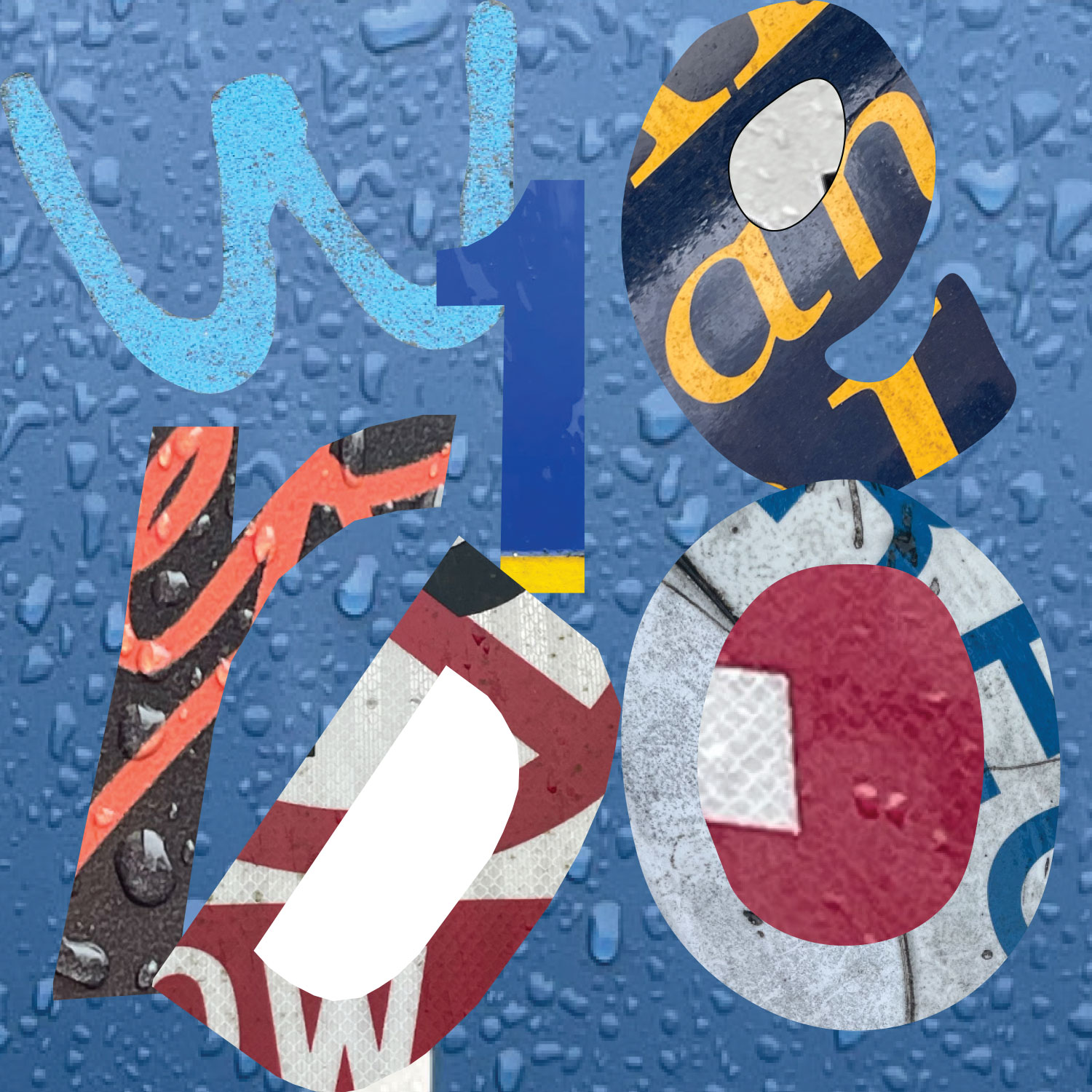
This is what I created from my photos. I chose to create the word untitled because while I was making it, I was choosing different elements from the photos, and it felt like I was taking parts of different pieces.
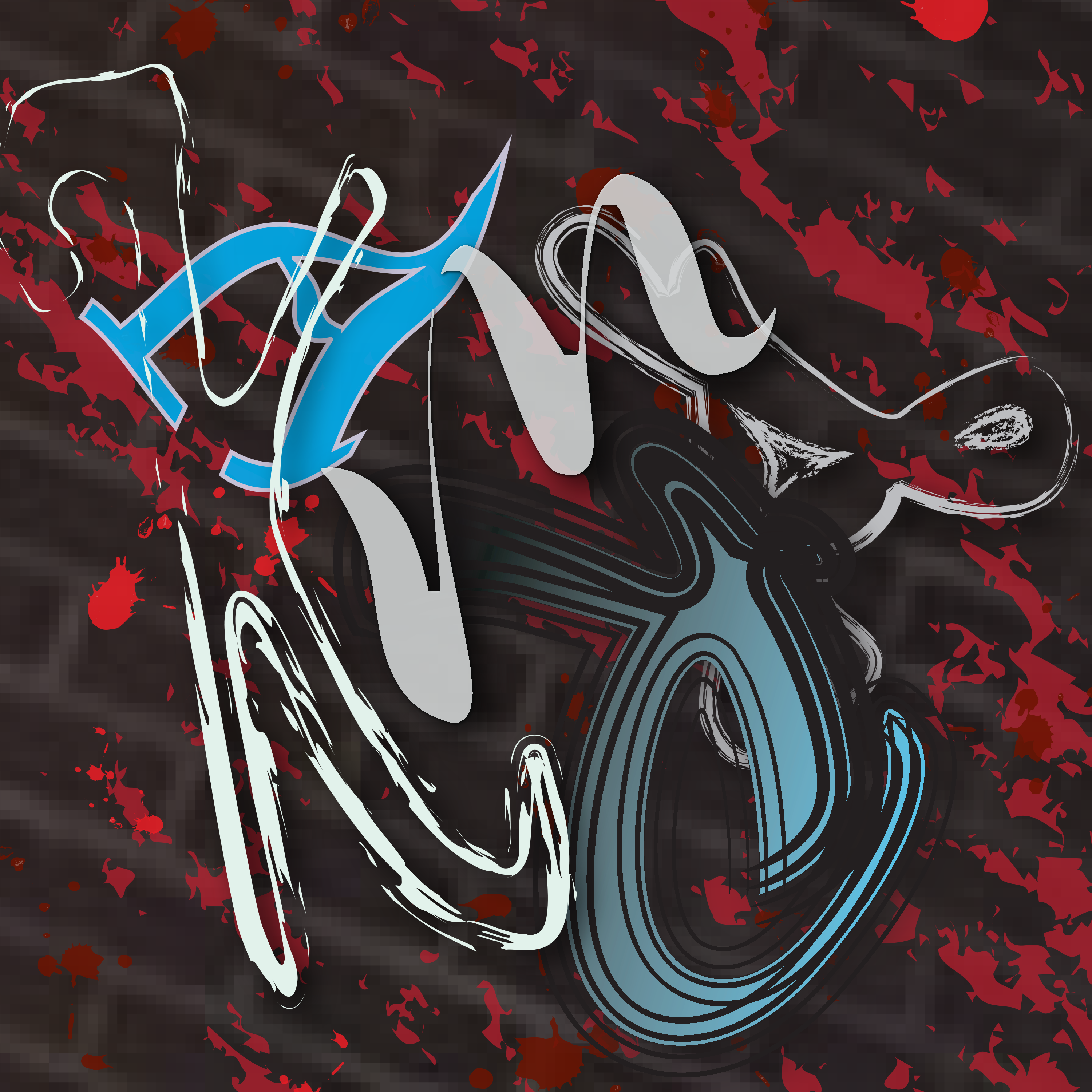
Black, pink, and white, gothic/grunge aesthetic gibberish freestyle. Inspo from tattoo shops
https://uncg-my.sharepoint.com/:b:/r/personal/r_riley_uncg_edu/Documents/_Rachele%20Riley/teaching/S25/ART%20341%E2%80%9302/Chris%20Pierce/Week%203/Chris%20Pierce%20letter%20project.pdf?csf=1&web=1&e=zX73zT
Black pink, and white, freestyle gibberish grunge aesthetic. inso from tattoo shops
https://uncg-my.sharepoint.com/:b:/r/personal/r_riley_uncg_edu/Documents/_Rachele%20Riley/teaching/S25/ART%20341%E2%80%9302/Chris%20Pierce/Week%203/Chris%20Pierce%20letter%20project.pdf?csf=1&web=1&e=zX73zT
1. The piece is the PlayStation logo, created for Sony’s gaming brand. It was designed by Manabu Sakamoto in 1994. The logo represents the PlayStation brand and is used on consoles, controllers, and marketing materials.
Its design includes a bold, three-dimensional “P” standing over a curving “S.” The colors like red, yellow, blue, and green match the iconic PlayStation controller buttons. Over time, the logo evolved into a sleek black and white version for a modern look. I personally prefer the colors in the logo.
The logo is typically printed on various materials like plastic (consoles and controllers), metal (special editions), and paper (advertisements and packaging). The original colorful design gives it a fun, welcoming feel (love the colors.) The newer monochrome version looks more sophisticated and modern. The reason I chose this logo was because I grew up on playing the PlayStation. PlayStation was one of the first ever consoles I once. I didn’t have many interests growing up, so the PlayStation was the catalyst to my love for gaming.
2. The piece is the 2012 London Olympics logo. It was designed by Wolff Olins and unveiled in 2007. The logo was created to represent the 2012 Olympic Games in London, used on banners, merchandise, and promotions.
Its design is a jagged sort of abstract design of the numbers “2012,” with the Olympic Rings featured inside of the zero design. The blue version stands out with its bold, striking look, but other color variations, like magenta and green were used too. The style is energetic, has a sense of direction, and modern.
The logo appeared on various materials like digital screens, printed posters, clothing, etc. The reason I chose this logo was because it reminds me of a Mario and Sonic game that I used to play on the Wii. Crazy thing about that is the game was based on the 2012 Olympics, and the game used the magenta design.
The first piece I chose is an album cover for a 2007 album by an Argentine singer, Andres Calamaro called “La Lengua Popular.” This means “The Popular Tongue” in English. The cover was designed by an Argentine illustrator by the name of Liniers. Liniers is known for his unique comic style and he stated that he created the cover as a visual reflection of the style of Calamaro’s music. Although the name of the album translates as being a common language or a common music style, Liniers chose to illustrate the cover in a literal way by drawing the viewer’s focus to the focal point of the piece which is a big tongue. I chose this piece because of Linier’s whimsical art style and the colors he chose.
The second piece I chose was a Japanese soap package from 1931. The designer is Hiromu Hara, a Japanese graphic designer who designed various commercial items such as posters, books, and various other product packages. A contest was conducted for the design of “Newly-Packaged Kao Soap” and Hiromu Hara’s design was chosen as the winner. Although he became quite famous for his work. Hiromu was still unknown at this time. I chose this design because I loved the roundness and movement of the font. I assumed that the design would be much more modern but I find it even more interesting and impressive that it belongs to an object from the early twentieth century.
https://peoplesgdarchive.org/item/14974/la-lengua-popular
https://peoplesgdarchive.org/creative/6300/hara-hiromu-yuan-hong
For my project, I went for an aged comic sort of theme. I used the category I labeled as “comic font” from my photos that i took, then made a composition inspired by and similar to it.
https://uncg-my.sharepoint.com/:f:/r/personal/r_riley_uncg_edu/Documents/_Rachele%20Riley/teaching/S25/ART%20341%E2%80%9301/Ethan%20Heggins/Week%204?csf=1&web=1&e=ubGhpy
PIECE 1: BRUTUS 1989: https://peoplesgdarchive.org/item/16528/brutus-1989
For my first piece to analyze, I have selected the cover of volume 10/15 of the Brutus magazine, a Japanese men’s publication that focuses on Tokyo pop culture. This is the Kyoko sightseeing edition, featuring a geisha with the Brutus logo. The logo was designed by Seiichi Horiuchi, who also serves as the chief editor of the magazine. What makes this cover graphically distinct is the blown out photograph of the geisha accompanied with the Brutus text and the kanji going down the right side of the magazine which translates to “Kyoto’s viewing mountain jubilee”, both of which are a pinkish-red color. They are also bold and flat, making them easy to read. The accented neutral color scheme allows for the text and the geisha’s lips to pop and capture attention. Most of the space of the cover is white due to the geisha, which contrasts with her eyes, hair, lips, and text. Materials used are a photograph and (likely) a computer for adding text. I selected this cover because I really like the look and feel of vintage Japanese media, most notably anime from the 70s-90s. I also love the appearance of kanji, romaji and hiragana. While Brutus is written with letters from the Latin alphabet, I really enjoy the sharp protrusions and how the word is tilted at an angle. The accented neutral color scheme also captured my attention; white, black, and red have always been very appealing to me.
PIECE 2: Marilyn Monroe Tru-Glo: Makeup Advertisement: https://peoplesgdarchive.org/item/14782/marilyn-monroe-discovers-the-worlds-most-glamorous-make-up-magazine-advert
My second piece I chose for analysis is a magazine advertisement published by Life Magazine circa 1952. It is for the company Westmore Hollywood Cosmetics’ Tru-Glo Liquid Makeup product promoted via testimonial from Marilyn Monroe. Its distinct graphic qualities are a soft cream and rosy color scheme, which are stereotypically associated with femininity (as the product is marketed towards women) and give the advertisement a soft, romantic feel. The text, however, is black. The font varies: the words Marilyn Monrie, Tru-Glo, and Hollywood are in a thin cursive font. “WEstmore Cosmetics” is in bold. The rest of the text is in a standard font, similar to the Georgia font. The materials used to create this advertisement are paper, ink, photography, and were distributed via printing.
I selected the piece because of the romantic feel created by the font, soft color scheme, and Marilyn’s essence. I alsoI enjoy the grainy paper-texture. I love stationary and rococo era-art, and this combined both of those interests. I also love cursive.
PERSONAL PROJECT: OVAL https://uncg-my.sharepoint.com/:b:/g/personal/r_riley_uncg_edu/EQMlB0psH2ZIiSyuRi_X0s4BAPRmLH3JjzuWVnmNp3tkKw?e=oMwojH
For my project, I spelled the word “oval.” I tried to arrange the letters in an ovular arrangement, but I didn’t like how that looked, so I made them overlap each other slightly. I worked with varying levels of opacity and blending modes. I believe I mainly used the exclude one, resulting in a mostly complementary color scheme. I enjoy the cyan around the letter v. I will say in Illustrator, the file appears more pink.
Discussion:
1) The piece I chose is a micro-macro typography exhibition poster. The UGA graphic design professors Julie Spivey and Moon Jang designed it in July 2023. The poster is for an exhibition that features work created by their students in advanced typography. One distinct quality of this poster is that the title of the exhibition is in two different fonts and it’s surrounded by cubes with white shadows. These cubes are unsymmetrical to each other but in a way, that forms a fluid movement throughout the poster. Another distinct quality is the color scheme, which is black and white, so they contrast each other. The only materials used are paper. I selected it because the white words on the black background, in a scattered array, made it attractive. It stood out because two fonts were used in a different, unspecific pattern. The poster invites me in, and once I’m hooked, I can see more into the details of the actual poster. Below the title are the names of all the students in the exhibition, along with the date, and I like how interesting it is that they added that into the poster in that way. The final thing that draws me in is that you can clearly read and understand what the poster is for.
https://peoplesgdarchive.org/item/12422/micro-macro-typography-exhibition-poster
2) The second piece I chose was an illustrative typeface called “Platform 4 Chaos,” designed in 2007 by Amy Suo Wu. The letters are made up of squatted and abandoned buildings in Rotterdam which were used as the components of each letter. Distinct graphic qualities include layered design and color used in this piece. There is a layer on top of the buildings that was added using Scriptographer to generate unpredictable lines, which physically highlight chaos. Materials are not listed, but they do mention the use of an Illustrator Plugin named Sciptographer. I selected it because each letter is visually appealing in its own way. The letters invited me in, so I could look closer at what was on each one. The use of the red letter “T,” in the title was also interesting because that is the only one that is colored.
https://peoplesgdarchive.org/item/2891/platform-4-chaos
Studio:
The word I chose for my assignment was “love.” With Valentine’s Day approaching as my favorite holiday, it feels a little different this year. So for my project, I wanted to convey love in a messy, chaotic, non-pretty way, as it most often usually is. That’s why I also chose to use not only red or pink but a variety of warm colors.
https://uncg-my.sharepoint.com/personal/r_riley_uncg_edu/_layouts/15/onedrive.aspx?id=%2Fpersonal%2Fr%5Friley%5Funcg%5Fedu%2FDocuments%2F%5FRachele%20Riley%2Fteaching%2FS25%2FART%20341–02%2FChristina%20Kibler%2FWeek%204%2F%23Week3Studio%2Epdf&parent=%2Fpersonal%2Fr%5Friley%5Funcg%5Fedu%2FDocuments%2F%5FRachele%20Riley%2Fteaching%2FS25%2FART%20341–02%2FChristina%20Kibler%2FWeek%204
Hi Christina! Your piece is really cool! I love how you didn’t just go with the stereotypical imagery associated with the word “love.” It makes your design feel so much more unique and interesting. I also really like how your letters are arranged at different angles, but are still legible. The smaller text saying “love” being put over the main larger letters is a nice touch too. I’m also really into the melting effect the ‘V’ and ‘O’ have!
One of the pieces I have chosen is “Kaleidoscope Jazz Chair” from Metropolis Architecture Design and the other is Typography and Letterpress Printing at U.C. Davis. The first piece was made on June 25th in the year 2020, the second was made in 1979. In “Kaleidoscope Jazz Chair”, a series of collages can be seen in nine different styles. Yet you’ll see that all of the individual pictures in the frame have one thing in common, which is the cropping. All nine of the pieces are precisely symmetric, in the terms of patterns, placement, etc. This allows consistency and engagement, allowing the viewer to hop around to each picture, comparing and contrasting each picture’s element. Upon viewing one will notice the color scene hints similarity, with reds, blues, and black being sprinkled onto each image. This is in the category of motion graphics. The second piece is more monochromatic with bronzes and golds, along with hints of blues and greens. Unlike the first picture, this one presents scattered words and symbols. This is printmaking and letterpress which was made into a poster. I selected these two designs because the pattern choices were the first to draw me in. Both look very distinct in their own ways.
Those sound very interesting! The Kaleidoscope Jazz Chair specifically sounds super fun and dynamic. The symmetry and bold colors make it engaging, and the way each piece connects keeps the viewer’s eye moving.
Hi T,
I really like how you pointed out the symmetry in the Kaleidoscope Jazz Chair design. Sounds like it makes the whole piece feel balanced and exciting at the same time .
I chose two pieces from the People’s Graphic Design Archive that demonstrate novel approaches to typography. The Art of Typography is a visually appealing book that features experimental type abstractions and print art. The book, designed by Paul Neale, Mike Montgomery, and Ann Richter and including contributions from Steven Heller, John Maeda, and others, dives into typography as a form of artistic expression. Its pages contain a variety of type compositions that use various print processes to push the boundaries of traditional letterforms. I chose this design because it demonstrates typography’s flexibility as both useful and artistic.
The second article, Reverse Contrast Typefaces, looks at a typographic design that reverses traditional weight distribution, preferred horizontal strokes rather than vertical ones. This design style produces an unexpected and striking impact while challenging traditional letterform structures. While no individual creator is mentioned, the concept has been developed in a variety of typefaces throughout history. The article discusses how typography may challenge preconceptions and create new visual rhythms. This piece caught my interest since it shows how typography has evolved beyond typical forms, pushing designers to experiment with unexpected looks. These works demonstrate the dynamic and unlimited potential of typographic design. In general, these were both good examples!
https://peoplesgdarchive.org/item/14337/the-peoples-graphic-design-archive-is-rethinking-how-we-talk-about-design-history
https://peoplesgdarchive.org/item/11815/reverse-contrast-typefaces
Hi Cindy,
The way you described The Art of Typography makes it sound like such a creative and inspiring book. It’s kind of like each page is an experiment with letters.
The pieces I chose to write about are “Persian calligraphy” by Hossein Zenderoudi, and “Tide Pride” which was made by the University of Alabama. I chose Persian calligraphy because it was the first one that caught my eyes when I opened the website. The colors and patterns drew me to it instantly. Persian calligraphy was made in 1968 and is a painting on canvas with Persian inspired script. The background is a gradient mix of yellow, blue, green, and orange with black strokes of individual characters which are more abstract rather than legible text. The fact that the persian inspired script is made to be more abstract is a distinct quality which makes it more interesting to see, at first I saw random patterns but after reading the title and descriptions I know its persian script.
The thing that drew me to Tide Pride was because of its simplicity. I chose Persian calligraphy because of its colors and abstract patterns, so I wanted to choose a design that was the opposite. Tide pride was made in 1992 and is a car tag which was given to those who have season tickets for Alabama football games. The description doesn’t say what the design is made out of, but since it’s a car tag I can only assume it’s made of aluminum. A distinct graphic quality of this piece is that cursive word pride on top of tide. I say this because I believe the choice to do this helps it look aesthetically nicer.
For my design I chose the word “draw”. Whenever I have free time I choose to draw so I wanted to chose a word that means a lot to me. I also used different types of blues because its my favorite color.
https://uncg-my.sharepoint.com/shared?id=%2Fpersonal%2Fr%5Friley%5Funcg%5Fedu%2FDocuments%2F%5FRachele%20Riley%2Fteaching%2FS25%2FART%20341%E2%80%9302%2FXimena%20Perez%2DChavarria%2FWeek%204&listurl=%2Fpersonal%2Fr%5Friley%5Funcg%5Fedu%2FDocuments
Hi Ximena!
I love the variety of textures you used for your design! The color palette is feels very serene and peaceful, and I absolutely love the form of the R. The swirl on its bottom right edge goes so nicely against the striped pattern, since their shapes contrast each other. The texture for the W as well is really cool and the gradient background ties in everything so nicely.
Discussion:
https://peoplesgdarchive.org/item/16635/design-038162
My first chosen piece is titled Design/ 038162. This piece was designed in 2005 by artists Roy Ellis, Zulema Orozco, Richard Romero, and Jose Ramos. It’s hard to find exactly why this piece was created, however, it’s housed by the Chicago Design Archive; an archive that specializes in Chicago related experimental design, graphic design, and product design. The artists, similarly, are hard to learn of as well I’ve found. However, Ellis and Romero have worked on a separate piece also housed by the CDA. The distinct graphic qualities of this piece, as well as the qualities that drew me to it, are its asymmetry and overlapping imagery. Its fuzzy/noisy quality is something that drew me to it, too. It appears the only material used was ink, and maybe some digital manipulation applied. The mystery kind of surrounding the piece is something that really intrigued me. I think the piece, visually, is really cool! And I like that it isn’t popular and well known but actually seems to be the opposite.
https://peoplesgdarchive.org/item/1642/the-root-of-typography-and-it-s-colours
My second chosen piece is titled “The Root of Typography and it’s Colours”. It’s designed by artist Dimitar Trendafilov during, roughly, the 1960’s. It’s unclear exactly why the piece was created, however, Trendafilov specialized in typography during the 1960’s; creating his own private typefaces, as well as public calligraphic viewings (both solo and joint). Its distinct graphic qualities are the overlapping of its letter forms, bright colors, abstraction of letter forms, and the juxtaposition between abstract and traditional letter forms (seen in the foreground and background respectively). The piece appears to be mixed media, incorporating paper material, paint, and ink. Similarly to my first chosen piece, I mostly chose this piece because I really liked how it looked. Similarly to Fella’s work, I really appreciate and find interesting how Trendafilov plays with the letter’s form. As well as how the artist focuses on visual composition rather than readability.
Studio:
https://uncg-my.sharepoint.com/personal/r_riley_uncg_edu/_layouts/15/onedrive.aspx?ga=1&id=%2Fpersonal%2Fr%5Friley%5Funcg%5Fedu%2FDocuments%2F%5FRachele%20Riley%2Fteaching%2FS25%2FART%20341%E2%80%9301%2FJohnny%20Monroe%2FWeek%204%2FTextImage%5FMonroe%281%29%2Epdf&parent=%2Fpersonal%2Fr%5Friley%5Funcg%5Fedu%2FDocuments%2F%5FRachele%20Riley%2Fteaching%2FS25%2FART%20341%E2%80%9301%2FJohnny%20Monroe%2FWeek%204
My piece uses letters I found just really visually interesting to form the phrase “FREE OR DIE”. I chose this phrase because recently I had a really frustrating experience with my car being booted, and it just had me ruminating a lot on how US citizens are financially exploited and controlled. I know everyone doesn’t subscribe to that idea and, admittedly, I am biased and traditionally prone to thinking that way. However, that being said, I just reaaaallly dislike money, and personally really think that cars are a great example of how people are forced to spend their money whether they like it or not; simply because of how our cities are designed. People are forced to drive for transportation, spend money on their car for upkeep, insurance, etc. and then are forced to pay to park almost everywhere. The whole situation just gets me really heated. And, ironically, often when I feel this way I think of a New Hampshire license plate that has the slogan “Live Free or Die” on it. And I often wonder when faced with the financial challenges any young adult faces, how free we’re really able to live when we have to pay not to die; for food, water, shelter, etc.
So for my piece, I focused on a simplified version of that slogan, and behind it I used a very zoomed in version of Rage Against the Machine’s self titled album cover. For those that don’t know, the image used for the cover is a photo of a monk committing self-immolation. I chose to zoom in on the image because the original is honestly pretty graphic, although extremely breathtaking, and unnecessary for the purposes our assignment. However, that being said I still wanted to include the image because, to me, the action depicted in the image and the context of its subject tie so heavily into my feelings surrounding the, I argue, financial exploitation US citizens face every day.
The first piece I chose was Fisherman and the Sea, a piece made by an artist named Nayereh Taghavi. The Iranian typography piece was made in 1973 for a book written by Azim Khalili. The piece includes small black text on the right side in Arabic, there’s a woman in a brown boat on top of waves, she holds a black net that covers a school of colorful fish. The piece looks like it is made using watercolor for the fish, boat, and sky and ink for the net, waves, and text. I selected this particular piece because the fish in the net caught my eye, the mix of black and white and color work well together.
The second piece I chose was The Sound by Wes Wilson, a psychedelic poster made in 1966 to advertise shows. The poster is of a nude woman standing with her arms up, the piece is made with four colors: orange, green, purple, and white. I chose this piece because the brightness of the colors the artist used caught my eye. I also really like the way the font looks like it moves, filling all of the negative space around the woman in the middle.
Hey Rory, Your selections demonstrate two very different but equally interesting approaches to typography and design. Nayereh Taghavi’s Fisherman and the Sea strikes a careful balance between art and typography, with the interplay of black ink and vivid watercolor providing a dramatic contrast. Using the net as a design element gives depth to the piece, making the viewer feel the fish’s entanglement perhaps a metaphor for the book’s themes. Despite its modest size, it’s remarkable how the text remains a vital component, anchoring the composition while not overpowering the visuals.
The first piece I chose focuses on typography and is from “The Monster at the End of this Book” which was a children’s book published in 1971 written by Jon Stone and illustrated by Michael Smollin. The distinct graphic qualities of this book include being described as the illustrations being “so bold, bright, and confronting” and that “the typography on each page paints a clear picture of the emotions” which you can truly see on display. The illustrations and typography were all hand drawn for the book and I truly chose this piece especially because the mixture of different colors and fonts really stood out to me and drew me; this is most likely to gain the attention of the kids’ reading it too which I think they did a good job on. The second piece I found is a short film that was created in 1969 that is called “Gena Crocodile” which was created by Eduard Upenski. What makes this so unique is that he uses clay figures and animates them to create this clever stop motion film. I have always been a fan of the Claymation style in movies and short films and so this one immediately grabbed my interest.
https://peoplesgdarchive.org/item/16300/the-monster-at-the-end-of-this-bookandnbsp
https://peoplesgdarchive.org/item/6089/gena-crocodile
For my project, I just went with a simple one word on a cool background, as I felt using one word would be more effective.
https://uncg-my.sharepoint.com/:b:/r/personal/r_riley_uncg_edu/Documents/_Rachele%20Riley/teaching/S25/ART%20341%E2%80%9301/Anthony%20Valentine/Week%204/art%20341%20week%204.pdf?csf=1&web=1&e=isWkfq
Ooh I’m drawn to both of the pieces you’ve analyzed, especially the first one with Grover due to the bold and fun typography.
Hello Anthony,
The typography in The Monster at the End of This Book is such an engaging example of how design can capture a child’s attention.
I love how you correlated the hand-drawn typography and illustration to the target audience. I agree the bold colors and playful fonts definitely help keep kids engaged, and do make this piece stand out.
Your second choice, “Gena Crocodile”, sounds really unique too! Claymation has such a distinct charm, and it’s interesting to hear about its use in a short film from 1969. The fact that Eduard Upenski used clay figures for stop-motion animation adds unique depth to the film.
The Print contains two images of characters playing the piano and drums. The text is Pretty simple and contains two larger font styles. The smaller font that contains appears to be an italic Times New Roman font. The second Larger Font I think is a bold Arial. Above the major text components are separated into three smaller logos with simple individual font styles. The album’s music cover was designed by Yuki Kodama. The album cover was designed back in two thousand twelve. The print is designed as a cover for a music album based off an anime called “Kids on the Slope”. It’s designed for fans of the anime “Kids on the Slope”. I chose this piece due to my fondness for Yuki Kodama’s blocking of Logos, titles, characters, and author to the story’s name. My assumption is that the target audience is derived from fans of the “Kids on the Slope” anime. Rather than taking attention away from the characters playing instruments. Yuki Kodama blocked out major shapes to place logos, text, and characters.
https://peoplesgdarchive.org/item/590/photos-from-nut-tree
This piece Contains various interactive and directive text throughout what appears to be an amusement park. Two photos contain a large sign labeled “TOYS” giving directions to a toy store. The font is like the company Toys R US except for color and cute drawings of animals on top of the text. The first image shown on the webpage contains an interactive playground for children. The playground design is a collage of text, shapes, and animals. The last major text seen on the photo contains the park’s title “Nut Tree”. Of all the prints seen on the amusement park, the entree way title is the most serious. The Entree Way title kind of reminds me of older Disney font intros before movies start. The Nut Tree was designed by multiple artists which are: Don Birrell, Dreyfuss & Blackford, and Robert Deering. The park is designed for families and children. The interactive playset consists of bright bold warm colors with animals. Pretty much the whole design of the park is pretty welcoming and bubbly. I chose this print due to the first image of the playset. I loved the collage and blocky style with little hints of text. Unsure when the “Nut Tree” was designed. Based on the photos it looks like it took multiple years. Distinct qualities are the round shapes, collage style, and warmer-toned colors. The Material used appears to be mostly wood, paint and, plastic.
Photos from Nut Tree | People’s Graphic Design Archive
https://uncg-my.sharepoint.com/shared?id=%2Fpersonal%2Fr%5Friley%5Funcg%5Fedu%2FDocuments%2F%5FRachele%20Riley%2Fteaching%2FS25%2FART%20341%E2%80%9301%2FKarla%20S%20Morga%2FWeek%20Four&listurl=%2Fpersonal%2Fr%5Friley%5Funcg%5Fedu%2FDocuments&login_hint=KSMORGA%40uncg%2Eedu
Take it On SVA Posters-
https://peoplesgdarchive.org/item/6665/take-it-on-sva-posters
What is the piece?
These pieces are posters for the School of Visual Arts (SVA) in New York City.
Who designed it?
Stefan Sagmeister is given the credits along with creative designer Jessica Walsh, Designer Santiago Carrasquilla, Henry Leutwyler, and photographer Erik Johansson.
When was it designed?
These three posters were designed in 2013.
What is it for?
They are for promoting the School of Visual Arts.
What are its distinct graphic qualities?
These posters take on photoshop depiction as the words, “Take it on” are Photoshopped onto three faces. Each poster is done differently, but are very creative and grab your attention. The center poster is specifically interesting as there is an octopus put on a man’s face, and the tentacles spell out the words.
What materials are used?
Photography, Photoshop
Why did you select it?
I enjoy photoshop, and photo manipulation. These posters are simple to do, yet tend to grab people’s attention easily. I have done a couple projects like these, so these posters immediately grabbed my attention. I love the use of photography and photoshop together.
Blade Runner-
https://peoplesgdarchive.org/item/110/blade-runner
What is the piece?
This piece is a movie poster for the movie Blade Runner.
Who designed it?
John Alvin created this poster.
When was it designed?
This poster was designed in 1982.
What is it for?
According to Haley Watts, Alvin was not the first choice for this movie poster. It was later chosen for his creativity.
What are its distinct graphic qualities?
This poster adds a very space feel with a strong cinematic tone to it. The lighting and details are detailed, and everything looks sharp. This poster was appealed by the director, Ridley Scott and I can see why.
What materials are used?
Unknown materials
Why did you select it?
I have a big interest in movie posters and the designs of them. I used to make posters when I started learning Photoshop. It’s challenging to organize posters and flyers, and I will always support the artists who create professional posters like this one.
https://uncg-my.sharepoint.com/my?id=%2Fpersonal%2Fr%5Friley%5Funcg%5Fedu%2FDocuments%2F%5FRachele%20Riley%2Fteaching%2FS25%2FART%20341%E2%80%9302%2FAlex%20Gentry%2FWeek%2DFour&listurl=%2Fpersonal%2Fr%5Friley%5Funcg%5Fedu%2FDocuments&remoteItem=%7B%22mp%22%3A%7B%22webAbsoluteUrl%22%3A%22https%3A%2F%2Funcg%2Dmy%2Esharepoint%2Ecom%2Fpersonal%2Fwagentry%5Funcg%5Fedu%22%2C%22listFullUrl%22%3A%22https%3A%2F%2Funcg%2Dmy%2Esharepoint%2Ecom%2Fpersonal%2Fwagentry%5Funcg%5Fedu%2FDocuments%22%2C%22rootFolder%22%3A%22%2Fpersonal%2Fwagentry%5Funcg%5Fedu%2FDocuments%2FART%20341%E2%80%9302%22%7D%2C%22rsi%22%3A%7B%22listFullUrl%22%3A%22https%3A%2F%2Funcg%2Dmy%2Esharepoint%2Ecom%2Fpersonal%2Fr%5Friley%5Funcg%5Fedu%2FDocuments%22%2C%22rootFolder%22%3A%22%2Fpersonal%2Fr%5Friley%5Funcg%5Fedu%2FDocuments%2F%5FRachele%20Riley%2Fteaching%2FS25%2FART%20341%E2%80%9302%2FAlex%20Gentry%2FWeek%2DFour%22%2C%22webAbsoluteUrl%22%3A%22https%3A%2F%2Funcg%2Dmy%2Esharepoint%2Ecom%2Fpersonal%2Fr%5Friley%5Funcg%5Fedu%22%7D%7D
My project went okay. I think I got frustrated at the software because it was not working right. I kept getting errors I have never seen, and couldn’t figure out how to fix them. Illustrator ended up not letting me package my project, so my folder only has my PDFs of my work in them. Very unclear why that is, but I tried to fix it. Other than that this project was interesting.
Hi William!
I really enjoyed your first pick! How the artists incorporated “Take It On SVA” onto each of the models faces were incredibly creative, and very well done. The tentacle one and the 3D block lettering one are definitely my favorites!
I also liked your project as well! Love the variety in textures and styles, especially with your choice in splitting it down the middle with contrasting colors. I do wish for the right side with the blue, that you added that drop shadow on the right most side of the edge rather than on the left ti add to that symmetrical effect! Overall, really nice job!
With the recent protests against the deportation of immigrants of all backgrounds, I used flyers and posters I’ve seen to create my own and highlight some community privileges.
The poster titled “The Public Theater, 95-96 Season,” was designed by Paula Scher in 1995 for New York’s public theater as an advertisement promoting multiple plays. Its distinct graphic qualities consist of photography and dynamic typography, and I selected it because of how visually text-heavy the poster is. I love the combination of multiple typefaces, font colors and weights, and how unconventionally yet organized the information is placed. The poster is definitely very playful, as Scher utilizes multiple layouts and formats with the text, and orients them at various angles. She successfully executes it as well, as the lines placed around the poster separate the information from each other, making it visually easier to understand. It’s incredibly visually interesting too, how she chooses to vary some texts with either thin or thick forms, as well as the spacing between the letters. The color palette also supports its playful style, with yellows, reds, and blacks, making the poster effectively stand out even more as an advertisement. It makes me curious to see how much the poster would change if the person was printed out in color rather than in black and white, and whether it would offset the balance with the text-heaviness and become too chaotic. Or, it would bring out the liveliness of the poster.
https://peoplesgdarchive.org/item/8995/the-public-theater-95-96-season-1
This newspaper advertisement was made for Panasonic, formerly known as the Matsushita Electronics Company, and its design was credited to Ryoichi Takeoka, the art director. It dates back to 1960 and was also made as a response to post-WWII, when Japan’s economy had recovered from international pressure, leading to the opening of the gates for foreign trade again. In comparison to Paula Scher’s poster, the design for this advertisement is very minimalist, which was what drew my eye to it. It’s very clean, simple, yet effective. It’s formatted in a way where the text is clear and easy to read, with lots of negative space surrounding it and the images. There are still distinctions between the fonts used, as some as bolder, thicker, and bigger than others. I also loved how there is a subtle texture to it, which is more prominently shown in the images and the bold N, as it’s slightly grainy and rough. What makes this image even more interesting is how the designer chose to keep the apple as the only piece in color, while the rest are in black and white. Especially as it is placed off-center from the surrounding circle it is in, while the rest of the text is formatted in a grid-like style.
https://peoplesgdarchive.org/item/12516/matsushita-denki-newspaper-advertisement
As for what I have for my project so far, I wanted to do a yellow/gold and red theme in honor of Vietnam and play around with texture! The word I used is “vàng” which is gold in English. The form of the word was taken from this scroll from one of my favorite restaurants and then I used multiple textures from the pictures I took from Week 3 and embedded it into each of the letters. As for the background, it’s an image of fabric used for Ao Dai’s otherwise known as the traditional clothes worn in Vietnam.
https://uncg-my.sharepoint.com/:f:/r/personal/r_riley_uncg_edu/Documents/_Rachele%20Riley/teaching/S25/ART%20341%E2%80%9302/Cindy%20Pham/Week%204/ART%20341%20Week%204_Folder?csf=1&web=1&e=jkVb1O
At the start of this project, I did not have a plan for the design. The print studies on this week’s discussion inspired me to go for a blocked-out shape look. I started off by following along this week’s teams meeting lecture. After blocking out the larger text shapes I switched to blocking texture within the square. The Os were placed as a juxtaposition with the sharper edges. The last design choice I made was to go back and playground with colors in addition to playing around with the overlay tool.
https://uncg-my.sharepoint.com/shared?id=%2Fpersonal%2Fr%5Friley%5Funcg%5Fedu%2FDocuments%2F%5FRachele%20Riley%2Fteaching%2FS25%2FART%20341%E2%80%9301%2FKarla%20S%20Morga%2FWeek%20Four&listurl=%2Fpersonal%2Fr%5Friley%5Funcg%5Fedu%2FDocuments
For my first object from the archive, I have chosen “Object: type sort in the shape of a donkey” which was photographed by Cole Heitmann, who found the object within a collection of similar type sorts in the Univerity of Connecticut’s Merlin D. Bishop Center’s Letterpress shop. While it is unknown who designed it or when it was designed, it can be surmised that this object was used in letterpresses of its time as a sort of maker’s mark or other ornamentation, mostly due to it’s distinct design sticking out in the crowd it was found in, which is primarily composed of arrows, pointing hands, and other graphic elements that would serve more of a functional purpose in printing presses like it. It takes the form of a small, cuboid metal stamp with a raised design of a donkey, which is to be printed in metal-type printing presses. I personally chose it because, like the crowd of hands and arrows, the donkey stamp also sticks out among the typography category in the archive being more of a mechanical and historical artifact of typography than an actual typographical work, It’s evident as something behind the scenes of typography.
The second artifact I’ve picked from the archive is a 1930s woodblock print titled “To the Sea” which would’ve been used in advertising of the time. While there are no names of actual artists attached to the piece, it is noted that it was designed by someone or a group for the Ministry of Railways and utilized athlete and film actress Mikoshiba Hatsuko as the model. The piece itself was photographed by one Shabano Kiyosaku and was uploaded to the archive by Zixiong Fang. The piece itself is of Mikoshiba in a red one-piece swimsuit and matching swimming cap, prepared at the edge of a diving board, Poised for a jump into the pool, The grain of the woodblock evident in the solid blue backdrop on top of which is typography. While this piece was made for the Ministry of Railways it was rejected by them and eventually, the rights were acquired financially by Keisei, a private railway group as an advertisement for their waterpark. I chose this piece personally because of the combination of traditional Japanese printmaking techniques with a more modern subject matter, showing that traditional artistic techniques don’t just disappear but do evolve with the times.
For my typography project so far I utilized some typography in my collection that I knew for a fact was sourced from people rather than advertisers or the city and I went with a theme of memories so I found some polaroid era childhood photos on the internet because I don’t have access to any of my own currently.
Hello Finn, Your picked emphasizes typography’s historical and artistic significance. The donkey-shaped type sort is a one-of-a-kind item that demonstrates the hidden aspects of letterpress printing, which brought my interest. It contrasts with functional symbols, highlighting its ornamental role. To the Sea combines traditional Japanese printmaking with contemporary advertising, demonstrating how processes change. Its rejection and subsequent adoption reflect shifts in marketing. Your typography project, which focuses on memories and uses personal rather than commercial type, is consistent with these concepts. After all, both of your choices were great!
Hello Finn,
These are great picks! The “Object:type sort in the shape of a donkey” is a unique concept. It is fascinating how functional objects like this become part of typography history.
Meanwhile, the “To the Sea” woodblock print is also a fantastic choice. I love how it combines traditional techniques with a modern subject, showing how art evolves with time. The shift from being rejected by the Ministry of Railways to being used in advertising for a private company adds an interesting layer to its story.
https://peoplesgdarchive.org/item/14678/modern-student-magazine-cover
This is “Modern Student Magazine Cover.” It is the cover of a chinese magazine titled “Modern Student”, designed by Chen Zhi-fo. It was completed in June of 1931 and was illustrated on paper with ink. It utilizes a distinct combination of the Art Deco style and Chinese typography with cool tones. I chose this piece because of how satisfying the geometric composition is. I also thought the way the artist blended Chinese text with the Art Deco style was incredibly unique and intriguing.
https://peoplesgdarchive.org/item/12353/death-note-manga-cover-vol-4
This is “Death Note Manga Cover, Vol 4.” It is the front manga cover for the fourth volume of Death Note and was designed by Takeshi Obata on March 7th of 2006. The piece utilizes distinct Christian iconography and a unique color palette that cobines pastels with black. I thought the straight-facing, stark composition and visually appealing use of blank space was satisfying, and I’m particularly attracted to the cover’s use of color.
As for my project, I was inspired by the concept of the aftermath of a fire; I wanted to capture the feeling of char and degradation in my poster, which I mainly achieved through the use of distortion.
https://uncg-my.sharepoint.com/:f:/r/personal/r_riley_uncg_edu/Documents/_Rachele%20Riley/teaching/S25/ART%20341%E2%80%9301/Callie%20Roberts/Week%204/Week4_CallieRoberts_Folder?csf=1&web=1&e=WTq53o
Hey Callie,
You did a job well done on demonstrating your project to feel like the aftermath of fire. Usually when the fire takes place it is all vibrant chaos, but when I see your project it give the underwhelming colors and sense of ash and darkness. I like the irony of the word fire as the main character.
Discussion:
The first piece that stood out to me was titled “Martha and the Vandellas” made in 1967. The designer of this surrealistic poster is Bonnie MacLean. The poster was created for a Fillmore concert featuring the band Martha and the Vandellas. The work features the iconic psychedelic design style from the late 1960s. MacLean’s contribution to the Fillmore concert was vital in shaping the visual identity of the venue. Even though the materials are not listed, her design encapsulates the era’s distinct aesthetic. The orate typography present on the front of the poster is Gothic script. The color palette has cool toned colors such as blues and greens for the base, and bright red-oranges to make the typography pop from the background. These design choices make for a very surreal experience, reminiscent of the late 1960’s spiritual flair. I found this piece to be a perfect example of how designers are influenced by cultural norms of their respective time periods.
The second piece I chose is titled “14th Summer Jazz Festival Japan” dated 1982. This poster was designed by Igarashi Takenobu to promote the 14th Summer Jazz Festival in Japan. While the materials are not listed, the modernist simplicity and a flair for expressive graphic elements are present. I was immediately impressed by Takenobu’s clean, geometric shapes and limited palette. The bold, graphic style of the typography was also visually appealing. I also felt as though this style directly counters the whimsical psychedelic style of Western designs around the same time period. Takenobu’s poster is sleek, bold, and colorful. Which I believe it a perfect depiction of Jazz as a design.
Studio:
My project poster is sleek and colorful. I was inspired by my favorite brands and utilized their most iconic typography to represent them. The bright colors are reminiscent of the original coloring their respective brands used, which I believe suits them best.
Link to Art board:
https://uncg-my.sharepoint.com/:f:/g/personal/r_riley_uncg_edu/EjNIyCtg3RtKgDrXa45Z3-cBDkreZfye-2ETskhuJkd7mA?e=W5cbwG
I selected a piece called “Cover of ‘Retro: A Guide to the Mid-20th Century Design Revival.’” This was designed by Adrian Franklin in 2011 and was used for a book cover. The distinct qualities of this cover include the dotted patterns that give it its retro aesthetic, capturing the quality of the mid-20th-century design. Another element I found interesting is the backward “e” in the title, which adds uniqueness to the design. The different color of the “e” also makes it stand out, drawing the attention to that area. The texture of the cover, including the font and patterns, makes the layout look more complete and appealing. The cover was used for a book displaying retro objects, covering all the bases from furniture and fashion to ceramics, technology, and metalwork. I selected this because it caught my attention, mainly because of the halftone text. To me, it looks like a simpler design, but I also feel like there is not too much and not too little going on, which makes it feel like there is just enough going on to capture my attention. I also selected this because I was looking for retro inspiration as well as something that gives a feeling of nostalgia for this week’s project.
For my work this week, I took a lot of inspiration from the retro and nostalgic look of Franklin’s book cover design. I picked out the phrase “The Best Days” to convey a more nostalgic emotion. From the pictures I took, I chose fonts that appeared more fun and round to capture the mood I was going for. I gave the word “Best” from the phrase a 3D and halftone effect to make it the focal point while keeping the words “the” and “days” more simple.
Both pieces you chose effectively use design to communicate important messages. The Mirabal Sisters design uses strong, emotional imagery to honor the sisters’ legacy and create a connection to personal and cultural roots. The use of red ink splatter and distressed visuals adds intensity to the piece, making it compelling and memorable. On the other hand, the City of Concord Police Dept. Narcotic and Drug Book uses bold, dynamic visuals to engage readers and raise awareness about drugs. Both designs show how powerful graphic elements can grab attention and convey a serious message.
Hi Cindy,
The way you described The Art of Typography makes it sound like such a creative and inspiring book. It’s kind of like each page is an experiment with letters.