Due end-of-day Sunday. Responses to other people’s posts, due Tuesdays.
Week 6 — Assignment “Many-sidedness”
Project 2 —Combine and Contrast—shaping meaning and developing voice. A series of visual messages that express a position on human experience and media culture. The focus this week is on creating visual messages using two images (select two from those you collected last week). Create alternatives of them and combine and contrast them: making adjustments, framing/cropping, use digital or analog processes. Also experiment with typography and different structures. Select just (2) two images to work with for the rest of the project (see example exploration galleries below).
1/
Discuss
- Read the Jan Van Toorn text which we are using for this project (text in in blue):
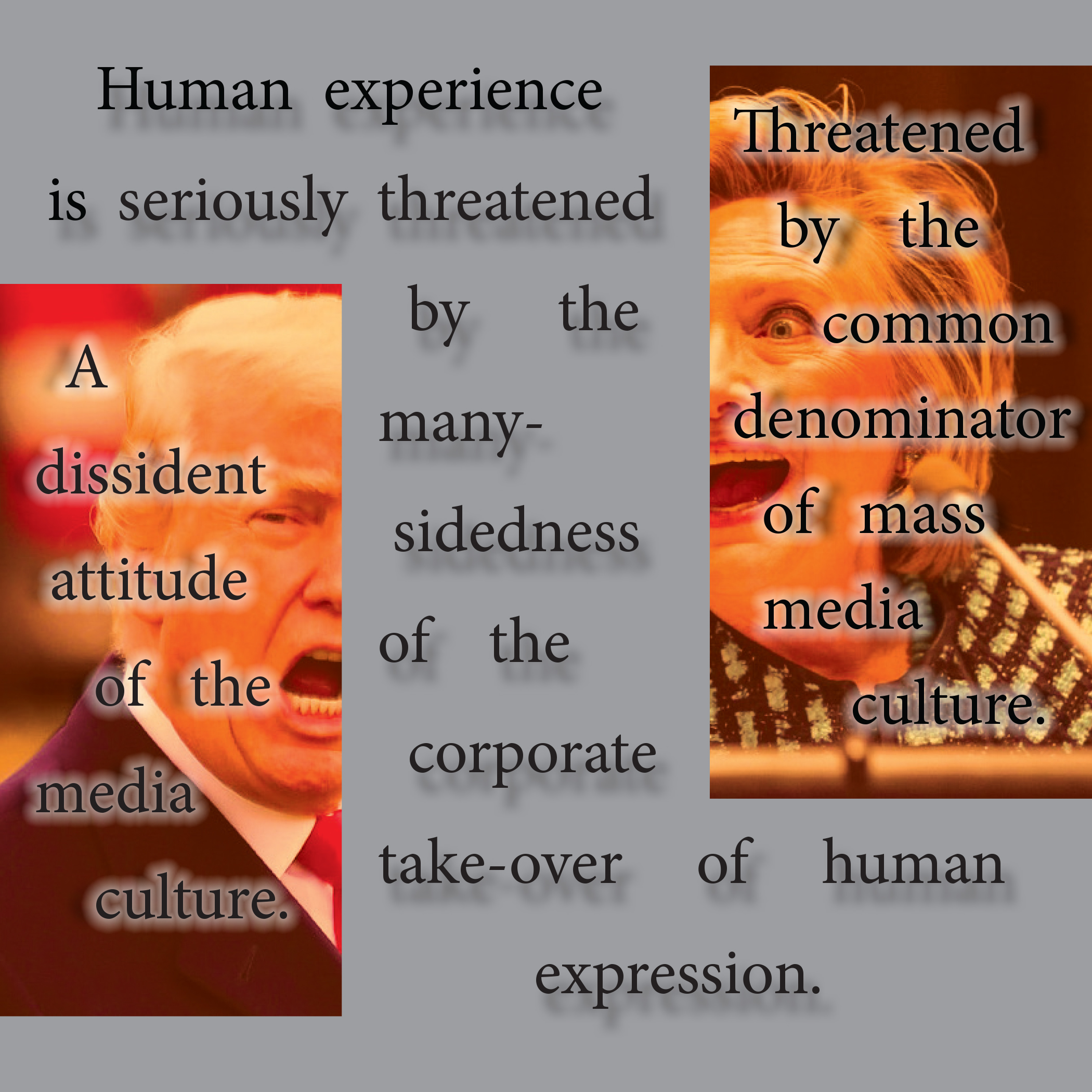
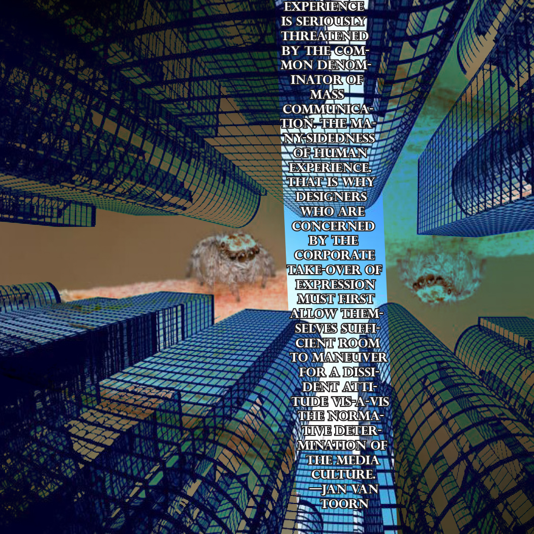
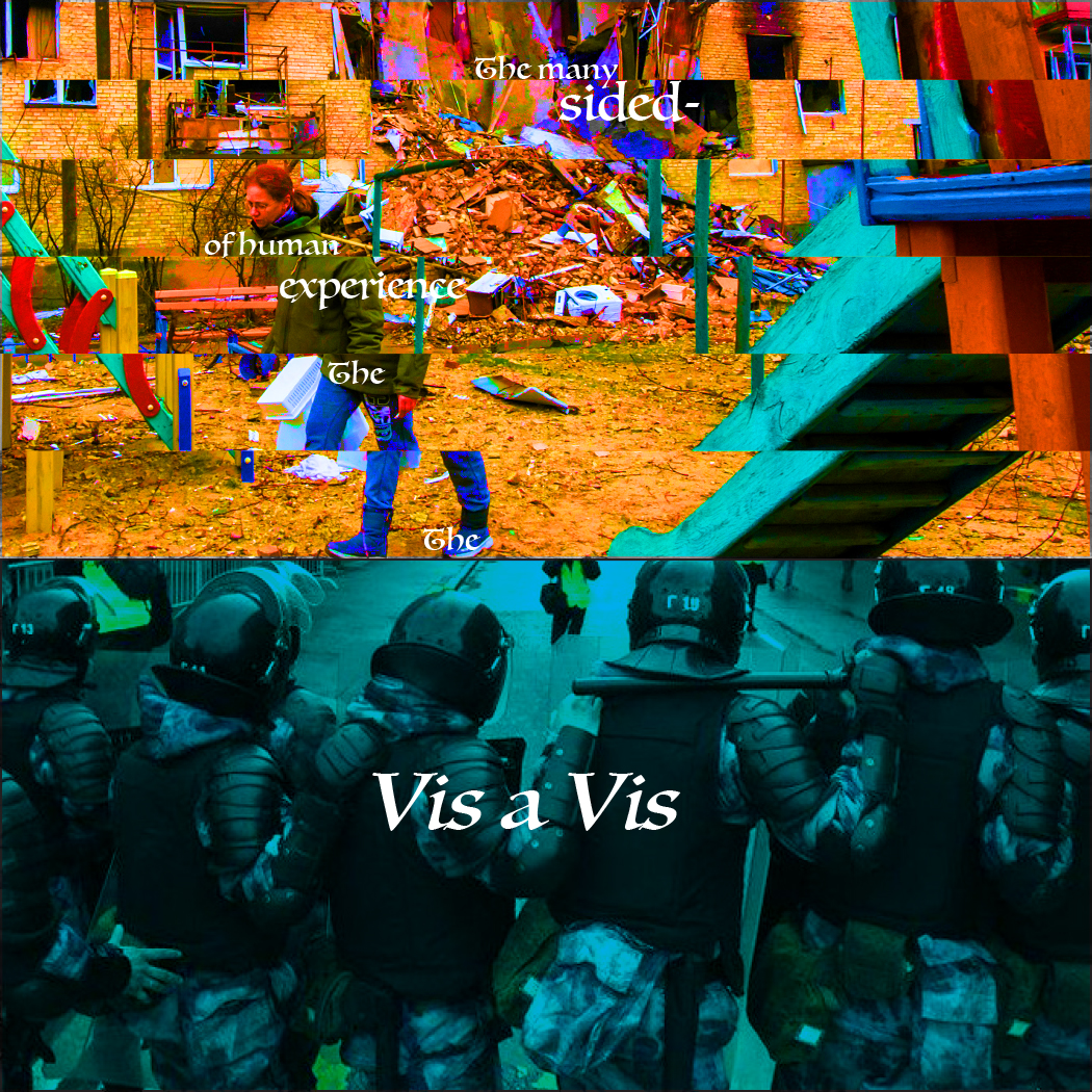
The many-sidedness of human experience is seriously threatened by the common denominator of mass communication. That is why designers who are concerned by the corporate take-over of expression must first allow themselves sufficient room to maneuver for a dissident attitude vis-à-vis the normative determination of the media culture. — Jan van Toorn
What do you think about when reading the words many-sidedness of human experience, common denominator, mass communication, dissident attitude, vis-à-vis…. Look up words and phrases and meanings. Use Wikipedia, a dictionary, and web search—for example, vis-à-vis meaning. - (After working on your studio project) write a description of your studio project as a comment below (200 words minimum). What is your theme? What ideas are you expressing? How does the meaning of the same two images and the same text shift across your 6 different artboards depending on how you have shaped them? Post a link in your post to your folder in the class folder on the drive.
- Reply to two other people’s comments.
2/
Studio:
- Select two (2) contrasting photographic images for one (1) thematic direction.
- Begin transforming the photographic images. Save as alternate versions (keep original versions intact). Upload these to a separate photo folder, and label. Things to try : change the color, contrast, orientation, crop and reframe, extract/clip and remove from original context, repeat, layer, etc. Use Indesign, Illustrator, or Photoshop. Explore different possibilities from the images you collected. Explore how the meaning shifts depending on how you transform and compose.
- Create a 7 x 7 inch file (at 300 dpi) in Illustrator or InDesign.
- Make six (6) text and image compositions that are different from one another — working with the two images you have selected which present a contrast on a theme.
- Explore making choices for the images (cropping, extracting, changing color(s), repeating, changing scale and proportions, layering, juxtaposing, fusing, etc..)
Explore making choices for the text (selecting different typefaces, different type settings (caps, lowercase, bold, italic, color)).
Explore different type structures (radial, axial, dilatational, transitional, grid, modular, random, bilateral).
— > again, this is your text (text in blue), copy and paste from here:
The many-sidedness of human experience is seriously threatened by the common denominator of mass communication. That is why designers who are concerned by the corporate take-over of expression must first allow themselves sufficient room to maneuver for a dissident attitude vis-à-vis the normative determination of the media culture. — Jan van Toorn
Use the full quote in at least one composition. You can (optional) use part of the text quote in the other compositions. Text and image can relate structurally. Across your 6 different artboards, the text and image can be complementary, supportive, subtle, proportional or disproportional, or contradictory in relationship to one another. Text and image can inhabit the same space (fusion) or operate on different planes (separation). Explore shapes, cropping, properties of layers (multiple, overlay, etc), use of color, clipping masks, replacement, orientation change, repetition of elements (text and/or image). - Package your design files from InDesign or Illustrator. Make a PDF. Upload the entire packaged folders for your design files, plus PDFs, to the drive.
-
Antwain Hairston, 2019
-
Jackson Griffith, 2019
-

Zainab Adamou-Mohamed
-
Abigail Woodard, 2022
-
-
Madison Wanchia, 2023
Jada Reed, exploration, 2024:
-
Jada Reed, 2024
-
Jada Reed, 2024
-

Jada Reed, 2024
-
Jada Reed, 2024
Andrea Moyado, exploration, 2024:
-
Andrea Moyado, 2024
-
Andrea Moyado, 2024
-
Andrea Moyado, 2024
Caleb Carter, exploration, 2024
-
Caleb Carter, 2024
-
-
-
Links:
Typographic Systems, Kimberly Elam (UNCG library)
Geometry of Design, Kimberly Elam (UNCG library)
Graphic Design: The New Basics (ebook)
Jan Van Toorn: Arguing with Visual Means
Chantal Jahchan Editorial Design (It’s nice that)
In my work I began looking for very old images of women expressing themselves. Either fitting into the gendered norm or going out of their way to show off their own personal hobbies and interests. The two images I chose are of a woman’s portrait wearing a very stylish and probably in trend hat for the time, her name is even at the bottom. The other image is a woman wearing a dress and doing gymnastics, stretching her leg up in the air like a dancer or a gymnast. The woman in this portrait is obviously going out of the norm from most images taken of women at the time, and it reveals so much more about her than the other woman, even though we have less information about her. This idea of self expression versus conformity is something that I’ve always been interested in, and with the quote from Jan van Toorn added into the mix I wanted to add onto the idea of fluidity and mass knowledge. In my work I wanted to focus on the portrait woman’s eyes, hat, and name; as those are what established her as a person in the photo. For the other woman, I wanted to focus on her limbs, and how she’s posing, using her arms, legs, and dress to establish her in in the photos.
Word count: 224
Hi Lucio,
I like your idea so far with using women expressionism in the images that you chose. I also like the idea of focusing on certain parts of the woman established. I can’t wait to see what you come up with!
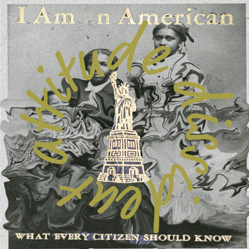
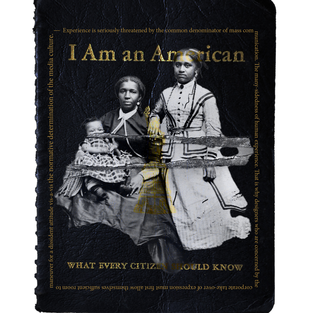
My studio project explores the balance between my Black cultural identity and my personal journey toward peace through text, imagery, and composition. A key element in my work is the phrase “THE EARTH, THE AIR, THE FIRE, THE WATER, RETURN” which I took from a chant by Libana. I find this song deeply peaceful, and it serves as a grounding mantra in my art, representing my connection to nature, spirituality, and inner stillness.
The repeated words “I AM” and also “RETURN” emphasize themes of self-identity and reconnection, both with my heritage and with myself. Across my six artboards, I manipulate the same two images. A vast, open landscape and a historical Black resistance scene, to explore how context shapes meaning. In some, the land and sky feel expansive and meditative, symbolizing my search for peace. In others, the overlay of figures and text creates tension, reflecting the resilience and history I carry with me.
Typography plays a key role in shifting perception. When bold and structured, it asserts power and cultural pride; when faded or dispersed, it mirrors the fluidity of peace and self-reflection. This project is a visual expression of how I navigate the coexistence of cultural strength and personal tranquility in my life.
Hey Tre. Your subversion of the required quotation was a bold choice. The concept behind you piece is also interesting. The use of “I AM” and “RETURN” truly do speak to you reconnecting to your roots. In that way I also find it relatable as my indigenous ancestor’s culture has been largely lost in my bloodline and what remains is whatever Spain found “acceptable” to practice. What I found most interesting is the placement and manipulation of the “RETURN”. They truly emphasize that desire of reconnection with the earth. One of my main criticisms of the piece would be the quality of the background photo. It is extremely blurry and would benefit if a larger image file were used.
Many-sidedness of human experience:
I think of it literally as in the vast amount of experiences that humans go through, the good, the bad, and the ugly.
Common Denominator:
I think of it as being the common thing that goes on with mass communication as being a major issue that is threatening the unique human experiences we all have.
Mass communication:
The very large ways we can communicate, whether it be reproducible mediums, face to face conversation, social media, etc.
Dissident attitude:
The attitude of somebody that is just opposed to the current policies are against what is currently going on.
Vis-a-vis:
In relation to something else. In this case, the dissident attitude in relation to the normative determination of the media culture.
What is your theme?
The theme that I have chosen is simplified forms of Freedom.
What ideas are you expressing?
The overall ideas that I am expressing through the topic of freedom is the idea of having freedom to be a part of society and viewed as an equal, and on the flip side, the freedom from society and being free and alone on your own.
How does the meaning of the same two images and the same text shift across your 6 different artboards depending on how you have shaped them?
In my 1st image I put the images really close together facing each other to really show the contrast of my theme. In the 2nd image I extended the idea from the first and mirrored all of the images across the middle and made it so the word Freedom stood out. In the 3rd image I mixed both of the images together and lowered the opacity so they appear at the same time. This was done to express the idea that you can want freedom in society as well as freedom from it at the same time. In the 4th image, I took the outline of MLK Jr. and overlaid it onto the guy sitting on the cliff to show the aspect of value tied with these ideas. As an African American man in America I put a lot more value onto freedom to be equal in society then freedom to be from it. In the 5th image I was experimenting around with freedom and the effects of the civil rights movements, marches, etc. and further pushing the idea of the amount of work and repetition as well as perseverance it took for my people to finally be freed back then. In the 6th and final image I remade the first one in a different way and made it so that it shows the countless ideals we have of freedom, but no matter what MLK Jr. idea of it will always be the same throughout history.
Post a link in your post to your folder in the class folder on the drive.
https://uncg-my.sharepoint.com/:f:/g/personal/r_riley_uncg_edu/EkJQ_6jxeeZDiBEUy1w0fdkBAKq2Mq3i-UD7qI3H_8MW7A?e=MJzGWs
Hi Jon! I love the theme of freedom and I think you described your art boards really well!
Hi Jon,
I think all your compositions were done quite nicely, I liked the mirroring of the words as well as your use of layering the words.
Hey Jon,
I enjoyed looking through all of your pieces and I really feel that it reflects with your theme of freedom. I think it was cool to add MLK as the main character because his history and values match with what you want to imply.
PROJECT LINK: https://uncg-my.sharepoint.com/:b:/g/personal/r_riley_uncg_edu/EXzYH7SqRgBDlLJ2sRKxBWYBrB-3j8j46Om1QJz8TOy0fw?e=faNn35
My theme is how despite the existence of “mass communication” as the quote mentions, a lot of people in the modern day experience intense loneliness as a result of only interacting with people online rather than in real life. I also specifically wanted to highlight the feeling of being alone, and seeing photos and videos of people outside hanging out with friends, being in relationships, etc. It can be incredibly isolating to see people experience what you yourself aren’t able to, so I really wanted to stress that via my two images. The first is a photo of different groups of people out in the sun having picnics and talking, while the second is a single, depressed-looking figure sitting in the darkness in front of a large glaring screen.
In my first composition, I simply put the picnic photo on the screen, to show how the lone figure is seeing them online. In the second and third compositions, I cut out the lone figure and put them directly over the picnic photo, to show that they wish they were there with those people rather than alone in the dark room. I did something similar with the fourth composition, only this time I cut out elements from the picnic photo and pasted them around the lone figure like a collage; rather than the figure wishing they were with the others, they wish the others were with THEM. In the fifth composition, I put the picnic elements in the dark room, and the lone figure on the screen instead, which sort of makes it look like the lone figure is in some kind of cell that the others are sitting outside of, highlighting how the lone figure feels trapped and isolated. The sixth composition is very similar, except I made the location be outside, with the lone figure’s room being “on the screen” but sort of just floating in the air. This one is abstract, but I think of it as sort of showing “inside the screen” – the rectangle is the computer screen that the lone figure is looking at to see this picnic scene.
Hello Simon! Your idea is such a cool concept. The way that you show isolation through the screen with both photos in your first artboard. Especially the color contrast between lonely and being surrounded by people. I think that you did a great job of showing both perspectives and separating them through the screen.
I really love your art boards, Simon!I really love the filter you used in your second pdf, where the background looks like a VHS filter because of how shaky it is. I also love the 4th image, where you cut out images of the people on the lawn and fixed them near the image of the person looking lonely. The font choice you chose for the text saying “mass-communication” also looks really good and works with the piece.
Hey Simon,
Your pieces do very well on showing how it is to be lonely vs. having relationships. I liked how you incorporated the theme with the quotes and I also believe that social media has caused more of that problem.
After reading this text by Jan Van Toorn, I think they are talking about how the world is rapidly changing with the addition of social media and its ability to rapidly spread things. When Toorn says “The many-sidedness of human experience,” I think they are talking about how we all see the world so differently based on how we live, and how we’ve grown up. No one person has the same exact life experience as another person. When Toorn says “mass communication,” I think they are referring to the widespread media we have in today’s society that allows text to travel to millions quite rapidly. When Toorn says “dissident attitude,” I think they are talking about people who are stuck in the ways of the past and not open to change.
For my studio project, I explored dance photos in The New York Times archives. The two photos I decided to work with represented the theme of elegance and harmony versus drama and conflict. One photo shows two ballerina partners in traditional ballet clothing doing a traditional ballet pose. The other photo shows a couple in a more modern dance outfit, featuring ballroom shoes and non-matching costumes. For my project, I wanted to explore the differences between these two dance styles and photos. In a lot of my compositions, I have tried to make the four individuals interact together, even though they contrast each other greatly.
https://uncg-my.sharepoint.com/:f:/r/personal/r_riley_uncg_edu/Documents/_Rachele%20Riley/teaching/S25/ART%20341%E2%80%9301/Victoria%20McPherson/Week%206?csf=1&web=1&e=bUW17a
Dear Victoria,
I fully agree with your take on Jan Van Toorn’s text. The idea that ‘the many-sidedness of human experience’ reflects our unique perspectives particularly struck a cord with me. I also love how you connected ‘mass communication’ to how quickly media spreads today. Your studio project was also quite fascinating. I love how brought together the contrasting styles together in your work.
Hi Victoria, I like how you have understood the text with the concept of social media in mind. I think the idea you have chosen for your project is really interesting, and has great depth to it. I really like the variation in the designs you have created so far and I think it will be exciting to see your final iterations next week.
Discussion:
I chose for my project theme to be focused around the nature of urbanization. I used skyscraper buildings to resemble corporate America. The other image was a photograph of the countryside in Switzerland. The scenic rural landscape represents the harmonic balance between nature and human civilization before industrialization. The modern vertical landscape was invented to be the new home for all humans in larger cities. The unnatural consequences and disastrous effects on the natural terrain is not unknown. However, it seems as though people don’t mind the repercussions until it affects them. Personally, when I go to a city, a feeling of dread washes over me that not many others seem to reciprocate. I simply do not see the appeal of all the destruction cities cause on the once beautiful, natural landscape. Instead, all I see is the lack of trees, zero diverse wildlife, no source of clean water, and smog-filled air. The images were reorganized in a few different ways to slightly alter the perception granted to the viewer. Depending on the layout of images, the meaning can dramatically change. I wanted to emphasize the topic of destruction caused by modern landscapes, so I made sure that I planned the layouts accordingly. I believe my contrasting images firmly represent the destructive nature of urbanization.
Link to project:
https://uncg-my.sharepoint.com/:f:/r/personal/r_riley_uncg_edu/Documents/_Rachele%20Riley/teaching/S25/ART%20341%E2%80%9301/Saige%20Kennedy/Week%206/contrast_Folder?csf=1&web=1&e=7AyAam
Hey Saige, the styles of your pieces are one of the strongest aspects. It is both retro yet extremely relevant. I appreciate when a pixelated image has intention behind it. Your concept is also interesting. The city landscape does heavily contrast with the cattle ranch. Your use of “low brow” typefaces with the white background evokes that retro game feel which to me gives an element of horror or the uncanny. I partly say that because horror media has taken influence from dated media. All the pieces have this sort of generative feel to them, like a computer trying to piece together the “nature of urbanization”. Truly amazing work.
Hi Saige! I love your theme and the fact that you also mentioned your own experience!
Hi Saige,
I loved all your compositions but my favorite was the one where ‘sufficient room’ is layered many times, it’s super eye-catching and done very well. Very nice work.
I continued with one of the themes chosen from last week, specifically the angle of romance/intimacy being affected by technology. The topic is somewhat nebulous which allowed me to approach it with varying levels of specificity. Is the wedge driven between us self inflicted? Is it the product of insidious outside influence as Jan Van Toorn suggests?. Is technology merely giving us a means to make life more about us, such that there is an element of inevitability to our fragmentation? Is romance the focal point or merely a vehicle to explore the topic? I have no idea, but these were the derivations I used to direct the treatments of the chosen images. One image was a still from an early film titled, Bridal Couple Dodging Cameras (Scene6). In the image a couple is seen embracing one another in a dance. The second, contrasting image is of a modern couple embracing on the beach while checking their phones.
In art board 1 the idea was for the modern couple to appear as a ghost projection atop the other. I mixed two typefaces, a modern looking one with an old looking one. I feel like this draws attention to the contrast of our subjects. Since the topic is fragmentation, the text follows a disjointed pattern which diverges both forwards and backwards as it falls. One path sharpened, the other blurred, referencing an unsteadiness in forward progression.
In art board 2 I decided to tackle the whole quote. I composited the dancing couple into the screen of one of the phones. Atop this is an overlay of the whole quote. I blurred it, selectively sharpening specific words. “Threatened by Designers”, the words corporate takeover are also sharpened but scribbled out as if vandalized. I wanted to take on the idea above about outside manipulation, so I had the idea of making it appear as if “corporate” had vandalized the piece in order to deflect blame to dissident thinkers.
In art board 3 I really wanted to focus on the dread of people being replaced by machines. The brides face has been ripped away and is now a phone, which almost appears as some god-figure blinding the viewer. I positioned it at eye level as a nod to the painted depictions of Christ. The groom is strewn in darkness as a metaphor for losing the light of humanity. The scene itself it ripped apart as well to reveal glimpses of the future. The text treatment is meant to be eroding away, another on-the-nose metaphor I guess.
In art board 4 the composition centers around all of the hands of the various figures reaching towards the perceived origin of their fragmentation, technology. Similarly to the previous piece, the phone is blindingly bright and is meant to appear as if it is emitting that light in slow motion.
I tried to cleverly use inversion to make it look like the emissions were crossing between timelines or something to that effect. There is a lot of urgency baked into the composition through the sweeping arcs in the leading lines. I wanted to mirror this in the text treatment by using something
with tessellation and movement in the bottom text. The top text is an experiment on how to make the two worlds feel like the are collapsing inward or falling away from each other simultaneously.
Art board 5 shows a dual sided composite of the men’s arms from both realities. One hand open to gesture openness/intimacy, the other grasping a phone. I positioned the arms as if clock hands. The text is meant to feel like is belongs in propaganda or perhaps even a self help poster when combined with the imagery. I won’t lie, I mostly just wanted to make one look like a traditional poster design. The ghosted projection lines create a sense that the subject in the foreground has arrived or is departing, could be tied to the idea of a transition through time, like with the clock hands? You tell me.
Art board 6 focuses on the idea of self inflicted fragmentation. The groom is embracing an eroded image of the bride, who has been replaced by the image of the modern woman grasping a phone. Her face could be interpreted at the same time as concern or longing. This image feels the most like it engages with the above idea of inevitability, the idea that we may selfishly want to be alone. The text treatment is meant to appear almost like neon, an allusion to red light districts and other seedy imagery that could be associated with vice.
https://uncg-my.sharepoint.com/:b:/g/personal/r_riley_uncg_edu/EeuL_Je-bb1MgizidQj5WvEBfDTihCBG2uF6z5MIdDznAQ?e=NEwpDG
Hey Zeus! I really enjoy your approach to this project and the images you picked to express this idea. Especially since I think the topic of romance, technology, and a lack of communication is talked about more today. I really like your 5th and 6th artboards as I think they communicate your idea in a really unique way!
Hello Zeus! The contrasts between past and present, choice and inevitability, are super powerful. The blinding phone and the eroding, neon text in the sixth artboard were a great depiction of your theme of romance being affected by technology. These are really strong artboards, thank you for sharing.
them? Post a link in your post to your folder in the class folder on the drive.
For my project, I wanted to explore the different facets of harmony. More specifically, I wanted to find images that display different reasons people unite together. In the case of my two images, one is because of a clear passion and comradery while the other is because of obligation and hierarchy. Though I will say, this is based on my perception of the images. In terms of the ideas, I wanted to express with this project, I wanted to explore fluidity versus rigidity. Looking through my pieces, those aspects are very present. Its almost as if I tried to shift between dominance of each concept. I used a combination of scripts, serifs, and san-serifs to give the pieces a light feel or heavy feeling. I think images 2-4 have a similar message. The band is always surrounded by color and movement to convey that light and willing unity of people. It’s fun, its expressive and the image doesn’t feel as if any one of these members has more authority over the other. Image 6 is the one that contrast heavily with the others. It conveys of the structure, order, and hierarchy of that military marching band. I focused a lot on using squares for that piece as well to further the orderly and structured message of the image. I also wanted to display race as another aspect of my two contrasting themes. A lot of the images I chose for willing harmony represent aspects of non-western cultures and collectivism. Contrasting, the images I chose for hierarchal harmony displays generalized white culture and militarism.
https://uncg-my.sharepoint.com/:b:/g/personal/r_riley_uncg_edu/EVVnFqsVmzZGqY4HIMZEcyoBkaK52cQbUBy4xC7L8-l1Cw?e=yJzioh
Hi Mar! I love your theme of fluidity vs rigidity and how you use that to represent different facets of harmony. In particular, I love your third and fourth compositions and how you use these rounded shapes and colors in contrast with the images of the military. Great work!
Jan van Toorn’s statement is about how media shapes how people see the world. The many-sidedness of human experience means that life is complex and full of different perspectives. But the common denominator of mass communication suggests that media simplifies things, making everyone see the same message. This makes me wonder if mass communication takes away individuality. A dissident attitude means resisting or pushing back against something. Van Toorn believes designers should challenge the way media controls expression instead of just accepting it.The phrase vis-à-vis means “in relation to.” Van Toorn is saying that designers need to take a stand against how the media limits creativity. Instead of following trends, they should question and challenge them. Overall, this passage is about the struggle between creativity and media control. Van Toorn encourages designers to think critically and make work that challenges, rather than just follows, mainstream ideas. In regards to the assignment, I am still struggling to bring my ideas together as I am still learning the program that we are using and I am just freestyling/playing around at the moment. I do know that I am going to incorporate misery/sadness (a gloomy couple) with something euphoric (a ride at the fair). The photo of the couple relates to the quote because it captures a raw, personal moment that goes against the polished, corporate imagery of mass media. It echoes Jan van Toorn’s call to resist uniform, commercial norms and preserve diverse human expression. This Ferris wheel’s bright, uniform lights show how mass culture can standardize our experiences. Yet, its shifting colors suggest room for creative expression. This reflects Jan van Toorn’s idea of resisting uniform media to protect the diversity of human expression.
Hey Chris! I really like the combination of the people sitting on the lawn with the Ferris wheel in the back, it looks amazing, especially with the different perspectives you were trying out 🙂 I can also clearly see the contrast between sadness and euphoria with the combo of photos you chose.
With the text that was provided the theme I wanted to go for is environment and how it can be natural or unnatural. I decided to pick picture that were contrasting in both content and color. I started with experiment with color on the monochrome cityscape. As I shift into the second art board I wanted to try to add natural elements is unnatural settings. I also wanted there to still be color. My mindset shifts again for the third piece and wanted to look more like a look book. I wanted to due at least one that looks like a collage because I wanted to see if I could convey the theme without distorting or cutting the images as much as I did previously. After the collage I wanted to play more with the landscape and that’s the inspiration for the next piece. The 5th artboard I wanted to have a more minimalistic design. I wanted to “peek” at the landscape which is a reality for a lot of urban cities where nature is very sparse. I think that after the 5th Dartboard I wasted to have an dartboard that stood out while still keeping a stylized touch and that was the shift for the final artboard.
Hey Raquel! I really like your theme and think the contrast of a natural world versus an unnatural world is really cool and has a ton of possibilities visually. I think the various ways that you worked to design so many different compositions and your use of color contrasted with black and white really works well in these compositions! Great work!
Hi Raquel,
I like all of the artboards that you made, but in particular the one that caught my eye the most was the second artboard. I think the idea of creating a piece that has a clash of natural and unnatural was a nice touch and I think you did a good putting those two ideologies together.
Hi Raquel, I think that exploring the idea of environment is very interesting. I like that you have considered exploring the layouts and compositions of the two images is very different ways. It would be interesting to see what type of compositions you choose for your final iterations.
My studio project is and will be exploring humanity’s connection with others in the modern age, and the ways modern forms of media allow for connection around a singular figure or idea. To achieve this idea I am seeking out images of both religious icons and locations, such as the Buddhist temple I used this week, as well as ephemera of a mechanical nature such as the masses of wires I used in this week’s presentation. Extra attention will be given to images that visually communicate the idea of connection, such as wires, or groups of people. Later on, I will expand this idea to include more modern phenomena that mimic older spiritual practices, namely the human phenomena of fandom and the ways in which fandom has replaced cosmologies of yore as a newer version of the polytheistic faith and the religiosity of those who follow, as well as their practices, important cultural figures, and venues of devotion. But to even begin with that we must start at a zero point, the very baseline of my ideas is summed up visually by a temple and wires, a venue for connecting with the divine, and a venue for connecting data together.
Typography also plays a big role in this as a means of communicating time and place, letters and writing have been used forever to communicate. Both spirituality and data can be recorded using type, whether it be scripture or code. And the shapes of the letters themselves can denote era or medium. The fonts I used were more digital this time around, even using a font from the matrix, a piece of media that espouses the digital, spiritual, and what it means to be a human in between those concepts.
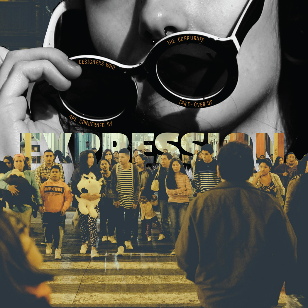
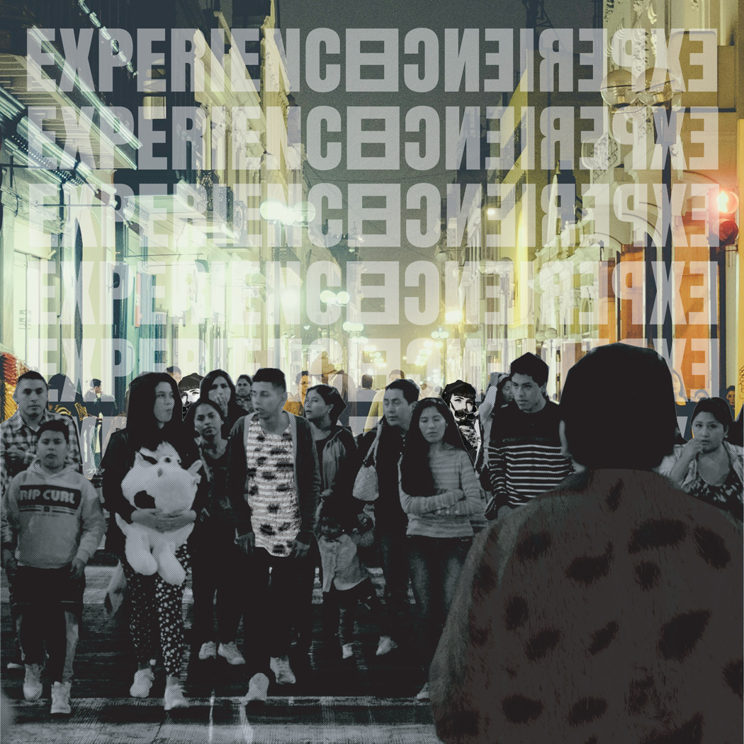
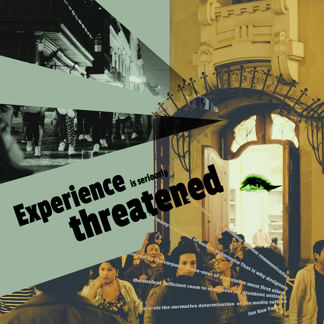
Jan Van Toorn argues that mass communication reduces human experiences by pushing standardized, corporate storytelling. His appeal for designers to adopt a dissident mentality emphasizes the importance of resisting media culture’s normative guidelines. To simplify, the many-sidedness of human experience refers to the diversity of perspectives, emotions, and cultural manifestations that define individual and collective identities. This variety, however, is at risk by the common denominator of mass communication, which simplifies and standardizes information for larger consumption, frequently losing depth and nuance. A dissident design mindset indicates an active challenge, creating work that challenges expectations, critically engages audiences, and provides alternate perspectives. My projects allowed the audience to view their perspective on culture. I allowed the letters to engage issues. I investigate these issues by varying how images and text interact across six artboards. The same two photos and text evolve according to their arrangement, scale, fragmentation, and layering, shifting meaning each time. My work references van Toorn’s task of creating room for critical engagement with media culture by interrupting readability, distorting structure, or emphasizing issues. The use of terms like “EXPERIENCE CULTURE” and “MASS COMMUNICATION” in various permutations exemplifies how language in media is frequently repeated to reinforce specific narratives. By breaking, twisting, or rearranging these words, I demonstrate how meaning alters depending on the presentation. These two are examples of the significance that can bring the text into something meaningful/significant to the viewers.
https://uncg-my.sharepoint.com/:f:/r/personal/r_riley_uncg_edu/Documents/_Rachele%20Riley/teaching/S25/ART%20341%E2%80%9302/Cindy%20Ortiz/week%206?csf=1&web=1&e=aZ6xsE
I think your approach in art board 2 is nice. The color shift effect you have on the text in the background mixes well with the overall color scheme while adding a nice contrast.
Dear Cindy,
Your take on Jan Van Toorn’s argument is quite refreshing. It was interesting how you connected “dissident mentality” to challenging standardized media. Your project is a great example of this, as it uses both image and text variations to encourage critical engagement. The way you manipulate terms like “experience culture” and “mass communication” shows how meaning shifts depending on presentation.
When I read Jan van Toorn’s words, I think about how mass communication tends to simplify human experiences, reducing them to a common denominator that’s easy to digest. This reminds me of how media often strips away complexity in favor of broad appeal, leaving little room for alternative perspectives. The phrase “dissident attitude” stands out to me because it suggests resisting this norm—pushing back against the way media dictates meaning. I’m also drawn to “vis-à-vis the normative determination of media culture” because it makes me think about how designers engage with these norms—whether they follow, question, or challenge them.
For my studio project, I’m focusing on the contrasting attitudes toward LGBTQ rights, using two photos that capture the divide. One depicts a group protesting against gay people, while the other shows a lesbian couple holding up their marriage certificate after the passage of the same-sex marriage bill. My theme is both hatred and triumph. The text I’ve used is intentional—both succinct, to keep attention on the story being told, and visually integral to the work itself. I took the main quote and distilled it into the phrase “the human experience,” as it reflects both ends of the spectrum of attitudes toward LGBTQ individuals. This framing influences my storyboards, some of which emphasize the humanity of LGBTQ people. Depending on how I arrange the text and imagery, the work could lean more toward the theme of hatred—such as my third storyboard, which primarily features protest imagery—or highlight the triumph of the gay community, shown in my 3rd pdf.
Link to my project so far:
https://uncg-my.sharepoint.com/:f:/g/personal/r_riley_uncg_edu/EpYb3BVRVGNPv-iH9d7Ki2EB-2lELmcKCTV9wp31M8WTRw?e=MfqKA7
I really like the second and fourth compositions! The fourth one is simple but pleasing to look at, but I think the second one is the best. The one thing I think could be improved about it is the replacing the “shaking” effect you put on the protestors image with something else. Maybe I’m just chronically online but I only see that effect used in memes usually, so for me personally it’s a little distracting and disrupts the feel of the piece a bit. But I don’t know if others would agree or if that’s just me. I also think you could try making the protestors image black and white, adding more contrast between the two images and also helping get across your message of joy vs. hatred.
Hey Eva, I enjoy seeing your final results for the project. The way you used typography was interesting; the images you picked definitely go well with the text. The way you arrange these elements to shift emphasis—whether toward protest or celebration—demonstrates a keen awareness of visual storytelling. After all, you did a great job!
Initially when I started looking for archival images I was interested in the idea of beauty. I chose images that related to physical, human beauty as well as natural and man made beauty. I have a strong interest in architecture so I chose images of a building built in the international style which emphasizes minimalism and functionality. I liked how the image showed its interaction with the natural beauty around it. Another interest of mine is silent films so I chose a picture from a late 1920s promotional shoot for the films of Mack Sennett, a silent film director of the era. I thought that the quote by Jan van Toorn went well with these images of beauty because both of them incorporate design, expression, and ideas that were at one time challenging the norm. Both the architecture and the glamour shots are from various time periods during the 20th century and looking back on them it’s so clear to see the evolution of design and to imagine the resistance to the mainstream since then. I chose specific words or parts of the quote that stood out to me and emphasized them in several of my compositions as well as repeating the entire thing over and over again.
Hi Isabella! I thought your work did a great job of displaying two different forms of beauty. I think it’s interesting to look at it as a comparison of an almost artificial beauty represented by the woman (in all of her dress and makeup) and “natural” beauty represented by the environment. As for your designs, I especially love the piece that included that newspaper texture being revealed through the photos! Great work here.
What I think about when reading these words first starting with many- sidedness of human experience is simply the vastness of life around the world. The vastness of experiences that many of us share or do not share. When looking up these words the meaning is the more complex human identity. These include emotions, thoughts, experiences, etc. Common denominator in the context of the reading is essentially a shared experience or a shared experience. Looking up the meaning common denominator is exactly that, it is a feature that is shared. Mass communication to me in this reading is how we can communicate with the world. Unlimited sources of communication, looking these words up it is the mass sharing of thoughts with a large amount of people. Dissident attitude means a disagreeing approach or rebellion. Vis-à-vis means in relation to or relating to.
My themes were memory and loneliness, in my project I wanted to highlight how these themes go hand in hand. And can visually look alike, I wanted this somewhat haunting feeling of the memory aspect of the work. I believe the different approaches in these artboards shift these two topics into one. As well as how visually different these ideas can seem. As each piece has similar but also dissimilar visual aspects, other than the images themselves, in the work. I think some of my approaches seem darker in tone than others. To me is interesting to see how using two of the same images can look vastly different.
https://uncg-my.sharepoint.com/:b:/r/personal/r_riley_uncg_edu/Documents/_Rachele%20Riley/teaching/S25/ART%20341%E2%80%9302/Sarah%20Hines/week%206/Week%206%20artboards.pdf?csf=1&web=1&e=mndose
I enjoyed your approach to art board 3. Even though you left the text in shadow, which obscures in a bit, I feel it matches your intended theme. Its almost like the text is a reminder in the back of the viewers mind?
Hi Sarah!
Your artboards were absolutely stunning and I love how vastly different they all were. The fifth artboard is by far my favorite, the use of depth and layers was so effective. It creates a hypnotic effect, and I liked how you incorporated the text into the black lines.
https://uncg-my.sharepoint.com/:f:/g/personal/r_riley_uncg_edu/EoyP3Z93kO1GlivGahNg_x0BiUxSXlBDc0qfroMkk99ZrQ?e=pAiQz8
My theme is cultural fragmentation and its opposite, unity. I am expressing themes of togetherness and division. Utilizing an accented neutral color scheme, I experimented with various shades of gray, black, and red. For my first image, I simply traced and cut out a clipping mask of kids holding out their fingers, making a star (representing unity). For my second image (hands reaching out) I used the image trace feature to make the image black and white.
For the typeface, I experimented with: normal, bold, and combination. I used the fonts Ebrima for most of my pieces and Cascadia Mono Artboards 5 & 6. Below, I’ll briefly describe each. They can be grouped from Artboards 1-3 and Artboards 4-6. Artboards 1-3 utilizes two sets of hands (star and reaching out). Artboards 4-6 use the star hands.
1: Black and white hands stagger against a dark gray background. The star pattern is slightly visible and the full quote staggers in the negative space in red.
2: Verbatim for 1 except the background is lighter and the words are a dark burgundy.
3: Verbatim for 2 except the background is a slightly lighter gray and the text is bold.
4: The star shaped fingers are white against a mid-gray background. Some text follows the star-shapes path.
5: The hands vary in opacity; the star is dark gray and the background is very dark gray. Red text is arranged in a spiral pattern.
6: The background is the same as in 5, but red words that say “vis-a-vis” are repeated 5 times and lower in opacity the lower it goes.
I’d say across my artboards, the theme almost becomes more dangerous and threatening because of the bright red against the dark gray.
Hey Autumn! I love your designs and in particular I really like how you slowly move to a realm of abstraction through each composition. It almost feels like each composition becomes more and more of a remnant of the prior one and I really enjoy the shift of use of color on top of use of detail throughout each composition! Great work!
Hi Autumn!
You definitely nailed the theme of unity! I enjoyed the repetition throughout the pieces, and how the color of the texts gradually becomes bolder. I also love how you formatted the text into the spaces between the hands and then through the fingers! I would be curious to see how it would look if you were to make a fan effect in one of your pieces, to create an even deeper layered effect.
Hey Autumn,
I really liked your first design the most out of all of them. I liked the color palette you used. really like how you used different shades of gray and red to show the contrast between unity and division. The way the text follows the shapes of the hands makes your art feel connected.
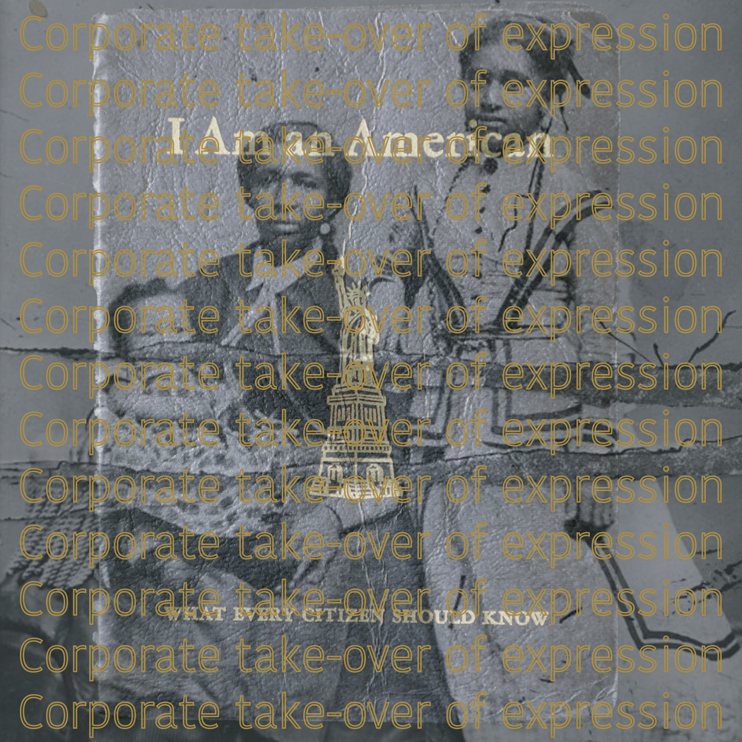
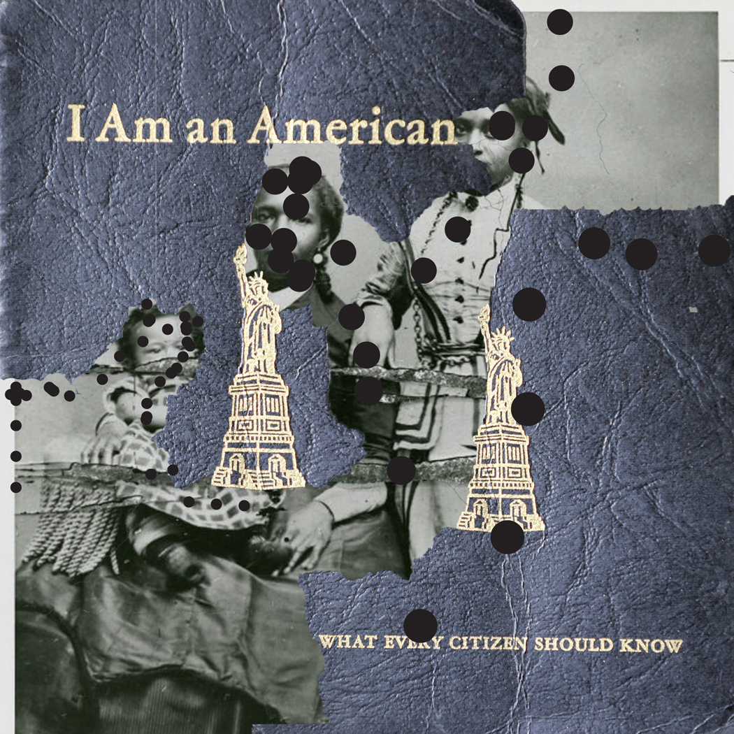
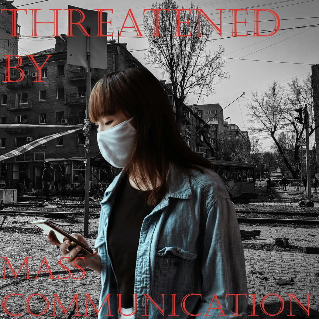
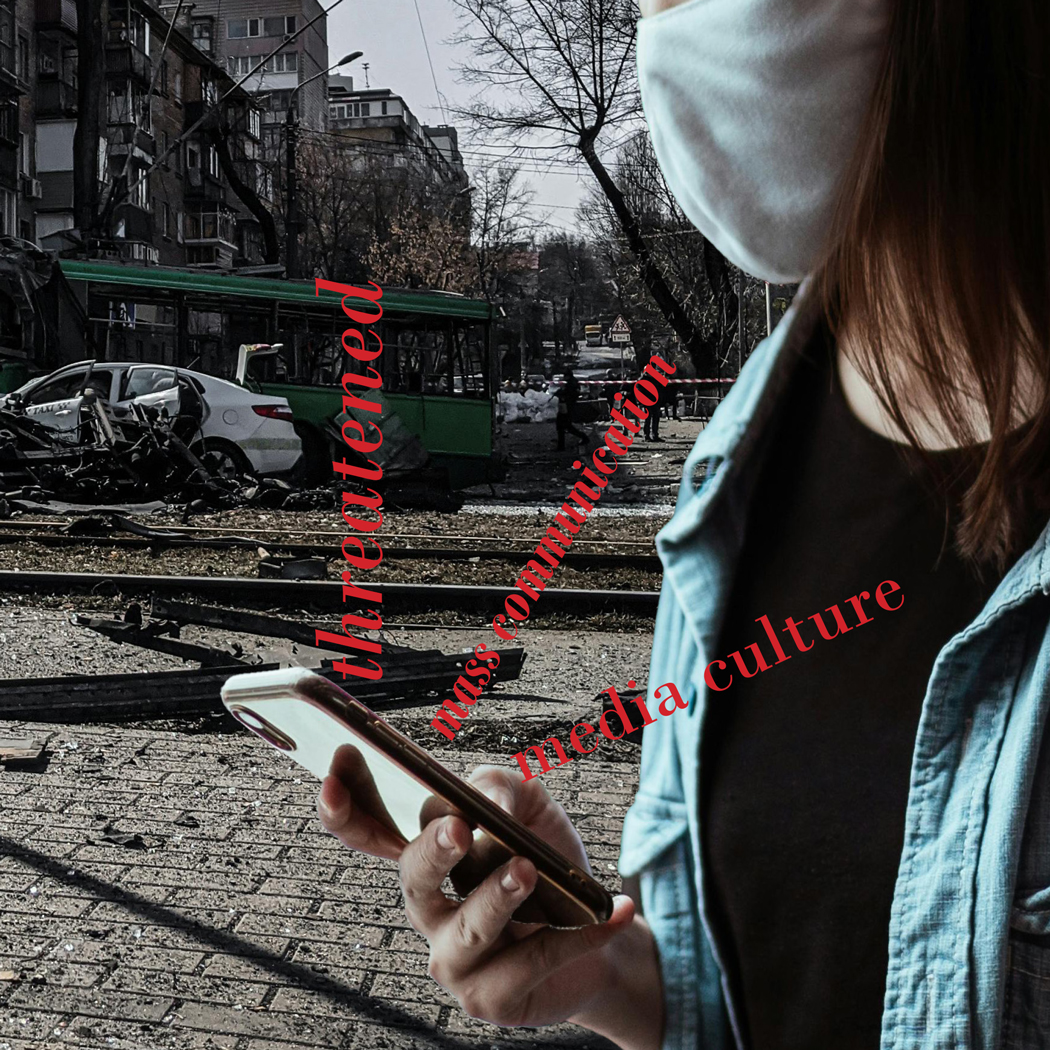
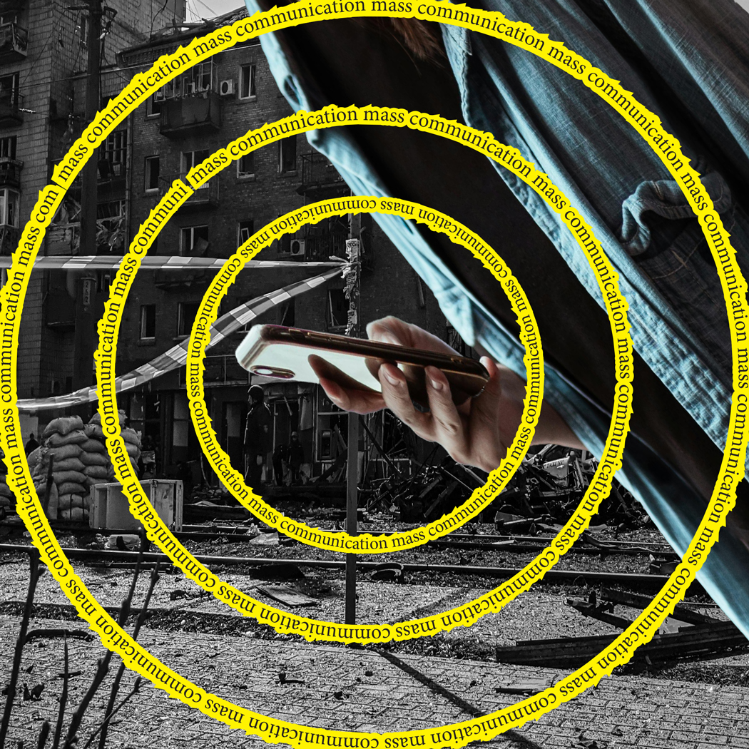
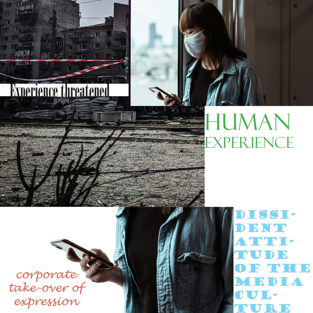
My studio project explores the tension between corporate influence and human experience. It uses repeated imagery and text to convey shifting meanings. The photos I chose were of striking skyscrapers to represent corporate consumption, and the other is a black and white photo that shows artistic expression and joy. My project compares historical black-and-white photographs with contemporary corporate aesthetics, creating a dialogue on expression and media control. My work critiques the corporate takeover of artistic and cultural spaces. One artboard displays the phrase “corporate takeover,” emphasizing the intrusion of capitalist structures on human creativity. Meanwhile, “vis-à-vis,” meaning “in relation to” or “face-to-face,” suggests a direct confrontation between corporate power and individual expression. The repetition of these elements highlights the tension between these forces. My manipulation of the same two images across six different compositions alters their meaning. The circular frame and reflective distortions show surveillance or corporate oversight. In others, the layering of text over images creates a sense of suffocation, reinforcing the idea of restricted creative space. Overall, my project critiques the uniformity of creative culture under corporate dominance, urging designers to resist and carve out spaces for authentic expression while media is becoming more and more influenced, just like the quote implied.
.
.
.
https://uncg-my.sharepoint.com/:f:/g/personal/r_riley_uncg_edu/EqxBSdcKc2hIrcT_hBvcDBoB-y-1ZPGWaIfxZvRP4-YXnA?e=vxuUcW
I really like your concept! My favorite composition is the fifth one. I think it’s the most detailed and interesting to look at, and I really like the repetitive text. The one thing you might want to change is that the figure in the middle looks a bit stretched compared to the original image, which I assume was unintentional.
Hi Taylor! I really liked your 1st and 2nd artboards. And the topic that you wanted to explore with this project. With this 1st composition your eye goes straight to the artist and at least for me it takes a second to acknowledge the buildings in the back, the corporate aspect. Your second one is really interesting to look,I really like the way the buildings are edited!
My studio project took the form of two images that relate to the human experience of time. I took a picture of a clock in a downtown area setting and contrasted that with an image of a casket. My theme was one of being content with the life you have lived and time you’ve spent on earth versus having regrets about the life you have lived and worried about the end of life. The meaning of these two images change throughout my various compositions because of how I contrast them or because of the words that I include alongside the imagery. Some of my compositions show a more defeated feeling of having lived ones life while others are more on the line and could lean either way. Most of my compositions definitely work to showcase a reflection of life and the difference human emotions that people could feel based on that life. I think that a lot of the compositions bring into question the use of time as I make the clock a primary focal point in many of my compositions even if it does take different forms each time. I included several phrases formed from the Jan van Toorn quote above that I thought accompanied the imagery well or helped to continue heighten a contrast.
Link to my week 6 one drive:
https://uncgmy.sharepoint.com/:f:/g/personal/r_riley_uncg_edu/EmX59sE1qF1Pst4q7V-2ECABs5f4ALxurcO_8yRSqwxP-Q?e=ce0zh7
Hey Hayden,
The theme of time is such a cool concept in the sense that a casket and a clock differ so much but still share pretty intense similarities.
For my studio project I focused on the idea of how mass communication has changed the way we work in society, with many of us now able to work from home due to advanced technologies and great technological communication. I couldn’t quite decide on two photos to use so stuck with one main photo representing ‘working from home’ and altered the other photo I used between a selection I had. Some of those images included a group of people working together in an office, one of people commuting to work and one of a busy city. The main thing that I took from the text is how mass communication is changing the way we work and so I very simply wanted to resemble that. I played with opacities and clipping masks as well as drop shadows. In one of the images I used there were shadows and so I made the drop shadows on the text match in order to help it fit in much more smoothly. I think in some, due to the way I have structured it the woman working from home looks like she is lonely, isolated and missing out on the in person work, while in others she looks empowered and comfortable working in her own environment.
https://uncg-my.sharepoint.com/:b:/r/personal/r_riley_uncg_edu/Documents/_Rachele%20Riley/teaching/S25/ART%20341%E2%80%9301/Hannah%20Hind/Week%206/Typographics%20Week%206.pdf?csf=1&web=1&e=hSWE1j
– I have uploaded my PDF but even though the package button was there on illustrator I wasn’t able to press it, it wasn’t an option.
So for my work, my studio project focuses on queer visibility vs. queer erasure, specifically looking at counterculture in the 1970s and 1980s. I chose this theme because, as an african american queer man, I recognize both the progress we’ve made and the struggles that still exist. The past wasn’t just full of rainbows and celebration. It was full of pain and protest- people fighting just to be seen. So, I want to based my project off of that. Queer people still face censorship, violence, and discrimination. But also in contrast, we also continue to exist despite the hardships we have faced.
I used two images of a drag queen showcasing her beautiful character to the camera. For the contrast, I used a photo of a police officer detaining and handcuffing a man of the community. I want to express a sort of sad truth that’s bittersweet. I came up with the quote “Invisible scars whisper beneath radiant rainbow facades.” That ties everything together. It reflects how even in the most visible, colorful celebrated queer spaces, there is still deep pain and trauma from years of oppression and discrimination. I showcased that through my artboards. One design is the drag queen fading into a rainbow. The police officer and the detained man are outside of the rainbow clear as day. Another design I did was a half-crack split of the queen (who has been distorted) and the man, who is in a chaotic, zig-zag like shape. I want people to look at my work and think, not just about how far we’ve come as a community, but about what still lingers underneath.
For my studio project the theme I am going for is Phone awareness. I wanted to show the positive ways we use phones and the negative way phones can affect us. The photo with the guy in an office holding two phones shows him responding to calls from people who need help during a hurricane. For the other photo it shows the inside of a cyberattack investigation. So in order to show which photo was the negative one I tried to mostly put it in as the background or in black and grey. That way the photo of the guy helping can stand out more. Although the theme stays the same throughout all 6 artboards, I tried my best to make them look different from one another. I wanted them to have the same meaning behind them but in different ways, so in one artboard I would use sharp corners but in another one I used round corners. They all have a purpose as to why I did it and in the end they still have the same meaning. During the process of making the designs I really wanted to express the idea that cyber investigation is dark and that the guy helping during a disaster is bright. It wasn’t really difficult to portray that since they both already came in those colors. But even so, whenever I had the opportunity, I tried to add some black and white color.
https://uncg-my.sharepoint.com/shared?id=%2Fpersonal%2Fr%5Friley%5Funcg%5Fedu%2FDocuments%2F%5FRachele%20Riley%2Fteaching%2FS25%2FART%20341%E2%80%9302%2FXimena%20Perez%2DChavarria%2FWeek%206&listurl=%2Fpersonal%2Fr%5Friley%5Funcg%5Fedu%2FDocuments
Oooh this is really nice- I really like the second one as the blue adds a feeling of nautical submersion. I didn’t pick up on your theme at first (I knew it had to do with communication of course) Bu through your explanation I can tell you put a lot of thought into expressing and developing your ideas.
Ximena, I enjoyed winning your project. The way you used different backgrounds caught my attention, especially the blue one. You also did a good job picking typography. I also appreciate how you’ve kept the theme consistent across all six artboards while ensuring that each one remains visually distinct. The variation in design choices, like using sharp versus round corners, adds depth to your project and reinforces the idea that the same message can be communicated in multiple ways. Overall, all good job!
The theme that I chose to express was that of communication via texting vs. communication face-to-face (or vis-a-vis). I wanted to make my artboards express the inauthenticity of texting and how it in a way threatens intimate, genuine communication because of its ability to allow people to put on personas. Because of this, many people now find texting to be a preferable form of communication, reducing the amount of time live communication takes in a day. In my artboards, I wanted to experiment with color, contrast, and composition to create feelings of confusion, sadness, disconnect, and even fear, which I believe I accomplished. Though the message stays intact throughout them, I believe that the tone changes dramatically, as would the reception by viewers. For example, my first artboard uses a lot of blues to indicate the sadness of this disconnect of communication, whereas my 5th artboard primarily uses reds to indicate frustration regarding this inauthenticity. I wanted to try different approaches with each piece, using different color gradients, different forms of composition, and multiple different filters. In particular, I love the way my third artboard turned out. I feel like it captures the feeling of uncertainty and lack of true identity that excess texting can cause.
https://uncg-my.sharepoint.com/:f:/r/personal/r_riley_uncg_edu/Documents/_Rachele%20Riley/teaching/S25/ART%20341%E2%80%9301/Callie%20Roberts/Week%206?csf=1&web=1&e=d63Gk7
Discussion:
Reading this quote, I think about how the human experience is very complex and personal, but it’s something we’re all experiencing. I think about “many-sidedness” explaining this and how each person’s experience and perspective is different. The mainstream media and mass communication reduce everything down to a simple message. This drowns out individual voices and other perspectives. The media usually tends to favor what’s largely appealing versus what things are different and includes individuality. A “dissident attitude” suggests resisting the norm and thinking differently, even when the media pushes sameness. Van Toorn warns the creators about how often corporations control what is seen and valued. Vis-a-vis means “compared with” and he’s saying this resistance should be responding to the media’s culture of specific influences. Overall, this quote is about protecting our creativity in a world that tries to keep everything the same. Especially in today’s society, it’s so important because we depend on social media and technology very heavily. Our minds are constantly being influenced by ads and companies that want to keep us in a box. Toorn is challenging the creatives to find ways to push back and make sure that the human experience stays diverse and unique.
Studio:
My project consists of six artboards that alternate between two photos I’ve chosen. The first image is children playing outside a neighborhood in the 1960s and the second image is a child being consumed by their phone screen. I decided to compare these two images because one highlights outdoor play, social interaction, and physical activity, while the other reflects how modern technology absorbs younger children. My theme revolves around the transformation of childhood through media and technology. I wanted to visually critique how technology potentially limits diverse and real-world experiences. The modern photo expresses the loss of unstructured play and suggests the loss of real-world connections – not just through mass media. The first artboard gives a sense of “remembering” how things used to be, as the black and white photo shines through as the “lit up” phone screen. The second artboard gives a broad outlook on the quote as a whole, so I tried to simplify the photo to bring importance to the quote. The third artboard emphasizes the kids tossing a ball in the yard, being compared to the phone screen, with only the word experience to show. I chose the word experience to highlight the importance of living in the moment, through social interactions. The fourth photo imitates a glitch that is often paired as a symbol of technology. The words are important here because we don’t know the effects of mass communication. The fifth artboard uses the whole scene to paint the picture of the human experience with the phone screen lingering in the background because society went from neighborhood play to being on our phones 24/7. Last, but not least the sixth artboard specifically had these words because my generation knows them all too well.
https://uncg-my.sharepoint.com/personal/r_riley_uncg_edu/_layouts/15/onedrive.aspx?ga=1&id=%2Fpersonal%2Fr%5Friley%5Funcg%5Fedu%2FDocuments%2F%5FRachele%20Riley%2Fteaching%2FS25%2FART%20341–02%2FChristina%20Kibler%2FWeek%206%2FWeek6Studio%2Epdf&parent=%2Fpersonal%2Fr%5Friley%5Funcg%5Fedu%2FDocuments%2F%5FRachele%20Riley%2Fteaching%2FS25%2FART%20341–02%2FChristina%20Kibler%2FWeek%206
To me, “Many-sidedness” suggests the complexity of the Human experience as a whole. There are many perspectives, layers, and interpretations of our lives. When thinking about it the phrase focuses on how we as students, individuals, and people encounter a wide variety of experiences, emotions, and ideas that make up an existence. with a “Common Denominator” being something we all share, The “common denominator” refers to different things or groups, often simplifying what is diverse in comparison to what AI and corporations hands are doing to art. In the context of the text, it points to mass communication as a single experience. This can be seen in how media like social media, news, and ads often cater to the widest possible audience, creating less diverse viewpoints on these experiences. I begin experimenting with the idea of technology in natural spaces in relation to the corporate take-over of art. As I struggled to find images that could express a topic I designated with, I ended up moving forward with the idea of repetition and blunt almost confusing imagery to grapple with the idea of art and these experiences having less value, meaning, and context. My art boards get more detailed in certain ways when looking t how readable the text is as I begin to let go of achieving a perfect composition and focused instead fully on creating the feeling with visuals and nuances. I struggled and do not fully agree with my images, however I am satisfied with them.
https://uncg-my.sharepoint.com/:b:/r/personal/r_riley_uncg_edu/Documents/_Rachele%20Riley/teaching/S25/ART%20341%E2%80%9302/Jackson%20Highshaw/Wekk%206/week%206.pdf?csf=1&web=1&e=Ocw12M
Hey Jackson I really enjoyed the way you made the font and the passage the forefront of your work. It worked really well with the office photo capturing that subtle dystopian feel. I would love to see more of the second picture as well.
What do I think about Jan van Toorn’s words? I think his message emphasizes mass communication and corporate interests threatens human experience diversity by it’s standardization. My studio project’s theme can range along the lines of contrast, emotion, fullness, isolation, and more. I wanted to express the idea of emotional dynamics and how two emotions are able to share similarities despite having stark differences. If I were to choose one word for a title for a theme, it would be contrast. Contrast terms of color and saturation, variation, emotion, etc. I enjoy this art term in particular. It provides an opportunity for expression and allows a wide range of expimenting and playing around with images and design. The theme for my collage could also send a message of how fast human emotions can change depending of circumstances. An example being in my picture isolation and crowdedness. There is proof of some animals species who are proven happier in pairs, packs, etc. than compared to being isolated and alone. I put this logic into humans. A specific example being how isolation is capable of declining and ultimately resulting in little interaction. This in comparison with groups of friends and family is the opposite and can stimulate the brain positively.
In my work I am contrasting the difference between industrial versus rural life. The differences between lifestyles and how different the environments could be. Among my compositions, my favorite compositions include a family sitting on their porch on their farm. I was not able to package my project which is the second week this has happened. I have no idea why it won’t let me, and I have been trying to fix it. The background image is in the city where there are more buildings, people, etc. I used Photoshop to mask out the family and then bring them back into Illustrator. I grabbed the words “culture”, and “designers” from Jan van Toorn. These words help bring my story to life. Out of all the words that Toorn wrote, “vis-à-vis” means “face-to-face”. This could mean that things that are face-to-face with each other, can be easily compared and contrasted. This makes sense as to why we are creating compositions with contrasting images. In full honesty the other words are confusing to me. Even after looking the words up I could not understand fully what they mean. I hope others were able to understand so I can learn more about the meaning of the writing. Dissident attitude is defined as a person who publicly disagrees with and criticizes their government. This may be in reference to our culture, rules, and how we see certain things. This topic is very broad, and I wish I could narrow it down more.
https://uncg-my.sharepoint.com/my?id=%2Fpersonal%2Fr%5Friley%5Funcg%5Fedu%2FDocuments%2F%5FRachele%20Riley%2Fteaching%2FS25%2FART%20341%E2%80%9302%2FAlex%20Gentry%2FWeek%2DSix&listurl=%2Fpersonal%2Fr%5Friley%5Funcg%5Fedu%2FDocuments&remoteItem=%7B%22mp%22%3A%7B%22webAbsoluteUrl%22%3A%22https%3A%2F%2Funcg%2Dmy%2Esharepoint%2Ecom%2Fpersonal%2Fwagentry%5Funcg%5Fedu%22%2C%22listFullUrl%22%3A%22https%3A%2F%2Funcg%2Dmy%2Esharepoint%2Ecom%2Fpersonal%2Fwagentry%5Funcg%5Fedu%2FDocuments%22%2C%22rootFolder%22%3A%22%2Fpersonal%2Fwagentry%5Funcg%5Fedu%2FDocuments%2FART%20341%E2%80%9302%22%7D%2C%22rsi%22%3A%7B%22listFullUrl%22%3A%22https%3A%2F%2Funcg%2Dmy%2Esharepoint%2Ecom%2Fpersonal%2Fr%5Friley%5Funcg%5Fedu%2FDocuments%22%2C%22rootFolder%22%3A%22%2Fpersonal%2Fr%5Friley%5Funcg%5Fedu%2FDocuments%2F%5FRachele%20Riley%2Fteaching%2FS25%2FART%20341%E2%80%9302%2FAlex%20Gentry%2FWeek%2DSix%22%2C%22webAbsoluteUrl%22%3A%22https%3A%2F%2Funcg%2Dmy%2Esharepoint%2Ecom%2Fpersonal%2Fr%5Friley%5Funcg%5Fedu%22%7D%7D
I really enjoy this and would describe it as simple yet effective. The urban star-shaped cutouts against the sepia-toned background is unified by the text. I enjoy the typeface as it is reminiscent of a typewriter or retro font – bridhing the gap between rural life and the evolving modern world.
I liked seeing your dartboards and hopefully the packaging problem gets resolved. Your topic and it’s effect in your work is very prevalent. I love that you use very rural design elements such as stars and a more rustic font.
WEEK 6
https://uncg-my.sharepoint.com/:f:/r/personal/r_riley_uncg_edu/Documents/_Rachele%20Riley/teaching/S25/ART%20341%E2%80%9302/Chris%20Pierce/Week%206?csf=1&web=1&e=UjkmAG
My project explores the human experience through the ocean and space, focusing on how both represent the unknown in different ways. The ocean feels deep, emotional, and unpredictable, while space is vast, isolating, and full of mystery. I chose images of an astronaut floating in space and a surfer out in the middle of the ocean to show how, even in totally different environments, people face similar feelings of fear, curiosity, and the need to adapt to the unknown.
Across my artboards, the meaning of these images shifts depending on how they are arranged. In some, the astronaut and surfer may seem lost and overwhelmed, emphasizing isolation. In others, they may appear more at peace, embracing the vastness around them. The way they are framed and positioned changes the emotion behind them, making the unknown feel either intimidating or full of possibility. Through these variations, my project explores how we experience the unknown, whether drifting in space or caught in the middle of the ocean. It’s about how we face uncertainty and find meaning in it.
My theme is about mass consumerism and overconsumption, and I went towards a more editorial look, which goes in hand on how marketing and advertising has essentially perfected their ways into convincing us to purchase things. You could take an ordinary object, and with the right advertising, make it so appealing that it convinces people to buy it. We might not need it, but people naturally want things, and will therefore buy it. In most cases, it is to show off their wealth or social standing. A very common example of mass consumerism would be through phones, how there is a constant rise and demand to have the newest phone. Apple is a great example in this case, as their products and their media advertising have largely contributed to creating a consumerist culture and tech overconsumption. By releasing new iPhones every year, it’s almost as though it’s become a race as to who can upgrade to the newest phone, despite their current phone already being in perfect condition. Thus, in my studio project, I aspired to portray these ideas by using an image of iPhones and an image of a pile of old phones. I primarily used filters and effects to create the artboards, and tried using different formatting and layouts. My favorite would be the second one, as I wanted to create a pixelated effect onto the old pile of phones, to create this state of being discarded and forgotten in media, as many of those phones are no longer manufactured. Then, I placed the text around the lines to further distort the image, forcing the viewer to look around the image as a whole. As for the iPhones, I brightened them to present them as more bold and modern.
https://uncg-my.sharepoint.com/:f:/r/personal/r_riley_uncg_edu/Documents/_Rachele%20Riley/teaching/S25/ART%20341%E2%80%9302/Cindy%20Pham/Week%206/ART%20341%20Week%206_Folder?csf=1&web=1&e=qLhGiL
The initial theme I chose was “Cars are a money Pit”. I started off with three separate photos. The first photo showed an image of a newer luxury car with a couple. The second two photos I chose were images of abandoned vehicles. I decided to work with three photos mainly because one of the photos had a smaller resolution of a vehicle. The photo that has a lower resolution had alternative design qualities that I still wanted to work with. Across the artboards the goal was simply to show Comparisions of the rusty old car and newer shiny car. The colors I decided to work with car red, grey, and red simply to emphasis the Idea of age. For the text I played around with different design principles taught in the previous lecture. So far, my favorite text design is the circular radial. For the photos I masked out certain parts in addition to adjusting colors in photoshop. Towards the end of each artboard, I decided to mess with the transparency tool to add a little bit more separation in its texture. In my opinion, the theme did change from its initial idea “Cars are a money pit” to “Cars expire with time”.
https://outlook.office.com/host/377c982d-9686-450e-9a7c-22aeaf1bc162/7211f19f-262a-42eb-a02e-289956491741
In my work these past two weeks, I wanted to touch on topics that are very relevant right now in American politics under Trump’s presidency. I began the process of gathering images from multiple archives and searching for images of a few different marginalized groups that are being targeted right now. I searched for many different images of immigrants, black Americans, other POC, women, and people in the LGBTQIA+ community. I wanted some images that were positive, pictures of families or communities helping one another, pictures of parades and celebrations. I then searched archives for some images that contrasted with the positive images, showing conflict and the struggles these communities have been going through both in the past and now.
The two images I ended up using in my pieces this week were an image of two women celebrating at a pride parade and a picture of an HIV-positive couple laying together on a bed. I chose those two images to show a positive part of being in the LGBTQIA+ community in contrast with an image that shows a period of conflict the community has been through, one that is being heavily discussed now as Trump has attempted to halt funding for a highly influential anti-HIV program.
When I think of many-sidedness of human experience, I think of the different perspectives of experiences that people go through in their personal lives. When I think of the common denominator, in relation to the Jan van Toorn quote, I think of the most common issue that comes up when discussing the mass communication of people. When I think of mass communication, I think of the bigger general way that people communicate with each other. Dissident attitude refers to when someone disagrees with the current state of what is going on and has their own beliefs. Vis-a-vis is when two things are in correlation of each other. In my studio project, I am trying to express the ideas and theme of how people interact with each other in the world and do different activities with each other and how the threat of mass communication can be a common denominator in affecting that. I was able to find pictures from different festivals and outdoor events that has people celebrating them and wanted to figure out a way to exemplify the decay of those experiences through mass communication. I am trying to show how those pictures and memories can wither away and become an aftertohught.
My theme revolves around “Privacy” and how, in today’s world, it seems like nobody truly has privacy anymore. People constantly find themselves being recorded or photographed without their consent. Some real-life examples that made me reflect on this issue include the installation of secret cameras in bathrooms or hotels, celebrities constantly being hounded by paparazzi and fans, parents oversharing intimate photos of their children, and stalkers relentlessly stalking their victims’ social media profiles. The issue also works the other way around, as many people no longer value their own privacy and freely share an overwhelming amount of personal information with the world. This is due to the fear of being left out and wanting to seem “raw and real”, but now people forget the consequences of these actions and how maintaining privacy is better for the health of your own and for others. In my contrasting photos, I aim to visually represent these concerns by blending images together to show the unsettling feeling of privacy being stripped away in front of cameras. I experimented by masking different shapes and colors from the photos. I tried highlighting phrases from the quote like “human experience is seriously threatened by the common denominator of mass communication” which means to me how the normalization of mass communication is becoming a threat to our daily lives. I also emphasized the phrase “concerned by the corporate take-over of expression” the resemble that the problem also stems from those who makes this happen, those who invent this technology knowing its dangers and consequences. I liked to emphasize the meaning of Privacy by pulling out the phrase “sufficient room to maneuver”.
The photo of the paparazzi really reminds me of the “the normative determination of the media culture.” They seem to be in angst to take a photo and their eyes seems to be focused on the quick prize of receiving information from the idols.
Week 6:
https://uncg-my.sharepoint.com/:f:/r/personal/r_riley_uncg_edu/Documents/_Rachele%20Riley/teaching/S25/ART%20341%E2%80%9301/Debora%20Guevara?csf=1&web=1&e=pBf917
Link to my project: https://uncg-my.sharepoint.com/:b:/g/personal/r_riley_uncg_edu/EcJ5aB6rng1Mmk-58CRtyxwBJefHqO5Oz_LaLMs2FNQdJg?e=lbtQVZ