Due end-of-day Sunday. Responses to other people’s posts, due Tuesdays.
Week 7 — Assignment “Image Series”
Project 2 —Combine and Contrast—imaging and typography series, shaping meaning, and developing voice. A series of visual messages that express a position on human experience and media culture. The focus this week is to explore/refine one (1) theme—using the same two images throughout in different ways. Refine designs to produce a final series of three (3) distinct compositions.
1/
Discuss
- After working on your studio project, write a description of your studio project as a comment below (200 words minimum). What is your theme? What ideas are you expressing? What did you refine this week from the work of last week? What new things did you try? Post a link in your post to your folder in the class folder on the drive.
- Reply to two other people’s comments.
2/
Studio:
- Refine your work into a final series of (3) three (artboard/pages) compositions, relating to your selected theme. Using the same two photographic images throughout your series, in different ways. Expand from the six variations you made in Week 6. Use Indesign or Illustrator; artboard size is 7 x 7 inch file (at 300 dpi).
- Use this text (at least one comp must use the full text, the others can use parts of the texts):
The many-sidedness of human experience is seriously threatened by the common denominator of mass communication. That is why designers who are concerned by the corporate take-over of expression must first allow themselves sufficient room to maneuver for a dissident attitude vis-à-vis the normative determination of the media culture. — Jan van Toorn
- Continue to explore:
Explore making choices for the images (cropping, extracting, changing color(s), repeating, changing scale and proportions, layering, juxtaposing, fusing, framing with different shapes, other graphics, etc.)
Explore making choices for the text (selecting different typefaces, different type settings (point size, leading, spacing, all caps, lowercase, bold, italic, different hue/color modes)).
Explore different systems (radial, axial, dilatational, transitional, grid, modular, random, bilateral). -
Package your design files from InDesign or Illustrator. Make a PDF. Upload the entire packaged folders for your design files, plus PDFs or PNGs, to the drive.
Links:
Editorial Design PGDA
Magazines Letterform Archive
Magazines/Periodicals FontsInUse
Jan Van Toorn
Optimizing/Reducing size of a PDF
Adjustment brush tool in Photoshop
When looking at my 6 I had worked on in week 6 I wanted to refine my concepts, my theme was exploring the idea of fitting in with society versus blazing your own path despite what others say. When talking with the professor, she mentioned playing with more color, using more of the quote, and trying to move outside of my comfort zone. I completely recolored one of the pieces, using the colors of the trans flag. In such hard times I want to make sure that my own existence is seen, and not erased. The quote itself is something I connect to, but had a hard time dissecting. With one of my pieces I played around with black out poetry to fit my own narrative, I tend to dislike quoting large amounts of text due to how strenuous it is to fit into the page, but I believe simple is often best, so I have a simple background to work with the whole quote. My final piece I wanted to play around with the “mass communication” phrase, something that is being heavily scrutinized and dampened in todays society, making it harder and harder to organize, and I wanted to bring that into the piece.
Word count: 205
Hello Lucio,
Both the message and the design of your project is wonderful! I love the way used the colors of the trans flag alongside the blackout poetry.
Hi Lucio,
I liked how relatable your concept is. I saw your project and I really like how your 2nd design relates to the situation of the current world.
Hey Lucio, I think it’s so amazing that you had a work that hit so close to home. I also had a hard time with the entire text but I think you did really well with it.
What is your theme?
My theme for all of my designs is still Freedom and what it took to gain it. Elaborating just a bit, the ideas of being free in society or being free from society.
What ideas are you expressing?
The main ideas I’m really expressing with these 3 designs is that being able to live freely in society was a very long and repetitive process that took a long amount of time to achieve.
What did you refine this week from the work of last week?
A lot of what I refined this week were the overall ideas and messages I was portraying through the images as well as the unity amongst the edited photos. My work from last week didnt seem to stick together as much as I wanted it to do so this week I simplified the overall ideas and made it so everything in the composition fit together and didn’t really stand out. To achieve this it required me to do a lot more cropping, editing, color matching, color changing, and transforming of the texts and images.
What new things did you try?
The new things I tried this week consisted of more 3d elements, working with more layers, adjusting different levels of opacity, playing with as well as breaking the rule of thirds, and making things pop at the viewer a little more.
https://uncg-my.sharepoint.com/:f:/g/personal/r_riley_uncg_edu/EsheKWDrldFNruPj7qd_KZgBpIceagQ2ibmRIlE_gIz7tg?e=h5ZMnF
I really like your compositions! I’m drawn most to the second one – it’s simple but really nice to look at. I also like the 3D elements of the first composition.
Hey Jon, I think your pieces covey the freedom that Dr. King sought after. The use of text is bold, strong, and stable. It adds to the persistence of those who fought for racial equality.
Hey Jon, I understand what you mean when it comes to trying to find compositions that give a good sense of unity with the message. I found myself attempting to do the same thing!
As I mentioned last week, I chose two dance photos from The New York Times archives. One photo is a more traditional dance photo of two ballerinas, and the other is a candid photo of what looks to be a contemporary/modern dance style. My theme was the contrast between elegance/harmony and drama/conflict within the dance context. Dance is something I have been heavily involved in since I was three years old, so these particular photos and theme sparked my interest when I saw them in the archives. Last week, I was not super satisfied with my final designs; I thought they were somewhat boring to look at and did not communicate my theme as well as I wanted. One thing I really struggled with was the color palate since the photos I chose were black and white. When I added color in other places in the composition, I felt it took away from the focus of the photos. When going back to refine my final three pieces, I wanted to focus on filling negative space and showing the contrast between the fluid movement in the ballet photo and the ridgid movement of the modern dance photo. In one of my compositions, I have the ballerinas circling around the photo of the modern dancers. I used the circle pattern to communicate fluid vs rigid movement.
https://uncg-my.sharepoint.com/:f:/r/personal/r_riley_uncg_edu/Documents/_Rachele%20Riley/teaching/S25/ART%20341%E2%80%9301/Victoria%20McPherson/Week%207?csf=1&web=1&e=prBP2f
Hey Victoria, I like how your compositions are very balanced and orderly. It speaks to the elegance aspect of your theme. The use of grayscale also emphasizes that drama. You mention how you used patterns in the text and images to create fluidity and rigidity. I think that is a very successful contrast.
Hello Victoria,
I reviewed your work from both the previous weeks to now. I can definitely say this last set shows your talent. You did a wonderful job filling in negative space and enhancing contrast between the photographs. Despite your struggle, you did an amazing job!
Hi Victoria! Your artboards look great and I love how you experimented with different types of repetition! Your second artboard in particular is mesmerizing. I see what you mean by being cautious against color so as to not take away emphasis from the images–in my own works I found it to be kind of overwhelming at times. I do think for your last two pieces, though, it could be interesting to experiment with placing emphasis on a specific word by making that single word in color and leaving the rest of the piece in b/w. Great work here!
Hi Victoria, your analyzing of the quote is really interesting to me. When I first looked at the quote I thought of entirely how I could use it and take it apart, but instead you looked at it as a whole, and that really speaks in your work.
The theme for this project has been essentially how technology forms a rift between people. The idea that at the gain of convenience, we’ve become more isolated than ever through dependency of screen based devices. The original notion was to focus on how romance is affected through the use of photographs that depict couples. However, I feel these three final boards more so address an overall theme of interpersonal relationships being affected and makes a broader statement.
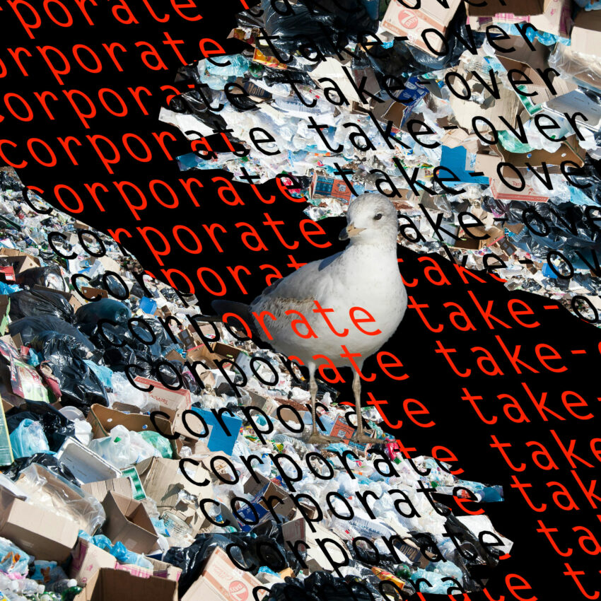
The approach was to select three of the more dramatic images from last round and try to make them more fitting for an editorial image rather than standalone art pieces. I had the idea of making all three images share a graphical continuity through use of ripped paper and tape that appear to be clumsily patching the images together. 2 of the images have direct continuity horizontally if viewed as a traditional two-page spread.
In art board 1 I experimented with conforming the text to the interior of a shape and rotating it. Adjusting the vertical spacing in conjunction with the size of the font allowed for interesting groupings in each subsequent line. I chose to mimic the jagged shapes present in the composition to attempt at maintaining a sense of balance. In art board 2 I chose to commit text to paths in an arc to follow the existing sight lines. In art board 3, I added the phrase corporate takeover in repeating vertical columns. The challenge was find a spacing scheme that looked pleasing in the vertical orientation.
https://uncg-my.sharepoint.com/:f:/g/personal/r_riley_uncg_edu/Eo3joIC5tjtCqDd10VKG-OYBocVcqXKrzNj6isf_CQvW7A?e=cjQVUZ
Hey Zeus! I really enjoy your three compositions and love how different the approaches to getting your idea across are. If I had to pick a favorite composition, I think that the third one would be my favorite from a compositional standpoint, however I think your ways of incorporating text throughout all of your works is really cool! I specifically like the first one with the text as it almost reminds me of a poem layout. Great work!
Hey Zeus! I really enjoy your three compositions and love how different the approaches to getting your idea across are. If I had to pick a favorite composition, I think that the third one would be my favorite from a compositional standpoint, however I think your ways of incorporating text throughout all of your works is really cool! I specifically like the first one with the text as it almost reminds me of a poem layout. Great work!
Hey Zeus!
I love all of your compositions! You have such a great skill for creating this dream-like effect across all your pieces and making them feel cohesive. The last one especially caught my eye- I love how you layered vis-a-vis over the repeating hands. The separation of the words corporate takeover in the background is also such a cool touch.
Thank you for sharing your revised artboards, Zeus. The second one is my favorite because of the way you incorporated the text of the quote as if it was pasted on top. Good job!
Hi Zeus! All of your artboards look incredible, and I especially enjoy the more graphic elements in your second and third compositions. The variety of textures you’ve included is fascinating; in the second piece it adds a lot of visual interest and in the third, it’s subtle enough to add a warmth to the composition. I also enjoy in the last one how the text in the background is not only blurred but appears to be fading out (or in?) from the left. Your first composition also shares these lovely elements, though maybe I would suggest the text not going all the way up to the edge? I feel like it starts to cram the piece. Regardless, this is fantastic work!
I am developing the theme of my project as “Technology invading natural spaces.” I am trying to express the idea of technology growing present and advanced in way that are invasive and threating to natural art and human experiences. With art being made into less dynamic and more abysmal forms of expression limited to marketing and corporations rather then used as a tool to express yourself and the human condition. I am trying to express a vague feeling and idea of contrasting the element of a peaceful natural space being off putting and hard to see with the presence of a workspace and old introductions of computers in the image. I refined my way of working as artist, in terms of allowing myself to add additions of bold colors, overlays, and creative spins on text and frames, and overall editorial elements of my compositions. I also refined my spacing and more technical details of my pieces to be more visually appealing. Some new things I tried, was bringing on some paper overlays I was working with in the past, as well, I also tried some new fonts. I am feeling a lot more confident in the feeling my artboards create.
Hi Jackson!
I really love your second composition with the pink filter. It creates this shifted look that I think adds to the overall feeling of invasiveness you’re showing in your work. Your last piece also looks fantastic- I love how you made the text look like it was printed on paper.
Hello Jackson! I really enjoyed the colors throughout your three artboards. The third artboard is catching my attention especially because of how you blended the two photos together. There’s lots of variety here as well – thank you for sharing. Good job!
For this project I really wanted to do something different from my previous designs. I wanted the designs to be simple but more eye-catching, I wanted to be more content with these new designs. My themes were loneliness and memory using images of a person and a vintage family book. I wanted the idea of a memory or memories still being with this individual. Using different sections of the vintage family book as I did not want the imagery to be too repetitive. When refining the work, I did want some familiarity with the previous artboards which I think is more visible in the first artboard. As a I use a concept from my third artboard from week six into this one. New things I tried were with the composition, colors, abstraction, and more graphics. I wanted this set to be more colorful than my last set. Overall, I enjoy this set of artboards more than my previous one as I kept reminding myself to keep it simple and not overthink the designs. For me I enjoyed this process more than last week.
(Will repost a link to my work as I am trying to get the images to be higher quality)
https://uncg-my.sharepoint.com/:b:/r/personal/r_riley_uncg_edu/Documents/_Rachele%20Riley/teaching/S25/ART%20341%E2%80%9302/Sarah%20Hines/week%207/week%207.pdf?csf=1&web=1&e=mzIPUX
I like how you kept the second art board very simple with the mono color scheme. Makes everything pop out more.
For with this set of images I wanted to focus on representing harmony through circular forms. Initially, for the background, I used these alternating stripes. With the first image I kept them vertical, but I decided to explore more with how I positioned them, so I made them more of a radial pattern for the final two images. This focus on the circle as a form can show unity in a way as it does not have sides and is even throughout. I also wanted to show an implication of a perspective. I accomplished this by overlapping images that had negative spaces inside of their forms. By doing this, one can see through one image to view another image behind it. Scale was also something that help contribute to the perspective. For example, the second image has these star-like shapes that get progressively larger as they make their way from the right to the left of the composition. A similar effect is seen with the last image of the series. I also wanted to incorporate movement through the gazes of the people from the photographs. I usually also incorporated elements that showed where I wanted the viewer to focus on, like the text circle in the first image. I didn’t really have a particular reason for using the star form, but I did want a shape that was looked like it was moving while also looking nice when placed next to others of its kind. In a way, I kind of see them as people. Text was something I struggled with, especially with trying to present a message with it. I don’t think my images truly represent any aspect of the quote.
https://uncg-my.sharepoint.com/:b:/r/personal/r_riley_uncg_edu/Documents/_Rachele%20Riley/teaching/S25/ART%20341%E2%80%9301/Mar%20Alvarado-Escobar/Week%207/mar_image_series.pdf?csf=1&web=1&e=7cMYxD
Hi Mar, your response was interesting to read. Your exploration of harmony through circular forms is well thought out, especially with your shift from vertical stripes to a radial pattern, which enhances the sense of unity. Even if you feel the text doesn’t fully align with a specific message, the visual language you’ve developed still communicates a sense of typography.
Hey Mar, I really enjoyed reading how you refined your elements I think that it really helps to give the viewer an additional add on of information. I really liked your second image and your use of graphics it helped create a fun design that was still nicely cohesive.
https://uncg-my.sharepoint.com/:b:/g/personal/r_riley_uncg_edu/ETtms1yHeetIt8xyt1QE0EcBCYCqqcVy_49r24fwH_D_GA?e=3uzzv8
My project explores themes of unity and division by focusing on the lives of LGBTQ individuals in America and the contrasting beliefs surrounding gay rights. I want to capture the solidarity among LGBTQ people when they face adversity- reminding us that regardless of our experiences, beliefs, or identities, we’re all navigating our own life journeys.
Over the past week, I’ve refined my approach by experimenting with new color schemes and incorporating more graphic and textual elements into my visuals. I even played around with the direction of the text to create a more dynamic overall composition. Throughout this process, I made sure to preserve the quality of the photographs on each art board, so that no detail was lost. I also delved into layering techniques by overlapping signs to create a sense of repetition and add a spatial dimension to the work. A key element was juxtaposing the signage from a gay protest with more hostile posters. I intentionally bolded the colors of the hopeful posters to make them stand out, drawing the viewer’s eye to the tension between messages of love and hate. This contrast not only heightens the visual impact but also deepens the narrative of the piece. I am happy with how my art boards came out, and think I would do this project again using different pictures instead.
I think these compositions are great! I remember I saw your original six, and these are definitely an improvement. I really like the first and third compositions especially. The colors and spacing of the text with the central figure in the first one are really nice to look at. I also like the simpler black and white approach in the third one, and the texture there is nice too.
Hi Ava!! Loving the strong sense of contrast throughout your compositions, looking at your artboards, I love how different all three are, I think you really allowed yourself to explore the theme and how it interacts with the colors, and set up of your compositions. I really enjoy the second artboard the most, I think it not only envelopes the idea of contrasting the beliefs, but also uses graphic elements to further push the themes of unity and division in the way the black and white overlaps each other throughout the font and images. Really good work and I adore how the three of them came out. I believe the third artboard shows a perfect mix of your exploration of bolding and reimagining colors and texts to emphasize themes in one board with with more compositional elements like where viewers eyes getting drawn too further expressing your story. I think these are awesome, kudos to getting playful with such a sharp and complex topic.
PROJECT LINK: https://uncg-my.sharepoint.com/:b:/g/personal/r_riley_uncg_edu/EapeOCyjwEBGu8jQCgzQVZ4BU4DG_vf1DOy0ijpsWg-fzg?e=jxklUS
My compositions revolve around the theme of isolation, and how the existence of the internet has fostered a specific kind of isolation where you can interact with others online without interacting with people in the real world. My original images were one of a lone figure sitting in a dark room in front of a screen, and one of people outside having a picnic.
In one of my original compositions, I cut out the figure and placed them in the picnic scene. I liked that composition, so I refined it into my first new composition. I played with scale and made the figure bigger, and I focused on just a few excerpts of the quote rather than the entire thing, which I had used in all my original compositions. I also played around with colors, adding a blue tint and glow to the picnic scene to make it look like a screen.
In my second new composition, I really tried to simplify things as much as possible. I left the background black and cut out specific parts of the two images, putting them into circles using clipping masks. I also wrapped the text around the main circle to make it a bit more interesting to look at.
In my third and final new composition, I expanded on my fifth original composition, where I had cut out the people having a picnic and a tree and placed them in the dark room of the other image. That composition was very rough, so I wanted to make it a bit more in-depth and really try to blend the two images together. In this new composition, I added the grass, trees, and even one of the people from the picnic image to the dark room, using feathering and layering to try and really combine the two images.
Hey Simon, your work is really interesting, I have to say that your concepts and themes seem really simple, but you make it extremely complex when it comes to your work. You do a really good job with that!
Your third composition is so well done. It feels like a whole new world that you created. I am interested in how you made this. Was Photoshop used?
Forgot to link my project lolhttps://uncg-my.sharepoint.com/:u:/r/personal/r_riley_uncg_edu/Documents/_Rachele%20Riley/teaching/S25/ART%20341%E2%80%9302/Jackson%20Highshaw/Week%207/week%207%20finished%20product/week%207%20JH.ai?csf=1&web=1&e=CE4BJk
My project explores the contrast between euphoria—those fleeting moments of pure joy that we long to relive—and the deep emotions of misery or loneliness. Through this project, I aim to visually capture the tension between these two states, highlighting how they coexist in our memories and experiences. As I navigate this creative process, I am also learning to work with new software. Since I am still in the early stages of understanding its features, this week has been a valuable opportunity to experiment and refine my skills. I want to push myself to explore different tools and techniques, ensuring that my work not only conveys my intended theme but also meets my personal standards of quality. My goal is to create something meaningful pieces that resonate emotionally while also reflecting my growth as an artist. By blending technical experimentation with my conceptual vision, I hope to develop a project that effectively communicates the beauty and pain of nostalgia. Ultimately, this process is about more than just learning software; it’s about using digital tools to bring my ideas to life in a way that feels authentic and visually compelling.
Hi Chris! I appreciate the pictures you chose to capture these states. I think you did a really good job at representing the out of touch spaces we as humans can live in in comparisons to the joys and happy expieriences life is portrayed as sometimes. I love the first artboard the most as I think using that tv static to represent loneliness and our headspace when we feel it is very successful, and can be played with even more. You mention being newer to the software which is totally awesome because you killed it. I think experimenting with overlays and cropping as well as even warping and clipping masks a little more would push the composition even more to capture the feeling of the topic you are wanting. Awesome work!!
This week I had to course-correct a little bit. Since we are still restricted to the two images we’ve been using, I was unable to expand my concept of connection around a central figure or subject as it relates to religion and fandom, especially in regards to the passing of time and progression of technology. Instead, I decided to re-focus around the quote we’ve been using, and made my project more so about how technology and especially those behind the infrastructure sort of police the content seen on them, think about how algorithms are used by CEOs to push down posts that they find unsavory. Plus I think this approach works better with a more graphic design-y juxtaposing of two images, in this case, the mechanical wiring (infrastructure) is restricting the Buddhist temple (human connection around a subject) rather than being fully integrated into it. I’ve also incorporated the text into this, utilizing blending modes to make them more ethereal and mutable in comparison to the more physical aspects of my pieces, and to tie it back into the infrastructure as restrictive theme I have placed it behind the mechanical parts as well. The incorporation of Buddhism and technological communication is also my sort of homage to TV Buddha by Nam June Paik, a piece which is also in reaction to those who own infrastructure and lines of communication limiting the ways people can express themselves. I also finally found out how to export my work as a PDF while maintaining the fonts, turns out you have to export it instead of saving as a PDF, rookie mistake on my part.
https://uncg-my.sharepoint.com/:b:/r/personal/r_riley_uncg_edu/Documents/_Rachele%20Riley/teaching/S25/ART%20341%E2%80%9302/Finn%20Horstman/week%207/typography%20week%207.pdf?csf=1&web=1&e=nweo7f
Hey Finn! I remember that you had discussed your theme when we were in a group together. I still really find your topics to be interesting. And how you relate the two with your description as well as your images is really well put together! I enjoy your new set despite your course-correct, a small critique I have is that the images do look really similar to one another. Would love to see different ideas but I still really like this set you have!
These pieces represent my journey of navigating culture and finding peace within myself. I wanted to visually explore the tension between tradition, individuality, and the overwhelming influence of mass communication. In VIS-À-VIS, the large, distorted typography stretches across the land, symbolizing the struggle of maintaining cultural identity in a world that constantly tries to redefine it. The black-and-white tones contrast with the warm sky, representing the push and pull between past and present. The small group of figures, highlighted in green, is a recurring symbol of resistance—of finding strength in community while searching for my own voice. In Mass Communication & Individuality, I played with the idea of text blending into the landscape, representing how mainstream narratives threaten to erase the complexities of personal experience. The figures remain, standing against that erasure. Dissident Expression brings them even closer, cutting them out in a jagged style that mirrors the feeling of being both a part of and separate from my surroundings. The text layers reflect the complexities of self-expression, especially for artists trying to resist corporate and media-driven norms. Through these works, I’m trying to connect my heritage with my personal journey, exploring what it means to carve out space for my voice in a world that often drowns it out.
https://uncg-my.sharepoint.com/:i:/r/personal/r_riley_uncg_edu/Documents/_Rachele%20Riley/teaching/S25/ART%20341%E2%80%9301/Tre%20Leach/week%207/photo-output.png?csf=1&web=1&e=xZ9WgP
My studio project’s theme had to deal with time and the way that different people work through the concept of time during the course of their lives. The particular contrast I wanted to highlight was the difference of having time left in life versus death (the end of life). I have always found it interesting to get peoples opinions on if they are scared of the end of life or content with the life they have lived. For me personally, I have my own religious beliefs about life and what comes next, however I always enjoy these conversations with people thinking towards the end of a persons life and finding out if there is fear about the end or hope or whatever it the feeling might be. In my 3 refined compositions, my goal was to evoke different feelings that people might have regarding the end of time/life. The things I refined within my first composition is I needed to better position the image within the text to make it a more seamless transition between black and white to color as well as make sure all my edges were covered so that the piece looked fully complete. My second composition required refinement with the sizing of the text and causing the text to have a less uniform feel and create a bumpy feeling when reading the text. I also experimented with adding an additional shadow but didn’t like the look after some thought. My third and final composition from this week took on the most refinement as I wanted to completely rework how to incorporate the full quote. This required nearly a full restart, however I was still able to incorporate a design from one of my compositions from Week 6 into this one and I am really happy with how it turned out.
Link to my Week 7 File in OneDrive:
https://uncgmy.sharepoint.com/:f:/g/personal/r_riley_uncg_edu/EtCQneKCMiVEpnNIFAzuwFIBXCM3tjlRG6Y53ZwQEsXIIA?e=hWGFuZ
Hey Hayden, I find your theme really interesting in exploring religion and incorporating within your art.
Hi Hayden,
Seen your project today in teams. You exploring time and the emotions connected to the end of life is very thought provoking, and it’s great that you’re considering different perspectives on this deep topic
This week I tried to push my approach further by experimenting with text placement and distortion to create more depth and movement. Compared to last week my work is more integrated with the painter’s figure and the contrast between personal creativity and corporate dominance is more stark. I used different black-and-white and color contrasts to emphasize the tension between individuality and systemic control and to make the visual and conceptual impact even stronger. I tried several new techniques. I layered repeated text with different opacity to create movement and accumulation and distorted perspectives to create a tunnel effect that pulls the viewer in. I also used high-contrast black-and-white imagery to make it more dramatic and to make the message more urgent. These make my work more immersive and confrontational and force the viewer to think about how corporate influence restricts creativity and enforces conformity. By using visual rhetoric I want to critique the homogenization of culture and the loss of individual artistic voices. My work is an artistic statement and a call to action for creative autonomy in a world dominated by corporate interests.
.
.
.
https://uncg-my.sharepoint.com/:f:/g/personal/r_riley_uncg_edu/EhKAknhzKqxLsm2MDMIdV3MB6irphE6J_0sxnQDHgKq4nA?e=8OzgGK
For this week we were tasked with refining our artboards from last week and selecting three final artboards. For my refinement I wanted to use different elements of my original six but mostly focus on creating a better final three that were centralized, clear and concise. I chose three of my first six and the themes for theme were based on the environment and the relationship between humans and environment. Some changes I made were that I didn’t rely on the photos composition as much. When looking at others works and my own I felt that I was trying to keep the composition similar to the original photos instead of having the original photos fit into what I wanted to do. The way I changed how I was working was by making a boundary for myself that none of the final photos would have more than one third of the original photos. That restriction helped a lot conceptually because with that constraint I was able to think more about what I wanted from the poster. I also tried to use more tools like blending text and text on a path. It helped a lot to experiment with how I wanted the text to lay on the poster.
Hey Raquel! I really like the way that you integrate text as a part of your environment and use it as either a space of its own or as a way to move the viewers eye around your three compositions. I particularly enjoy your third composition and its abstract nature, however based on your theme I would say that your second composition is the most successful in highlighting the difference between the natural and human made environments. Great job!
Hi Rocky!
I love how intentional and different each artboard was! Especially with the second one, I liked how you took the original photo composition to create a completely different arrangement, and how its symmetrical. The grainy blue texture of the background beautifully blends with the text, and the overall artboard truly represents your theme the most.
Discussion:
My studio project followed the inspiration of my original designs from the previous week. I wanted the theme to remain focused around the repercussions caused by urbanization. Therefore, I found it fitting to make the art boards look overwhelming, superficial, and visually grotesque. The first image I chose from the previous week was one of a cow in a field in Switzerland. In direct contrast, the second photograph was of a crowded urban area. I wanted the images I had chosen to clash against one another to emphasize their division. Since last week, this project definitely has improved. I feel as though my idea is more clearly presented visually through font. I tried to make the designs look like an overcrowded internet browser, with too many tabs open. This is also fitting for the theme, as I wanted the viewer to be visually overstimulated. I do feel as though I had achieved the results I desired in regards to that specific part of the theme. I also tried layering, transforming, arranging and many other techniques. Overall, this project has helped me refine and build upon the foundation from the previous weeks. I can confidently say I now have a stronger understanding of Adobe Illustrator software.
Link:
https://uncg-my.sharepoint.com/:b:/g/personal/r_riley_uncg_edu/EX-BFX3QFr1IjbIes8ZX6OsB5Fbsx0azIxbrkUA7oBZZcA?e=2R1JjO
My studio project focuses on exploring the idea of how mass communication effects the way we work in this modern day. It displays people commuting to work and working together with an image of a woman working at home on her sofa. I played around with opacities as this is something I enjoy exploring in my work. In my first edition of three designs I refined it by making sure the type could be read legibly as there were parts that I think were difficult to read last week. I also added a drop shadow which I think helped to incorporate it into the photo better. I also played around with black and white imagery to emphasise my idea behind the composition. For the second edition I worked with the scale and amount of text in the image, I really like how the text now fills the design and while the rest of the type was a lower opacity, I made sure that the phrase ‘mass communication’ stayed full opacity to highlight it as the main idea behind my design. For my final edition I wanted to explore with shape, I struggles slightly coming up with a final idea but after some inspiration I came up with the idea and explores clipping text, adding drop shadows and highlighting the front image more than I had in my other designs.
I also wanted to add a note that package my file on Illustrator isn’t an option when I try to as there aren’t any linked files, as I embedded them to edit. But I have uploaded the PDF and PNG’s of my designs here: https://uncg-my.sharepoint.com/:f:/r/personal/r_riley_uncg_edu/Documents/_Rachele%20Riley/teaching/S25/ART%20341%E2%80%9301/Hannah%20Hind/Week%207?csf=1&web=1&e=u9D75j
Hey Hannah! I love how you saw your flaws in your previous designs and decided to improve them. I love the different ways you used the opacity to show your idea.
The theme I chose was phone awareness. One of my photos shows a guy receiving phone calls to help people in need during a hurricane, the other one shows the inside of a cyberattack investigation. So in my art boards I tried to really show what photo is the positive one and which one is the negative one. For this week I really tried making designs that I was proud of, because last week I felt like my motivation was slowly draining. Last week as I was working, I didn’t have many ideas, but after watching others designs I felt a lot more motivated this time. So I tried a couple new things like changing the opacity in letters, adding more glow effects, and trying new fonts. I also kept or improved the things I liked from my other designs like certain effects and making things neater. I realized that I like my designs on the simpler side, so I tried not adding too much but I still tried adding enough so my designs look interesting and so you can still get the idea I’m trying to show throughout my designs. I feel a lot better with these designs and as I create more I learn new things and get better at using illustrator.
https://uncg-my.sharepoint.com/shared?id=%252Fpersonal%252Fr%255Friley%255Funcg%255Fedu%252FDocuments%252F%255FRachele%2520Riley%252Fteaching%252FS25%252FART%2520341%E2%80%9302%252FXimena%2520Perez%252DChavarria%252FWeek%25207&listurl=%252Fpersonal%252Fr%255Friley%255Funcg%255Fedu%252FDocuments
For the refined version of my studio project, I focused on the themes of the big corporation trying to take over the different facets of the human experience. I wanted to focus more on the idea of corporations being the problem and the main focus of what we should worry about. I refined my work by using more imagery of an office building to symbolize corporations, but also tried to use it for an interpretation of mass communication as many people are in the office building and how most office jobs involve using phones and computers to spread communication. With the two photos that I chose it was a bit difficult to stray away and try to come up with new interpretations of the central theme, but I decided to focus less on the image that was meant to represent the “many-sidedness” of human experience because I wanted to focus on what harms that. I also found some images that were taken from festivals and downtown areas with mass numbers of people but I really felt that I could truly do something with this image taken from a field day. I also chose to make that image more saturated and dark and the office building image brighter to get the message of what is more of the thing to look at.
https://uncg-my.sharepoint.com/:b:/r/personal/r_riley_uncg_edu/Documents/_Rachele%20Riley/teaching/S25/ART%20341%E2%80%9301/Anthony%20Valentine/Week%207/art%20341%20week%207.pdf?csf=1&web=1&e=d5gO91
Hey Anthony! I love your theme, I like how you decided to focus on how the corporations are the problem.
Hey Anthony, I enjoy reading your discussion. The contrast between the saturated, darker field day image and the brighter office building effectively directs focus to the real source of concern. By narrowing in on what harms the “many-sidedness” of human experience rather than just representing it, you’ve created a more pointed and impactful narrative, After all, great job!
My theme for this project is the drastic shift between intense human emotion. I wanted to bring human feelings into an illustration and show them side by side to prove the opposite aspect of these feeling but also a connection between the two as well. A brief example being fulfilled in comparison to hollowness. Both being capable of having a powerful impact on one’s mental. In my illustration I decided to have multiple prints of the isolated person and placed the images to where it looks like multiple web browser’s when one isn’t loading. But I liked the idea of having multiple images when it’s really just the one person presented in the picture. In the other images I hide the person’s silhouette. Feeling alone differs from being alone, and the silhouette’s that I hid throughout the other images could represent mentally feeling lonesome with potential presence. And for the background which contrasts to a more vibrant, colorful, energetic feeling with a vast crowd, this feels ecstatic. The atmosphere is positive and could arguably overturn the hollow feeling. Which is why I thought it’d be great for a background. There commotion and loudness which I think should take up most of the visual.
For my project, I decided to do a theme of recent logo design practices, specifically the simplification of logos. For my contrasting images that I used for my refined project for this week, I actually completely scrapped the original images and idea of a theme I had and started over. I used the Windows logos, specifically one being of Windows 7 and the other being of Windows 10. I explored ways that I could possibly convey the idea of simplification of logos, and how the corporate takeover is driving this to occur due to the belief of how this simplified style gives the logos a “cleaner look.” Some new things I tried in this project include changing the opacity of objects, adding strokes to text, and repetition. I believe my favorite piece out of the three is the third one. The opacity and colors were fun to experiment with, and the composition overall with the layering of hexagonal shapes. I had an interesting time looking for ways to represent both logos within the composition, while still trying to find a way of showing which logo is “dominant”. To do this, I used transparent tints of the multiple colors of the Windows 7 logo within the hexagonal shapes, and outlined them with the single blue color of the Windows 10 logo. Not only this, but I also created another transparent tint of the Windows 10 blue color, and layered them in front of the Windows 7 tints, almost as if they are closing in, and about to cover the colors of Windows 7.
https://uncg-my.sharepoint.com/:f:/r/personal/r_riley_uncg_edu/Documents/_Rachele%20Riley/teaching/S25/ART%20341%E2%80%9301/Ethan%20Heggins/Week%207?csf=1&web=1&e=yQWYzb
I really enjoy your use of color and imagery that you have in your compositions. It really makes your phrase “Corporate takeover” stand out even more.
My theme for my project is Queer Visibility VS Queer Erasure. I was focusing on counterculture in the 1970s and 1980s. I chose this theme because, as a queer African American man, I see both the progress we’ve made and the struggles that still exist. The past wasn’t just about celebration, it was also about pain and protest. People had to fight just to be seen. I want my project to reflect that. Queer people still face censorship, violence, and discrimination, but despite everything, we are still here. We continue to exist and push forward, no matter the challenges we face. I also wanted to chose something that I was passionate about.
The three designs I chose was a design with rainbow arcs as the focal point, a light prism, and a typographic staircase. I mainly explored using different typefaces, since the ones I used in my original project were all the same. I also had to integrate the blue text into my projects because I originally came up with my original quote. Even though my quote had to be removed, I still wanted to try and experiment with ways to convey that theme. For the rainbow arcs, I wanted to make the images have a little more texture since they were a little flat in the original. I also tried to make the text formatting less janky. For the light prism, I experimented with a radial type system. I played around with distortion too. Shadow play was the main focus with my typography staircase design, so the blending technique and opacity was used. I removed some original things from the design since I felt like they didn’t convey my message as clear as I wanted.
https://uncg-my.sharepoint.com/:b:/g/personal/r_riley_uncg_edu/EfHj3oNRfotJrJ1jdLb-rMIByf2QZp1SAbbT0EJNQpBfQw?e=8QaWPh
Hi Clint! Your message is very touching, important and relevant, and I really think your message comes across so well in these images. I really like seeing your really different approaches across these three images. My personal favorite is your first one, in my opinion, it is the strongest. Really good job!
This is great! Such an important topic.
Your message is very clear, and I like the way you manipulated each of your compositions. The third one is very powerful especially how the person seems to fade as he walks up the stairs.
My theme is about mass consumerism and overconsumption, and I went towards a more editorial look, which goes in hand on how marketing and advertising has essentially perfected their ways into convincing us to purchase things. You could take an ordinary object, and with the right advertising, make it so appealing that it convinces people to buy it. We might not need it, but people naturally want things, and will therefore buy it. In most cases, it is to show off their wealth or social standing. A very common example of mass consumerism would be through phones, how there is a constant rise and demand to have the newest phone. Apple is a great example in this case, as their products and their media advertising have largely contributed to creating a consumerist culture and tech overconsumption. By releasing new iPhones every year, it’s almost as though it’s become a race as to who can upgrade to the newest phone, despite their current phone already being in perfect condition. Thus, in my studio project, I aspired to portray these ideas by using an image of iPhones and an image of a pile of old phones. I primarily used filters and effects to create the artboards, and tried using different formatting and layouts. As for what I did differently from last week, I changed the image that initially had a fanning effect of multiple iPhones and deduced it down to two. I wanted to go for more intense and dramatic effect with the text, and changed the look of all the screens, to create this idea of how corporate companies have essentially taken over phone production and “hacked” into the system. Hence, the glitched screens. My favorite still remains to be the first one, as I wanted to create a pixelated effect onto the old pile of phones, to create this state of being discarded and forgotten in media, as many of those phones are no longer manufactured. Then, I placed the text around the lines to further distort the image, forcing the viewer to look around the image as a whole. As for the iPhones, I brightened them to present them as more bold and modern.
https://uncg-my.sharepoint.com/:f:/r/personal/r_riley_uncg_edu/Documents/_Rachele%20Riley/teaching/S25/ART%20341%E2%80%9302/Cindy%20Pham/Week%207/ART%20341%20Week%207_Folder?csf=1&web=1&e=KhqAel
I appreciate your use of filters to convey your message. My favorite is the third one, it’s very strong as the arrangement takes your eyes from the bottom right corner to the top of the artboard.
I appreciate the grain and pixel textures you used in your art boards. It helps tie the three images all together while being different enough in each to not be repetitive.
My research analyzes the impact of media culture and how mass communication generates a common denominator that harms diversity of opinion and expression. Inspired by Jan van Toorn’s critique, I intend to fight corporate control of media and question common narratives. One of the images explicitly mentions this concept, highlighting the dangers of uniformity and the significance of fighting it. The other image expands on this by visually bombarding the spectator with repeated words of “MEDIA CULTURE,” which depict the persistent presence of media in daily life. The repetition represents how the media influences vision, making it impossible to step away from dominant views. The image distills this theme even further with the fractured typography of “COMMON DENOMINATOR,” demonstrating how mass communication reduces complexity to easily consumable forms. Through these pieces, I explored with repetition, distortion, and typography to expand meaning beyond words. This week, I adjusted my technique by emphasizing visual intensity and abstraction, moving away from direct critique and toward a more immersive experience. By breaking down readability and structure, I want to encourage the audience to think more critically about how media shapes their viewpoints. My intention was to highlight media saturation and control while at once with the importance of resistance. Moving forward, I’m thinking of other methods to expand on this concept, including introducing interactivity or motion to investigate the impact of media on perception.
https://uncg-my.sharepoint.com/:b:/r/personal/r_riley_uncg_edu/Documents/_Rachele%20Riley/teaching/S25/ART%20341%E2%80%9302/Cindy%20Ortiz/week%207/Untitled-1.pdf?csf=1&web=1&e=WV7hy0
My final three artboards explore nostalgia, social change, and technology’s impact on human connection – especially children. I blended the old photo with a modern one to show how the past and the present contrast.
In the first refined artboard, I decided to play around with the lettering and the coloring to make a bold impact on the viewer. I aimed to use pink to enhance the black-and-white contrast of the photo. I also explored using the facial features more so the letters were connected with the part of the body. The letters also make up a face on top of the child’s face. This quote suggests that expression needs room, so I wanted the words to be pushed together.
In the second artboard, I really liked the design I did before, so I wanted to build on it. I used the part of the quote, “many sideness” to make the many sides of the houses red in the background. The child in the sky has a red tint over it because it suggests they are looking into the scene of the kids playing in the neighborhood. Red is also a very prominent color on top of the black and white photo.
The last artboard has a warped effect that shows how technology can reel us in and alter our reality if we let it. The quote was fitting here because if we don’t get off of our phones more and interact with our world – we will be warped into another reality and lose touch with this one.
https://uncg-my.sharepoint.com/personal/r_riley_uncg_edu/_layouts/15/onedrive.aspx?id=%2Fpersonal%2Fr%5Friley%5Funcg%5Fedu%2FDocuments%2F%5FRachele%20Riley%2Fteaching%2FS25%2FART%20341–02%2FChristina%20Kibler%2FWeek%207&ga=1&noAuthRedirect=1
Your first artboard is my favorite. It’s very fun with the warping.
Your final three artboards sound like a powerful exploration of nostalgia, social change, and the impact of technology. I really like how you’ve used colors and composition to enhance the emotional impact of each theme. The way you’ve integrated text with the visuals, especially the facial features and the warped effect in the final piece, really emphasizes the concepts you’re trying to convey. It’s clear you’ve thought deeply about the message in each piece, and the bold use of color and design makes each one stand out. Great job!
Hi Christina!
I absolutely loved your third artboard. The warped effect and the melting fluid shapes adds such a great contrast to the square frame. The color palette choice with the reds and blues against the blacks and whites blends so nicely, and I really liked how you chose to do both lowercase and uppercase letters for the statement!
My theme for this project was captivating the difference between rural and urban living. I wanted to compare how people live in the rural areas of the world vs the urban areas. I took one picture of a family who lived on a farm and one of the busy city. My favorite composition is the last one. I masked out the family and the word “culture” is masked in the middle. I took one of my compositions I did last week and expanded on it with more masking. I like having the word being masked into the family. I feel like it brings emphasis on the word. I also kept the bottom half of the family photo where the dirt ground was present to further emphasize the comparison between rural and urban. My main problem that I have been experiencing is that Illustrator Has not let me package any of my past weeks work. I am still trying to figure out why this is happening. I mainly work in Photoshop, and Illustrator has not been my strong suit, so I have been trying to relearn a lot of the tools that Illustrator has. I used Photoshop to help mask out the family, and then exported it back into Illustrator to do more photo manipulation.
https://uncg-my.sharepoint.com/my?id=%2Fpersonal%2Fr%5Friley%5Funcg%5Fedu%2FDocuments%2F%5FRachele%20Riley%2Fteaching%2FS25%2FART%20341%E2%80%9302%2FAlex%20Gentry%2FWeek%2DSeven&listurl=%2Fpersonal%2Fr%5Friley%5Funcg%5Fedu%2FDocuments&remoteItem=%7B%22mp%22%3A%7B%22webAbsoluteUrl%22%3A%22https%3A%2F%2Funcg%2Dmy%2Esharepoint%2Ecom%2Fpersonal%2Fwagentry%5Funcg%5Fedu%22%2C%22listFullUrl%22%3A%22https%3A%2F%2Funcg%2Dmy%2Esharepoint%2Ecom%2Fpersonal%2Fwagentry%5Funcg%5Fedu%2FDocuments%22%2C%22rootFolder%22%3A%22%2Fpersonal%2Fwagentry%5Funcg%5Fedu%2FDocuments%2FART%20341%E2%80%9302%22%7D%2C%22rsi%22%3A%7B%22listFullUrl%22%3A%22https%3A%2F%2Funcg%2Dmy%2Esharepoint%2Ecom%2Fpersonal%2Fr%5Friley%5Funcg%5Fedu%2FDocuments%22%2C%22rootFolder%22%3A%22%2Fpersonal%2Fr%5Friley%5Funcg%5Fedu%2FDocuments%2F%5FRachele%20Riley%2Fteaching%2FS25%2FART%20341%E2%80%9302%2FAlex%20Gentry%2FWeek%2DSeven%22%2C%22webAbsoluteUrl%22%3A%22https%3A%2F%2Funcg%2Dmy%2Esharepoint%2Ecom%2Fpersonal%2Fr%5Friley%5Funcg%5Fedu%22%7D%7D
These past two weeks I focused on the theme of beauty in all of my pieces. I chose an image of the beauty of architecture and the way it interacted with nature and another of a woman from a glamour photoshoot from the 1920s. I chose these because I felt that they showed beauty in two ways that can both be natural and created by man. I also chose beauty as a theme because it challenges ever-changing standards throughout time. In my final three pieces for this week I focused more on layering my images and changing the way that the words interact with the images. I played around with more features from InDesign as this week I was more used to the program. This week I also just had more of a clear idea of the final way that I wanted to show the theme of beauty. Last week it took me about six hours to do half of my pieces just because I didn’t really have a clear vision and I had to teach myself where all of the features were, what they did, and how to use them. This time I was much more comfortable and was able to use them easily to create a result I was satisfied with.
It sounds like you’ve made great progress in exploring the theme of beauty through both natural and man-made perspectives. It’s impressive that you’ve become more comfortable with InDesign, and the layering and interaction of text with images is a creative approach to enhance your work. It’s clear that your growing confidence and clearer vision have led to more satisfying results!
https://uncg-my.sharepoint.com/personal/r_riley_uncg_edu/_layouts/15/onedrive.aspx?id=%2Fpersonal%2Fr%5Friley%5Funcg%5Fedu%2FDocuments%2F%5FRachele%20Riley%2Fteaching%2FS25%2FART%20341%E2%80%9301%2FIsabella%20Galvan%2Fweek%207
PROJECT LINK: https://uncg-my.sharepoint.com/:f:/g/personal/r_riley_uncg_edu/Ej6m9oBev1RFvbSHAADIkM0BBVENIWY0Oj7YjkXgGyWZXw?e=BsVrvs
For my project, I focused on the themes of (cultural) fragmentation (division) vs unity. This time, I focused more on unity. What differs the most from the first project are my color choices and compositions. For the first artboard I took a star shape, duplicated it, and shrunk it down to form one star mass. To me the stars represent people. I duplicated it and played with the arrangement. I applied a skew effect to the text. For the second one I played with the star shape created by the fingers and played with circular text arrangement. For the last one I wanted to experiment with my original composition and do something different with it- mainly playing with layer styles and color. It’s the darkest of the three (they progressively go from pastel to saturated).
I felt very drawn to the colors because they feel optimistic and magical, which can highlight unity. It was a bit self-indulgent since I used most of my favorite colors and continued to play with transparency. I think varying transparencies can give a piece a magical or mystical feel, sort of like fading in/out of reality. The first one was my favorite to work on.
Hey Autumn,
I love how you approached the project with deep rich colors of purple and it really does show the feelings of optimism and magic, it seems to be dreamy in a way. And its cool that you played with the transparency, it gave a different point of view and perspective for the photos and shows originality.
For my submission, I tried to maintain my theme of how mass communication both brings us together and divides us. However, I think my final three pieces do show more of the dividing aspect than the unifying one. I tried to change my approach for these final three pieces by incorporating more pre-cut-out images from photoshop; and kind of piecing them together in different, interesting ways. I also, admittedly, think I struggle with incorporating the text in a cohesive way. So for these final three pieces I tried to really think about that and be really intentional with which parts of the quote I’m using and how they’re placed within the composition.
https://uncg-my.sharepoint.com/personal/r_riley_uncg_edu/_layouts/15/onedrive.aspx?id=%2Fpersonal%2Fr%5Friley%5Funcg%5Fedu%2FDocuments%2F%5FRachele%20Riley%2Fteaching%2FS25%2FART%20341%E2%80%9301%2FJohnny%20Monroe%2FWeek%207&ga=1
Hey Johnny,
I enjoyed looking at your project and what really draws me about the second one is how the words are hidden into the parts and I noticed that the man is walking in the same way yet in different directions, which reads to me that it matches with your theme of division and how we always have the opportunity to unite but we choose to divide ourselves.
https://uncg-my.sharepoint.com/:f:/r/personal/r_riley_uncg_edu/Documents/_Rachele%20Riley/teaching/S25/ART%20341%E2%80%9302/Chris%20Pierce/Week%207?csf=1&web=1&e=PzSRJf
My theme was communication via texting vs. communication face-to-face (or vis-a-vis), and how the inauthentic communication that texting encourages threatens intimate, genuine connection. Texting is incredibly useful in this day and age, but it also gives people the ability to communicate through carefully crafted personas of themselves by editing every word they intend to say. Because of this, many people now find texting to be a preferable form of communication, reducing the amount of time live communication takes in a day. The three artboards that I chose to revise all speak to different elements of this, with the first one emphasizing the human experience element, the second emphasizing the full threat, and the third emphasizing the (tech) corporation element. I was mostly happy with my compositions from last week but wanted to still refine a few details. For the first one, I changed the rounded shapes to squares to give the image a more “glitched” appearance, and arranged these shapes in a way that made the word “human” look a bit more readable. For the second one, I experimented with emphasis on certain words within the text (and also fixed the text alignment that I was struggling with last week). Lastly, I changed the composition slightly for the third artboard, moving the front images in a way that places emphasis on the hand more so than just the phone to make the piece easier to relate to.
https://uncg-my.sharepoint.com/:f:/r/personal/r_riley_uncg_edu/Documents/_Rachele%20Riley/teaching/S25/ART%20341%E2%80%9301/Callie%20Roberts/Week%207/Roberts_Week7_FINAL_Folder?csf=1&web=1&e=K4QcY2
https://uncg-my.sharepoint.com/:f:/r/personal/r_riley_uncg_edu/Documents/_Rachele%20Riley/teaching/S25/ART%20341%E2%80%9301/Debora%20Guevara/Week%207?csf=1&web=1&e=go70KU
My theme for my project is “Privacy” because I noticed how in this generation it has become difficult to maintain. It is considered normal now to be frequently recorded or photographed without consent, whether by hidden cameras in private spaces, paparazzi and fans chasing celebrities, parents oversharing their children’s lives online, or stalkers tracking through someone’s social media. At the same time, many people willingly give up their own privacy, oversharing personal details due to social pressure and the desire to appear real. But honestly this just leads to unintended consequences, and now personal boundaries are overlooked.
My two contrasting photos were of a woman in the bathroom; symbolizing privacy, alone time, vulnerability etc. meanwhile the other photo is of paparazzi; symbolizing the intrusiveness and violation. Through these photos, I tried to visually express the reality of privacy being stripped away. Some things that I changed from my last project of 6, is that in the first photo, I repeated the phrase into the wall “Corporate take over” ; meaning those who participate in the violation. And below that “the room to maneuver” ; meaning the space of oneself to move and get comfortable. In the second photo, I focused the color to red to emphasize unsettlement and danger. I also added photo albums to show one of my main concerns of less privacy meaning that everyone takes photos of themselves or of others.
This week, I refined my project by adding a shadow for depth and changing the background from space to the ocean, reinforcing the theme of the unknown.
For my second artboard, I added space elements like planets and a wave-shaped text to make it feel like the surfer is riding it, blending motion with typography.
In my third artboard, I introduced an extra surfer and more planets, adjusted the wave’s luminosity, and changed the text to green for contrast.
These changes enhance the connection between space and the ocean, shifting the emotional tone and deepening the project’s exploration of the unknown.