Due weekly on Sundays. Responses to others’ posts due Tuesdays. * Next week is Spring Break, therefore this assignment can be submitted on Sunday, March 16.
Week 8 — Assignment “Funnyface Alphabet”
Project 3 — overview of project: Create a full latin alphabet (26 letters) and three (3) punctuation marks: a period, a comma, and a question mark or exclamation point or colon… Numbers (optional). Construct your letters using an experimental physical material that you manipulate hands-on, and photograph. The project will progress to creating design applications with your lettering.
Construct all the letters of the alphabet and selected punctuation, and document each letter individually using a camera (or scanner). The form of your letters will be informed by from the particular physical qualities of your chosen material. In the end your alphabet will consist of a collection of 29 individual photographs.
1/
Discuss:
- Watch the presentation Becoming Vocal with Tré Seals—from the 2020 Typographics Festival. Tré Seals website: Vocal Type
- Write your response (200 words minimum) as a comment to this post.
Questions:
1. What is Tré Seals’s motivation for starting his own font foundry and what questions does he ask himself?
2. What is “Martin?” What makes Martin so special?
3. On a personal note, what inspired you about Seals’s life story and work? Reply to at least two other people’s comments in this group.
2/
Studio:
- Test out three (3) materials.
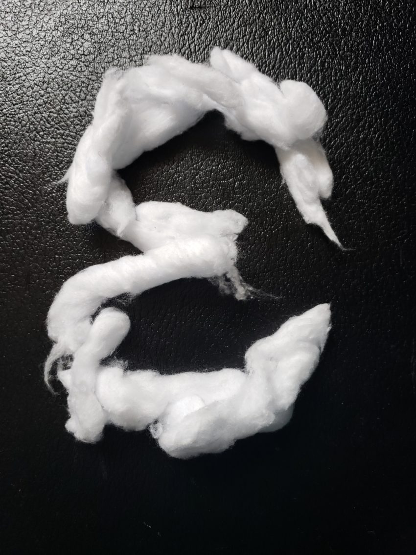
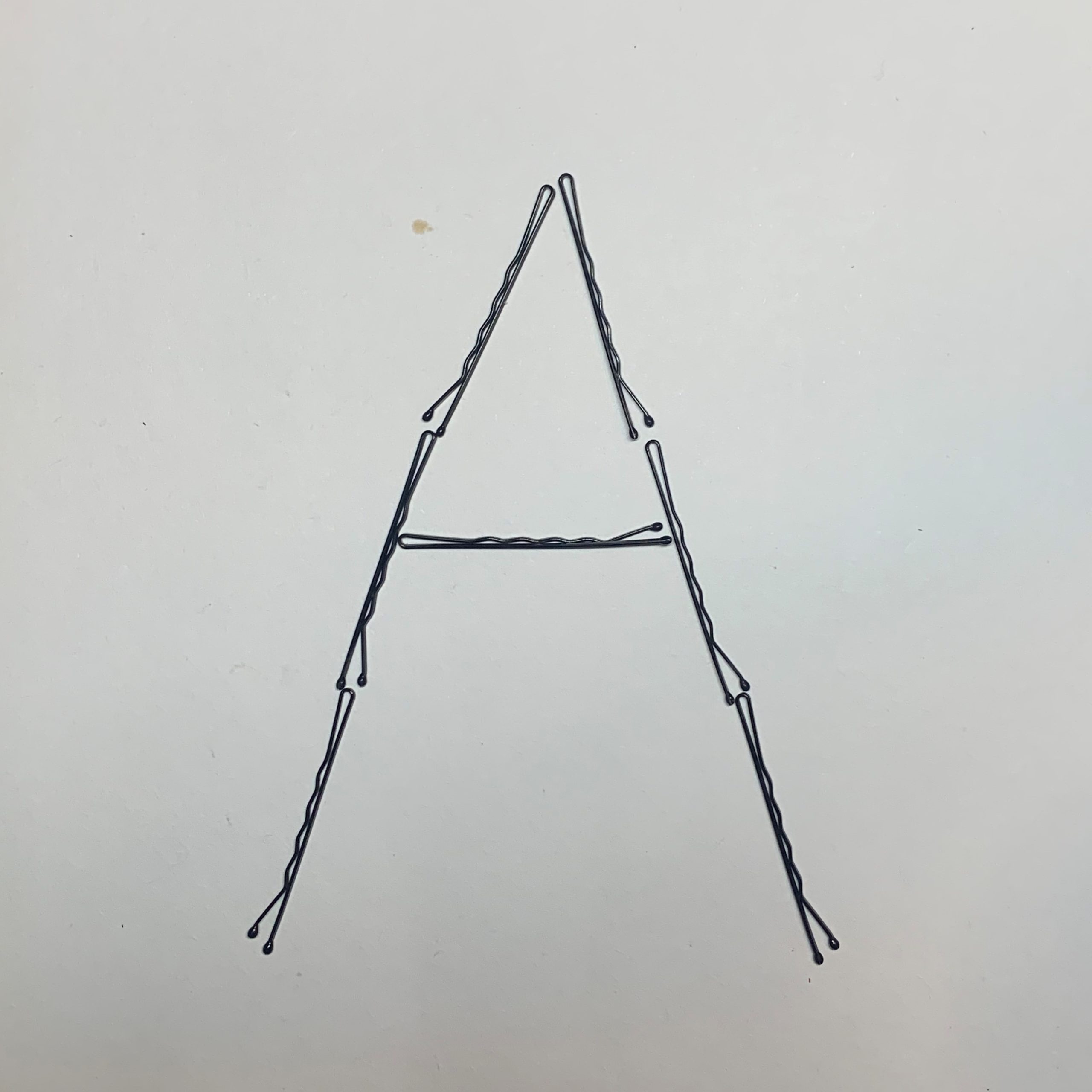
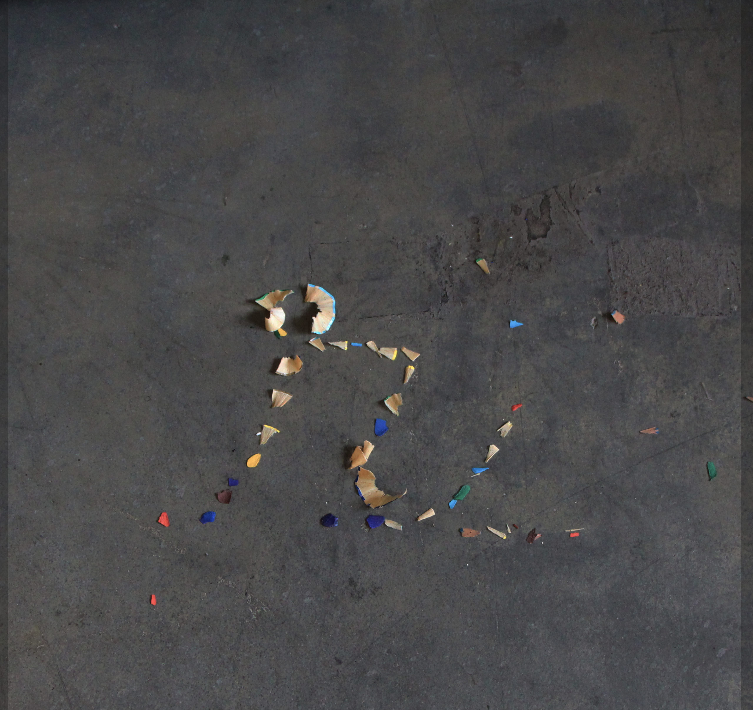
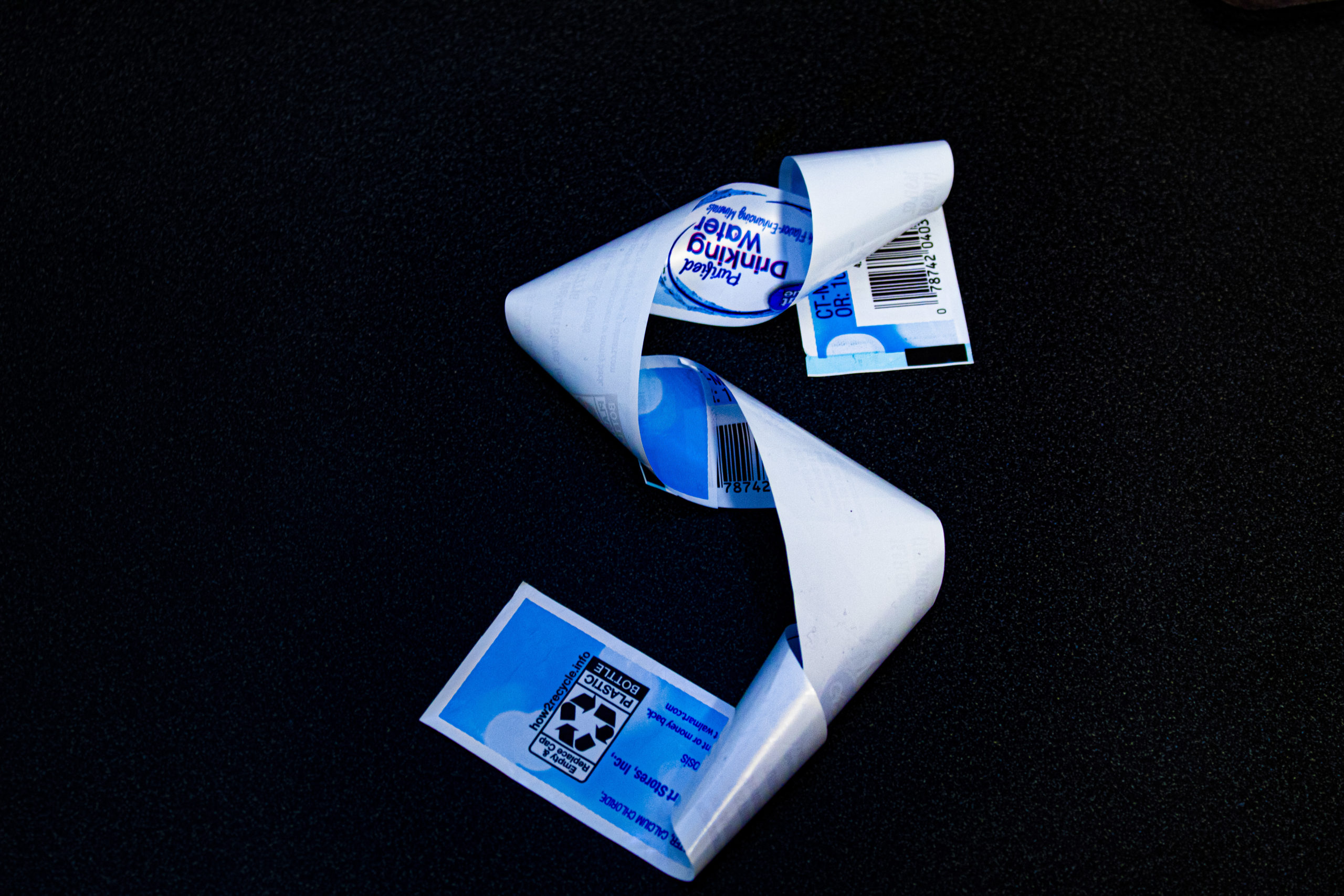
Construct these six (6) letters: O, M, H, B, A, S, in each material. Uppercase or lowercase.
Take photos of each letter, one letter at a time, one letter per photo frame.
Keep the letters consistently framed in your camera viewpoint/set up.
This week, you will be making a total of 18 photos. - Upload your test materials/letter photos to the drive. Organize them by material (three materials, six letters/photos each).
Notes:
Consistently set up your composition frame and your camera lighting (for your individual photo documentation of each letter).
Keep the scale and baseline the same from letter to letter. The baseline is the invisible line upon which the letter sits. Unless there is a conceptual reason for letters to widely vary, build a consistent structure whereby the distinct characteristics of individual letter forms are made visible. - Briefly name the three materials you tested in the comment space below and provide a link to your work on the drive.
 ++
++
Links:
Typography as a Radical Act in an Industry Ever-dominated by White Men
Black Designers: Missing in Action, Cheryl D. Holmes-Miller, Print Magazine, 1987
Black Designers: Still Missing in Action?, Cheryl D. Holmes-Miller, Print Magazine, 2016
Vocal Type
Books:
Thinking with Type (pg 46 has info about serif /sans serif )
More designers:
Amuki
Emigre
Bauer Type
David Jonathan Ross
Lynne Yun
More fonts to study:
Google fonts
Fontshop
Myfonts
https://uncg-my.sharepoint.com/:f:/g/personal/r_riley_uncg_edu/EjDLlHP8k-dIgzqj_QsmjikB34bOoZTprLyVH7SkQP8nOQ?e=9gf23b
The materials that I worked with for this experimentation were strawberry leaves, allergy pills, and earrings.
Your letters are really cool! I like the strawberry leaves the most. They give a really nice natural vibe that’s pleasing to look at.
1. Tré Seals was motivated to start his own font foundry because he noticed how little diversity there was in the design world, especially when it came to typography. After reading Black Designers: Still Missing in Action, he realized just how many voices were missing from the field, and that pushed him to figure out how he could change that. He thought back to when he was younger, making graffiti name designs for classmates or sketching tattoos for friends, and how much he loved creating designs that felt personal. Before starting, he paused and asked himself, “Does the world really need another font foundry?” and “If I do start one, how can I make it different?” That mindset is what drove him to create something that wasn’t just another design company, but one focused on preserving culture and sharing overlooked stories through type.
2. Martin is a typeface inspired by the 1968 Memphis sanitation workers’ strike, which Martin Luther King Jr. supported shortly before he was assassinated. What makes Martin so special is that it’s more than just a font- it’s directly connected to the history of protest and nonviolence. The design itself is based on the signs that the sanitation workers carried during the strike, so there’s a real connection to that moment in history. But Seals didn’t create Martin just to stay in the past- he made it with the intention of being used today, in protests, posters, and designs that speak out against violence and injustice. I also thought it was cool how he said he wanted it to be used across all cultures, not just one group, which makes it feel even more powerful.
3. What really stuck with me about Tré Seals’s story is how he noticed this huge problem in the design world and actually did something about it. Instead of just accepting the lack of diversity, he turned it into motivation to create something meaningful. I love how his work goes beyond just looking good- it’s telling stories, preserving history, and giving people a way to express themselves through design.
Hi Ava,
I also found it inspiring that he made a change, he noticed an issue he was passionate about solving and actively worked to find a solution. I think we could all benefit from implementing that sort of mindset into our lives.
Hi Ava, your answer to number 3 was really introspective. I loved hearing about your perspective on such an interesting article!
What is Tré Seals’s motivation for starting his own font foundry and what questions does he ask himself?
Tré Seals founded Vocal Type to address the lack of diversity in typography and give marginalized communities a voice in design. He noticed that most typefaces were Eurocentric, which led him to ask: Whose stories are being told in design? Who is being left out? His mission is to create typefaces inspired by historical movements and figures, ensuring that underrepresented communities see themselves reflected in design.
What is “Martin?” What makes Martin so special?
One of his most notable typefaces is Martin, inspired by the signs used during the 1968 Memphis Sanitation Strike, where Dr. Martin Luther King Jr. gave his final speech. What makes Martin so special is its direct connection to history, it isn’t just a typeface but a revival of a moment of resistance. It captures the raw, hand-painted quality of the protest signs, making it an extension of the voices of the past.
On a personal note, what inspired you about Seals’s life story and work? Reply to at least two other people’s comments in this group.
Personally, I found Seal’s journey inspiring because he turned a passion for typography into a tool for activism. His work proves that design isn’t just aesthetic; it carries history, identity, and power. As an art student, I admire how he uses his craft to challenge norms and give new life to stories that deserve to be told.
Briefly name the three materials you tested in the comment space below and provide a link to your work on the drive.
I used a couple pairs of my Crocs, I used floss picks, and I also used colored pencils.
https://uncg-my.sharepoint.com/:f:/g/personal/r_riley_uncg_edu/EhKmYa-K5QBCgmG_BS1dw-IB0ZuKT25BVDLOuVQ1qOhk1A?e=tdBdgk
I really like your letters! Especially the floss picks and colored pencils. I really like how you formed your letters in a way that’s more abstract and irregular, it’s really cool to look at. I do think the colored pencils are better because they’re more legible; the floss picks are really interesting but also pretty hard to tell what letters they are. I think both are good, it just depends on what context you’d be using them in.
Hi Jon! I also find it inspiring how he uses his craft to challenge norms. It’s inspiring to many people and will hopefully be eye opening to many!
Hi Jon, I really love your lettering you did! The floss picks are really interesting in my opinion, I’d love to see more
The three materials I tested were Rings/jewlery, Meticulous random tiny found items, and Jelly Beans!
Heres a link to the file:
https://uncg-my.sharepoint.com/:f:/r/personal/r_riley_uncg_edu/Documents/_Rachele%20Riley/teaching/S25/ART%20341%E2%80%9302/Jackson%20Highshaw/week%208?csf=1&web=1&e=KWfwgj
Hi Jackson!
I really loved the experimentation you did with jewelry. The rings you have are so cool, and the way you arranged them for the letters look amazing
one day in 2016, he was looking through fonts searching for inspiration and got bored, he said it all looked the same. He felt this was because there was no culture, after reading an article from 1987 written by Dr. Shel D Holmes Miller which made him think about communities being not being represented, which after reading the follow up to the article it made him think about what his role was as a designer in the industry and reflected on what he has done, which lead to him wanting to make his own Font Foundry and asking questions like does the world need another one? And if so, what he can do differently. Martin is what he likes Tre likes to call a non violent Typeface, inspired by the Memphis Sanitation workers that went on strike for recognition of their union in 1968. What makes martin special is the Church it was printed in, the story behind it. What inspired me personally about Tre’s story is how he ties these happenings of racism and hate that exists in the world against him as well as the history of fighting those concepts from the past as well as how they are happening currently into his work.
Hi Jackson,
The removal of culture more specifically the lack of underrepresented communities within the industry is definitely an issue that needs to be addressed. As a first-generation Latina being underrepresented within media is a norm within the western culture. I agree with how Seals’s inspired you. Seal’s place in the world with how his community has and continues to be negatively impacted. Within his earlier years Tres struggled with his voice as an artist. Ultimately it was a complex combination of experience, history and call to action that changed his approach to design.
Hello Jackson, I agree that the way Seals includes his experiences of racial prejudice and injustices in work is very inspiring. He gives meaning to fonts, along with making them look pretty.
Tre Seals motivation for creating his own font foundry starts is deeply rooted in him when he first started facing racism. As he grew up in the world of design, he realised type was boring and there was no culture influencing it. He also came to realise that industry’s in design were white male dominated and he wanted to change that b making it more diverse. He knew that a designer’s job is to solve problems that clients have but he wanted to solve the diversity issue in the design industry first and so found a way to diversify his design with influences from previous black culture. He then created Martin; a typographic tale based off of Martin Luther King. The typeface was originally non-violent characters, all uppercase letters that were inspired by posters created on protest signs during a strike. He later sought inspiration from newspapers which helped him to design a lowercase alphabet to go along with his original uppercase set of type. He says what makes the typeface so special is the church it was printed in, the extra ink on the press, the poster board it was printed on and the people that carry it and the story behind it. I find his work inspirational, it is so important for designers to value the meaning behind type rather than just viewing it as a vehicle to communicate, he particularly exceeds at valuing the meaning behind his typeface.
In my studio work I explored creating type out of string, post-it notes and Hershey kisses. https://uncg-my.sharepoint.com/:f:/r/personal/r_riley_uncg_edu/Documents/_Rachele%20Riley/teaching/S25/ART%20341%E2%80%9301/Hannah%20Hind/Week%208?csf=1&web=1&e=yy1Not
Hi Hannah,
I really enjoyed your studio work, particularly the letters created out of the string. The contrast between the circular Hershey kisses and the boxy square Post-its was also pleasing to the eye. Nice work!
Hi Hannah,
Yeah, the importance behind the design rather than its face value visuals. In addition to a designer’s impact on society with the type of design made is impactful. I really liked the neatness behind all three materials choice for your text.
Regards,
Karla
Hello Hannah,
I really agree with your take on Tré Seals’s motivation. It’s inspiring how he recognized the lack of diversity in design and decided to make a change. Also, your project is coming along quite nicely! I like the materials you chose to experiment with!
One of the main motivators for Seals was the feeling he felt in the 3rd grade when selling his graffiti cards. From then on, he continues to do at makes him happy which then causes other people to be happy. When it came time for his to think about his font foundry, the two main questions he asked himself were: “Does the world need another type face?” and “What can I do differently”. With these questions he wanted to bring his own racial experiences to his font create, both negative and positive.
Martin, in Seals’s words, is a nonviolent typeface with the remnants of the Memphis Sanitation Strike of 1968. He took influence from the signs protesters used to strike against the unsafe equipment from the Memphis Sanitation Department. This was also one of the last causes Dr. King fought for before his passing.
I found Seals’s incorporation of his racial experiences to be the most interesting aspect of his work. I can defiantly see the influence of Black culture on his work. I also agree with the thought he brought up about typefaces. If we want more diverse typefaces you need to start including a diverse group of people.
Studio:
The three materials I used were recycled yarn, sause from a sause packet, and my tarot crads.
https://uncg-my.sharepoint.com/:f:/r/personal/r_riley_uncg_edu/Documents/_Rachele%20Riley/teaching/S25/ART%20341%E2%80%9301/Mar%20Alvarado-Escobar/Week%208?csf=1&web=1&e=MBZGD4
Hello Mar Alvarado-Escobar,
I love how you pointed out Seals’s motivation stemming from his third-grade experience selling graffiti cards. That sense of joy in creating something that made others happy clearly stuck with him throughout his career.
Your project is very creative, nice job!
Tré Seals started Vocal Type Co. after observing a lack of diversity in the design business, particularly in typography. He intended to create fonts that reflected other cultures, histories, and movements, allowing underrepresented voices to be heard in design. His company focuses on typefaces inspired by historical events and social justice movements. He poses himself questions such as whose stories are expressed via design, how may typography be used to promote activism, and what perspectives have been historically disregarded in design?
Tré Seals produced the “Martin” typeface, which was inspired by the advertising used during the 1968 Memphis Sanitation Strike, a movement intimately linked with Dr. Martin Luther King Jr. The typeface is unique because it retains the bold, handcrafted design of the sanitation workers’ protest posters, preserving an important point in civil rights history. Seals created this font to ensure that historical voices continue to impact contemporary design.
Tré Seals’ commitment to diversity in design is truly inspirational. He does more than just design fonts; he uses typography to tell stories and give historical movements a current voice. His work demonstrates that design is more than just aesthetics; it is also about effect, activism, and inclusiveness. In a group conversation, I might respond by saying: “I agree with your point about Seals using typography as activism.” It’s wonderful how he transforms historical events into fonts that keep these stories alive.”You mentioned how Martin captures the spirit of the Civil Rights Movement; I think that’s so powerful because it connects past struggles with present-day design needs.”
https://uncg-my.sharepoint.com/:f:/r/personal/r_riley_uncg_edu/Documents/_Rachele%20Riley/teaching/S25/ART%20341%E2%80%9302/Cindy%20Ortiz?csf=1&web=1&e=MmhPGk
Hi Cindy! I wanted to comment on your studio work, I really liked your H formation with flowers and your B formation with coins! Using the flowers in particular to me are more interesting to use outside findings to form manmade writing. I will say I am confused on the three items you used as it looks like there is a mix of experimentation. Great work!
Hi Cindy!
I loved your experimentation for this part of the project. I think that your use of using paper clips was one of my favorites. Can’t wait to see what you use for the final project 🙂
Hey Cindy, I really loved the clips and specifically the “S” it was really crisp and spot on. I also enjoyed your other jewelry letter I think it can be fun to explore more
Tré Seals’s motivation for starting his own font foundry was to introduce a piece of minority culture to the root of all great pieces of graphic design which is typography. The questions he asked himself were “Does the world really need another font foundry?” and “If I do make a font foundry, what can I do differently?”
“Martin” is the first type face that Tré Seals created that told a deeper story related to minority groups. This type face was made in connection with Martin Luther King Jr. and is what Seals refers to as a non-violent type face. Tré says the thing that makes “Martin” so special is “the church it was printed in, the extra ink on the press, the poster board it was printed on, the people that carried it, and the story behind it.”
On a personal note, the thing that really inspired me about Seals’s life story and work is the overall theme of perseverance from his childhood years into adulthood and then the ability to carve out a unique niche in typography. I think him realizing that there can be a much deeper story behind typefaces is super cool and an important point to highlight because often times I feel like I fall victim to relying strictly on imagery when I could let type do the work at times.
The three materials I tested to form the different letters were Cheez-Its, York Peppermint Patties (w/ the wrapper on), and Solo Cups.
Link to my Week 8 One Drive: https://uncgmy.sharepoint.com/:f:/g/personal/r_riley_uncg_edu/Es_vYjTmKnFGjf_IpMATQW4B1_QHqKu_vbTsRZKi8tW4cA?e=iJJbH1
Hey Hayden, I also found Seal’s constant perseverance very inspiring. I also liked how Seal incorporates intentionality in his typeface because I feel like that aspect is something I neglect to think about when looking for typefaces.
Tré Seals started Vocal Type because he noticed that most fonts looked the same and were mostly made by white designers. He wanted to bring more diversity into typography and highlight voices that are often overlooked. He asked himself, “Why do all fonts look the same?” and “Whose voices are missing?” These questions led him to create fonts inspired by different cultures and historical movements, giving them a place in modern design.
One of his most well-known fonts is Martin, which is based on the signs used in the 1968 Memphis Sanitation Strike. This was an important protest where Black workers fought for fair wages and better treatment. What makes Martin special is that it comes from real history—it’s not just a font, but a way to keep the past alive. Seals isn’t just designing letters; he’s telling stories and making sure these voices aren’t forgotten. His work pushes designers to think about the deeper meaning behind the fonts they use and to bring more representation into the world of design.
What inspires me from his story is how he uses art and design as a tool for activism and storytelling. His journey shows that creativity isn’t just about making things look good—it can also give a voice to people who have been ignored.
Hi Tre! I like how you mentioned that “Martin” went beyond being just a typeface and became a means of “keeping the past alive.” This makes it special in a much deeper way than just being of aesthetic value. It forces both the user of the font and the viewer to question their understanding if its origin and to look deeper into its importance.
Seal’s motivation to start his own font foundry was the article Black Designers: Still Missing in Action? Along with the lack of diversity in the design field. He wanted to represent underrepresented minority groups. To fix the issues in the design community to better help the issues of clients. Looking back on his past with his previous typefaces and index cards he believed it made sense for him to start this foundry. The questions he had were “Does the world really need a new font foundry? If I start one, what would I do differently?” Martin is a typeface Seals made this typeface to educate through typographics. Tre brings the stories during the Civil Rights Movement into design. To diversify design further, while bringing forth the stories of sacrifice, protest, and hardships. Drawing inspiration directly from the signs that were held by protesters. What makes Martin so special is that this typeface was all over the country during the Black Lives Matter protests. Martin was on billboards, posters, in public spaces, and exhibits. The message of the typeface of Martin was, still is prevalent.
What inspires me about Seal’s life story and work was how tangled his life story is in his work. His story about getting into art was heartbreaking but also inspiring to hear. How he wanted to bring joy to others through his work, doing what he loved brought joy and he wanted to keep doing it. How he wants to change the design community to be more welcoming and more educated. Using design to educate through typographics is a concept I personally have not heard of. Using stories to inspire the design and later that design being used for the same purpose. His unveiled typeface is also very beautiful! I find inspiration in the face he loves making his art for others and using personal stories or historical events to influence his designs.
My three materials I used for this week 8 project were earrings, gum, and q-tips.
https://uncg-my.sharepoint.com/:f:/r/personal/r_riley_uncg_edu/Documents/_Rachele%20Riley/teaching/S25/ART%20341%E2%80%9302/Sarah%20Hines/week%208?csf=1&web=1&e=d1pbkS
Hello Sarah, I enjoyed reading your response! I wanted to compliment the similarities between your Q-Tip letters and the gum wrappers. I liked how you arranged them and increased the thickness on some while keeping others thinned and spaced apart. Thank you for sharing.
1Tré Seal’s motivation for starting his own font foundry was the article titled “Black Designers: Missing in Action?” And its sequel, “Black Designers: Still missing in Action?” These started bringing up questions like “Does the world really need another font foundry?” and “If I start one, what can I do differently?”. It caused Seal to think about his own racial background, and the difficulties he faced because of it, as well as the good things that came from it.
2“Martin” is a “non violent typeface” based in the font of posters held by nonviolent union protestors. This font is simplistic, not nearly as extravagant or complicated as other typefaces. This one however holds deep history in the story of black liberation, as well as workers rights.
3Seal’s life inspired me because of the adversities he faces, and how he used his past to inform his future. So often our histories are used as warnings, and as a show of what should be fixed. While Seal does acknowledge this, he also uses it as a jumping off point on where to move forward, how to move forward, and what the world could be. It’s something I desperately want to be able to do in my own creative practice, much less my entire life.
Word Count:212
Tre Seals started his own font foundry because he noticed something was missing in graphic design. He felt like all the fonts looked sorta the same. Even though they were pretty, they didn’t really show different cultures or people’s stories. It just felt like everything was too much alike.
Tre then asked himself two important questions: First, he wondered if the world even needed another font foundry. There were already lots out there. Second, he thought about what he could do differently from all the others.
That’s when he decided to make fonts that shared stories from people who don’t usually get noticed. One font he created is called “Martin.” It’s inspired by signs that workers carried during the Memphis sanitation strike in 1968. Those workers wanted better pay and safer conditions. Martin is special because it isn’t just letters; it has history and meaning. It remembers Dr. Martin Luther King Jr. and the workers who marched.
For me personally, Tre Seals’s life story really inspired me because he went through tough things like having a brain tumor and facing racism. We all go through struggles that can hold us back, health issues, and I can especially relate as a black man in America. And instead of giving up, he used art to express his feelings and help other people. I think that is pretty admirable. He also cares about sharing different voices and cultures through design. I think it’s also amazing how he uses his talent to teach people important lessons and make the world better.
Hey Clint! I also found it really cool how he was able to add such a deeper meaning to a type face and as you mentioned, give a voice to differing cultures. I think being able to create something with a deeper meaning as he has with his varying fonts is incredible! Great work!
Hey Clint, I also found Seals’s life story very inspiring because of the strife he has endured his entire life. I also appreciate his intentional use of voice through his work as well as urging others to share their voice through design.
When Tré Seals started rebranding by creating logos and stationary projects, he started getting bored while looking for inspiration. He noticed how fonts look the same to him and that there was a lack of diversity and character. He was inspired by an article that he came upon; “Black Designers missing in Action” that made him think more about how many communities are not seen and heard enough. Therefore, creating his own font foundry helped find ways to diversify his design. He asked himself questions like:
-“if part of our job is to solve problems of our clients, then should we solve the ones facing our own industry before we can effectively solve the ones for our clients?”
-“Does the world really need a font foundry?”
-“If I start one, what can I do differently?”
These indicates his true thought process of what he wants to produce for the world of communities and how he will shape it.
“Martin” represents a non-violent typeface that he made inspired by the remnants of the Memphis sanitation strike of 1968. What makes Martin special is the history behind this civil movement and the message he is trying to to give. The strike was a protest by African American sanitation workers who were demanding for better wages and working conditions. They held posters that were written “I AM A MAN”, and those iconic fonts is what reflects with the typeface. Tré shares how this is a message to continue this activism and also as a tribute to Martin Luther King Jr. who was also assassinated.
On a personal note, what inspired me about his story and work is how he searches and strives to speak for the problems that others are going through. Even through the racism that he dealt with, he didn’t stop himself from doing his own typeface of something that can be very sensitive to the world. I like that he implemented his way of design to create more diversity and connections of historical movements.
Studio:
https://uncg-my.sharepoint.com/:f:/r/personal/r_riley_uncg_edu/Documents/_Rachele%20Riley/teaching/S25/ART%20341%E2%80%9301/Debora%20Guevara/Week%208?csf=1&web=1&e=s0UZa0
Materials used…
-Dandelions
-Clear glass beads
-Sea shells
Tre Seals’ motivation for starting his own font foundry was his experiences throughout his life. He was inspired by the pain that was brought to him when he experienced racism time and time again and the pride he felt learning about black history and influential people like Martin Luther King Jr. He asks himself, “Should we solve the problems facing our own industry? Does the world really need a new font foundry? What can I do differently?” Seals’ font foundry attempts to tell a story. For example, “Martin” is a non-violent typeface inspired by the Memphis sanitation strike of 1958, where workers carried signs reading I am a man. The font on these posters and others alike were a starting point for this font. Martin is used in attempts to create diversity within design.
Personally, I found it super interesting to think about how the individual letters tell a story rather than the words telling the story. I would have never thought to think about a font foundry in that way. I was particularly inspired by the first font face he created in high school. It was interesting to see that he made something so successful when he was not that educated in the subject; instead, he used the tools he knew how to use like Illustrator.
Hi Victoria! Hearing about Seals’ story, I think he encourages people to ask themselves the same questions that he asked himself. His story is inspiring in his design work and how his culture influenced his artistic expression. His work is groundbreaking, but I think his work also serves to inspire future generations to ponder and similarly act on these questions as well.
The materials I used were cheez its, receipt paper, and train pieces from a board game. Here is the link to my work.
https://uncg-my.sharepoint.com/:f:/g/personal/r_riley_uncg_edu/EsSWJnxtvOhBoxWNv6-owVMBu9nUOhZGrA90Ut1wFKfBww?e=KlsdbU
What is Tré Seals’s motivation for starting his own font foundry and what questions does he ask himself?
Seals was motivated to introduce more culture and diversity to the design sphere. The writings of Cheryl Miller inspired him to address the problems facing his industry to more effectively solve the problems facing clients. Seals asked himself if the world needs another type foundry and what could he do differently to make sure he could have the impact he desired.
What is “Martin?” What makes Martin so special?
The type face is a homage to the life and works of Dr. Martin Luther King Jr. The font is Seals way of entwining the story of the Memphis sanitation strike of 1968 visually into a type face. Seals refers to the type as non-violent. The strike was the last action King was able to advocate before his untimely death. Seals was inspired by the printed signs the protesters used.
On a personal note, what inspired you about Seals’s life story and work?
I appreciate his interest in furthering the sphere of design by linking typefaces with the historical events where they were present.
For my Test Materials I used a chain bracelet, a crushed espresso puck, and shadows captured with a flashlight through hanging/posed letter forms:
https://uncg-my.sharepoint.com/:f:/g/personal/r_riley_uncg_edu/EurwuWqRvwhIkwaoZpFIIu4B4d0T0cxDLLdckSy8oo3Oig?e=X8xgd2
Hey Zeus, I love how much of a variety of forms you played with to form your letters! It is super cool, but I have to say that my favorite is the crushed espresso. I think that the texture that is created by it is so cool and could really create for some great detail down the line. In close second though, I really enjoyed seeing how you created these ghostly appearances of letterforms through the use of shadow! Great work!
Zeus, I’m drawn to your espresso cup lettering! In my opinion, this was a creative idea that you executed really well. The quality of your photos was also captured well – down to the grains. Thanks so much for sharing!
Hey zeus I enjoy the range of motion you got with the chain. It was also cool seeing both uppercases and lowercases. I think it might be better to go with a different material than the chain because of how restrictive it is.
Tre Seals motivation for his very own font foundry is that when he was working designing type fonts he realized that he wanted to solve problems that was plaguing his industry. He thought about the diversity of people from gender to race to even religion. He wanted to create a font foundry to understand the discrimination that is prevalent and the appreciation and joy of the difference of cultures.
Martin is a “typographic tale” which is a non violent type face that he based on a sanitation strike from Minneapolis in 1968. The font is special for Tre Seals because of the church that it was printed in and the way that it was made to further the cause that was crated for. The font’s also special because is based on sign that was carried from this strikes and was part of signs for one of the last causes that Dr. Martin Luther King had fought for before his untimely death. I also think that for the creation makes the type font special because Tre Seals puts more emphasis on the tiny quirks that made the font have a story and brought life to it.
I really enjoy his life story because through hardship his created a job that is for his self satisfaction and from there he used his self satisfaction to create more awareness to others.
Discussion:
Tre Seals started his font foundry, Vocal Type, by questioning the need for another font foundry and what he could do differently. His motivation stemmed from experiencing racism for the first time in school when he was younger and his job when he got older. Tre’s motivation also stemmed from witnessing race positivity, making him reflect on whose voices were missing in design. He saw typography as more than just a visual tool and wanted to make it a way to share stories and educate people about history and culture. By creating fonts inspired by social movements and underrepresented communities, he aimed to make design more meaningful and inclusive.
“Martin” was the first typeface Tre designed, it was inspired by Dr. Martin Luther King Jr. and the 1968 Memphis sanitation strike. It was influenced by the typography used in protest signs, including the “I AM A MAN” and “We Shall Overcome” posters. What makes “Martin” unique is not just about the design, but the history behind it. He mentions the church where the signs were printed, the extra ink from the press, the poster board, and the people who carried signs during the march to indicate how special it was. Every detail of the typeface reflects the power and resilience of the civil rights movement, making “Martin” more than just a font, but a tribute to history and activism.
I admire how Tre Seals questioned the industry and found a way to combine design with history. It proves that typography can be a powerful tool for education and change.
Studio:
Trail Mix
Sea Shells
Jewelry
https://uncg-my.sharepoint.com/personal/r_riley_uncg_edu/_layouts/15/onedrive.aspx?id=%2Fpersonal%2Fr%5Friley%5Funcg%5Fedu%2FDocuments%2F%5FRachele%20Riley%2Fteaching%2FS25%2FART%20341–02%2FChristina%20Kibler%2FWeek%208
Tré Seals started his font foundry, Vocal Type, to address the lack of diversity in typography. He realized that most typefaces in branding, media, and activism were rooted in European design, failing to represent a broader range of voices and cultures. This led him to ask, Who is being excluded from design history? and How can typography help tell a more inclusive story? His goal was to create typefaces inspired by historical movements and figures from underrepresented communities, making design more reflective of diverse experiences.
One of his most notable typefaces, Martin, is inspired by the hand-painted signs used during the Civil Rights Movement, particularly in protests led by Dr. Martin Luther King Jr. What makes Martin unique is how it revives the visual identity of past activism and turns it into a resource for today’s designers. By digitizing these historical letterforms, Seals ensures that the movement’s legacy remains relevant in modern design.
I found Seals’s story truly inspiring. His work highlights how typography can be more than just aesthetics—it can be a powerful tool for storytelling and activism. He encourages designers to think critically about representation and the impact of their creative choices.
VIDEO RESPONSE:
1) Seals’s motivation for starting his own font foundry was that he felt like a lot of fonts just looked the same, and that there weren’t enough Black designers being encouraged and spotlighted. He asked himself the questions “Does the world really need another font foundry?” and “If I start one, what can I do differently?”
2) “Martin” is a font that Seals created, inspired by Dr. Martin Luther King Jr. Seals describes it as a “non-violent” typeface and it was specifically modeled after the look of signs carried by protesters which said “I AM A MAN” and “HONOR KING! END RACISM!” He also took inspiration from specific newspapers and the American Wood Type Manufacturing Company. The font “Martin” was also used a lot in Black Lives Matter protests in 2020.
3) I think it’s incredibly inspiring that Seals was able to take a bunch of negative experiences he’s had over his life and fuel it into something creative. Him drawing to cope with the pain of his tumor, or experiencing racism and instead wanting to highlight the positive experiences around race he’d had through fonts; it’s all really amazing and it reminds me that you can take bad experiences you’ve had and turn them into something beautiful. That’s what a lot of art is all about.
PROJECT:
Link to OneDrive folder: https://uncg-my.sharepoint.com/:f:/g/personal/r_riley_uncg_edu/Ep8YyfcWZPNMot5RKQz5L8wB1vERVq-7VhIzyQWogziYLQ?e=XGNK12
The materials I used for my letters are Perler Beads, a necklace, and wood glue.
The materials that I used were q-tips, bananas, and knives from the kitchen drawer.\
https://uncg-my.sharepoint.com/:f:/r/personal/r_riley_uncg_edu/Documents/_Rachele%20Riley/teaching/S25/ART%20341%E2%80%9302/Chris%20Pierce/Week%208?csf=1&web=1&e=K3gAXt
1.) Tré Seals mentioned that his motivation for starting a font foundry was the fact that there were not enough black designers in the industry. He knew he wanted to find a way to diversify design, and explained how he worked on his penmanship throughout the years. When it comes to questions he asked himself, he found himself wondering if the world really needed another font foundry. I assume that since there are probably already hundreds of foundries, this may be why he asked such a question. He also asked himself that even if he did begin one, what could he do differently.
2.) Martin is the very first typographic tale that Tré Seals ever told. He described it as a “non-violent” typeface that was inspired by the strike of 1968. He explained that Martin went through multiple changed before it’s official release, and originally was based only on the signs that were present at the strike.
3.) One of the most inspiring things I got from Seals’ story is his overcoming of a brain tumor. He was able to find something that gave him solace, and was even able to evolve what he loved to do into a career.
Tré Seals motivation for starting his own font foundry was because he read an article by Cheryl D Miller titled Black designers: missing in action. The article summarized that black and brown communities should have a seat at the table especially since a designers job is to communicate an idea to them. But Tré took it a step further and believes females, lgbtq communities, indigenous communities, religious communities, etc. should have a seat at the table. A couple months after that he read the sequel to that article and this one was titled black designers: still missing in action? Which was basically the author passing the torch to the next generation of black designers. Which made him question if part of their job was to solve problems for their clients, then shouldn’t they solve the ones in the industry before solving their clients? So he decided to try to find a way to diversify design. But he first asked himself two questions: does the world really need another font foundry? And if he starts one, what can he do differently?
Martin is a non violent typeface inspired by remnants of the Memphis sanitation strike of 1968. Memphis Santorini workers (mostly black) went on strike demanding better wages, recognition of their union, and a safer working condition.
Tré’s story was truly inspiring. I loved that when making big decisions he asked himself important questions to make sure what he was doing was the right choice. He also used the negative comments people made about him but was able to use them for his benefit and others.
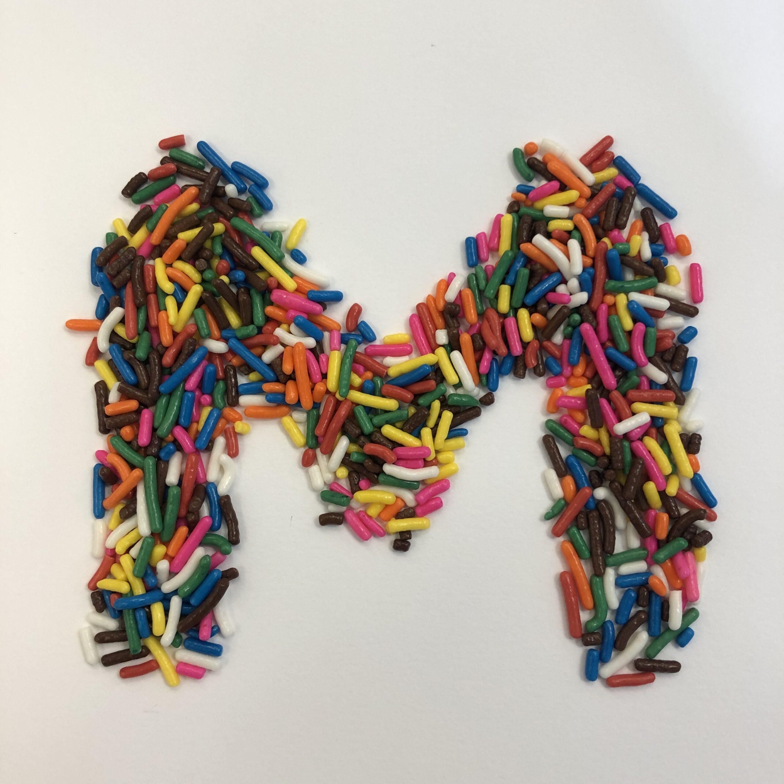
For my letters I used M&Ms, cheerios, and earrings.
https://uncg-my.sharepoint.com/shared?id=%252Fpersonal%252Fr%255Friley%255Funcg%255Fedu%252FDocuments%252F%255FRachele%2520Riley%252Fteaching%252FS25%252FART%2520341%E2%80%9302%252FXimena%2520Perez%252DChavarria%252FWeek%25208&listurl=%252Fpersonal%252Fr%255Friley%255Funcg%255Fedu%252FDocuments
Hi Ximena!
I was also inspired by Tré’s story, and how he was able to incorporate his own personal experiences into Martin and his work, alongside wanting to uplift the voices of minorities.
I enjoyed how you used earrings to create letters as well! Especially how you chose to space them apart rather than having closely knit together!
Tré Seals asks himself: Does the world really need another font foundry? If he did start one, what could he do differently? Seals believes that there isn’t enough diversity in the design field which is why he wanted to start his own foundry. He talks about his past experiences and how they affected him both in a good and bad way. He then describes how type is a tool to share stories and experiences aside from just using it to design things. He also points out that everyone should be able to do the same. “Martin” is a non-violent typeface. He describes Martin as special because of how it was printed, the people that carry it, and the story behind it. What inspired me most about Seal’s life is how important diversity and inclusion is to him. I also think it is important to diversify design and allow people to share their unique stories.
Seals points out that although allowing different people to participate is important, it also takes a long time to do so. Seals past experiences and growth throughout the years shows his determination that I also find very inspiring.
I used mechanical pencils of different colors, staples, and ibuprofen tablets to make my letters. All three variations came out different in size but overall, pretty easy materials to manipulate. The staples took me a while but mostly for lighting reasons:
https://uncg-my.sharepoint.com/:f:/g/personal/r_riley_uncg_edu/EpgAm7kNL4ZHkWZ8bfxuDiMBfyP9-COw4YvEpuSlX0HvqQ?e=k5hOit
Hey Jose,
I also was inspired by Seals determination to diversify design and use his story + historical moments. Also, for your studio, I really liked how the staples look and how you separated them from each other to create a unique design from it. The texture and shine is interesting.
I also was inspired by Seals determination to diversify design and use his story + historical moments. Also, for your studio, I really liked how the staples look and how you separated them from each other to create a unique design from it. The texture and shine is interesting.
Ooh – I just your staples one the most. The way you took creative liberty with certain letters such as the M is done really well. In combination with the material, the letter being chopped up feels extremely futuristic.
Crackers, Almonds, Tic Tacs
https://uncg-my.sharepoint.com/:f:/r/personal/r_riley_uncg_edu/Documents/_Rachele%20Riley/teaching/S25/ART%20341%E2%80%9301/Ethan%20Heggins/Week%208?csf=1&web=1&e=MJ1yQX
For my three materials I explored creating the letters out of Sunflower seeds, Q-tips, and Rubber bands. I liked using the Q-tips the most overall.
His motivation for starting his own font foundry was from his brain tumor when drawing and writing became his way of expressing himself. He found motivation based on his experiences with racism. He states that “type can be more than a tool for just design, but a tool for education”
It is a typographic inspired by Dr. Martin Luther King Jr. Tre likes to call a “non-violent typeface”, inspired by remnants of the Strike of 1968 in Memphis. This was a powerful protest done by workers after two trash handlers were killed by a malfunctioning garbage truck. Martin had many updates before it was finally released. It was originally only based on the original signs with only upper and lowercase characters. He was later able to construct the entire lowercase alphabet and Arabic numerals after finding newspaper headlines. Specifically he found in the words “We Shall Overcome” which inspired his creation.
Overall Tre Seals is a prime example of creativity. He was able to find his true passion in the midst of struggle and pain. He found his calling, and did not let his health get in the way of being able to chase his dreams. To be able to stay motivated, and create an entire typographic is beyond incredible.
https://uncg-my.sharepoint.com/shared?id=%2Fpersonal%2Fr%5Friley%5Funcg%5Fedu%2FDocuments%2F%5FRachele%20Riley%2Fteaching%2FS25%2FART%20341%E2%80%9302%2FAlex%20Gentry%2FWeek%2D8&listurl=%2Fpersona
Studio:
1) What is Tré Seals’s motivation for starting his own font foundry and what questions does he ask himself?
Seals’s motivation behind his foundry is to expand the diversity of where fonts originate. He asks himself questions like: what are the inspirations for this font and where are they coming from? And, who is going to be profiting off this font and who will be using it?
2) what is “Martin?” What makes Martin so special?
Martin is an original typeface designed by Seals. It’s unique for a variety of reasons, notably from taking inspiration from traditionally widely used typefaces; specifically, inspiration from newspaper clippings written about racism within the United States. However, Seals has taken the Martin typeface and used it for the pro-black movements of today.
3) On a personal note, what inspired you about Seals’s life story and work?
I think the amount of thought that Seals puts into the typefaces he creates (where they originate from, their inspirations, how they will be used) is really inspiring! I would hope that all graphic designers do the same as Seals. Because I agree with him that culture shown through typography is real and noticeable. And the public being exposed to other cultures through commercial design is important if we are to respect our fellow man.
Studio:
The three materials I used for my studio assignment were, straight pretzels, a bracelet chain, and my keys.
https://uncg-my.sharepoint.com/:f:/r/personal/r_riley_uncg_edu/Documents/_Rachele%20Riley/teaching/S25/ART%20341%E2%80%9301/Johnny%20Monroe/Week%208?csf=1&web=1&e=V7jwwH
Seals’s motivated to start his own font foundry was a call to action from a lack of underrepresented communities. Between 2014 to 2017 most of Seals design work was conformity within the corporate takeover. He was left creatively unmotivated until Seal real two separate articles discussing the problems within the industry more specifically a lack of Black Designers. It was a complicated amalgamation of Seals’s history and personal experience behind the choice of making the choice to start his own foundry. Type can me more than a tool for design but a tool for education and sharing stories. To introduce the root of minority culture within typography. Martin is a type face inspired from remints of the Memphis sanitation strike protesting. Martin type face is special for a numerous reason. More importantly Martins continued renewing of history throughout generations. Its Hard to pick out one specific note that inspired me about Seal’s life story. If I were to pick one note to start off with would be Seals’s ability to reclaim design based on history, artistic abilities and personally experiences.
Three Materials Used:
Dishwasher Soap
Dough
Jello
https://uncg-my.sharepoint.com/shared?id=%2Fpersonal%2Fr%5Friley%5Funcg%5Fedu%2FDocuments%2F%5FRachele%20Riley%2Fteaching%2FS25%2FART%20341%E2%80%9301%2FKarla%20S%20Morga%2FWeek%20Eight&listurl=%2Fpersonal%2Fr%5Friley%5Funcg%5Fedu%2FDocuments
My favorite of yours is the dishwasher soap! It looks playful in a way and would love to see the whole alphabet with this bubbly form of material.
Hi Karla, i find it interesting that one of the materials you chose to use for your fonts is dish soap. I would have never thought to use something outside of solid materials!
1. Seals started his own font foundry to not only produce fonts but to also fill in the gaps of diversity that many mainstream font boundaries, and the art world at large are biased towards. In short, he wanted to uplift voices left behind by the industry.
2. Martin is a typeface created by Tré Seals inspired by newspaper clippings and media from the civil rights movement, namely signs worn and held by protesters. Self-described as a nonviolent typeface. It’s not only radical in its development but also in utilization, as it was used frequently in the 2020s black lives mater protests.
3. Seals is out here doing stuff that I’d like to be a part of someday, namely making space for gaps in representation to put their work out there and have their own means of production away from the more mainstream means of production, which to be honest have always had unfair standards on marginalized voices, and will continue to have those standards.
Materials used:
Post-it notes (torn by hand)
Dryer sheet (twisted by hand)
fast food napkin (ripped and folded by hand)
https://uncg-my.sharepoint.com/:f:/g/personal/r_riley_uncg_edu/ErceHsXHzW9LrspRwHxJxTIBu4RNqBzoTwm00OQpbz46Xg?e=enS01F
1. Tré Seals started his own font foundry Vocal Type to address the lack of diversity and representation in the design world, specifically in type design. He realized the industry had a long history of underrepresentation of people of color and wanted to create fonts that told the stories and experiences of marginalized groups. Seals asks himself questions like “Who is this font for?” and “What voices are being represented?” These questions guide his approach to designing more inclusive typefaces and his foundry is dedicated to amplifying voices that have been silenced.
2. “Martin” is a font Seals designed as a tribute to Martin Luther King Jr. It’s unique because it was designed to capture the strength, beauty, and power of Dr. King’s voice and legacy. The font was designed to reflect his impact while being rooted in the historical context of the civil rights movement. Seals chose to name the typeface “Martin” because honoring leaders who shaped history with their words is important.
3. I was inspired by Seals’s journey of finding his own voice through design. His commitment to representation and using his skills to tell the stories that matter is dope. It’s great to see him using type design not just as an art form but as a tool for social change and empowerment.
.
.
.
https://uncg-my.sharepoint.com/:f:/r/personal/r_riley_uncg_edu/Documents/_Rachele%20Riley/teaching/S25/ART%20341%E2%80%9302/Taylor%20Menton/week%208?csf=1&web=1&e=wnKw5q
The materials I used were:
Popcorn
Organic Sugar
Sliced Mushrooms
Hey Taylor! Your material list is really interesting! For me personally, I really like your popcorn and sugar materials the most. I really enjoy your O letter with the sugar the most, it looks smooth and satisfying to look at.
Hi Taylor! I also think it’s amazing how Seal was able to use type design and use it for social change. He did was he loved and was good at and turned it into a way to empower others.
Discussion:
Tré Seals’s wanted to create typefaces that represent people and communities who have often been overlooked in the world of design. He asks himself some powerful questions like, “Why do fonts look the way they do?” and “Who are they really designed for?” His goal isn’t just to create beautiful fonts; it’s about making sure that people from all walks of life can see themselves reflected in the design world. One of his typefaces, “Martin,” really caught my attention. It’s a tribute to Martin Luther King Jr., and the design is inspired by the boldness of protest signs and activism. What makes “Martin” so special is that it’s not just a font—it’s a statement. This type was designed to speak to both culture and history. Lastly, on a personal level, I found Seals’s journey and his focus on inclusivity really inspiring. His work reminds me that design isn’t just about making things look good—it’s about making sure everyone feels seen and heard. It’s an important lesson for any creator.
Studio:
I experimented with marbles, seashells, and beads for my raw materials when shaping the alphabet.
https://uncg-my.sharepoint.com/:f:/r/personal/r_riley_uncg_edu/Documents/_Rachele%20Riley/teaching/S25/ART%20341%E2%80%9301/Saige%20Kennedy/Week%208?csf=1&web=1&e=7vLR3a
Hi Saige,
I very much agree with your last point about how its important for any artist to remember that aesthetic isnt everything in making art, and that is about the idea of expression. I don’t think that gets talked about enough as it should.
1. What is Tré Seals’s motivation for starting his own font foundry and what questions does he ask himself?
Tré Seals’s motivation for starting his font foundry was that he realized how there is a lack of diversity in design. While looking back on his own life when he experimented with penmanship, graffiting designs of people’s names, designating tattoos, he noticed how personal his experience was with typography. He wanted to bring light to different cultures and movements, and address the problem of racism in the field. “If part of our job is to solve problems for our clients, then shouldn’t we solve problems facing in our own industry before we can effectively those of our clients?”
2. What is “Martin?” What makes Martin so special?
Martin is a type face that was inspired by the original signs from the 1968 Memphis Sanitation Strike, which was the last cause Dr. Martin Luther King Jr. fought for before his assassination. What makes Martin special is that it reflects the story of the movement, and maintains the exact design of the typeface from those same signs. Thus, Martin was created to diversify design, and desires to amplify the voices of minority communities, emphasizing how renewing and preserving culture has become more important than ever.
3. On a personal note, what inspired you about Seals’s life story and work? Reply to at least two other people’s comments in this group.
Tré Seals’s dedication to diversify design is truly motivating and inspiring in itself, especially with the creation of Martin. Beyond the type faces, he reminds us how there are stories and histories behind them, and uses them to bring awareness and shed light on them. That not only do certain type faces all look similar to each other, they all come from different locations and parts of the world, which reflects how we as people are all alike to each other than we admit.
As for the materials, I used silver hair pins, silver jewelry, and fake nails that I’ve worn and designed in the past!
https://uncg-my.sharepoint.com/:f:/r/personal/r_riley_uncg_edu/Documents/_Rachele%20Riley/teaching/S25/ART%20341%E2%80%9302/Cindy%20Pham/Week%208?csf=1&web=1&e=AOZgtu
Hi Cindy,
I agree that it is awesome that Tre is bringing awareness to previous significant moments in history by creating something new out of them. I also love your creativity that you used in creating your letters!
For my three materials, I used coins, shoes, and perfume bottles.
https://uncg-my.sharepoint.com/:f:/g/personal/r_riley_uncg_edu/EsCCTGhAIAFIgPJB2alUDkcB_AcBbPFdesS4uvOl9S4Scw?e=offueh
Hey Clint, these are really cute! I love how you added the serifs to your coins one. A commantlity between all your projects is that they’re all very neat, even with the way they’re photographed.
Tré Seals’s motivation for starting his own font foundry was that he got bored of the repetition that he saw in the world of typography; he felt that there was little diversity in the designs and that every font looked the same, and so he wanted to change that. He asks himself if the world really needed a whole new font foundry and if so, if he was to start one then how can he make it different than the rest of them? In terms of “Martin”, it is a very notable typeface that was inspired by the 1968 Memphis Sanitation Strike, which Dr Martin Luther King Dr was a huge supporter of. What makes Martin so special is that it has a very significant historical presence to it but also has a similar font style to the signs that were used by the protestors during that same strike from 1968. On a personal note, what inspired me personally about Tre Seals’s life story and work is his dedication to trying to use historical context to bring to light a new style of typeface. I think that has an ironic effect by taking something from the past and use it as inspiration for a potential new and popular typeface for the future.
https://uncg-my.sharepoint.com/:f:/r/personal/r_riley_uncg_edu/Documents/_Rachele%20Riley/teaching/S25/ART%20341%E2%80%9301/Anthony%20Valentine/Week%208?csf=1&web=1&e=q1QeiS
Tré Seals was moved to start his own foundry in response to solving problems in his own industry instead of just focusing solely on solving problems in clients. He began to ponder this after reading “Black Designers: still missing in action?” In addition to experiencing racism and being conscious of it. Moving forward, starting a font foundry made “sense” to him. In this endeavor, he asked himself two important questions: 1) does the world need another font foundry? 2) If I start one, what can I do differently? He makes the point that type can transcend design and spill over into education. Stories are connected, and this was a vessel to spread minority culture to all pieces of graphic design.
“Martin” is a non-violent typeface inspired by the Memphis sanitation strike of 1968 in which Memphis, Tennessee workers advocated for better working conditions after two trash handlers were killed due to a malfunctioning garbage truck. The typeface underwent several updates.He wanted it to renew culture and diversify design. He firmly believes that “European culture shouldnt speak for all cultures”.
I liked Seals’ quote “I want all communities to be more than just a target audience”. I want people to work and engage with a culture out of genuine interest and curiosity, not just to meet a quota.
For my project, I constructed the required letters out of belts, makeup brushes, and necklaces. I actually enjoyed seeing letters emerge through unconventional materials, especially the necklaces.
LINK TO PROJECT: https://uncg-my.sharepoint.com/:f:/g/personal/r_riley_uncg_edu/EjWHUixHddNIodbYzAuLyfcBH1S_HI8oNPR9R0_fuoKdZA?e=Jr4XPq
1. Tre Seal’s motivation to start his own font foundry was to encourage the growth of diversity in the field of typography. He noted the homogeneity of the field and how there was no representation of cultures outside of the professionally established “norm” (i.e. designs made by white males within a largely European context). Seal started questioning his purpose as a designer and whether or not he should even create another font foundry but ultimately came to the conclusion to help lift up the voices and creative visions that have been historically oppressed.
2. Seals created “Martin” which is a typeface that was inspired by the picket signs created by protesters during the Civil Rights movement, specifically those used during the 1968 Memphis Sanitation Strike. The typeface name is clearly inspired by Dr. Martin Luther King Jr., and its exact style is heavily influenced by the lettering on the sanitation workers’ signs. This typeface goes beyond being a simple typeface and instead becomes a way of honoring the people of which it was inspired by.
3. I was inspired by the historical and deeply emotional thought and design process that goes into Seal’s work. His typefaces go beyond styles and aesthetic and explore further his culture, life, and his people (as well as those who are also underrepresented). I admired how determined he was in the face of a variety of different trials.
For my materials, I played around with q-tips, Jenga blocks, and Nerds!
https://uncg-my.sharepoint.com/:f:/r/personal/r_riley_uncg_edu/Documents/_Rachele%20Riley/teaching/S25/ART%20341%E2%80%9301/Callie%20Roberts/Week%208?csf=1&web=1&e=sbXMek