Due end-of-day Sunday. Responses to other people’s posts, due Tuesdays.
Week 10— Assignment “Funnyface Alphabet”
Project 3 — Create a full latin alphabet (26 letters) and three (3) punctuation marks: a period, a comma, and a question mark or exclamation point or colon… Numbers (optional). Construct your letters using an experimental physical material that you manipulate hands-on, and photograph. The project will progress to creating design applications with your lettering.
1/
Discuss
- (Do after doing Studio) Write a description of your project (200 words minimum) as a comment below and provide a link to your works on the drive.
Reply to others’ works.
2/
Studio:
-
Choose one (1) material to move forward with to create your whole alphabet system—26 letters, plus punctuation. Now that you have some experience, make refinements to last week’s work—refine the letter forms, how you layer, stack, arrange materials, the lighting, photo set up, the background, etc. Take a look at your photos and refine your letters, as needed. Rebuild and re-photograph.
Start from the same 6 initial letters as last week, because you can build other letters from them—O, M, H, B, A, S
Reuse your material letter-by-letter for the entire alphabet, and build letters that are similar/related, directly from one another. For example, build the Q from the O; build the F, R, E, P from B, and so on. - Upload the new set of 29 photos of your full alphabet (all letters and punctuation) to the drive. * if you package your InDesign file correctly (see #4) the packaged folder’s “Links” will have all of your final letter photos, double-check or upload them separately here to be certain.
- Create a type specimen. The specimen is one design file with three (3) pages— use InDesign, landscape orientation at 17 in x 11 in. Turn off facing pages. Set your photos of letters 1. to show the full alphabet system, 2. to spell a word, and 3. to spell a phrase.
Again, the type specimen includes:
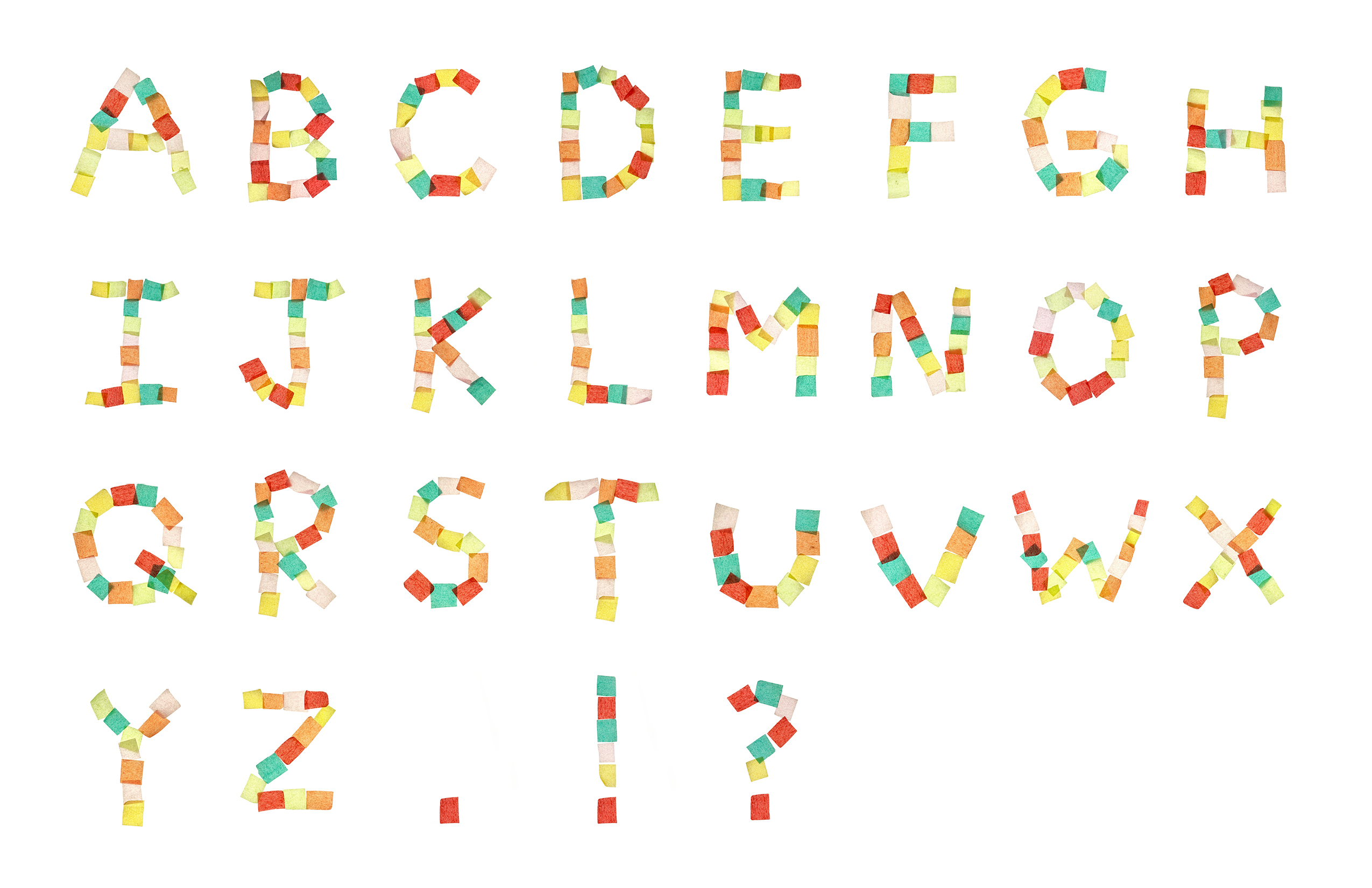
— your full alphabet plus punctuation (unedited photos) in a grid, give some space in between letters.
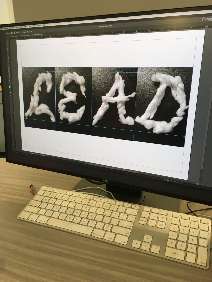
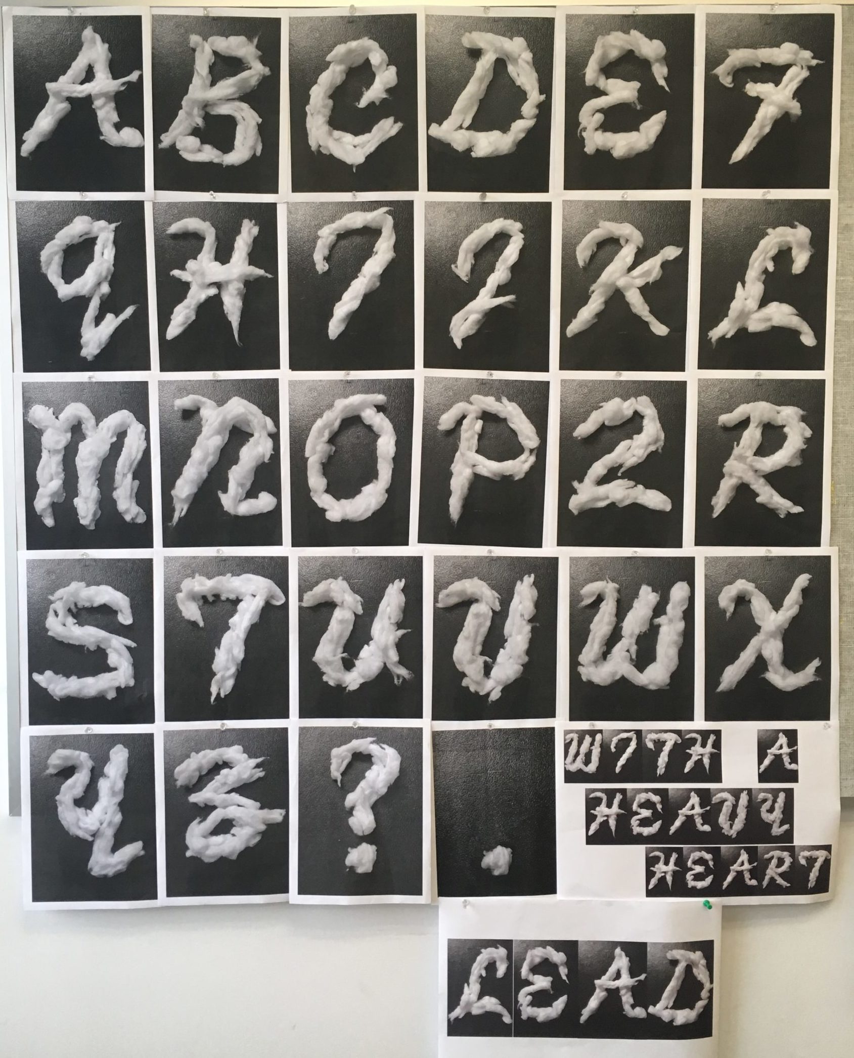
— a word in InDesign using the photos (unedited photos), set letters side-by-side (see LEAD example by Lauren Hale).
— a phrase in InDesign using the photos (unedited photos), set letters in words side-by-side, give space in between words.
See demo screenshots below. - Package the working InDesign file. Upload the entire packaged folder with a PDF to the drive.
Type specimen student examples:
-
Nayeli
-

-
Sarah Young, 2022
-
-
(below) Example of letters physically printed and installed on the wall. The word and phrase are printed on one sheet of 17 (w) x 11 (h) in paper, Lauren Hale, 2019


For this part of the project, I chose my earring materials from last week’s exploration. I was really drawn to the different metals and shapes, and I thought they would be a great malleable material for creating the entire alphabet. Rearranging the pieces was a lot of fun, and seeing it all come together in the final project in InDesign was so satisfying. I had considered using strawberry leaves to form the alphabet, which was a material I experimented with during last week’s assignment exploration, but since I went with the earrings, I’d love to save the leaves for another project or exploration. I enjoyed how creative this process was and how much freedom I had to experiment with different compositions. The contrast between the metallic textures and the letterforms made for an interesting design, and I love how the final piece turned out. Working with physical materials before translating them digitally gave me a new perspective on typography and design, which made the project even more exciting. I’d like to explore more unconventional materials in future projects, especially organic elements like the strawberry leaves. Overall, this was such a fun and engaging experience, and I’m really happy with the final result!
https://uncg-my.sharepoint.com/:b:/g/personal/r_riley_uncg_edu/EQiLc8d9vU1Pp-mFR0uyA-kBMpogoD9kRq09wum2ZMmwkA?e=rbN8Ge
Hi Ava! Glad to see you went with the earrings! I love how you’re making sure to save the strawberry leaves for something else, amazing way to not waste materials!
Hey Ava, I really enjoy the disconnected pieces of your alphabet. Just by providing enough structure, our eye is able to see the letters very clearly. Each piece being a different size and luster adds a unque ness to the overall forms of each letter.
Hey Ava, I love how you explored your chosen material. Having the slight pop of color added so much interest to your letters. It was something that definitely drew my eyes in.
For my studio this week, I made my letter forms from blue toy trains from the game Ticket to Ride. I chose to use the trains because they were the easiest to work with, and I have lots of them to work with. My letter consists of blocky shapes and minimal curves, as the trains are straight and do not bend. All of the letters are four to five blocks high and three to four blocks wide. I also chose the blue train color so it would contrast more with the white background. I did the phrase “We’ll be a fine line” and the word “alright,” both from a Harry Styles song. I enjoyed doing this, it made me pay more attention to how letters and forms are created and how they all work together. It was fascinating to see how many letters are so similar in form, and by moving a few blocks, you could have a completely different letter with a completely different meaning. I am very excited to continue working on this project as I find it quite interesting. I am also excited to see everyone else’s work and how they attempted to make these letterforms.
I love how you didn’t try to change the trains and how they are as an object, you didn’t fight their shape and instead embraced it into something that looks really well put together! If you had tried to make it look rounded or curved I think it would have been less effective. Good job!
My work was about making my own custom typeface and then making the entire alphabet in the process. My material of choice were floss picks mainly due to the ease of access but also it was such a complex material to work with. I made it a little challenging by not breaking them apart and just using how they came out of the package which left me with quite a variety of different geometric and almost organic shapes in the end. The word i spelled was guillotine which is actually a song title from Pi’erre bournes album called The Life of Pi’erre 4. The phrase I spelled out was actually the album title Which was The Life of Pi’erre 4. I struggled a bit with the overall sizing of some of the shapes and figures. Even though I took them all at the same angle with the same size formatting, some of them ended up being a little higher up on the imaginary lines than I liked. But as i mentioned before out of the three this was probably the most complex and challenging to work with in the end. This was most definitely a fun and challenging process that I really enjoyed.
Hi Jon! This is definitely one of the most creative/unique typefaces I’ve seen, and the result is incredibly interesting! With the sharp angles and sleek design, it reminds me of futurism. I can definitely see where you’ve pushed yourself and I think it was worth it! Admittedly, it is a little hard to make out some of the letters, but this feels more like an abstraction than a one-to-one replication of the alphabet. Great work!
Hi Jon! I love how abstract your typeface is, each letter stands alone as its own work of art. I think leaving the pieces intact instead of breaking them was a great choice that led to a great typeface. I also struggled with getting the sizing right when collaging my typeface together. Nice work!
This week I ended up choosing to go along with my shells, they really struck me when I started using them as something much more malleable than I thought that would be. I wanted to go along with the concept of calm, and of natural order, a naturalistic material being brought into the order of the alphabet. The concept of small, individual objects creating a larger, more distinct form has always been fascinating to me, and is always a wonderful metaphor for coming together to make something larger than anyone could be by themselves. This concept originally came to me when I saw the example of the sprinkles, but I wanted to make it a little bit more mature. I also connect the shells to the simplistic, round style font I chose, keeping things from getting too sharp, and allowing the shells to help dictate the shape because of their own curves. I kept the thickness of the words broad, keeping it generally rather bold, but allowing the shells to choose whether something was going to be thicker or smoother, such as the serif on the Q, which needed to be smaller and thinner because of how thick the rest of the letter was.
Word count: 204
For my studio project I chose to create an alphabet made from sticky notes. I reflected on the 6 letters I had created last week and each varied in proportion and also some has shadows created from the lighting and the sticky notes not laying flat. I actually thought that the shadow added a lot more interest to the letters and so this week I recreated the 6 letters. All the letters were exactly 7 post it notes in height; however the width was dependent on the letter. For some letters such as the M they had to be wider in order to be legible. I also made sure this week that the post it notes were placed top to bottom so that each letter had interesting shadows from the post it notes. I followed the rule of only creating my other letters from the letters we were given last week. I though this was fun but also slightly challenging as I had to work out how to adapt each letter to get a new individual one. I think that it helped to maintain the typeface consistency throughout the alphabet though. The letter that I struggled with was the Y as no letters from the previous week were that similar but I used part of the diagonal on the A to create one part at the top of the Y.
Here is the link to my file for this week:
https://uncg-my.sharepoint.com/:f:/r/personal/r_riley_uncg_edu/Documents/_Rachele%20Riley/teaching/S25/ART%20341%E2%80%9301/Hannah%20Hind/Week%209?csf=1&web=1&e=sTt37I
Your letters look almost digital, and it really plays well with how you constructed your alphabet. The variation in thickness, while sticking with the same height really elevates your work. These look really nice!
Hey Hannah, I really enjoyed the letters. I think having a sans serif worked so well with the materials and the font was cohesive throughout. Such a great alphabet and material exploration!
For my project I picked the Q-tip material out of the three materials I had experimented with prior. My three materials were the Q-Tip’s, earrings, and gum wrappers with the gum still inside. I chose the Q-tips because I felt out of the three experimentations the way I went about with this material was the strongest. However, I did think I would go with earrings because I felt that would be more interesting. But I felt with the jewelry I had the letters would not look cohesive. In week 8 for the Q-Tip presentation of letters they were a lot thinner in many letters. I wanted to thicken up the letters this go around and try to make them more united. For our studio work I thought it was pleasing to the eye to organize and see the letters right next to each other in the grid formation. I also realized that some photos look different from others which somewhat threw that off. For the short phrase and word, I wanted to showcase some letters that I felt were the strongest. For example, my B, H, L, and F. While forming these words I also realized some letters that fell short such as my O or U. I wish I thickened those letters up so they would fit more with the rest.
https://uncg-my.sharepoint.com/:b:/r/personal/r_riley_uncg_edu/Documents/_Rachele%20Riley/teaching/S25/ART%20341%E2%80%9302/Sarah%20Hines/week%2010/Week%2010%20pdf.pdf?csf=1&web=1&e=XPQtdw
Hey Sarah! I love how you aligned your q-tips, they have such a grid like pattern to them and i love the phrase you chose to make!
From Cindy Pham:
Hi Sarah!
I love how you switch from thick and thin compositions throughout your letters, and how you chose to align some Q-tips to be either very close to each other or spaced out, especially with the C. I also enjoyed how you arranged your phrase and spaced them out! The changes between the thin and thick lines and then the spacing really makes the word and phrase stand out!
For this project, I chose to represent typography through my jewelry, drawing inspiration from the Rochester font in all uppercase letters. I was pulled towards this font because of its elegant, decorative style – which is similar to the jewelry itself.
Shaping these letters was the hardest compared to my previous options from last week, but it turned out to be my favorite visually. I used necklaces, bracelets, and ankle brackets in bronze and gold tones to add some color and variety. Each string of jewelry I used holds personal significance, gifted to me by loved ones. They carry memories and emotions, and because of this, I chose the phrase “I love you…” – the three dots creating a sense of longing and connection. I even incorporated a heart-shaped pendant necklace in my letters to symbolize love. The fluidity of the chains and the pendants created a unique contrast, mirroring the complexity of desire and love.
Jewelry has always represented yearning, whether as a gift, memento, or personal treasure. This project captures the feeling of wishing, cherishing, and turning meaningful objects into a visual language that speaks beyond words. Throughout this assignment, I explored how sentimental objects shape our emotions and how typography can express more than just letters.
https://uncg-my.sharepoint.com/personal/r_riley_uncg_edu/_layouts/15/onedrive.aspx?id=%2Fpersonal%2Fr%5Friley%5Funcg%5Fedu%2FDocuments%2F%5FRachele%20Riley%2Fteaching%2FS25%2FART%20341–02%2FChristina%
Hey Christina! I really loved reading your reasonings and ways you went about this project. Your message is lovely and your letters are so well done with your jewelry. The font is pleasing to look at and your word and phrase connecting with your material is a beautiful touch!
These turned out great. The amount of variation between each letter makes it really fun to look at. The elaborate forms you chose works very well with this material since it leans into all the little flourishes.
My project was created from the material of White Cheddar Cheez-Its. After experimenting with my material in Week 8 and talking with Professor Riley, I decided to reconfigure how I was forming these letters by using a substantially larger amount of Cheez-Its to form each letter. This allowed for me to create more visual interest within each letter and to be able to really dive deeper into working with a grid. By working with this very geometric square shape, I feel like the aesthetic that presents itself is one similar to early stage video games and a pixelated look. This look is intriguing to me as I grew up being shown older video games by my Dad so I have a connection to this type of letter form. Another thing that I had to work through with Professor Riley was how to address similarities in certain letters and working to consistently represent the forms within these letters in the same way so that my alphabet seemed cohesive and not disconnected because of certain letters going off and doing their own thing. Overall I am really happy with how my alphabet turned out and how it progressed from Week 8 to now.
Link to my Week 10 Packaged Folder:
https://uncgmy.sharepoint.com/:f:/g/personal/r_riley_uncg_edu/EsQdgBowgNlPh2VtI09VHrMBeX0C8BlXAcGGcZP_rfa6IA?e=URg0Re
Hello Hayden! I enjoyed looking at your project and reading the “Say Cheese!”. The Cheez-Its was a fun and interesting idea, especially with the angular square shape of the cracker. I liked how you configured your font into a retro, video-game format too. Thank you for sharing!
From Cindy Pham:
Hi Hayden!
I absolutely love the pixelated look you went for; everything is so cohesive and balanced. The X and the Q are by far my favorite as they’re so dynamic and unique, and using Cheez-Its to create that videogame aesthetic was very clever! Even the word and phrase you chose is so ironic and humorous, you absolutely killed it!
For this project, I used pipe cleaners to create the entire alphabet, along with three important punctuation marks: a period, an exclamation point, and a question mark. Each letter and symbol was carefully shaped and formed using this flexible and colorful material. Pipe cleaners gave me the freedom to experiment with different letter forms and styles, and I felt that I worked best with this material because of its versatility, ease of use, and ability to hold shape without the need for glue or tape. Working with pipe cleaners allowed me to focus on the design and structure of each letter. I was able to bend and twist the material in a way that felt very natural to me. It made the process fun and hands-on, almost like sculpting. I explored how to make each letter clear and readable while keeping a consistent size and style throughout the entire alphabet. This project taught me a lot about patience and attention to detail. Even though pipe cleaners are soft and forgiving, getting each letter to look just right required time and care. I’m proud of how everything turned out. The finished alphabet feels unified and expressive, and I believe this project showcases both my creativity and my ability to work effectively with unconventional materials.
https://uncg-my.sharepoint.com/shared?id=%252Fpersonal%252Fr%255Friley%255Funcg%255Fedu%252FDocuments%252F%255FRachele%2520Riley%252Fteaching%252FS25%252FART%2520341%E2%80%9301%252FTre%2520Leach%252Fweek%25209&listurl=%252Fpersonal%252Fr%255Friley%255Funcg%255Fedu%252FDocuments
Hello Tre,
I think using the pipe cleaners is a good material to use for the typography especially because they’re easy to form together to make what you want. I also like that you used different colors for the pipe cleaners because I think it makes it more diverse.
Hey Tre, I agree pipe cleaners holds more benefits in terms of folding and twisting to form a letter compared to other materials. This has an interesting result!
I had to abandon my original idea of expanding the shadow alphabet due to time constraints. I have chosen to expand on the crushed espresso idea instead. The letters were formed using a dried espresso puck. I used a white piece of card stock to keep the background consistent between images. The goal was to maintain the granularity in the images and use them to accentuate certain letters and in some cases emphasis the differentiation between similar letter forms using suggested grain lines such as in A and R.
For the third page I chose the phrase. ‘how did we get so tired?’. I thought this would be a fitting application for the espresso alphabet while also alluding to the increasingly stressful climate in our surrounding world. Breaking the phrase up into 3 separate rows allowed me to get the word tired on a row by itself, which I felt enhanced its impact subtly.
I feel the material shows a lot of potential to explore deconstruction of letter forms in possible future iterations of the project. An interesting experimentation could include using macro photography to better reveal changes in texture. In the case of my ‘Z’ form, I noted an interesting relationship between compacted and non-compacted sections giving a sense of implied planar angles. This could be exploited by others to use similar granular materials in a way that emulate dimensional hard surface textures.
https://uncg-my.sharepoint.com/:f:/g/personal/r_riley_uncg_edu/EgquOKnBwDBOieG1UIG9w3ABI-e8_OD-aTZqLs9-qtryjA?e=kQM2a2
I absolutely love your letters Zeus! From the bold font choice to the consistency of your background and sizing I think this makes for such a successful typeface and great example of what artists can put together out of what can seem impossible to someone else!!!
Hey Zeus! I love how the crushed espresso looks like! Although you had to abandon your first idea, this outcome stills looks amazing!
Hi Zeus!
I realllyy like how you used espresso powder to create your alphabet, it looks so visually pleasing. All of your letters also look very clean, which is very impressive given how messy this type of material tends to be.
Hey Zeus! I really enjoy the texture that is created by using the dried espresso! I think that the uniqueness in where espresso piles up and where it expands on the edges creates a really visually intriguing alphabet. I also think that you did a great job keeping your letters consistent in height which shows how you really thought through the overall design of your letter forms. Great job!
Hey Zeus, I was surprised to find out that espresso powder was the material used here. Your letters are bold and compressed. The opposite of a powdery texture.
For my project, I had a hard time deciding which material I wanted to use out of the three materials I had. I originally had made the alphabet with shoes, coins, and perfume. I leaned to the shoes at first. I thought the different shapes, colors, and sizes of shoes would make the letters look bold and interesting. But when I started trying it, I realized it would take way too much time and energy. It was hard to move all the shoes around and get the right shapes. It felt like too much physical work for something that might not even turn out the way I wanted.
So instead, I decided to go with the coins idea. It was easier to handle and still looked really nice. The coins were small and shiny, and I could arrange them more easily. I made my letters using serif style, which the letters had little lines or strokes at the ends. I will say, I did make the letters at different times of the day, so I would’ve loved to edit them before. But this assignment calls for us not to edit them, so I didn’t (even though I really wanted to.)
Despite some inconsistencies in lighting, I think the letters themselves turned out really nicely. I made the word “Pretty” and the phrase “Pretty Hurts, Heavy Hearts.”
https://uncg-my.sharepoint.com/:b:/g/personal/r_riley_uncg_edu/EYtjvMeqxjJPq_fKGxzQuzkBBv3U6ZP-BykZVJYdEWWvIA?e=woXam1
Hey Clint! I am really glad to see how your coin designs have developed since last week! Keeping the serif throughout your letters really makes these unique cause I feel like most people didn’t have one. I also really enjoy the use of a variety of coins and the layering that you do to create these unique letter forms. Great work!
Hey Clint, the use of coins to bulid up your letters is really interestings. Coins provide diversity even among the same type of coin which adds an interesting color scheme. Choosing to make them a serif font makes each piece look vintage with calls back to the aesthetics of a coin.
My project for this week consists of a typeface made using various strips of a fast food paper napkin acquired from the local Zaxby’s I get food from when I’m in a particularly down mood. I prepared each segment of napkin by tearing it with my hands and folding them to size. With my segments prepared, I made some guidelines for the production of this typeset to maintain consistency and style, though I do admit I broke my guidelines where I saw fit. Using my cutting mat which is on my desk to measure, each letter could not exceed 7 inches by 5 inches, and to make sure the ripped edges faced inward for each shape. Those were the two guidelines I settled into as I went, which allowed me to stay systematic about my production of the type. The phrase I chose in the PDF is “succumb to the line, the finishing time.” these are the opening lyrics to the song ‘Tears in the Typing Pool’ by Broadcast, a band I was watching a documentary about while producing my typeface, choosing this song wasn’t unintentional either as the song itself uses typing and language as a motif. While I do really dislike using indesign I found the process of creating letters from materials meditative.
Hey Finn, It was interesting viewing your final results. I love how structured you made your letters. I love how the edges also give an effect. Another thing I want to add is the way you used a phrase from the lyrics. This is so cool; I would never have thought about this. Using a song that plays with themes of language and writing reinforces the materiality of your process poetically. Even your dislike of InDesign feels like part of the project’s tension, which makes it interesting.
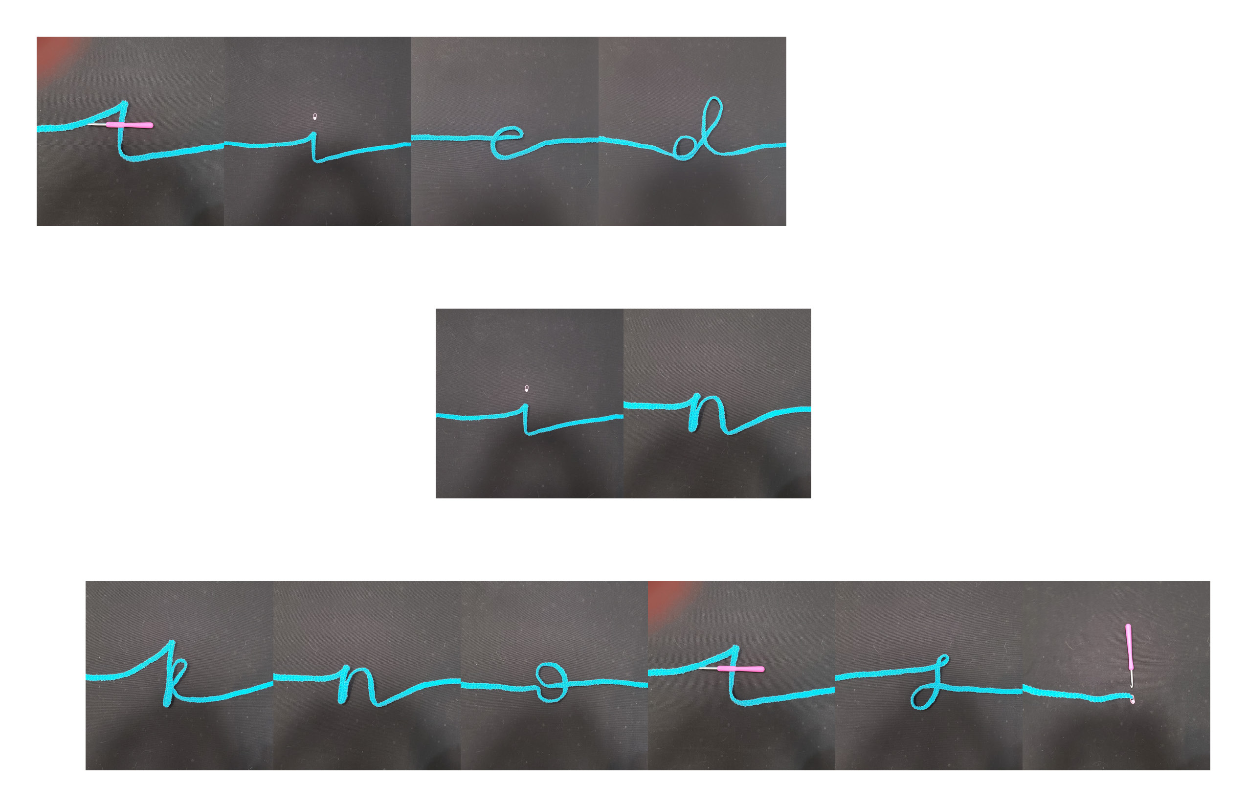
For this project, I chose kitchen knives as my material to create the entire alphabet system, including punctuation. After experimenting with different objects last week, I found that kitchen knives offered something visually unique: the reflective quality of the metal under directed lighting created interesting highlights, shadows, and textures that made each letter feel dynamic and dimensional. As I moved forward with this material, I focused on refining each letterform to make sure the shapes were clear and legible while still maintaining an abstract, sculptural feel. I spent time adjusting the arrangement, layering, and angles of the knives to get more interesting compositions and reflections. Some letters required stacking knives to create more complex shapes, while others worked best with simple, minimal arrangements. I also made refinements to my lighting setup, using a stronger directional light and adding a white foam board to bounce light and soften shadows. The background was simplified to a matte black surface to contrast the bright reflections of the metal and make each letter stand out. The word I focused on for this round of refinement is Sublime, and I aimed for the letters to feel sharp, bold, and striking—both literally and visually.
For my project, I’ve decided to expand on my experimentation with lettering with Nerds. I was fascinated with both the colors & the irregular texture of the nerds. It reminded me of a type of small, colorful cobblestone, and I like the way that each little candy arranges itself onto one another to create a figure. I spent more time on the endings of each letter and trying to make them more consistent throughout the entire alphabet. Creating the type specimen with such an unorganized/chaotic medium like Nerds was difficult but fun to work with. I spread a handful of the candy on top of cardboard and arranged them into the different letters before photographing them with my phone. Transferring them into a typeface was a process to figure out but ultimately satisfying. For my word, I thought it was fitting to arrange them into “Nerd”, and then for my phrase, I decided on “Sweet for the soul.” In general, I’m satisfied with the way my typeface is turning out. I might have experimented more with the random nature of the candy rather than trying to organize them neatly, but all in all, I like the way that it turned out.
https://uncg-my.sharepoint.com/personal/r_riley_uncg_edu/_layouts/15/onedrive.aspx?id=%2Fpersonal%2Fr%5Friley%5Funcg%5Fedu%2FDocuments%2F%5FRachele%20Riley%2Fteaching%2FS25%2FART%20341%E2%80%9301%2FCallie%20Roberts%2FWeek%2010&ct=1736865315342&or=Teams%2DHL&ga=1
Hi Callie! I absolutely love this. The combination of the purple and pink colors creates a super interesting texture and I love the ends of the letters where they stick out a bit. Great work!
Discuss:
For my project, I went with seashells. I did build the letters off of eachother. I found it quite enjoyable to arrange the letters and put them into Adobe Indesign. I kept the background brown, because the shells blended into a white background. I still plan to experiment with other materials. This project is my favorite so far, as I had been waiting for a chance to use my seashells. I made sure to take clear photos with good lighting so that the typography would be easily legible. I have thoroughly enjoyed viewing my classmate’s work from the previous week as well. There was a vast array of styles that caught my eye. I particularly was drawn to the letters that were cut out from a magazine by Rory Bohn. I chose the phrase “Under the Sea!” It was a moderate length, perfect to represent a decent range of letters. I also chose the word “Seashells” as S is my favorite letter. Lastly, I struggled a little bit making sure the letters were the same size. Once I learned that I could stretch and compact them, I no longer had any issues! Overall, this process was the right amount of challenge for me.
Studio:
https://uncg-my.sharepoint.com/:f:/g/personal/r_riley_uncg_edu/EorTf5Sct8tNhFG6rCIiUq4B-wjXFHB-gHLDm_0muz5nVw?e=rg0ms5
Hi Saige! I was struck by your material as I am also drawn to seashells as well! It’s the same material but each of them are different. Which is nice to look at and your phrase is fitting! It’s nice to know you also enjoyed your time with this project because it really shows!
I love your letters as well Saige I think the differentiation in your seashells makes for a great stylistic choice. As well, the consistency in your shapes works really well, I almost wish they were in a bit of a tropical font to further push the Beachy oceanic vibe!! Great work Saige!!!
For my project, I first experimented with form and texture. I tried making letters out of sugar, popcorn, and mushrooms, which I found in my kitchen. I decided to create an entire alphabet out of popcorn. There’s something playful and imperfect about popcorn—its light, airy, and irregular shape made it a challenge but also an exciting material to work with. I carefully arranged each kernel to form letters, making sure they were readable while still maintaining the organic feel of the popcorn. The irregular form makes it both a challenging and fascinating material for letter creation. Each kernel expands unpredictably when popped, resulting in a variety of shapes—some rounded and compact, others elongated or jagged. This randomness meant that I had to carefully select pieces that could naturally suggest parts of different letterforms. For example, softer, more rounded pieces worked well for curves in letters like “O” or “C,” while sharper, angular pieces helped define the edges of “M” or “A.” The airy, lightweight quality of popcorn also contributed to the overall effect. Unlike rigid materials, popcorn letters had a slight sense of movement, as if they could shift or crumble at any moment. This gave the text a playful, almost ephemeral quality, reinforcing the theme of imperfection and spontaneity. The contrast between the delicate, unpredictable popcorn shapes and the structured nature of typography created an interesting tension—balancing order and randomness within each letter. Additionally, the rough, uneven surface of the popcorn added texture to the composition, making the letters feel more tactile. The small crevices and folds caught the light in different ways, creating highlights and shadows that gave depth to each letter. This three-dimensional aspect made the typography feel more dynamic compared to traditional flat lettering, enhancing its visual appeal. The organic, handcrafted quality of the popcorn letters made the phrase feel more personal and engaging, drawing attention not just to the words themselves but to the materiality of the text. The wooden background added a contrast, making the white and golden tones of the popcorn stand out even more. Once I had the full alphabet, I came up with “WANT A PIECE?”—a phrase that felt both inviting and a little cheeky, perfectly tying into the theme of popcorn.
.
.
.
https://uncg-my.sharepoint.com/:f:/g/personal/r_riley_uncg_edu/EoTn0U2DFBZHrQrrK-E8gwoB2AqiP5Er5vaPrVSB3YC77g?e=kP9MLV
I started by reviewing my existing paper clip alphabet to see where I could make improvements. I noticed that some letters weren’t as consistent in size and shape, so I carefully adjusted them to make sure they looked more uniform. For example, letters like “G” and “R” needed better alignment, while “X” needed a cleaner structure. I made sure the spacing between the clips was even and that each letter felt cohesive. I fixed how the paper clips connected. Some of the curved letters, like “C” and “S,” needed smoother transitions, so I repositioned and added clips where necessary. For diagonal letters, like “K” and “X,” I worked on getting the angles just right so they looked balanced. Once the letters were adjusted, I focused on improving my photography setup. I used a matte background to reduce reflections and make the colors pop. I also adjusted the lighting to minimize shadows and ensure each letter was clearly visible. I made sure to photograph each letter from the same angle and distance so the final set looked consistent. This part was a little tricky, but I believe I got it done! After all, when I finished taking all the photos, I checked carefully, and everything was good. If something seemed off, I went back, made small adjustments, and re-photographed those letters, which were like two.
https://uncg-my.sharepoint.com/:f:/r/personal/r_riley_uncg_edu/Documents/_Rachele%20Riley/teaching/S25/ART%20341%E2%80%9302/Cindy%20Ortiz/Week%209?csf=1&web=1&e=6y6Gtb
These look awesome! The paperclips make for a really interesting texture, and the letters themselves are formed really nicely. The colors make them feel really bright and happy.
For My original experimentation I wanted to use methods that were different from others to create the words. I decided to go further with the Pretzel sticks because they had the best uniformity among them as well as being clearly legible. They were also much easier to work with than the other materials that I worked with during week eight. When diving back into the assignment I found that I used a very basic sans serif font that had an extra attachment. I recreated almost all of the alphabet and punctuations but I did leave some that were in my original experimentation. The ones I left in had the same level of uniform as the newer one and they still had the same quality in photo. As I was creating the alphabet I realized that I needed to simplify some of the letterforms because they were becoming too bulky and therefore creating a different font inside the font I was working on. I had enough sticks to properly experiment with that so it turned it for the better. For the punctuation I wanted to include the most common and that is why the three that I completed were the ones I chose. For the words I wanted to do puns based of the material to create a fun energy around the font.
The pretzel sticks do seem easy to use which makes viewing your work and making out the letters very easy. Great Job!
I appreciate how you doubled up the lines in places to create new letter forms. Keeping that as a consistent element across the alphabet makes it very characterful.
So far for my studio project, I decided to make the alphabet and punctuation marks by using my medication as the material. After organizing all of the letters and punctuation marks, I made a simple word of “hello” out of them and then decided that for my phrase, I wanted to create a play on the phrase “bitter pill to swallow” by arranging the letters to just say “bitter to swallow?”. I thought it would be a creative take and some clever irony in doing it; I also was inspired by a similar project that my friend had done with medication bottles and pills and organizing them into letters. I went with the idea of using medication for the material for making letters instead of doing the other ideas of had of using foods like bacon and popcorn. I felt like there was more depth in the context and helped create a piece that created more questions. The process definitely was a bit time consuming due to having to organize the images and to make them fit proportionally and to size them right. That also was a problem when it came to organizing the letters into certain words or phrases.
https://uncg-my.sharepoint.com/:b:/r/personal/r_riley_uncg_edu/Documents/_Rachele%20Riley/teaching/S25/ART%20341%E2%80%9301/Anthony%20Valentine/Week%2010/Week%2010%20ART%20341.pdf?csf=1&web=1&e=8rUd3l
I’ve actually enjoyed this project as itn has allowed me to have creative freedom when it comes to choosing my material. I chose cotton swabs because they are both an uncommon material yet effective material when it came to being able to build each letter. I was able to create unique forms with them in the form of layering rather than simply outlining the different letters. I wanted a material that would be able to be manipulated and changed while still having the necessary forms of letters. I used my material to create the word “create” and the phrase “Be Still”. Both of these hold relevance to my life and how I have been feeling lately. The word “Create” explains how I love to create things with my own forms of art. As many of us are artists we can relate to this unique way of expressing ourselves thus why I chose this word to create out of my material. The phrase “Be Still” is a phrase that I am trying to relate to myself. As a senior who is about to graduate I have a lot to figure out for my future and where I want to be. This can be stressful, so this phrase is meant to calm me down and realize that things will be okay.
https://uncg-my.sharepoint.com/my?remoteItem=%7B%22mp%22%3A%7B%22webAbsoluteUrl%22%3A%22https%3A%2F%2Funcg%2Dmy%2Esharepoint%2Ecom%2Fpersonal%2Fwagentry%5Funcg%5Fedu%22%2C%22listFullUrl%22%3A%22https%3A%2F%2Funcg%2Dmy%2Esharepoint%2Ecom%2Fpersonal%2Fwagentry%5Funcg%5Fedu%2FDocuments%22%2C%22rootFolder%22%3A%22%2Fpersonal%2Fwagentry%5Funcg%5Fedu%2FDocuments%2FART%20341%E2%80%9302%22%7D%2C%22rsi%22%3A%7B%22webAbsoluteUrl%22%3A%22https%3A%2F%2Funcg%2Dmy%2Esharepoint%2Ecom%2Fpersonal%2Fr%5Friley%5Funcg%5Fedu%22%2C%22listFullUrl%22%3A%22https%3A%2F%2Funcg%2Dmy%2Esharepoint%2Ecom%2Fpersonal%2Fr%5Friley%5Funcg%5Fedu%2FDocuments%22%2C%22rootFolder%22%3A%22%2Fpersonal%2Fr%5Friley%5Funcg%5Fedu%2FDocuments%2F%5FRachele%20Riley%2Fteaching%2FS25%2FART%20341%E2%80%9302%2FAlex%20Gentry%2FWeek%2D10%2FTypography%2DWeek10%22%7D%7D&id=%2Fpersonal%2Fr%5Friley%5Funcg%5Fedu%2FDocuments%2F%5FRachele%20Riley%2Fteaching%2FS25%2FART%20341%E2%80%9302%2FAlex%20Gentry%2FWeek%2D10%2FTypography%2DWeek10&listurl=%2Fpersonal%2Fr%5Friley%5Funcg%5Fedu%2FDocuments
For my project I decided to use M&M’s to create my alphabet. M&M’s were actually the first item that I tried creating my letters with and I loved how they turned out, they are colorful, and were easy to move around. For my font I went with something simple, no cursive, just because I wanted the alphabet to be readable and I wasn’t sure I was gonna be able to do that with M&Ms. The process of creating them wasn’t so hard, what was hard was trying to get the lighting right in my pictures and trying to make sure the letters were the same size. For my word I decided to write pink, since it’s one of my favorite colors and it was the first word I thought of when thinking of one. For my phrase I wrote “so pretty!” since I thought it would fit well with the word I chose and the alphabet itself since it has too many colors. I was having a bit of a hard time using indesign, just because I’m not really used to it, but thankfully in the end I was able to get it and it got easier as I used it.
https://uncg-my.sharepoint.com/shared?id=%2Fpersonal%2Fr%5Friley%5Funcg%5Fedu%2FDocuments%2F%5FRachele%20Riley%2Fteaching%2FS25%2FART%20341%E2%80%9302%2FXimena%20Perez%2DChavarria%2FWeek%2010%2FWeek%2010%20Folder&listurl=%2Fpersonal%2Fr%5Friley%5Funcg%5Fedu%2FDocuments
I really like your M&M’s letters! They make for really fun and colorful forms that are super interesting to look at. One possible improvement is to maybe try and brighten up the images a bit; right now they look a bit dim and I think having the background be more white would make the colors pop even more.
Wow, Ximena! When I read M&M’s, I wasn’t expecting the final product, but I love how it turned out. I think you did a fantastic job spacing out each M&M as well. I like how the different colors from the chocolate contrast with the solid white background Thanks for sharing!
This was very pleasing to my eyes. I enjoyed the fact that you tried to keep the colors together which makes this very visually pleasing.
Ximena, I enjoyed that you used S&M. “Pink” and “so pretty!” reflect both your personal taste and the colorful, joyful nature of your typeface. And I totally get the struggle with InDesign; it can be a pain at first, but once you get the hang of it, you can work with it. After all, you did a great job!
For my project this week, I decided to go with another route when it came to my material for the font. I wanted to stick with my original idea of something edible for my material, but didn’t want it to all be the same color and shapes. I had landed on the almond choice from my three experimental materials, but eventually went with trail mix for my final choice. This stayed on theme with the edible font, while having enough variation to be visually interesting. After finally choosing what to make the font out of, I then started brainstorming on what phrase I could use from it. I first began with the name, “trail mix”, and tried to think of something related to it. I then thought about why trail mix is called trail mix, of course being created for the purpose of hikes and walking trails. Then I came up with the idea of the saying “happy trails”, which basically just means goodbye and safe travels. With that in mind, I was pretty satisfied with what I chose, finding the phrase to be pretty apt considering the material of the lettering it is spelled from.
https://uncg-my.sharepoint.com/:b:/r/personal/r_riley_uncg_edu/Documents/_Rachele%20Riley/teaching/S25/ART%20341%E2%80%9301/Ethan%20Heggins/Week%209/art_341_week_9.pdf?csf=1&web=1&e=7mSwDp
Hi Ethan,
I think using the trail mix for your alphabet is a very creative idea for your project; I think the different colors make it pop out more especially with them being in random places among the letters. I also think the happy trails phrase is a cute thing to make with the letters.
Before starting the form the letters a second time I looked at a few font references on the google font website. The goal was to make the fonts a bit curvier and goofier. I decided to for my project I decided to work with break dough. The material was easy to work with other than having to wipe the smaller dough bits of the cutting board to keep the area clean. I decided to leave the ends of each line of the alphabet more circular to give the font a goofier shape. Within the in-between of each line, I decided to pull the dough to make the line change thickness. Instead of working against the material I decided to lean towards the dough fluffy and curvy shape. A few of the letters of the alphabet are lower case instead of upper case. The purpose behind alternating lower case and upper case was simply because some letters were easier to make in lower case. The quote I decided to choose was “Bake Me!”. Figured it would fit with the material. I might change the quote before class Tuesday we shall see. Finally, I cropped the images a little bit before importing the images into one drive.
https://uncg-my.sharepoint.com/shared?id=%2Fpersonal%2Fr%5Friley%5Funcg%5Fedu%2FDocuments%2F%5FRachele%20Riley%2Fteaching%2FS25%2FART%20341%E2%80%9301%2FKarla%20S%20Morga%2FWeek%20Nine&listurl=%2Fpersonal%2Fr%5Friley%5Funcg%5Fedu%2FDocuments&login_hint=KSMORGA%40uncg%2Eedu
Hi Karla! I thought your typeface was really funny and super engaging! The curves and round shapes you created really emphasize the nature of the dough, giving the typeface a light-hearted, fun feeling. I know the letters would probably be unrecognizable if you did, but I’m curious what these would look like after baking them!
For my project I chose to further explore my “Lost and found” Items to create a Typeface of. I think what really made me want to choose these to play with more was the reactions they were getting compared too my other two options. I really enjoyed connecting the lost and found/ I-Spy style theme with working with actual lost and found items, When I came to finally spelling the word found with the letters created with the object I was so happy that Professor Riley had encouraged me to further work with the items. As far as what changed from the first time I worked with them was one the orientation of my letters themselves, what I mean is that I was really struggling with keeping the shapes “Straight” and orientated in the exact same way, so rather then let that problem get in the way, I let that play into my choices stylistically. I felt that when the letters sort of were out of sync with how they were lined up, it played into them feeling like they were existing on their own as a form rather then scattered objects, wether it was a recognizable shape or not. As well, I also played with having more of a font, I explored websites like fontspace to get a good feeling f what I wanted my letters to be shaped like, I didn’t stray too far from the original serif style I was doing, however I do notice a more present personalization of my letters that allow them to stand on their own!! Overall I had so much fun with this assignment.
Link to my work:
https://uncg-my.sharepoint.com/:b:/g/personal/r_riley_uncg_edu/EXqlroG-SDJNvxcojn9kgf0BI1T-fJaAnEvxe2dePkPvxQ?e=uc8Ul0
Hey Jackson! I love how you chose metallic materials, it reminds me of my project. The assortment of buttons and other items really gives off a Coraline feel. The fact that you had fun with this project really shines through.
LINK: https://uncg-my.sharepoint.com/:f:/g/personal/r_riley_uncg_edu/Ehlo4EmxD0lMqE3oprUht1EB620zgTEBFhommMcW_jk8OQ?e=8Tum8N
For my project, I decided to go forward with the wood glue as my material. While it was messy and tedious to work with compared to the other materials I tested, I thought the forms that resulted from it were the most interesting, so I chose it in the end. I created my letters on the back of a plastic plate, pouring the wood glue onto the surface in the shape of each letter, using my finger to move it around a bit if necessary, taking the picture, and then washing the glue off the plate in between each letter. It took a while but I’m very satisfied with the end result. I really like the irregular, almost three-dimensional look of my letters. For my word, I chose “lemon” just cause it came to my mind randomly. For my phrase, I did “Allez Les Blues!” which is the title of a song by my favorite band, Los Campesinos! I included the exclamation point to test out one of my symbols alongside the letters.
LINK TO WORK: https://uncg-my.sharepoint.com/:f:/r/personal/r_riley_uncg_edu/Documents/_Rachele%20Riley/teaching/S25/ART%20341%E2%80%9302/Chris%20Pierce/Week%209?csf=1&web=1&e=v8fRpv
For my Type Specimen I used lighters to construct my letters. I wasn’t really happy with the materials I experimented with last week, so for this week I wanted to try and use something more visual interesting, and I really liked playing with the different shapes of the lighters and seeing how they fit together to create the different letter forms. There are definitely some I think that could be improved upon; I think one of the downsides of using lighters is they’re a stuck size, so some letters became smaller or bigger than ideal because of that.
https://uncg-my.sharepoint.com/:f:/g/personal/r_riley_uncg_edu/EjxEJJbcbitIop_CCGwfFN8Bb2evTem_JR7VJ_cNf1uMWg?e=PpyUf1
For my project this week I decided to use frozen vegetables to create my font. When I was first creating letters two weeks ago I’d made some with honey and some with an orange peel. Honey was my first idea and the one I was sure I was going to end up using for this week. The orange peel looked the best to me but it was unfortunately much more difficult to form letters with it. I tried making as many as I could but ultimately I decided to go with the frozen vegetables. I piled them up and made big, chunky letter forms. The hardest part was the lighting since I had to try to avoid any dramatic shadows. For my word I decided to write “veggies” which is pretty self explanatory. Since I was using food ingredients the first thing that came to mind when trying to think of a phrase was “kiss the cook.” It fit the theme perfectly so I decided to write it out with my new letters. The most time consuming part was putting all of my pictures into InDesign. The process is pretty straightforward but still very slow. I’m new to the program this semester so it also took me a while just to make sure everything was formatted correctly.
https://uncg-my.sharepoint.com/personal/r_riley_uncg_edu/_layouts/15/onedrive.aspx?id=%2Fpersonal%2Fr%5Friley%5Funcg%5Fedu%2FDocuments%2F%5FRachele%20Riley%2Fteaching%2FS25%2FART%20341%E2%80%9301%2FIsabella%20Galvan%2Fweek%2010%2Fweek%2010%20Folder&noAuthRedirect=1
For this assignment, I made letters using mechanical pencils that I borrowed from a friend. They weren’t the easiest to use out of my three options, which were the pencils, staples, and pills. I could’ve gone the safe route and had gone with the pills as they were the easiest to move around and make smooth and nice letters. I chose the pencils because I wanted to challenge myself a bit but also because I was fascinated by the way the letters turned out. I used different colored pencils and also arranged the point part pointing towards the eraser for each meeting point instead of keeping them the same because I thought it gave the letters some unique look. I realized that some letters came out a bit longer than others and that they also came out boxy compared to others that were more pointed. It was fascinating to see how moving a few pencils around could end up giving me results that I didn’t think of before. I would like to try out more objects in the future and see what kind of results I can get. I enjoyed doing this, but I have to admit it took longer than I thought it would.
The color and polygonal arrangement of the pencils is reminiscent of retro arcade graphics. Great job.
With my alphabet I wanted to choose a medium that was modular since I feel that would have given me an interesting perspective when constructing letters. I chose to use cards as they all have the same repetitive background. I wanted to focus on solely horizontal and vertical orientation as a limitation to see if I could produce recognizable letters. I also redid some of the letters from the previous assignment as I thought they were either unrecognizable or not the same scale as the other letters of the alphabet. Another design element I wanted to focus on is the curviness of the vertical lines. I feel like it makes it standout since I think it would have be very easy to simply overlay the cards in a perfect vertical line. I really like the contrast that is made with the rigidity of the cards and the curves of the overall shape. The ‘m’ is the letter I think exemplifies this the most, but I do like the movement of the ‘x’. I do want to retake the photos from a fix position because they all seem a little off. I could also just scale them to get them close enough.
LINK: https://uncg-my.sharepoint.com/:b:/g/personal/r_riley_uncg_edu/EceIwoPjTDxIvHG7FfwvlPABnwgKiJ3XVl2LuizCTdMlLg?e=bGJKek
My project features the latin alphabet and three punctuation marks created from various necklaces. I settled on necklaces as my medium because I enjoy the difference in line quality, the shiny metallic texture, and the beauty of jewels. For documentation, I used a mixture of natural light and overhead. I shot each letter on a piece of cardstock for consistency.
My favorite letters to shoot were probably A, C, and M. I like how these letters came together. Something these letters have in common is being composed of 3-4 necklaces; the more necklaces, the better! The way they interact and play a part in building the letters is very pleasing to the eye. Building the entire alphabet proved to be very rewarding – seeing all the letters together provided a sense of cohesion that I didn’t know this project would yield. It makes me excited to build my own downloadable typeface from scratch.
I had to reshoot some of my letters for cohesion. Some, such as the question-mark, lacked “oomph” and were a little lackluster. This was likely due to growing tired of working on the same assignment and just shooting some words to get them done. Overall, This is probably my favorite project I’ve done so far in this class.
LINK TO STUDIO: https://uncg-my.sharepoint.com/:f:/g/personal/r_riley_uncg_edu/En5TzqANqUpOoA1yqqxzdWgBG6R1ct1JNap2G1HLmOaxMA?e=OGjggd
I ended up settling on wrappers from granola bars to make into a composition of letters and some punctuation. In order to have room for more flexibility to make the letters more interesting, I split most of the wrappers into separate pieces. This made it easier to extend the size so I wouldn’t have to limit myself into working with three or four things of wrap instead. This also helped with the placement. An example being different sizes of the wraps. In the exclamation mark I made, I used a smaller piece of my material compared to the other sizes, which happened to be learning towards more of the same sizes looking back at it. Despite this, the one smaller piece did wonders. I was able to place and rotate pieces to where the letter would look clear. If it weren’t for this small detail I feel as if the composition would loose character and the letter would be more difficult to read. This was also a better idea compared to folding, my original plan. I feel like I would’ve had a harder time folding aluminum foil and actually making it stay in place. I can tell that it would’ve slowly unfolded while capturing it, leaving the letter unreadable.
For this project, I decided to experiment with creating a full Latin alphabet using paperclips, both practical and creative. Initially, I was drawn to the idea of using spaghetti due to its flexibility, which seemed perfect for shaping letters. However, after further thought, I realized that using food as a material would be wasteful. Additionally, using spaghetti would require extra effort to ensure the stability of the shapes, making it less cost-effective and potentially fragile.
Paperclips, however, were a perfect alternative. Not only did I already have a large supply on hand, but they are also durable and reusable. The wire structure of paperclips allowed me to bend and manipulate them into the desired shapes, and their metallic finish gave the alphabet a unique, industrial aesthetic that felt clean and modern. The simplicity and practicality of paperclips made them ideal for this project, as they were both accessible and offered the potential for various creative manipulations.
I started by constructing each letter using a minimal number of paper clips, initially limiting myself to just four clips for about half of the alphabet. This challenged me to think carefully about how I could create legible forms with such few materials. However, as I progressed through the alphabet, I encountered more complex letters that required additional clips to maintain readability and balance. By the end of the project, I found that I needed six paperclips for some of the more intricate or angular letters.
From Cindy Pham:
For my project, I chose to make these silver hair clips from last week’s materials. I was interested in how they ranged from widths to points to roundedness and how the star hair clip would mesh in between them. Originally, I wanted to use the silver jewelry to create the alphabet but, it was unfortunately too difficult for me to use since certain earrings wouldn’t lay flat, which takes away from the look I wanted to create. I honestly enjoyed how fun yet challenging this process was because I was able to experiment with how I could place certain hair clips with each other and how it would drastically change the “look/feeling” of a letter. I desired to create a metallic, industrial, yet playful look with these letterforms, and I think incorporating the stars really helped tied that all in together. Figuring out where to place the stars so that they weren’t in the same space for every letter, yet making sure that they were all similar yet different from one another, while also being balanced visually, was probably the biggest struggle. Overall, this part of the project was very fun, and I would love to explore more with different materials in different projects, such as the silver jewelry or nails I had used from last week’s materials. I’m pretty pleased with how my project came out as well!
WEEK 10 Folder