Due end-of-day Sunday. Comments on other people’s posts, due Tuesday.
Week 11 — Assignment “Funnyface Applied”
Use your Funnyface alphabet in an applied editorial design context. Develop a visual conceptual design for a topic that might be written about and featured in the NY Times Book Review.
1/
Discuss:
- Complete the Studio assignment first…then write a description of your project as a comment below, include a link to your project on the drive. (200 words).
Reply to other people’s comments.
2/
Studio:
- Make ten (10) alternatives (visual experiments!) with one (1) letter from your Funnyface alphabet font: change/remap/shift colors, remove backgrounds, add textures, etc. Be sure to save each as an alternate version, keep your original photos intact.
- Use your Funnyface letters in an applied editorial design context (message driven):
—> Imagine / select a topic that could be featured on the cover of the NYTimes Book Review—something where your experimental material letters (and perhaps your visual alternatives) would bring special added meaning. Imagine that it is referencing a topic that a book might be written about—something current, topical, compelling, public-oriented. - Create a lettering design — using your Funnyface letters as the main featured graphic. Your letters can be combined, layered, arranged, etc. however you wish (explore orientation, scale, color, texture, repetition, etc). You can include supporting images and/or additional typography.
Use this dimension for your design: 9.5 in (w) x 6.5 in (h) at 300 dpi (horizontal format) - Upload your packaged folder & final design files (if Indesign or Illustrator) to the drive. If you can make the graphic in Photoshop, upload the .psd file as well as a jpg.
++
Links:
Cover Junkie
The New York Times Book Review (3/19/24)
Vartika Sharma
NYT Book Review History
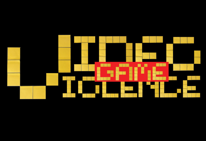
*featured image: lettering design by Sydney Bogie, 2021
-
Morgan Gustafson, 2019
-
Antwain Hairston, 2019
-
Jordyne Cox, 2021
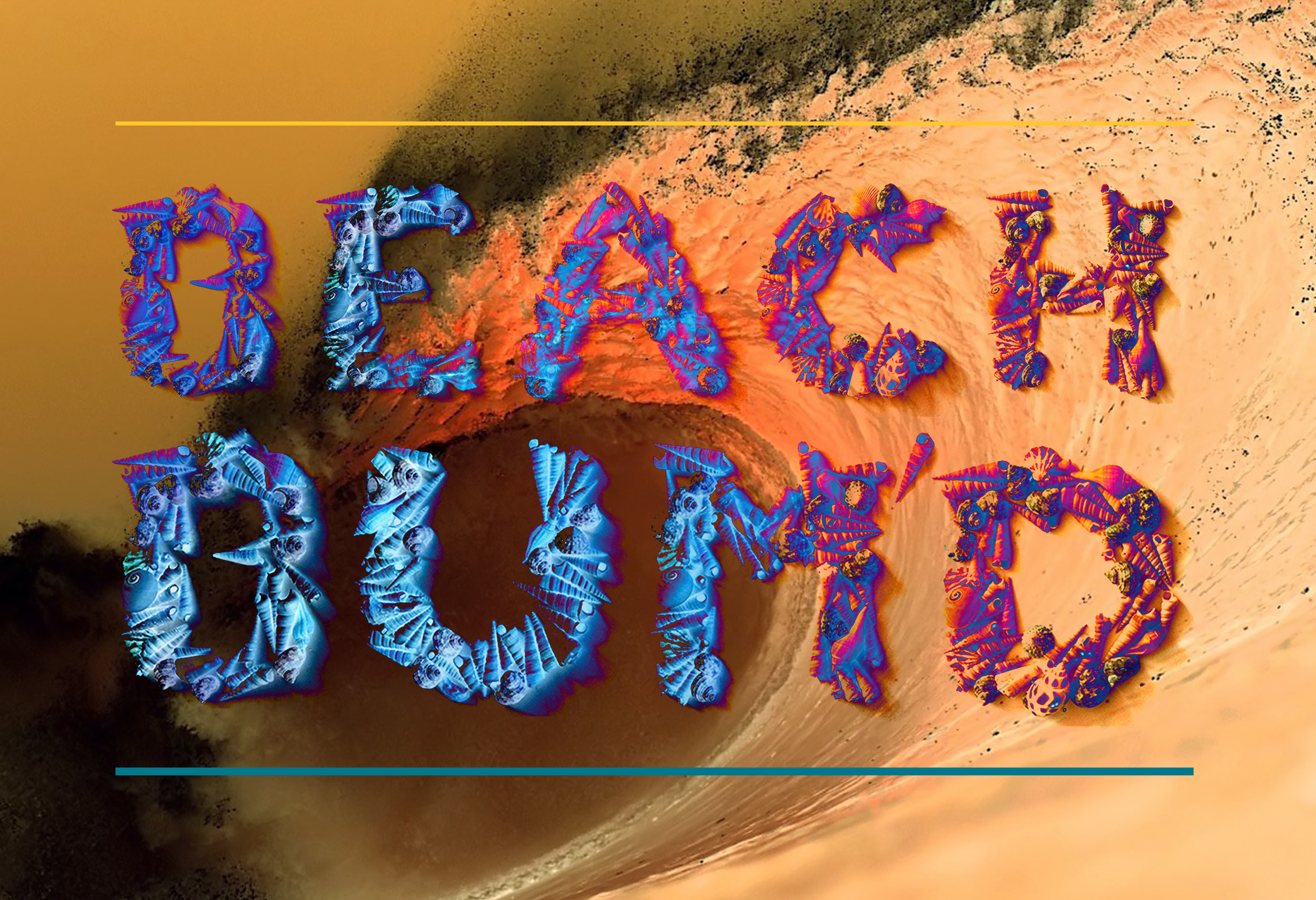
This week I really wanted to focus on the texture of my shells, and the physicality of my pieces. In my final work, I leaned into the shells, and the location shells are found in, the beach. I wanted to play into the idea of how shells often get taken back into the ocean, and aren’t around forever. This kind of temporary home for shells, is often a temporary home for so many others. The idea of things coming and going at certain times. People coming to the beach in the summer, shells being places on high times, and more importantly people being born when they are and dying when they do, is all such a large part of how the world functions. It leads me back to the question. Why Now? I often ask this question about myself and my life, and wanted to ask it of others. And parts of their lives that have affected them deeply. In my piece I wanted to focus on surreal colors, leaning into the idea of an out of body experience or dream. In my own dreams, the background often feels fuzzy, and unimportant compared to how high definition and bright the characters and things of importance are in my dreams. I wanted to play with that idea, in having something be so glaringly obvious on where you were supposed to look.
Word count: 230
Hey Lucio! I love how you connected shells to the idea of things coming and going. The way you used that holographic color pattern to show a dreamlike feeling is super creative. Thank you for sharing.
Hi Lucio!
The surreal color palette you chose for the seashells work so nicely against the monochrome background. I love the contrast in texture between the half tones on the seashells and the smooth, blurriness of the beach. The connection between the seashells and this idea of how they come and go is tied to life was very eye-opening.
My project is a very interesting combination of elements. The phrase that it spells out is “Pick your poison”, which can be looked at and taken in any way you see fit because overall it is just meant to be a pun on the toothpicks I used for my font. I started off very poorly in the beginning as I was drawing and reshaping my letter “O” before I went back and reread the directions and realized that we were mainly supposed to focus on the color changing and not necessarily changing the image as a whole. So after that realization I went into photoshop and started playing around with hues, colors, saturation, etc. and ended up with that wide range of different color schemes that you can see in my drive. As I finished all of that I ended up with a tealish black color on all of my letters and I put it over a gradient red and white background with a set of hands conjoining in the middle. It made the whole composition feel more unified as a whole but overall it isnt my best work.
https://uncg-my.sharepoint.com/:f:/g/personal/r_riley_uncg_edu/Eglu5wbGMT1Fs_WzVHknAd8BT8CMP5Nm6F5Z18k9CglWsQ?e=tPegrO
I think your composition is really cool looking! I think it is pretty hard to read the text, but the visuals still look really nice.
Your work is very pleasing to the eye visually! I think you did a great job composition wise and everything tied together.
Hi Jon! Compositionally, I like the concept of the grayscale outstretched hands (appears to be shifted in hue by a gradient map?) in front of the red. It gives the piece a very stark and serious tone. I like the sharp angles of your font, as I believe they aid this tone, but it is a little difficult to determine what words they are making out. Regardless, I think you did a nice job!
The process of creating this image started with a simple idea: I wanted to make something that visually represents love in a unique, eye-catching way. I began by choosing the word “LOVE” as the main focus. Instead of using a basic font, I decided to make the letters appear more artistic, almost like they were drawn with glowing strokes. Next, I chose the colors. I went with a bright cyan for the letters because it contrasts well with the deep purple background. This contrast makes the word pop, almost as if it’s glowing. The background wasn’t just a solid color, and I added texture to make it more visually interesting, using filters and brush effects to create a slightly wavy, rough surface. After that, I played around with lighting and shading to make sure the letters looked vibrant and stood out. I adjusted the brightness and saturation until the colors felt just right. I didn’t want it to be pink. I wanted to create something different instead of just pink and automatically thinking about love. I figured pink would give that sense of love; therefore, I used different colors. I wanted to give a sense of perspective and what love of colors can look like, such as simply having more ideas when it comes to colors.
https://uncg-my.sharepoint.com/:f:/r/personal/r_riley_uncg_edu/Documents/_Rachele%20Riley/teaching/S25/ART%20341%E2%80%9302/Cindy%20Ortiz/Week%2010?csf=1&web=1&e=sXYPhb
Hi Cindy! I really like your final project, it’s simple in terms of it is just the word with no images but it is really effective. I also dealt with the word love in my images so for me it’s interesting seeing how you handled the word. I really like your different color variations for me my favorite is your green and blue. Really great work!
Hi Cindy, I love the effect you put on your letters. I had no idea that they were paper clips!
Hello Cindy,
Your choice of material was very unique and I wish I had thought of this for my project. I like the vibrant choice of colors when creating the word “Love” as-well. Great job!
Hi Cindy, I really love your editorial design, and how you arranged the paper clips! The colors contrast really well, and create a very interesting image
Hi Cindy, I think its very interesting the way you played around with different colors in order to convey certain emotions. I can appreciate that you took a different approach than what would be expected normally of colors.
While coming up with alternative treatment for my espresso based alphabet, I stumbled
upon the idea of compositing the letters in a way to make them appear as islands. The phrase “every man an island” came to mind and I immediately shifted the theme to isolation. I chose the word alone to keep the image succinct as not to clutter the composition.
After constructing a good feel between each letter in space, I painted in various layers to emulate shorelines in places and varying depth of water surrounding each island. An integration pass was made to paint in highlights and shadows in places appropriate for the letters shifted orientations, keeping the angle of the “sun” consistent. I used clone stamp to extend the islands in subtle ways to make them appear to chain out into open water while creating a leading line as well in places. These smaller chains reach toward each other but never touch.
The top down aerial view gave me the idea to add in a cloud layer. As with the ocean, the clouds and volcano affects are paint layers, integration passes for highlight/shadow consistency, and finally texture overlays in places. The final touch was the seagulls. I thought it would be poetic to show a community of non human creatures seemingly thriving in the face of our analogy for human isolation. I feel like this reinforces the idea of isolation in the modern age as an invention rather than a natural evolution. The seagull most in focus I gave a hibiscus flower. The hibiscus has a symbology for fleeting beauty. I used liquify and motion blur to try and sell the idea of the hibiscus and the seagull in motion. A single bulb of the flower is falling behind in the gull’s flight arc to land back on the island. On the nose much? I don’t know. I had fun making this.
https://uncg-my.sharepoint.com/:f:/g/personal/r_riley_uncg_edu/Elc3lOuAi7dDtHAcvr6oX0sBSRCkoxLYf-TBUsvJzx_4KA?e=6eSZkm
Hey Zeus, I really think your experiment variations are truly fascinating. Modifying your typeface into other sedimentary materials is a creative approach to this project. I really enjoy the final piece where the letters are islands surrounded by water. I also appreciate the birds and clouds to show distance between your elements.
This composition is incredible!! The level of detail in it is insane, looks really professional!
Hey Zeus, I love your final results. I especially liked how you played around with different effects. It was interesting to view your progress. I belive you did such a good job!
Hi Zeus, your project looks sooo good! The way you used the material to create the island was so smart, and it came out great.
Hey Zeus, I really enjoy your composition and how you explored creating a poster that works well with the material that you had. I think that creating the various layers of this composition from the set up of the layers to the added element is so interesting and keeps me looking at the poster.
For this project, I focused on using the letter “L” as a creative foundation for experimenting with different design elements. I had a lot of fun playing with the form of the letter, not only in how it looks, but also how it contributes to a message within the images. Each piece explores a different word or phrase, and the letter “L” serves as a starting point or anchor for the composition. I experimented with various color palettes, textures, and materials for the lettering to make each word feel distinct. I also used different types of backgrounds—from nature scenes and symbolic spaces to abstract or minimal settings—to see how the text would contrast or complement each environment. Part of the fun was allowing the letter “L” to take on a personality depending on its context, whether that meant making it bold, subtle, serious, or playful. While the project is relatively simple in concept, it was a useful exercise in visual storytelling, composition, and expressive typography. It gave me a chance to test different visual ideas and techniques without overthinking the end result. This was all about exploring, creating, and letting each letter and background speak for itself.
LINK: https://uncg-my.sharepoint.com/:f:/g/personal/r_riley_uncg_edu/Egiyl9NDa5VHmlK-cG5N4ooBgtrNaJrjHbZITQyCukamSw?e=RNAQOg
I experimented with lots of different variations of my letters, including changing the colors, adding textures, etc. The one I was most drawn to was the red variation that I made to look like blood. I like using blood in my art and I thought it was really interesting seeing how I was able to turn something as simple as glue into convincing-looking blood, so that’s the one I decided to move forward with. For my composition, I decided to use the phrase “Turning a blind eye.” By spelling that out in my blood-like letters, I wanted to get across how people will see horrible things happening all around them and around the world, but will choose to not say anything – both everyday people, but especially famous people/people in power who could do a lot just by bringing attention to the issue. This is something which I think about a lot and infuriates me, but especially more recently, so I wanted to express that here. I made the background black both to make the letters pop, and to contribute to the darker/more serious tone I was going for. As an added detail, I use my period and commas to mimic small droplets of blood around the letters to make them appear more messy/like they had just dropped onto a surface and splashed a bit.
Hey Simon! I really appreciate your choice of topic and it is very relevant and your phrase fits perfectly. Along with the intent of making the letters seem like blood which I think you did a great job at doing. I also like the simplicity of your project it’s very effective! Really great work!
Hey Simon, I really like the messaging behind your final piece. The blood letters with the raw sentence really does impale the message into you. I also appreciate the variations as they explore very different messaging.
In my project I picked my Q-tip material for the FunnyFace alphabet that is seen in my images. I knew the phrase I wanted to use which is, Is Love Lost? My inspiration for this phrase was speaking to my friends or viewing statements online that love feels artificial. That dating and relationships are harder to come by now and it feels that love has lost its place in a romantic relationship. In my letter experimentation I went with this gradient color manipulation that I did. As I felt aesthetically it would be pleasing to the eye, and the colors are associated with Valentine’s Day. I searched for vintage depictions of love or cinematic and ultimately chose a vintage photo of lovers. For the rest of the project honestly, I had a hard time deciding what looked best. As posted in my folder there are three different concepts that I mainly explored, as I explored more but did not upload them. For my first alternative version I sought inspiration from New York Times Magazine designs where the text and image take up opposite sides. I explored different ways of going about this but for me personally I did not fully enjoy what I was going for. For my second alternative I went simpler and tried to think less about perfecting it. The text is meant to be read bottom to top but I think it can be read either way. This is the version I am turning in for the final assessment.
https://uncg-my.sharepoint.com/:i:/r/personal/r_riley_uncg_edu/Documents/_Rachele%20Riley/teaching/S25/ART%20341%E2%80%9302/Sarah%20Hines/week%2011/week%2011%20alt%202.jpg?csf=1&web=1&e=ph4Gcw
I appreciate the depth of thought you put into both the conceptual and visual elements. The phrase Is Love Lost? resonates strongly, especially in the context of modern relationships feeling more artificial or transactional, which brought my attention to it the most. After all, great job!
Hi Sarah, I’ve always found older photos and media to be a little fascinating, particularly from seeing how they changed over the years.
This poster features a black necklace stand – gripped by red, masculine hands – symbolizing danger. These hands are holding another necklace with the words “free her” dangling at its center while also wrapped tightly around the neck of the stand. The letters wind around the fingers, a desperate plea for the numerous women fighting against oppression. Traditionally a display of beauty, the necklace stand becomes a victim of restraint, control, and suffocation.
The background consists of jail bars with the word “freedom” intertwined and wrapped around them, representing the illusion of freedom in a society where women’s choices are usually dictated. The background is pink, evoking femininity and mimics my original letters’ background. This juxtaposition emphasizes the ongoing struggle for women’s rights and freedom from societal expectations.
The use of jewelry letters highlights the objectification of women. In this context, jewelry serves as a tool of confinement, even though it typically represents elegance. The forceful grip of the hands mirrors the grasp of societal control on women. My project reflects how women are admired yet restricted by the norms surrounding women. This piece invites viewers to reflect on the systemic structures that control women’s rights and challenges them to confront this ongoing battle for equality.
https://uncg-my.sharepoint.com/personal/r_riley_uncg_edu/_layouts/15/onedrive.aspx?ga=1&id=%2Fpersonal%2Fr%5Friley%5Funcg%5Fedu%2FDocuments%2F%5FRachele%20Riley%2Fteaching%2FS25%2FART%20341–02%2FChristina%20Kibler%2FWeek%2011%2Ffinal%2FFunnyFaceFinal%2Epng&parent=%2Fpersonal%2Fr%5Friley%5Funcg%5Fedu%2FDocuments%2F%5FRachele%20Riley%2Fteaching%2FS25%2FART%20341–02%2FChristina%20Kibler%2FWeek%2011%2Ffinal
Your message is very powerful here. I love the composition you made and it speaks a higher message. I wish I could read the words better, however your description explains your message clearly.
Hey Christina. It’s cool we both used necklaces to construct our typeface. You took a very different approach to the project, I appreciate the experimentation. The letters on their own are beautiful. I cannot make them out in the background however. Due to the delicacy of the letters, I think a style for the graphical elements would add some cohesion.
For this part of the project, I decided to take my earring in the shape of the letter Z to create my alternative forms from. I played around a lot with the filters found in Photoshop, including adjusting the hues and saturation of the letter, adding different overlays, stretching and shrinking it, repeating it, and pixelating my letter as well.
When it came to creating my lettering design, I decided to use the word “metal,” because my earrings fit that theme. I also decided to include an image of some metals in the background, and I layered the word “metal” to give it an alternative, blotchy look.
For the editorial design, I immediately thought of the word “mutilation.” There are varying opinions on allowing young kids, specifically those under the age of 4 or 5, to get their ears pierced. Most of these concerns stem from age, as well as whether the child is truly able to give consent. I played around with the coloring of the word, and I decided that red would be the best choice to convey the concept of mutilation. I placed an image of a young girl getting her ears pierced with a very blank expression, and I layered some images of a piercing gun around her. I like how these designs came out, but believe that I can push it even further.
https://uncg-my.sharepoint.com/:f:/g/personal/r_riley_uncg_edu/EvtmPgh0z5hEuLln_EtoFnABLGHRgW75eN2HucouxWT04Q?e=lxVLyJ
Hey Ava,
I enjoyed seeing all of the versions of the letter Z and I really like the thought of your message about Mutilation about young kids and their consent being just as important.
For this piece I wanted to incorporate the use of the material into the composition. Since I chose to use my tarot cards to construct modular alphabet, I chose a phase that corresponds to the use of tarot cards. “Fate or Delusion” was something I came up with in response to social media algorithms presenting me with creators that do tarot card readings. These videos claim that they are “destined” find you or “if this stumbles across your For You page, this message is for you”. This sort of content has been so rampant on my For You page that I have been getting different creators that satirize tarot card readers by making their own tarot cards, often with incredibly hilarious and nonsensical meanings.
In terms of the design, I knew I wanted to explore using different colors. I modified the teal of the cards to more of a blue and yellow. I also wanted to show perspective by adjusting the size of the cards as they lay on the background. I feel it provides the look of laying down cards. I also made the word “delusion” not aligned and scrambled to emphasize the meaning of the word. I did the same with “fate” but to coney stability and rigidity.
Link: https: //uncg-my.sharepoint.com/:b:/g/personal/r_riley_uncg_edu/EdVhwGba1nxPq5x_eN7S0w8Bk9t9dTigtIEXik0SOgtpDQ?e=0kwRKF
For my studio project I first started off experimenting with different ways to edit the letters. My favourite edition was one where the letter had a heat mapping type of colour to it and it used a colour half tone effect to create a really cool look. However, for the main studio project, I wanted to create something that relates to the use of sticky notes to create my typeface. The idea I came up with was to do with mums always using sticky notes to remember everything they have to do as they are usually so busy, not only with their jobs but also with life, and us, their children. So I chose the phrase ‘The Second Shift Never Ends’. To represent this concept, I chose to include a fridge with post it notes on and also one post-it note that covers a part of the type to exaggerate the busyness of the person behind this. I used both photoshop and illustrator to create this. Mainly photoshop to cut the letters out from their background and change the colour but also used illustrator as I find it easier to organise all the elements in it, and to add another type of typography for a handwriting effect on the sticky notes. The larger sticky note used and the ones of the fridge came from the period in my original set of typography.
https://uncg-my.sharepoint.com/:f:/r/personal/r_riley_uncg_edu/Documents/_Rachele%20Riley/teaching/S25/ART%20341%E2%80%9301/Hannah%20Hind/Week%2011?csf=1&web=1&e=lnw6wE
My project’s alphabet took form from the popular snack, Cheez-Its. I created a gridded design that followed similar structure throughout each individual letter. For my editorial design, I wanted my phrase to somehow be a play on the physical material itself so that as viewers would read the phrase their attention would be drawn in to investigate further what the type was made out of. I landed on the phrase “GET THAT CHEDDAR” and imagined the front of NY Times creating an article about everyone looking to make as much money as they can over the course of their lives. I used Adobe Illustrator to create two illustrations which were a dollar bill and a cheese-like pattern. I then imported these illustrations into Adobe Photoshop, where I used the illustrations to help me form a compositional boundary in which my text could live and to help heighten the overall message behind my phrase. After creating several compositions, I ultimately landed on the composition that centered my text causing it to be the focal point and for viewers eyes to land their first and then circle around to view the imagery that is paired with it. Overall, I am happy with how this project turned out!
Link to my Week 11 One Drive Folder:
https://uncg-my.sharepoint.com/:f:/g/personal/r_riley_uncg_edu/EtVeXOsknXZMvbaXxvS2-8UBPBHKAxJjuhT3m_q-9VOIxQ?e=yOpoyh
Hey Hayden! Love the way your background and letters look. Everything blends in well together, amazing job!
You even made the dude on the dollar bill cheese, A++.
This project is so fun! I appreciate you arrenanging the Cheez-It letters in a grid pattern- that was a good call considering the polygonal medium.
Hey Hayden, right off the bat your design has a lot of cool and exciting things going on in both background and center. Very engaging!
For my project, I had made an editorial design using Nerds candy as my main typeface. After arranging and photographing my candy alphabet, I found an image of a man blowing some bubble gum off of Pexels.com and inserted it into my Photoshop file as the background. I arranged my Nerds letters to create the phrase “SWEET TOOTH” before applying a few different color gradients over both the letters and the background image. I wanted to give the text a sort of wonky, childish feeling, so I tilted the letters when arranging them to make them appear playfully created, rather than meticulously arranged. I put an artistic filter on top of a duplicated file of the letters, as well as an oversaturated filter on top of the duplicated version of the background layer. I wanted to make a very bright, colorfully overwhelming visual that drove home this sugar-sweet, oversaturated feeling. I tried placing a couple of inverted color gradients that I had tried out on my letter experimentations, but I found that they made the letters blend in too much with the background. In general, I feel satisfied with the end result, though I did struggle to find a way to make the texture of the letters look brighter and more cartoony without losing the actual candy texture.
https://uncg-my.sharepoint.com/:f:/r/personal/r_riley_uncg_edu/Documents/_Rachele%20Riley/teaching/S25/ART%20341%E2%80%9301/Callie%20Roberts/Week%2011/NYTimes%20Book%20Review?csf=1&web=1&e=Mls0t8
Against a rich, textured background, I used popcorn to create the phrase “THE SHOW MUST GO ON!” with a visually appealing and immersive layout. This mix adds a playful and whimsical touch and ideas of entertainment, grit, and theatrical drama. Reminding one of a traditional theater carpet, the golden, jagged shapes of the popcorn create a lovely contrast with the rich red background that brings about expectation and thrill. The juxtaposition of colors and textures adds to the visual appeal, making the sentence boldly outstanding.
I wanted to make a strong, animated visual statement from a basic phrase that grabs instant attention. Not only do the popcorn letters allude to the world of movies and theater, where popcorn is a favorite staple, but they also represent the resilience of the entertainment business and the lasting impact of the narrative. Every different kernel in size and form reflects the variety of voices supporting the wonder of performance. Through this tactile and unexpected medium, the phrase itself—often linked with perseverance in the face of challenges—acquires fresh life. The communication becomes more than words using popcorn, a symbol of happiness and shared experiences; it becomes a tribute to the spirit of the performance.
.
.
.
.
https://uncg-my.sharepoint.com/:f:/g/personal/r_riley_uncg_edu/EivzKKK7AD9GqByjIHlyLm0BXV2Xkfo60Hac5mxKeIye9Q?e=1zaavz
I think this is a good composition for an editorial image. Also the first alt where you changed the color to blue almost looks like flower petals. Very cool.
Hey Taylor, I really enjoy your composition and find your use of additional imagery to be super beneficial to your overall composition. I feel as if incorporating a physical popcorn bucket along with the allusion to theater type space with the red carpet, you were able to heighten the success of your funny face letters! I really enjoy the way you spaced your words and letters and the variety of sizes that you used. I remember you saying that you like the individual identity of each popcorn kernel and I feel like this adds to that even more. Great job!
Hey Taylor! I absolutely love your creativity with the popcorn letters. The red carpet background definitely sets up the scenery you’re portraying as well. Thanks for sharing!
Hey Taylor, your composition using popcorn is very original. The use of the pungent red background really compliments the theater aspect of this design!
For this project, I wanted to use my Funnyface letters to address something meaningful. At first, I thought I’d stick with my usual grunge aesthetic and use knives as the materials for the letters. But as I worked through the project in Adobe Illustrator, I felt compelled to shift my focus to something more impactful: child hunger. It’s such an urgent issue, and I wanted to use my design to bring attention to it.
I used my Funnyface letters in bold, playful ways to draw attention, but also to reflect the seriousness of the topic. I played with different sizes, colors, and textures to create a sense of contrast—showing the innocence of childhood alongside the harsh reality that so many kids face. The design also explores the complexity of hunger, influenced by social and economic factors. Although I’m still learning the software and not able to fully create everything I envisioned, this project allowed me to use design in a personal way to raise awareness and start a conversation about something that really matters, as well as help get a feel of more things within adobe illustrator.
https://uncg-my.sharepoint.com/:f:/r/personal/r_riley_uncg_edu/Documents/_Rachele%20Riley/teaching/S25/ART%20341%E2%80%9302/Chris%20Pierce/Week%2011?csf=1&web=1&e=Gv4h75
Hey Chris, I really enjoy seeing all the different ways that you edited your Funnyface letters! I think that your work really gets your point across and is a great play on words given your material. I really enjoy how you make the word “KIDS” have a color effect for each individual letter. It reminds me of a box of crayola crayons which has a cheerful and innocent connotation yet you contrast it with this much darker meaning of child hunger. I also like how the rest of the aesthetic gives off a horror movie title scene vibe to continue to help that contrast. Great work!
For my experimentation I wanted to toe the line for what looks like the original material. I wanted to add an extra element as well. With that in mind as I was experimenting I saw a pattern that the pretzel sticks could look like charcoal or other wood materials. With that in minds I originally chose the word “Arson” and I was going to add a fire element. As I was working with the word it just didn’t meld well together and it had an issue with legibility or visual interest. With that in mind I decided to scrap the original word. I decided to go back to the experiments that I had and I really liked the monochrome letters I had. I gave great contrast and it held its legibility while keeping visual interest. I decided to do the word “Spore” because the threshold adjustments on the letter with exposure adjustments made the little rings on the pretzel sticks to resemble spore like circles. I added a scientific background. When I finished it I wanted a bit more interest. I was going for a mid 2000s to mid 2010s “look” and it worked. I wish I could’ve done a bigger transformation but its a good start.
Okay, so for my project, I made a graphic called “The Cost of Living.” I wanted my message to be about how expensive everyday life is getting in this current economy. I took real coins from my coin collection in the serif typeface, and for the typography, I made “THE COST OF LIVING”, which is self explanatory. After that, I put them into Illustrator and arranged them carefully.
After struggling with a concept for what I wanted to do for the background, I decided to be experimental with a purpose. I created a collage of all sorts of imagery. I wanted to show some sort of symbolism in connection with my them, so I had images of receipts, eviction notices, barcodes, and even a falling person to show financial stress. I wanted to be very intentional on where I placed my images to convey my message. But at first, it looked messy and hard to read because of how much imagery I added. To fix that, I made all the background images fade a bit. This made the letters pop out more clearly.
I also added shadows to each letter to give them depth. It made the words look way more professional. I played around with colors, spacing, and shadows to make everything fit nicely together.
Overall my goal was to show the stress and struggles people face when dealing with money problems. I think the collage helps people understand that message, and the coins in the typography tie that message altogether.
Link to my project: https://uncg-my.sharepoint.com/:f:/g/personal/r_riley_uncg_edu/EsZ98bBGHkFBpuiYytuu_ZgBPczFJXUUeztAfaWf2GUq1A?e=oOWLzz
LINK TO PROJECT: https://uncg-my.sharepoint.com/:f:/g/personal/r_riley_uncg_edu/Er-uEA82QQtEjrI_Ixey64gBcNz8ZmcQQiX9E1X-aDgNjQ?e=6rHfoP
My project was very fun to experiement with. For the first part of the assignment, I went my letter M. I constructed M from necklaces, so I was very eager to see how different alterations would interact with the metals and reflective serfaces of the letterform. While working I thought “How can I alter letterforms as strange as this one without making tedious selections?” and came across Gradient Maps from Image > Adjustments. Not only did this color the entire image, it produced some very pleasing effects. My favorites were when the metal would turn ghostly white or a similar color along with the subtle caste shadow, making it appear to glow. For my project, I went with the phrase “Global Future”. I chose this phrase because I wanted to highlight that globalization is humanity’s future. The skinny typography in addition to the black, blue, and green horizontal gradient makes my piece look futuristic, foreign, and alien. Very extraterrestrial.
I also played with the arrangement of the words. Every other word is above or below the other, adding to that extraterrestrial feel. I did this because originally I was worried about space. The result of that was to simply activate what was there in a very straightforward way without images.
For my project, I used M&M’s to create my alphabet. For my ten alternatives, I chose to edit the letter R. I really wanted to try new effects I hadn’t tried before and potential effects that I could use for my final design. In my alternatives I tried using glass ripple, removing the background, adding color, changing the opacity, etc. For my final piece I decided to write “our skies” with a background that I made myself. I first made the background to help me come up with ideas, and as I was making it, the colors I was choosing really made me think of a happy place. I think a lot of people can agree that looking up at the sky is a way of relaxation, so I wanted to focus on the beauty of the background and not adding too much to the letters so it all blends well together. At first, since I chose M&M’s as my items, I wanted my piece to have to do with rainbows. But now that I’m done, I’m happy that I changed my mind because I like the fact that my letters (that were made of M&M’s) have nothing to do with rainbows or chocolate. Overall, I’m super happy with how my final piece turned out, and I would love to see what else I can do with my alphabet.
https://uncg-my.sharepoint.com/shared?id=%2Fpersonal%2Fr%5Friley%5Funcg%5Fedu%2FDocuments%2F%5FRachele%20Riley%2Fteaching%2FS25%2FART%20341%E2%80%9302%2FXimena%20Perez%2DChavarria%2FWeek%2011%2FFunnyFace%5FFolder&listurl=%2Fpersonal%2Fr%5Friley%5Funcg%5Fedu%2FDocuments
Hey Ximena, I really love the color palette and your use of the flare tool. I think it reminds me of Kpop albums and how bubbly it is.
For my studio this week I found a book review from The New York Times titled “Railroads” it talked about the best train routes to take to see the beautiful scenery throughout Europe. Since my typeface is made up of trains I thought this topic was fitting. I composed my letters together in Photoshop and then changed the colors in Lightroom. I chose the green gradient color to represent the greenery shown in many of the train routes. For my letter exploration, I edited mostly in Lightroom to experiment with changing the colors, and then I put the letters into Photoshop to experiment with layering and how the different compositions would look. I found I was really drawn to the pink and blue tones. Overall I really enjoyed working with this custom typeface, I found it super interesting and would like to do it again.
Here is a link to my studio, https://uncg-my.sharepoint.com/:f:/r/personal/r_riley_uncg_edu/Documents/_Rachele%20Riley/teaching/S25/ART%20341%E2%80%9301/Victoria%20McPherson/Week%2011/letter%20exploration?csf=1&web=1&e=e0oqOW
For my project material I chose Q-Tips. This material was easy and unique to be able to manipulate into my own lettering. I decided to keep the same theme of my material in my phrase. The phrase “Hear Me” is ironic in this case but can also be used as a powerful message. In this case I wanted to do just that. I wanted this phrase to show how in different circumstances, we can be unheard and not comprehended. Rather it be amongst friends, family, relationships, classmates, or work colleagues, being able to be heard, validated, and understood are big things that everyone should have. I decided to add another image in the background as well to push my theme further. I would have liked to have had more time to manipulate my work more, however I also wanted to keep the color and texture of the Q-tips in my final piece. This allowed for the irony to come through and to also let the viewers see that the material was indeed made from Q-tips. This process did not take long, and I hope it achieved the purpose it was made for. Overall I like how it came out and I am eager to see what everyone else made.
https://uncg-my.sharepoint.com/my?remoteItem=%7B%22mp%22%3A%7B%22webAbsoluteUrl%22%3A%22https%3A%2F%2Funcg%2Dmy%2Esharepoint%2Ecom%2Fpersonal%2Fwagentry%5Funcg%5Fedu%22%2C%22listFullUrl%22%3A%22https%3A%2F%2Funcg%2Dmy%2Esharepoint%2Ecom%2Fpersonal%2Fwagentry%5Funcg%5Fedu%2FDocuments%22%2C%22rootFolder%22%3A%22%2Fpersonal%2Fwagentry%5Funcg%5Fedu%2FDocuments%2FART%20341%E2%80%9302%22%7D%2C%22rsi%22%3A%7B%22webAbsoluteUrl%22%3A%22https%3A%2F%2Funcg%2Dmy%2Esharepoint%2Ecom%2Fpersonal%2Fr%5Friley%5Funcg%5Fedu%22%2C%22listFullUrl%22%3A%22https%3A%2F%2Funcg%2Dmy%2Esharepoint%2Ecom%2Fpersonal%2Fr%5Friley%5Funcg%5Fedu%2FDocuments%22%2C%22rootFolder%22%3A%22%2Fpersonal%2Fr%5Friley%5Funcg%5Fedu%2FDocuments%2F%5FRachele%20Riley%2Fteaching%2FS25%2FART%20341%E2%80%9302%2FAlex%20Gentry%2FWeek%2011%22%7D%7D&id=%2Fpersonal%2Fr%5Friley%5Funcg%5Fedu%2FDocuments%2F%5FRachele%20Riley%2Fteaching%2FS25%2FART%20341%E2%80%9302%2FAlex%20Gentry%2FWeek%2011&listurl=%2Fpersonal%2Fr%5Friley%5Funcg%5Fedu%2FDocuments
For my project where I actually utilize the font I made, I sought to make something period due to my lack of free time this weekend, so I let it sort of grow itself in the short time I had to work on it. Utilizing a very papery substance for my funny face and the subject matter of literature and book journalism being part of the assignment, I eventually grew into the idea of making a theoretical headline and article about pulp fiction, being very much a genre or kind of media that was born directly from technological improvements in the mass production of paper, mostly assuming that the same improvements for literature-grade paper would also be used in the same workflows as mass napkin production. I feel like I probably wasn’t the first person to come up with this idea of uniting the aesthetic of ripped paper with the aesthetics of printed pulp fiction, but I can assure you I might be the only one who did it while cramming for an assignment this week!
I experimented with many different features of photoshop for my project this week. I chose to use the letter N as I felt it was one of my best ones. I experimented with gradients, halftones, blurs. After the initial part of the project I moved on to my final design. After making alternatives I found it much easier to work in the program since I was now much more familiar with its features. I imagined a design that would fit an article or page related to cooking since I was using frozen vegetables for my letters. I decided to design a bowl of soup with my letters floating in it. I chose the phrase “Let’s eat!” I staggered the letters and rotated them to really show them floating around. My composition felt a bit flat to me so I added drop shadows to my letters and layered a picture of a spoon on top to add a bit more dimension. Honestly, the part that took the longest was just adjusting the colors and opacity of my image in an attempt to make it as realistic as I could. Overall I am quite happy with the way it turned out in the end.
https://uncg-my.sharepoint.com/personal/r_riley_uncg_edu/_layouts/15/onedrive.aspx?id=%2Fpersonal%2Fr%5Friley%5Funcg%5Fedu%2FDocuments%2F%5FRachele%20Riley%2Fteaching%2FS25%2FART%20341%E2%80%9301%2FIsabella%20Galvan%2Fweek%2011
For my studio assignment I used the concept of an article about cigarette usage in children. I tried a couple different effects over my letters, however, ultimately decided to go with something more subtle so that it would fit with the rest of the image. Focusing on increased contrast to make the colors of the lighters pop. I think although it fits enough, the letters could definitely be improved upon. Specifically, some of the arrangement of the phrase is a little “off” I think, for lack of a better word. If I were to make this project again, I would definitely change some of it. Although, overall, I’m content.
https://uncg-my.sharepoint.com/:f:/g/personal/r_riley_uncg_edu/EnPxEsGnZzNCowla4U1d8TEBWxZOqApANRd7RaSnk8oYgw?e=Hn4Z9i
For this project, I created ten different versions of the letter X using mechanical pencils. The one that stood out the most looked like bones, so I decided to take that idea further. I designed a title that looks like it’s being dug up from the ground, almost like an archaeological site.
I went with the word “Unearthed” because it fits my topic of erased stories and colonialism. The idea was to make the letters look like bones being uncovered, representing lost cultures, forgotten histories, and hidden truths. To reinforce that, I used a dry ground as the background and made the letters look partially buried. The bone like shapes of the letters help tie everything together, making the typography feel connected to the concept.
My goal was to make sure the design visually supports the message. The idea of digging up something that was buried works well with the word “Unearthed,” and I wanted the whole piece to feel like rediscovering something that had been lost. I enjoyed this assignment and hope to do more stuff like this.
https://uncg-my.sharepoint.com/:i:/r/personal/r_riley_uncg_edu/Documents/_Rachele%20Riley/teaching/S25/ART%20341%E2%80%9302/Jose%20Vasquez/week%2011/Final%20Image/Bone.png?csf=1&web=1&e=q9aJKQ
For my studio this week, I wanted to expand upon the theme of trail mix, since it’s the final material I landed on for my lettering. I came up with the idea to create an advertisement for a fictional brand whos product is trail mix, that wants to target not only audiences of outdoor treks, but maybe someone who also would just like a tasty snack through the day. For the first part of the assignment, I took time to experiment and mess around with different photoshop editing tools, such as hue saturation, stroke glow, and other various tools. I also played around with different backgrounds behind the letter I chose (which is O), but ultimately felt like there maybe was a little too much going on, since my lettering material is already so varied to begin with. I felt that simple, solid backgrounds were a little more visually pleasing, due to it having less clutter in my opinion. For my fictional advertisement, I decided to add a subtle, solid black stroke to the trail mix letters in order to help it blend a little better, specifically with the simple purple background behind it. On the flip side, I didn’t want to make the stroke too large to where it would be distracting to the point that it takes away from the detail of the trail mix.
https://uncg-my.sharepoint.com/:f:/r/personal/r_riley_uncg_edu/Documents/_Rachele%20Riley/teaching/S25/ART%20341%E2%80%9301/Ethan%20Heggins/Week%2011/Lettering%20Design%20Graphic?csf=1&web=1&e=fZd8Xl
Hey Ethan,
I think considering that you had to change the background to something more simpler, it still looks fun to look at and it is interesting the way the title is shown in the corner instead of the center.
In this project I experimented with manipulating my letter “J.” I had a lot of fun playing with the form itself. As well, I Messed with things like color, texture , overlay, and paths. What I struggled with was really getting distinct different designs. The majority of my designs kept going out the same, however in th end I definitely was happy with m outcomes. For my Phrase, I chose’ “Losing hope” because in the current state of the world, specifically our country, economically, politically, and in general, with the state of the world’s health. With things like wildfires spreading, political tension rising, and society reaching a boiling point in general, levels of anxiety seem to be on the rise, with many people losing hope on a range of things wether big or small. What can be serious to one person can be taken as a joke to another and in a strange way I find that fascinating, the world is seeming very dystopian and art is so critical right now, in terms of spreading awareness, catching the eye of people who need something to hold on to, and additionally, just spreading a message, wether bout love, o saving someones home country, hope can be carried through art. I played with contrasting that theme with a playful yet adult setting, of a carpet floor littered with objects ringing in youth like recognizable teddy bear/ stuffed animal arm, ye things that are more out of touch with that and worldly, like lighters and scattered objects in my letter forms.
my link to my project:
https://uncg-my.sharepoint.com/:b:/r/personal/r_riley_uncg_edu/Documents/_Rachele%20Riley/teaching/S25/ART%20341%E2%80%9302/Jackson%20Highshaw/week%2011/letterchange7_Folder/final12pdf.pdf?csf=1&web=1&e=bKlvZN
Hi Jackson!
Absolutely love how your project came out! The level of detail is spectacular and everything just beautifully blends in with one another. I really resonated with the message behind your project and I agree 100%. With the current state of the world, art is truly critical as of now, and is probably what’s keeping most of us filled with hope.
Hi Jackson,
I did something similar to anxiety and having to do with people’s health, and so I like what you did in yours and comparing and contrasting the similarities and differences in mine.
For this project, I used my hair clips material for the FunnyFace alphabet. I knew I wanted a chrome/silver look for the letter forms, but I wasn’t set on the word or the overall look for the theme. I messed around in Photoshop with the filters, gradient maps, and brightness/contrast. Then, I set towards how I can change the texture and legibility of the letters.
At first, I initially wanted to do an ocean ripple concept with the word “dive,” where the letter forms would be made up of water particles and eventually spread out into ripples. Unfortunately, it didn’t come out the way I wanted it to so I had to scrap it entirely.
Then, I thought more about the material of the hair clips, and how they’re made of metal, and how if they’re sharpened, they can be spikey. Thus, I went for a grunge dark look for the editorial design, as if it were for a logo for a fashion design brand, where the letter forms have a silver metal appearance against a dark background. I chose the word “pierce” as it felt fitting for the concept, especially since I wanted the letters to feel like they were piercing to the touch. I mainly used the liquify tool to create the look and messed around the pinch effect to distort and warp the word, to further exaggerate its appearance and enhance the spikes. Then, I chose a black background with white streaks, adding a blurry and grainy effect to add visual contrast to the word.
Overall, I’m pretty satisfied with how it came out, though I definitely struggled the most on how I wanted to warp and angle the letters so some feedback would really help out!
https://uncg-my.sharepoint.com/:f:/r/personal/r_riley_uncg_edu/Documents/_Rachele%20Riley/teaching/S25/ART%20341%E2%80%9302/Cindy%20Pham/Week%2011/Final?csf=1&web=1&e=akIFyj
The Theme I chose was ingredient preparation lowers grocery cost. I had a pretty hard time coming up with a composition. I started the project by looking at the Newyork times and cover junkie. The goal was to try to hint subtle ideas of food scarcity. At first, I started the project by playing around with colors, textures, and more with only one letter. However, I noticed that the major adjustments with the context. Moved the materials meaning. At the end I decided to physically draw on top of previously created font in addition to enhancing the warm tones of the font. The smaller text of the bottom font contains the recipe to bake bread. For the background image I started with searching up commercialized photos from website Unsplashed. All the photos looked too perfect. It did not fit well within the content of the themes. I decided to take a background photo of my cutting board, grocery list, coins, behind a stove. I lowered the saturation of the background photo to give the font a more center focus. In the future I feel Like the top phrase “Prep” should be retaken with greater shadows. Four lines were added to give a secondary reference to cash spent on coins.
https://outlook.office.com/host/377c982d-9686-450e-9a7c-22aeaf1bc162/7211f19f-262a-42eb-a02e-289956491741
Hi Karla! I really loved your experimentation with the dough, especially with the baked textures! Your font is very playful and almost cartoonish. Because of this, I especially liked when you experimented with doodles around the dough! I thought it added a pleasant graphic “pop.”
Hello Karla,
I like your focus on the real world issue of lowering grocery costs, especially how much it comes up in the current day. Using all the elements associated with groceries for your piece is also a very nice touch and creative idea.
So, in my week 11 studio project, I took the letter I from the funnyface alphabet I made and arranged and organized it into ten different alternatives of the original photo. I experimented with changing the hue and saturation, the brightness, and I even did things like removing the background and creating a pattern from it. I wanted to relate my funnyface letters to the topic of mental health considering that I used anxiety medication to create my funnyface letters for the first part of the project. At first, when trying to create my idea for the studio project, I knew that I wanted to create something with that topic because of how relevant it is in the society of the modern day. However, I did not know immediately what I wanted to do or how I was going to translate the message within my studio project. But as I looked at what I made in the first part with the different alternatives, I figured that the best thing to do when making the next part of my project was to try and make something expressive that immediately gains the attention of the viewer to try and raise awareness for mental health.
From Debora:
“For my letterface project, I decided to continue with using the Seashells as my material. As I was exploring the different alternative filters and adjustments, I really liked the look of inverting and creating more contrast and glow. It made the Seashell patterns stand out and the color blue looked cool to me. The glowy blue reminded me of the topics of galaxy, universe, alien, science etc. I also concluded that the seashells remind me of the beach and therefore that made me think of ocean water. So I explored more while thinking of these topics and created the phrase “out of this world”, which I would imagine a cover would say for some sort of sci-fi interests. I kept the background black, added stars, and created a glow behind the letters. In the bottom I tried to create a water ripple effect, which was hard to do because I kept having complications with not being able to distort my letters. But I am pretty happy with the result although I would go even further to make the water in the bottom look realistic and somehow make the word “WORLD” stand out more. I was thinking of doing a glow to it like the rest of the letters, but it was making the contrast of the shells not stand out as much as I wanted it to be so I left it alone. “