
Due end-of-day Sunday. Comments on other people’s posts, due Tuesday.
Week 13 — Assignment “Modular Type Design”
Project 4: Fonstruct Typeface—design a typeface for the Latin alphabet using a modular design system in Fonstruct. Experiment and use the creative drawing and symbol-making possibilities of the web-based program, fontstruct.
1/ Discuss:
- Watch Whispers from the Andes with Vanessa Zúñiga Tinizaray, [Use this link for the same presentation on YouTube where there are closed captions] and check out @amuki.ec.
Write a personal response (200 words) to Tinizaray’s work. What did you learn about or from her research methods, concepts, and aesthetics. Share your thoughts as a comment below. Project 4 explore a design approach of modular thinking and making, and the development of simplified, geometric forms that emerge to build complex forms.
Reply to others’ works.
2/ Studio:
-
Create an account/login on fontstruct, a free web-based modular typeface design program. Check out the gallery of created alphabets.
- Start drawing letterforms on grid paper and directly in fontstruct. Test out the “bricks,” make different letter shapes, create variations. To begin—create a “new fonstruction.” To duplicate in order to make variation— “clone” it.
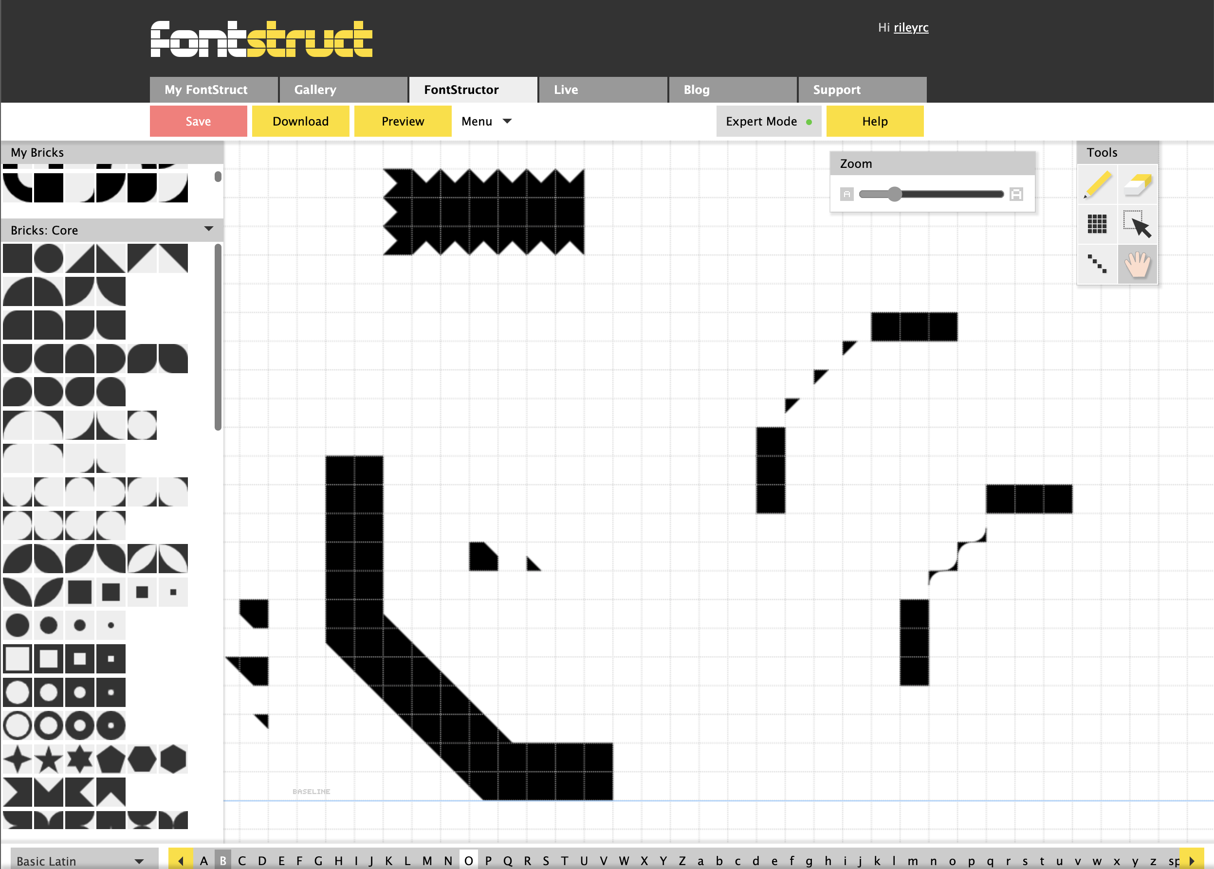
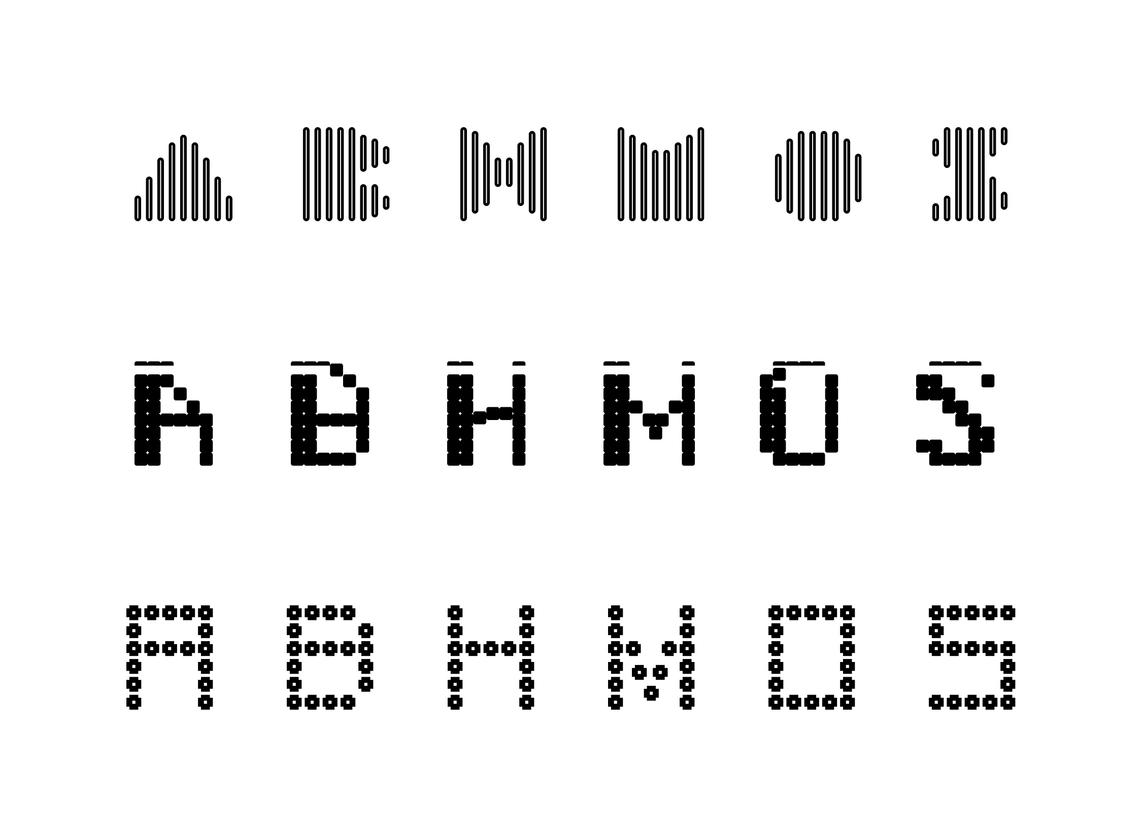
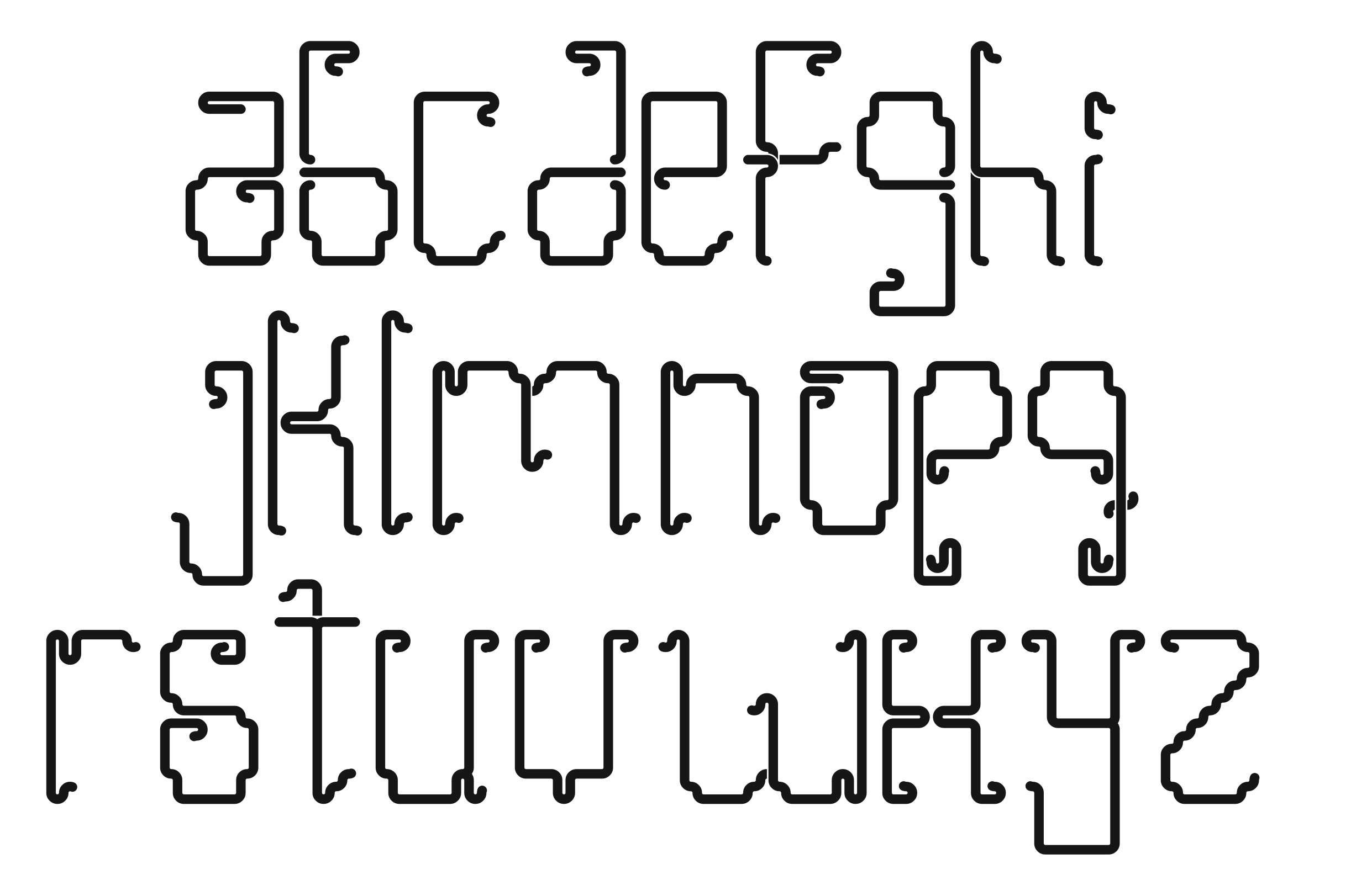
- Your studio assignment is to make three (3) distinct design proposals for a possible latin alphabet, to be reviewed next week. For each of your three (3) concepts you will design six (6) letters: A, B, H, M, O, S.
—> Choose either UPPERCASE or lowercase.
—> Concept 1 design your A, B, H, M, O, S
—> Concept 2 design your A, B, H, M, O, S
—> Concept 3 design your A, B, H, M, O, S
- Take six (6) or more screen shots of your letters in progress—from each concept— to show how you are building them so you can get feedback. Show the fonstruct workspace. Upload these screenshots to the drive.
- Write a brief description of your project as a comment below, and share a link to your project in our shared class folder on the drive.
**In Fontstruct, there is the ‘core’ group of brick shapes and a ‘connector’ group also that you can use. Find them under the drop down menu. See screenshots below:

Thien Le, 2018

Links:
Letterform Archive—Bauhaus Typography at 100, Ellen Lupton lecture
Letterform Archive online
Emigre
Hansje van Halem
Nontsikelelo Mutiti
direct link to modular font
about Kusina Mai/ Kusina Mai Futi Letterform Project (Nontsi Mutiti)
Fonts in use
Phillipe Apeloig
Thinking with Type (Ellen Lupton)
Watching Whispers from the Andes with Vanessa Zúñiga Tinizaray really opened my eyes to how powerful design can be in telling cultural stories. I was especially drawn to how she uses symbols from Indigenous communities in Ecuador and brings them into modern design work. It’s clear that she doesn’t just use these elements because they look cool—she takes the time to understand where they come from, what they mean, and how they connect to the land and the people. Her research methods stood out to me. Instead of just reading about these traditions, she actually visits the communities and talks to people. That personal approach makes her work feel more honest and respectful. I also liked how she blends traditional patterns with bold, modern design—it’s like the past and the present are having a conversation through her art. The biggest thing I took away is that design isn’t just about being creative—it can also be about preserving history and keeping cultural voices alive. Vanessa’s work made me think about how important it is to honor where ideas come from, and how design can help us reconnect with stories that matter.
While working on this font project, I found myself really enjoying the process of experimenting with different shapes and design tools. At first, I started with a basic idea for how I wanted the letters to look, but as I kept creating, I got more comfortable and playful with the tools. I began to explore different styles, like using bold forms, sharp angles, and unique patterns that reflect a mix of digital and abstract influences. Each version of the font shows my progression—starting from more decorative and detailed designs, to minimalist outlines, and finally to a bold, solid style. It was fun to push the boundaries of what each letter could look like, and I learned how powerful shape and form can be in expressing different moods or themes through type.
https://uncg-my.sharepoint.com/:f:/r/personal/r_riley_uncg_edu/Documents/_Rachele%20Riley/teaching/S25/ART%20341%E2%80%9301/Tre%20Leach/week%2013?csf=1&web=1&e=LWGkTl
Hey Tre, I really appreciate your experience with Tinizaray’s and I’m glad it you appreciate her thoughful approach to design. I think your 3rd font is the strongest out of you experiments. I really enjoy the textile look of it.
While watching Tinizaray’s presentation I was blown away by her creativity when recycling ancient imagery. The revival of ancient Ecuadorian symbols into fonts is something I had never thought of, or really most ancient forms. However, when looking at her work it’s clear the amount of research and time that went into creating these works. Her experiments alone felt so well rounded that they could practically be a finished piece by themselves. While looking through the work, her second type face caught my attention. The use of the same tiles recycled over and over into vastly different letters each time captivated me, and was something I had never thought of, like a shifting vocabulary that all arrived at making a new, fully functional sentence each time. Admittedly, I did my letter forms before I watched this presentation, and then soon after met with the professor, and I have many more ideas for letter forms that would make much more sense than the ones I have now. However, I cannot say I can even fathom how well and complex the letters are made out to be in Tinizaray’s work. Her exploration of already used patterns and imagery makes me look back on my own history and things that I could recycle into new letter forms, the first thing that comes to mind for me is Elder Futhark, the ancient Norse runes.
Word count: 230
Hello Lucio! I agree it was amazing to see how she was able to reuse ancient imagery! It was nice to see where her inspiration came from.
Vanessa Zúñiga Tinizaray’s work in Whispers from the Andes is a powerful reminder of how design can be used to preserve and reinterpret cultural heritage. I was especially struck by her deep commitment to research diving into ancestral Andean symbols, textiles, and architecture to inform her visual language. Her process shows how thoughtful design begins with respect and curiosity, not just aesthetics. What stood out most was her use of modular systems to echo the structure of ancient visual languages. This approach aligns perfectly with our Project 4 focus on modular thinking and geometric forms, but she takes it further by embedding meaning into every element. Her style rich, symmetrical, and rooted in bold geometry feels both ancient and contemporary, which is a rare balance to achieve. I learned how simplified shapes can hold deep cultural narratives, and how repetition and pattern can create rhythm in design. Tinizaray’s work inspires me to think more critically about the stories behind the forms I use, and to explore how geometry can communicate identity. Her fusion of research and abstraction shows that modular design doesn’t have to be cold or sterile it can be emotional, symbolic, and deeply human.
https://uncg-my.sharepoint.com/:f:/g/personal/r_riley_uncg_edu/EkOvC_xZgChFkwqFqMt2tzABiXLi9OweJM3SO20y3KtnKw?e=qZ7UWN
My work is a small series on geometric vs organic shapes. For 2 of the 3 sets of letters i focused on negative spaces as well as keeping the text compact and using negative space as a way of design. This way of forming letters and typefaces is definitely a learning process for me on this site as sits new to me. But in the coming weeks i believe my fonts will get more and more complex and interesting.
Hi Jon, I absolutely love your use of negative space. I think you created a really strong font typeface. Your third is my favorite in particular
Hi Jon! I really loved your second design. It feels very sleek and modern, but all of your lettering designs are amazing!
Hi Jon! I think it’s really interesting that you based one of your fonts off of your FunnyFace Letters. You have a broad range of experimentation here which is really impressive. I especially like your inverted letters! They give off the impression of the letters more so than being the letters themselves, but they’re still clearly readable.
Hey Jon, you did a great job. I enjoy viewing your typography and how you used negative space. I love how you took your time and experimented. After all amazing job!
Tinizaray’s work really opened my eyes to the power of design as a tool for cultural preservation. I was struck by how deeply rooted her process is in research—she’s not just borrowing from indigenous traditions for aesthetic value; she’s studying them, understanding the meaning behind each symbol, and then translating that into something new and relevant. That approach feels so intentional and respectful, and her use of color was so visually pleasing and perfect in honoring the culture she was inspired by.
I especially love how pattern-based her designs are and the way geometry is woven throughout them. There’s a rhythm and structure that feels both ancient and modern. One that really stuck with me was when she showed the letters J, K, and L and 13:07, those black, white, and red lines interwoven between the forms were just stunning.
Her aesthetic is beautiful, but it’s the concepts and research behind it that really gave me something to think about. Tinizaray’s work reminded me that design can be a bridge that connects the past and present, and helping us see old narratives in new ways. I’m leaving this with a lot of respect for her process and a desire to approach my own work with more intention and care.
https://uncg-my.sharepoint.com/:f:/g/personal/r_riley_uncg_edu/Er_zemCJoYZOtCYOkY7bPYIBshi99JKF0FFV6Psz0dqPbQ?e=0jpL1W
Right now, I’m having such a fun time in FontStruct. I’ve been building on more geometric shapes, playing around with size and spacing of the text itself, such as playing with shading within the letters and how it is structured. Im inspired by bold text, but am trying to lean into thinner font sizes as well.
Hi Ava! I really like your designs. They’ve all got a sort of pixel look to them which I think is cool. I think Concept 3 is my favorite, but Concept 2 is a close second!
Hi Ava! I agree that her presentation made me rethink design overall! I love how she was inspired culturally, because I also enjoy my culture. So seeing her express it in typography was so inpiring!
I really like your first concept and how the little detail of having one end of the letter having a sharpened edge really interest me. It reminds me a lot of gothic styles and depending on which concept going forward it might be cool to look at the gothic font and more stylized serif fonts.
Hey Ava, I agree with your assement of Tinizaray’s work. I think it’s a beautiful way to appreciate, celebrate, and perserve indigenous cultures. Your experiments are also interesting to me. I enjoy the vericality in your first experiment.
Hey, Ava, I love how you included your culture in typography; this brought my attention even more. Being able to express your roots but also play around with typography is very interesting. It’s also interesting how you played around with the letters!
Ive been interested in Amuki’s approaches since we were first introduced to her work in week 8.
The floral textured fonts on her page were incredibly striking to me and motivated me to make
the island project. I was disappointed to learn that these fonts are primarily a product of AI collaboration.
Concerning the modular experiments presented in the linked presentation, I found her approach
very interesting. The analysis of pottery to preserve motifs was unexpected but such an obvious
solution. Experiment 46 caught my attention with the use of overlaying different color modules
to generate new forms. The relationships between the different color passes reminded me almost
of musical counterpoint, the emergent forms adding complexity through harmony/dissonance with the base module.
I gleaned through an interview that Amuki uses a software plugin called fontself along with prepackaged geometric modules to build some of the fonts. Some of the prefabbed modules have origins in Italian modular fonts from the 1920’s/30’s, such as Fregio Mecano.
Experiment 86, Cosmogram, was also very exciting to me. I made my studio before watching her
presentation and found it serendipitous that we arrived at similar solutions. The use of a
iterative ‘anchor’ in the form of the statue’s stargazing face atop each letter form is very
similar to some of my concepts, where each letter emerges from a singular geometric ‘anchor’ form.
Studio:
https://uncg-my.sharepoint.com/:b:/g/personal/r_riley_uncg_edu/EYMPVjoWxNBHmNt8e0MpfnwB-_7gTvsGa1Odt3xNUyf1AQ?e=maeBhJ
For concept 1 I have a font that uses a singular geometric anchor to replicate a feeling
of calligraphy. I used images of lion fish as a visual guide to direct the feel of the shapes.
I tried mixing sharp edges with curved terminating lines in places to make the font feel
modern but organic. Accent marks are used in places to maintain height/width continuity
without sacrificing the feel of the letter form, this also balances the weight of the anchor.
The modules used in the main form are dictated by how they interact with the anchor.
For concept 2, I tried to suggest a lattice overgrown with vines. Each letter was drawn
crudely using the line tool with a simple dot matrix. each intersection point is replaced
with a distinct module to improve readability. A drop shadow is suggested with a separate module.
For concept 3, I envisioned a factory setting where each letter connects to the next.
I used an anchor motif above that suggests a scaffolding with a claw crane and storage.
The letter forms themselves are meant to appear as duct work transporting some sort of
spherical object from one letter to the next.
Hi Zeus, your first font is easily my favorite. All three are strong but your first is really strong, in its abstract nature and concept is really strong.
Hey Zeus, seeing someones work that interested you being AI is so frustrating especially because we have to be way more observant because of how fast its changing. For your concepts I really like concept 1 and how the fonts were very reminiscent of gothic fonts. Great Job overall!
Discussion:
Vanessa Zuniga Tinizaray’s Whispers from the Andes presentation focuses on the Andean visual culture. She reinterprets this ancestral knowledge through modern design. In her research, she studies pre-Columbian symbols and graphic systems, translating them into 3D graphics, typography, and motion posters. Tinizaray combines historical references and cultural research to explore and experiment with her discoveries. For example, she studies indigenous textiles/ceramics to create typefaces based on their patterns and designs. Animating posters that blend with ancient iconography is another aesthetic she designed. Tinizarary even designed a card game that teaches Andean symbolism. The card game allows this information to be presented – in a modern and interactive way. Her work is about preserving heritage while also continuing to push creative boundaries. This enables her to make this knowledge accessible and engaging for new audiences.
Tinizarary values storytelling in her designs. She studies symbols and their meaning versus just copying them – which allows her to connect them to Andean rituals and everyday life. She turns these meanings into modular designs, so her animated posters, for example, move in a way that matches the energy of the stories. This way, Tinizarary can combine the traditional aspect with modern design while still respecting the history.
Studio:
In my first typeface design, I decided to do all lowercase (mainly since I used all uppercase in my last project). This one is my second favorite out of all three because of the tails and the “funky” aspect it has to it. My second experiment consists of an italicized, uppercase typeface. I started with the slant of the “A” and used that to construct the rest of my letters. My favorite out of all three is the last design that I created. It’s all uppercase but has a consistent pattern using multiple shape blocks to make up the entire form. In this typeface, I designed it so that letters with a “middle” feature jagged edges, while the top and bottom of the letters have a straight line pattern.
https://uncg-my.sharepoint.com/personal/r_riley_uncg_edu/_layouts/15/onedrive.aspx?id=%2Fpersonal%2Fr%5Friley%5Funcg%5Fedu%2FDocuments%2F%5FRachele%20Riley%2Fteaching%2FS25%2FART%20341–02%2FChristina%20Kibler%2FWeek%2013&ga=1
Hi Christina! Your designs are all really cool! Concept 1’s forms are super interesting but simple, and Concept 2 being diagonal is super creative and unique! And Concept 3 is super detailed and interesting to look at. I think overall Concept 1 is my favorite, but they’re all really cool ideas.
Hi Christina, I really loved your 3rd design. It feels very pattern-esque. I can’t wait to see your final alphabet 🙂
What I learned about Tinizaray’s work is that her goal is to reconstruct the Latin American visual identity through her creations. How she makes these creations is seeing through a different perspective. Going to museums, revisiting history, and speaking with others is shows she constructs her work. For the first experiment 15 she goes over, they use cultural symbols to create letters from the Latin alphabet. Creating not only an interesting and a diverse set but the visual identity of the symbol has now shifted into a new identity. Experiment 46 showcases how Tinizaray works with different combinations. To see how she constructs her typefaces with software we are using is really inspiring. Experiment 86 expands on 46 centering around Pre-Colombian entities. Creating typefaces around that, including stamps, and sculpture. Seeing how Tinizaray takes visual identities of Latin America into typefaces depends on the theme and symbol. The typefaces differ but expand on one another. Tinizaray aesthetics through her work or her presentation are so pleasing to watch. As well as inspiring, taking complex topics into beautiful designs that include history. Noticing in her work she experiments with many ideas into a centered and cohesive work. In color, structure, and message her work is overall very beautiful.
For my project I wanted to simply experiment with different shapes and forms. It was frustrating at times because I didn’t know what to do. But after a while I got into the hang of things finding new things to experiment with. Which is why I went back and redid my concept 1. As I am not really happy with the first edition of that concept. I wanted to explore more and be happy with what I was doing. If I were to pick my favorite one I would pick my concept 1 redo and would love to explore how other letters look with that concept.
https://uncg-my.sharepoint.com/:f:/r/personal/r_riley_uncg_edu/Documents/_Rachele%20Riley/teaching/S25/ART%20341%E2%80%9302/Sarah%20Hines/week%2013?csf=1&web=1&e=WTexro
I agree with you, my favorite is the “redo” of concept 1. I enjoy that its just readable enough without sacrificing the style you came up with for the letters. Probably my fav font I’ve seen from the project.
Discuss:
Upon watching Vanessa Tinizaray’s “Whispers from the Andes” I learned of her research method which involves an in-depth analysis of archaeological artifacts. Vanessa utilizes a process of extracting visual signs that she later reimagines into modern graphic elements. In her work, she honors not only the geometric aesthetics of ancestral cultures but also bridges the past and present. I found that Vanessa Tinizaray’s process focuses on modular thinking. In her speech, she explains how complex forms can be viewed as simplified, geometric units. She also introduces the idea of how complex designs can be created through these simplified shapes using repetition and variation. From this, I learned of the basic principles of modular design. Vanessa’s emphasis on modularity has taught me of a powerful tool in design.
Tinizaray’s aesthetic is deeply rooted in her cultural heritage. Her designs are rich with Andean history and identity. I found it inspiring how Vanessa translates ancient visual language into contemporary forms. Her practice showcases her devotion for Latin America’s rich cultural tapestry. Lastly, her work serves as a testament to the enduring relevance of indigenous design elements and their capacity to inspire modern creativity. Overall, Vanessa’s speech “Whispers from the Andes” is a compelling fusion of research, cultural reverence, and innovative design which has opened my eyes to a new way to approach design.
Studio:
In my project, I tried to create three distinct types of text. The first one contains a lot of geometric shapes which creates a jagged and sharp look. The second font somewhat resembles that of a digital clock’s. Lastly, the third font is constructed using stars as the only repeating element.
https://uncg-my.sharepoint.com/:f:/g/personal/r_riley_uncg_edu/Elob98tOkM1JuaRDqNLdvbMBfKp7Tpbd73Qz61ZE2Dxm2g?e=U3xmpi
Hello Saige! Thank you for sharing all of your designs. I really like that you chose to explore line weight in your first design.
Vanessa Zúñiga Tinizaray’s Whispers from the Andes really opened my eyes to how design can carry deep cultural memory. As a college student studying design, I found her research methods incredibly inspiring—especially how she digs into ancestral knowledge and symbols from Indigenous cultures of the Andes, then reinterprets them through modern tools like modular grids. It’s not just about making something that looks traditional; it’s about respecting and reactivating the systems of thought behind those forms. Her aesthetic is super bold yet rooted in ancient visual language. I loved how she used simplified, geometric shapes to build up more complex compositions, which connects directly to our class theme of modular thinking. You can really see how one small pattern, repeated or altered, builds an entirely new meaning. That layering of design mirrors how culture is layered too. What stood out the most is her sense of responsibility to her roots—design for her is not just visual but cultural storytelling. It made me think more about where my own ideas come from and how I can be more intentional in honoring that. I’m definitely going to carry that with me into future projects.
Tinizaray’s work is incredibly appealing to me as someone from the Latina diaspora. I really like how she incorporates a history of culture within her projects. They are so detailed and well thought out with the imagery and representation of indigenous culture from Ecuador. My personal favorite project of hers is Experiment #46: the Andean Modules. I really like the types of designs they were able to create based on archeological symbols found from the Andes Mountains. They personally remind me of the style of textiles commonly made and worn by the varied indigenous communities at the Andes. I also appreciate Tinizaray showing time lapses of their creations because the process is just as informative to the overall experiment as the final product. The forms that the glyphs take also aethsth7ically appeals to me because they are very curvilinear, but they still conform to a controlled space. In other words, its blocky yet it holds so much movement. I think the use of color in their variations is very interesting as it plays with the positive and negative space. They almost feel more open or closed depending on the background colored used. For example, the black ground makes the letter look self-contained, but the white background gives and open feel to it.
For my project concepts, I wanted to do something with a lot of consistency with the overall shape. I also focused on the relationship between tiles and how they interacted with each other.
Link: https://uncg-my.sharepoint.com/:f:/r/personal/r_riley_uncg_edu/Documents/_Rachele%20Riley/teaching/S25/ART%20341%E2%80%9301/Mar%20Alvarado-Escobar/Week%2013?csf=1&web=1&e=UcaReh
Hi Mar! I loved your somewhat fire-inspired font! The amount of movement and dynamism is exciting, and I like how the central circle block balances the whole typeface. I also think it’ really cute how you based your first font off of people!
Vanessa Zúñiga Tinizaray’s Whispers from the Andes presentation was very emotional and intriguing. Her practice demonstrates an important dedication to honoring and revivifying Indigenous Andean visual languages in design. What I found most interesting is how she delves into the indigenous Andes textiles, ceramics, and architecture, decoding ancient symbols and reinterpreting them through a contemporary graphic design lens. Her approach is not only scholarly but also profoundly personal and cultural. She’s not just “using” ancestral elements — she’s translating their meaning with respect and intention.
Aesthetically, her work is lively, rhythmic, and dense with historical layers. Her work was inspirational because it connects traditional Andean knowledge with digital tools, designing typefaces and patterns that feel both ancient and modern. Her work challenges Western notions that design innovation comes from Western frameworks. Instead, she shows how ancestral wisdom is a source of great creative potential.
Exploring @amuki.ec also helped me understand how design can engage in cultural storytelling, activism, and preservation. As someone who is often obsessed with type and geographical form, the work of Tinizaray had me thinking differently about how letters and symbols can hold identity, memory, and resistance. It is a reminder that design goes beyond what you can see and is at its core, a human endeavor.
.
.
.
.
Concept 1: A zig-zag textured, pixel-style typeface that imparts a sense of movement to each character, as if static electricity were coursing through them.
Concept 2: A geometric, monospaced design featuring square and diagonal elements. The letters appear modular and somewhat abstract, reminiscent of sci-fi or digital displays.
Concept 3: A simpler and more refined design in terms of strokes, aiming for a clean vertical look while still incorporating some softer, rounded elements. It plays with contrast and cadence, blending modern and vintage sensibilities. Utilizing lowercase styling adds a softer, friendlier tone.
What I learned about from her research methods, concepts, and aesthetics is that she is very interested in researching cultures prior to designing and allowing these cultures to have a direct impact on the forms that she comes up with. She also mentions that a lot of experimentation has to occur in order for these letter forms to really take shape. The culture that specifically affects Tinizaray is the Andes. Her goal is to contribute in the construction of a Latin American visual identity as it relates globally. Her work has to do with where she comes from. Something interesting that I thought she said was when she talked about learning to observe things from another perspective because often times I think it is easy to get caught up in our own lived experiences and forget that others haven’t lived our same life. The aesthetic that really caught my eye in her work was how she was able to relate the environment that she grew up in to develop a type face that mimics that of a rock being thrown into a pond. This is at first an abstract idea but comes together beautifully in her work. I really find her work to be extremely interesting and have enjoyed seeing how she achieves some of her ideas.
My project has 3 separate concepts that all show the letters A, B, H, M,O, & S. The first concept that I developed I wanted to be my most abstract one so that I could push myself outside of my comfort zone early and then dial in a more comfortable approach in my last two concepts. My first concept involves the use of only triangles and took a lot of experimentation to achieve a zig-zag like form that reveals the letters within the negative space of these forms. I also wanted to keep things as cohesive as possible so I kept the bricks that I used to a minimum and pushed myself to make the forms work with a limited capacity. My second concept involved really thin lines that seem as if the letters are created out of a singular line that wraps on itself to turn or create additional lines. I had a fun time with this one as I was able to experiment with many forms and arrangements. My third and final concept, I decided to make the letter forms much thicker to contrast my second concept and I was thinking about the concept of vampires at the time. I decided to make a few letters that were more sharp in feeling yet bold and held a sense of power and position to them. Keeping the sharp edges of these letters was important to me and I like how I’ve incorporated that aspect in these 6 letters as of now. Overall I am happy with this experimentation week.
Link to my Week 13 One Drive Folder:
https://uncgmy.sharepoint.com/:f:/g/personal/r_riley_uncg_edu/Elztaa8M66ZIgblIJWNrlf0BiadoI4H8k1MngYdq9TmqQQ?e=98ald6
Hi Hayden! I agree with your statement about Tinizary’s work it is very interesting to see how she her ideas came about. For your concepts, I think all of them are well made! I also appreciate you stepping out of your comfort zone and making each one look different from one another. I would love to see you explore more of your first and second concepts as those are my favorite out of the three.
Hi Hayden!
I absolutely enjoyed all three of your concepts! Each of them was very strong and I love the variety in line weight and movement. I definitely would like to see you explore your first concept as that one was by far my favorite. Well done!!
VIDEO RESPONSE:
Tinizaray’s work is incredibly unique, and I really like how she incorporated her culture into her work. I admire how many variations she made when working on “Experiment 46” – I think being able to take a concept and make a bunch of different versions of it is really important in the world of design. It allows you to explore multiple possibilities and then choose which one(s) you like the most based on an actual product rather than just an idea in your head. I’m someone who tends to have difficulty with this; I often get stuck on one idea and struggle to branch out or make deviations from my original plan, so seeing Tinizaray’s examples and how they helped her in her process was really fascinating. In general, I just really like how detailed and funky the letters from this project look, while still being recognizable as what letters they are. I also find it really cool how she was able to mix her letters with actual imagery. Her compositions are really incredible to look at; there’s so much detail to take in. The final experiment she talked about was really incredible too; her taking her 2D designs and making them 3D and into actual stamps is super creative and a completely different way to experience her letters.
–
PROJECT LINK: https://uncg-my.sharepoint.com/:f:/g/personal/r_riley_uncg_edu/EjkreQDhleRCvAjBNubb4nEBYpVx2RY00rwXGqp_b9VxWw?e=QAUTrE
For my first set of letters, I went with a diamond pattern and kept the forms blocky while still being somewhat irregular. I also added little star twinkles to make them more interesting. For the second set, I made the letters thinner and really played into a spiky and irregular aesthetic, with a through-line of circles as an accent. For the third set, I tried to make a much smoother and neater design in contrast to the previous two. I used simple lines with squares and circular “wifi” shapes as accents. My favorite of the three is definitely the third set.
For my personal response to Vanessa Zuniga Tinizaray’s work, she really really inspired me because of how she connects design with history and culture. What stood out to me the most was her research method. She doesn’t just read books. She also visits museums, talks to experts, and studies ancient objects from her home in Ecuador. She spends a lot of time looking at patterns and symbols from native cultures. I just think its really amazing of her to understand their meaning. I really love how she wants to protect and share her knowledge so it doesn’t get forgotten.
Her concepts are very creative. She believes everything in life is connected. What she means by this are things like people, nature, the stars, etc. She made me think about how we all have roots and stories . She makes her own typefaces and patterns based on ancient shapes
Her style is bold, colorful, and full of life. She uses modular design, which means small pieces come together to create a whole. That goes to show me of how different people form a community. I learned from her that art and design can tell stories/save history and help people feel proud of their identity. It makes me want to look closer at my own individual culture, and how just everyone has their own unique separate identities and experiences that make them “them.”
I really enjoyed Vanessa Zuñiga’s designs and what inspired the ideas behind them. I found it interesting that she started off by introducing herself and her background. We needed to understand her first before looking at her typeface. This really gave me a sense that she was heavily inspired by the things around her. I love the fact that she was inspired by her home and her background which was Ecuador. She looked at artifacts, the culture, illustrations, etc. In order to compile her book she was inspired by native Ecuadorian culture, her book contains modular typography, patterns, and illustrations. Vanessa also included the quote by Min-soo Kim, “ Designs as a cultural symbol confronts life changes by understanding and re-interpreting the cultural-historical realization of the pre-existing system to create and communicate new symbols”. I think this quote sums up the way Vanessa designs and her thought process. Her aesthetic overall was beautiful, and although the aesthetic was the same, the typefaces that she showed were all unique and different which was amazing to see. I think the methods she used to create her designs were done beautifully and were really inspiring to watch. I am Mexican-Salvadorian, so our culture kind of felt similar which was nice to see in typography.
For my project I wanted to keep it similar but different at the same time. I tried designing something I would use in my normal everyday conversations. I didn’t do anything thick, I kept it pretty thin and simple, most “layers” I would add at most was three. My favorite concept was the first one, but I loved how I added three diamond shapes for all my letters in concept 2, to me that was the most unique one.
The link to my project:
https://uncg-my.sharepoint.com/shared?id=%2Fpersonal%2Fr%5Friley%5Funcg%5Fedu%2FDocuments%2F%5FRachele%20Riley%2Fteaching%2FS25%2FART%20341%E2%80%9302%2FXimena%20Perez%2DChavarria%2FWeek%2013&listurl=%2Fpersonal%2Fr%5Friley%5Funcg%5Fedu%2FDocuments&noAuthRedirect=1
Hey Ximena! I really enjoy seeing your progress and variety throughout your designs. Thank you for sharing!
In her Typographics 2020 talk, Whispers from the Andes, Vanessa Zúñiga Tinizaray–who is also known as Amuki—takes us on a typographic journey through the lesser-known stories of the original cultures that inhabited the Andes. She takes on a new analysis of visual signs found in archaeological artifacts. She translates these ancient symbols into a contemporary graphic where geometry plays a significant role. Her work is very pleasing to look at for one. I loved seeing her work, and would love to see her work in person. Her research project she has been working on is called, Visual Chronicles of Abya Yala, which aims to revalue Latin American cultural heritage and amplify it globally. Her mission is to design, share, and teach people to appreciate and celebrate this heritage with pride and without prejudice. I have seen that she has written a book too. It has illustrations of her work in it which could be interesting to look at. Overall every artist we have been able to see in this class has inspired me. It is daunting sometimes to be an artist in this generation, so seeing that Zuniga has created a well balanced career with her art is amazing. I hope I get to be like this one day with my own career.
My current project has been fun to create so far. My favorite option is my second one. I like how clean it looks yet it isn’t too simple. It’s unique and I think it will look nice once the whole alphabet is made.
https://uncg-my.sharepoint.com/my?remoteItem=%7B%22mp%22%3A%7B%22webAbsoluteUrl%22%3A%22https%3A%2F%2Funcg%2Dmy%2Esharepoint%2Ecom%2Fpersonal%2Fwagentry%5Funcg%5Fedu%22%2C%22listFullUrl%22%3A%22https%3A%2F%2Funcg%2Dmy%2Esharepoint%2Ecom%2Fpersonal%2Fwagentry%5Funcg%5Fedu%2FDocuments%22%2C%22rootFolder%22%3A%22%2Fpersonal%2Fwagentry%5Funcg%5Fedu%2FDocuments%2FART%20341%E2%80%9302%22%7D%2C%22rsi%22%3A%7B%22webAbsoluteUrl%22%3A%22https%3A%2F%2Funcg%2Dmy%2Esharepoint%2Ecom%2Fpersonal%2Fr%5Friley%5Funcg%5Fedu%22%2C%22listFullUrl%22%3A%22https%3A%2F%2Funcg%2Dmy%2Esharepoint%2Ecom%2Fpersonal%2Fr%5Friley%5Funcg%5Fedu%2FDocuments%22%2C%22rootFolder%22%3A%22%2Fpersonal%2Fr%5Friley%5Funcg%5Fedu%2FDocuments%2F%5FRachele%20Riley%2Fteaching%2FS25%2FART%20341%E2%80%9302%2FAlex%20Gentry%2Fweek%2D13%22%7D%7D&id=%2Fpersonal%2Fr%5Friley%5Funcg%5Fedu%2FDocuments%2F%5FRachele%20Riley%2Fteaching%2FS25%2FART%20341%E2%80%9302%2FAlex%20Gentry%2Fweek%2D13&listurl=%2Fpersonal%2Fr%5Friley%5Funcg%5Fedu%2FDocuments
A few things I was instantly able to pick up on in Tinizaray’s work was the variety of pattern styles and vibrant color choices, stark differences in size and scaling, placement, etc. I noticed how her work is very color coded the more I observe her more pixelated pieces. Color is urgent if colored pixels is the design. Same for placement, supposedly if one color is repeated in a two color pattern the art would convey something entirely different. I wanted to expand more about the scaling. The fascinating idea of making the illusion to where the work is unable to fit inside the canvas. The way she alters some parts of her pieces to where they are either stretched, shrunken, or squished makes for a more interesting composition overall. Despite most of her work being this choice of style primarily, I noticed a few works where symmetry is the most focused. One example that fits this description can be the red flower that’s on her page. Right off the bat we see a pixelated flower that’s centered. While this sits in the middle perfectly symmetric, we have a complimentary asymmetric pattern both on the top and bottom of the canvas, a contrast I also find intriguing.
I really liked how many concepts Vanessa Zúñiga Tinizaray worked with, although the key idea behind the designs were all the same she had so many different and unique concepts. I admired how the idea came from her background and her culture (Andean culture), you could really see how passionate she was and how she really inspired the project herself. One of the concepts that really stood out to me was her experimentation with stamps (experiment 86). I think as designers, sometimes it can be boring looking at a computer screen all day so working with something physical and tangible can be much more engaging and create more fun results. She then went on to make an animation which I also really like, I would like to create some more animations so seeing her work inspired me to try some new things, especially when it comes to animation. Her book also looked very interesting and I would love to have a look through it one day. Another think within these experiments that I particularly liked was her use of colour, such bright, vibrant interesting colour palettes which made the work look so appealing. Overall I just really liked how she took a cultural, historical, an pre-existing symbol and so creatively found ways to put it to use. It is also so incredible that it was a compilation of 16 years of work with 125 experiments.
For my three typefaces I decided to create one that had very neat, sharp, pointed edges, one that used curves and then one that worked with a lot of line work. I particularly like the one using a lot of line work. As it was the last one I made I think it was neater and more interesting as I got more used to the software.
https://uncg-my.sharepoint.com/:f:/r/personal/r_riley_uncg_edu/Documents/_Rachele%20Riley/teaching/S25/ART%20341%E2%80%9301/Hannah%20Hind/Week%2013?csf=1&web=1&e=F1mH4c
The video talks about Whispers from the Andes, Ecuadorian designer Vanessa Zúñiga. Her work focuses on reinterpreting ancestral visual symbols derived from archaeological artifacts into modern typographic and graphic formsZúñiga’s design process involves a semiotic and morphological analysis of ancient visual signs, which she translates into a contemporary graphic universe where geometry plays a significant role. Vanessa demonstrates a lot about her roots/background. This is how Vanessa brings her ideas into typography. It provides her with experiments and allows her to have a deeper meaning of these typography words. She demonstrates experiments/projects of cultural patterns, illustration, and typography. One thing that caught my attention is how Vanessa showed the process of some typography, such as the difference in vocabulary involving typography. The variation and form of each word are incredible. I love this because she shares a part of her culture with the public. All of this brings a perspective of typography in many ways. Her presentation at Typographics 2020 underscores the importance of decolonizing design practices and embracing diverse cultural perspectives. Zúñiga’s contributions not only enrich the field of typography but also serve as a testament to the enduring relevance of indigenous art and symbolism in today’s global design landscape.
https://uncg-my.sharepoint.com/:f:/r/personal/r_riley_uncg_edu/Documents/_Rachele%20Riley/teaching/S25/ART%20341%E2%80%9302/Cindy%20Ortiz/week%2013?csf=1&web=1&e=3Nuceg
I feel like your concept 2 could be really cool. If you want to manipulate the O the same way as the other letters, but don’t want it to look like a C or a D, you could interrupt the shape at the top or even the bottom like an omega symbol.
Cindy, I really enjoyed seeing your typefaces. Concepts 2 and 3 are very strong. I’m excited to see you take either one of those further. For the second one I love the melty metallic feel. For the third I love how you played with positive and negative space. Very creative typefaces.
Vanessa’s work I think really captured the modular style. Coupled with the fact that she focused on the Andes, and in specifics, her precolonial heritage is really exciting to dive into because a lot of things in modern times is very western or bastardized versions of ancient expressions due to the involvement of colonial forces. I really liked the card game she showcased towards the end because it had figures related to the mythos of her culture. I think that and the simplified module she showed before the cards really highlight what she was trying to have the audience see. With my modular letters I wanted to originally go for very gothic letter faces but after experimenting with the software I steered away from it. I really like the roundness a lot of the shapes have and I incorporated that element a lot in my work and I think that goes well with Vanessa’s work. Her work and specifically her typefaces really have a breath of life in them and it helps to connect the viewer with the artist. I think that seeing the events that she holds and the way that you can clearly see how much they connect with others made me really appreciate her work.
Hey Rocky! I agree that her work has life to it, it’s really interesting to see how the concepts of culture and typefaces blend together. And how she takes abstract concepts into beautiful works. Regarding your concepts they are all so beautiful to look at and all so different. I would’ve loved to see your gothic take on type as well. I would say my favorite concepts are your first and second one, but I’m leaning more towards the second one. Great work!
Link to folder:https://uncg-my.sharepoint.com/:f:/r/personal/r_riley_uncg_edu/Documents/_Rachele%20Riley/teaching/S25/ART%20341%E2%80%9302/Raquel%20Walton/Week%2013?csf=1&web=1&e=otcYjm
Discussion:…..I enjoyed hearing Vanessa’s background and the story behind her years of research. Her presentation highlights the richness of Andean culture with a lot of passion and genuine respect. What stood out to me most was her curiosity and dedication for the ancestral designs, while not copying everything, she reinterpreted them in a way that helps build a stronger Latin American visual identity. One of the research methods she used was historical and archival research, where she looked into ancient codices, documents, and museum collections to tracked down the roots and evolution of Andean visual languages. She also cross-referenced symbols and languages from different regions in Latin America, showing how they connect across indigenous cultures. I liked how she was able to blend tradition with contemporary design while still honoring the original meanings. Her approach felt very thoughtful and humble because she never tries to take full credit for the work, but instead gives recognition to the communities and cultures that inspire it. Overall, her work made me think about how design can be a respectful way to keep traditions alive and tell meaningful stories. It was inspiring to see how art, culture, and identity can come together in such a grounded and intentional way.
Studio:…. It was fun playing around with the shapes and I like how my design 1 came out. I used the round curvature as the barrier of the font rather than using the shape within it which I think is cool. The other two designs I explored creating the font through repeating shapes and creating texture with the patterns.
https://uncg-my.sharepoint.com/:f:/r/personal/r_riley_uncg_edu/Documents/_Rachele%20Riley/teaching/S25/ART%20341%E2%80%9301/Debora%20Guevara/Week%2013?csf=1&web=1&e=WwIw7R
Hi Debora. Nice to hear you touch on the interconnectedness between art, culture, and keeping ancient traiditons alive. It’s fascinating how archives can be smorgasbord for inspiration of the future.
Vanessa Zuniga Tinizaray talks about her project, Whisper from the Andes. In the past 16 years she researched, visited museums, talked with reacherhers and read many different books. She performed 125 experiments to develop typography and illustrations for this project. She had many experimental typefaces created in this process. Some of these ended up in her 2014 book. She says her goal is to contribute to the construction of a latin american visuality in the typography universe. Tinizary was born in the south of Ecuador, and her childhood was spent in different places that were influential to her future endeavors. These experiences made her learn to look at things from another perspective and experience.
Around 11 minutes into the video we see Tinizary making the fonts in a program similar to what we used for this week’s studio project. I thought it was super interesting to see her typeface being built in real time. I was inspired by her connection to her heritage, I think it’s super important to have representations of all cultures across the art world. I also thought it was interesting to see how she can look at a statue and that alone be the inspiration for an entire typeface.
Here is a link to this week’s studio project,
https://uncg-my.sharepoint.com/:f:/r/personal/r_riley_uncg_edu/Documents/_Rachele%20Riley/teaching/S25/ART%20341%E2%80%9301/Victoria%20McPherson/Week%2013?csf=1&web=1&e=jgbiMy
PROJECT LINK: https://uncg-my.sharepoint.com/:f:/g/personal/r_riley_uncg_edu/EoPLvqrnfPtOvwZ5sZMr3r8B0vnFvlCmPxPg6H6Migd8ZQ?e=RRNnMe
Vanessa Zúñiga Tinizaray, aka “Amuki” , is an Ecuadorian designer whose goal is to “contribute in the construction of a latin american visual identity through the graphic universe.” To assist her in this endeavor, she uses typeface as her weapon of choice, incorporating the motifs of her ancestors. For example, she graphically built a Condor, the Andean symbol for freedom.
During her presentation, she said “when you stop looking for something, you let it vanish away”. This phrase stuck out to me because everyone is searching for something; it only stops existing when you stop believing in it.
Utilizing typeface in this way reminded me of the typographic term revival, in which the designer aims to design a historic typeface in the realm of modern technology that hasn’t previously existed before.
I really liked her #46: Andean Modules segment. I learned so much about typeface and specifically the capabilities of Fontstruct. Seeing those intricately detailed graphics really inspired me for what’s possible. I also think it’s cool she’s developing a card game.
For my project, I explored three typefaces. For the first, I built a lowercase typeface constructed out of the curved brick. This gave an atom-like appearance. For the second, I did an uppercase typeface in which I explored the little house-like bricks. I played around with using different ones to correspond to the direction of the letter. For the final one, I actually experimented with core + connector bricks. I really like how this one came out – it’s tubular, sleek and futuristic – and I liked playing with some parts of the letter jutting out. I may experiment with this one further within the following weeks.
One thing that I took note of in Vanessa’s research and work methods is how she explained that she learned to look at things from another perspective in attempt to experience it in a different light. I also find it super interesting how she was able to discover a new typeface through inspiration from pottery from the times of the Inca. I think it’s incredible that she can somehow manage to create a style of type from many centuries ago, while staying true to modern design. It’s even more impressive how well she accurately captures and depicts the style of the Inca pottery, and transferring it to letters. In general, the patterns and details of her type is very interesting and fun to look at, while paying homage to, and spreading the joy of her culture. What I also think is so great about her work is how well it complements bright colors, along with darker ones if needed. I believe what makes this possible is due to how intricate her patterns are within the type, which makes it plausible to make it coexist with colors that may be harder with other types of letter designs.
I found Tinizaray’s methods of finding shapes by looking at things from different perspectives to be interesting, as well as her ability to do this in a way that’s still connected to her roots. She also does experiments, emulating and studying the traits of cultural artifacts and finding new and inventive ways to put them together, and in doing so, creates a modern visual identity for her and her people that loves its history just as much as it celebrates living in the current day. This can also be seen in her pattern making which utilizes historical pattern-making techniques and modern image creation tools to make her typeface. I find her specific union of the old and the new to be very genuine and crafted with love.
For my studio project this week I mostly tried to acquaint myself with the tools and tried to generate as much bang for buck out of limited space. I had some trouble, especially with the letter M that could’ve used more width, but I’m intent on keeping my characters within specific uniform dimensions
WEEK 13 WORK: https://uncg-my.sharepoint.com/:f:/r/personal/r_riley_uncg_edu/Documents/_Rachele%20Riley/teaching/S25/ART%20341%E2%80%9302/Chris%20Pierce/Week%2013?csf=1&web=1&e=MtbVXi
I was really just playing around, I didn’t really have a specific aesthetic in mind.
Here is my project
https://uncg-my.sharepoint.com/:f:/r/personal/r_riley_uncg_edu/Documents/_Rachele%20Riley/teaching/S25/ART%20341%E2%80%9301/Ethan%20Heggins/Week%2013?csf=1&web=1&e=6cmMBX
In watching Whispers from the Andes with Vanessa Zúñiga Tinizaray I found it interesting how she explained how her origins, her birth country and its history influenced her so much. She shared a quote at the end which said “Design as a cultural symbol confronts life changes by understanding and re-interpreting the cultural-historical realization of the pre-existing system to create and communicate new symbols.” This stood out to me as someone whose art is heavily inspired by my cultural roots, combining historical inspiration and combining it with my own lived experience. I love how she took something like a vase and was able to turn it into a typeface that was legible and still was so clearly a callback to the original vase. All of her designs were so unique and I loved how some of them even resembled animals. I really resonate with the way that she draws inspiration from things that she sees in her every day life since I do the same thing. The text that she created from the stone piece was my favorite. I enjoyed seeing the process and all the different variations that she created and how she turned them into stamps which were reminiscent of the original piece.
https://uncg-my.sharepoint.com/:f:/r/personal/r_riley_uncg_edu/Documents/_Rachele%20Riley/teaching/S25/ART%20341%E2%80%9301/Isabella%20Galvan/week%2013?csf=1&web=1&e=AdTJed
For my three Fonststruck typefaces I tried to experiment with different kinds of geometric forms to build upon. Font(1) and Font(3) are my favorites; I think Font(1) is interesting in how it uses contrast between the same shape, and I really like how complex Font(3) is too- I think, It’s easily the most interesting one out of my three typefaces. Font(2) is interesting as well, however, after making it I realized I don’t like how angular it is as much. Although, I think it’s an effective juxtaposition between Font(1) and Font(3).
https://uncg-my.sharepoint.com/:f:/g/personal/r_riley_uncg_edu/EoL9Coc0LmtIp88obaeeGa0BQYN-vXpoaQTY51mDenDtkQ?e=nK8Ztx
Hi Johnny,
Nice variation within experimenting with shapes within the text
What I learned about Tinizaray’s work is how typography can truly transcend cultural and language barriers, and her work serves as a reminder that not every font face needs to be legible. It’s a reminder that typography is more than about legibility, it’s an art that becomes more about shape and form. Looking through Tinizaray’s work was very eye-opening, as it is based more on experimental/modular typography and focuses more on patterns, symbols, or iconic forms that resemble symbols. I absolutely enjoyed how lots of her work is inspired by/derived from Indigenous cultures of Latin America, and that her goal is to teach people and give awareness to the Latin American cultural heritage. With her work from Experiment 15, I loved how it was inspired by the bottles made from the Inca period, and how she references the curves and bases from those same bottles into the font face she created. The repetitive symbolism of the 3 circles to represent the three pachas was so clever and left me in awe, as I would not have thought about creating such abstract letter forms. Before you can even read the words/letters, you’re immediately struck with a certain mood and tone visually, and you recognize that Tinizaray’s work is meant to resemble something, using elements that feel familiar.
As for my concepts, I honestly struggled the most with the first one since I wanted to have a more defined concept. The first one was supposed to be based on vines/leaves, and I think if I had made them lower case instead of uppercase, I might’ve been able to achieve that effect? As for the second one, I wanted to create a playful almost old-school look? I had a vision of buildings with windows to give context. As for the third one, it’s definitely my most abstract one. There wasn’t much of an idea in mind for this one, as I was mainly messing around with the look of curves and how I wanted them to be connected but still maintain those thin lines? I focused more on the curves and overall movement rather than them appearing to be legible. I’d say my third would be my favorite out of the three!
What I learned about Tinizaray’s work is how typography can truly transcend cultural and language barriers, and her work serves as a reminder that not every font face needs to be legible. It’s a reminder that typography is more than about legibility, it’s an art that becomes more about shape and form. Looking through Tinizaray’s work was very eye-opening, as it is based more on experimental/modular typography and focuses more on patterns, symbols, or iconic forms that resemble symbols. I absolutely enjoyed how lots of her work is inspired by/derived from Indigenous cultures of Latin America, and that her goal is to teach people and give awareness to the Latin American cultural heritage. With her work from Experiment 15, I loved how it was inspired by the bottles made from the Inca period, and how she references the curves and bases from those same bottles into the font face she created. The repetitive symbolism of the 3 circles to represent the three pachas was so clever and left me in awe, as I would not have thought about creating such abstract letter forms. Before you can even read the words/letters, you’re immediately struck with a certain mood and tone visually, and you recognize that Tinizaray’s work is meant to resemble something, using elements that feel familiar.
As for my concepts, I honestly struggled the most with the first one since I wanted to have a more defined concept. The first one was supposed to be based on vines/leaves, and I think if I had made them lowercase instead of uppercase, I might’ve been able to achieve that effect? As for the second one, I wanted to create a playful almost old-school look? I had a vision of buildings with windows to give context. As for the third one, it’s definitely my most abstract one. There wasn’t much of an idea in mind for this one, as I was mainly messing around with the look of curves and how I wanted them to be connected but still maintain those thin lines? I focused more on the curves and overall movement rather than them appearing to be legible. I’d say my third would be my favorite out of the three!
https://uncg-my.sharepoint.com/:f:/r/personal/r_riley_uncg_edu/Documents/_Rachele%20Riley/teaching/S25/ART%20341%E2%80%9302/Cindy%20Pham/Week%2013?csf=1&web=1&e=eSoNzR
I found Tinizaray’s work, which aims to “share ancestral knowledge through patterns,” to be absolutely incredible. The amount of depth that she imbues into her modular typefaces is beautiful to me. She not only takes inspiration from the Ecuadorian culture that she comes from, but she goes through intense periods of research and development that produce typefaces that simultaneously simplify cultural symbols and patterns but still respect the meaning of them. I love how she seeks out real-world references. I found it inspiring how moved she was by the cosmogorana statue, and how it motivated her to create that related typeface. There is a heart and a meaning behind these new symbols that someone who isn’t from her culture/knowledgeable of the culture would never pick up on. I love the way she takes these cultural patterns and iconography and boils them down into their most essential elements. It’s cleanly and masterfully done, taking ancient symbols and making them something so modern and relevant yet still respectful to their past. In a sense, she makes it feel like there isn’t really a separation between the past and the present–everything is linked and living.
As for my project, I’m still very much in the experimental phase/am uncertain about what kind of style I want to go with. I struggled a lot with making rounded fonts, but I did end up liking the patterns that went into my second font type. I want to try creating more like this, but figure out how to make the curves seamless!
My Folder: https://uncg-my.sharepoint.com/:f:/r/personal/r_riley_uncg_edu/Documents/_Rachele%20Riley/teaching/S25/ART%20341%E2%80%9301/Callie%20Roberts/Week%2013?csf=1&web=1&e=ZfnHdF
Hi Callie.
I like the repeated patterns more specifically the second photo that contains parts of a line on one side of the typeface.
I am loving these letter forms Callie!!
Watching Whispers from the Andes with Vanessa Zúñiga Tinizaray made me think about design in a much deeper way. Her process of transforming ancient Ecuadorian symbols into functional modern typefaces was seriously inspiring. What hit me the most was her research. She doesn’t just Google symbols and remix them. She travels, talks to people in Indigenous communities, and builds real connections to the cultural roots of the work. That level of respect and intentionality really stood out. I found it cool how she uses modular thinking, creating complex type systems from simplified geometric pieces. It reminded me a lot of what I’ve been doing with my own type concept. I’ve been experimenting with repeated forms and angular patterns to build each letter, and even though I wasn’t directly influenced by her at first, seeing her approach made me think differently about how I can push it further. The idea of recycling cultural or historical elements into something new really stuck with me. It makes me want to look into my own background and see if there’s anything meaningful I could draw inspiration from. Her work made me realize how type can carry stories, not just style.
I enjoyed thinking about that aspect as well, the ay text and phrases can not only be appealing visually, but also add and carry context, as well as story.
What I learned from listening to Vanessa Zúñiga Tinizaray lecture was simply the method of applying historical visual knowledge to current visual production. Within the lectures content Vanessa was looking at multiple aspects of her culture, more specifically researching museums, anthropology, archeology that connect with nature. Tinizaray studies patterns and typefaces found in artifacts before Spain colonized different parts of Latin Ameria region. Tinizaray created simplified versions of the pattern to create a new form of visual representation within Font Generator software. Throughout Tinizaray creative process she includes variety of designs, color, and shape. Tinizaray choices behind each design is very intentional. Each design goes through a rigorous process of research that drives reference to her culture’s history. Tinizaray also experimented with different types of media within each project. Some examples include stamps, font maker software, card games and 3D software. Tinizaray connection by referring the history also is a spiritual connection to both the earth and oneself.
For my studio I decided to try out different shapes and patterns. For the first design I attempted to try mimicking cursive. For the future I will try including more curved. The second typeface, I decided to include curved and open space within the text. For the third design I tried play around with line thickness.
https://uncg-my.sharepoint.com/shared?id=%2Fpersonal%2Fr%5Friley%5Funcg%5Fedu%2FDocuments%2F%5FRachele%20Riley%2Fteaching%2FS25%2FART%20341%E2%80%9301%2FKarla%20S%20Morga%2FWeek%20Thirteen&listurl=%2Fpersonal%2Fr%5Friley%5Funcg%5Fedu%2FDocuments&login_hint=KSMORGA%40uncg%2Eedu&source=waffle
Here is the link to my fonts
https://uncg-my.sharepoint.com/:f:/g/personal/r_riley_uncg_edu/EnTQb_2n6LZGms5lss-Cg7IBribruMwwGAVHWAMyduoY1w?e=aOsJZv
In response to Vanessa’s talk, I really enjoy and admire how passionately she talks about what she does. She mentions dedicating a lot of her time to a personal project with an immense curiosity which personally I can relate too as I love figuring out how things work, I have a passion as well for exploring the why and the artistic reasoning that can go into that. As well, I appreciate how Vanessa incorporated her upbringing, culture and passions growing up into her process, and what makes her her. I also have an eye for looking at everything through other peoples perspectives as I learned that growing up from my mother who I consider to be the reason for my creative passions as she is quite the creative herself. I also enjoy drawing from my past to create.. I enjoyed tying in my current passions and niches as I have had an eye for more retro and arcade like text. For my project I had a bit of a injury set back that took a chunk of my time away but I would have enjoyed exploring more forms and textures if I had more time.